"Cats Playing Pirates" illustration update
-
I'm finally editing it, using both critiques as references, from @Jake-Parker and @davidhohn.
This is what I got so far:
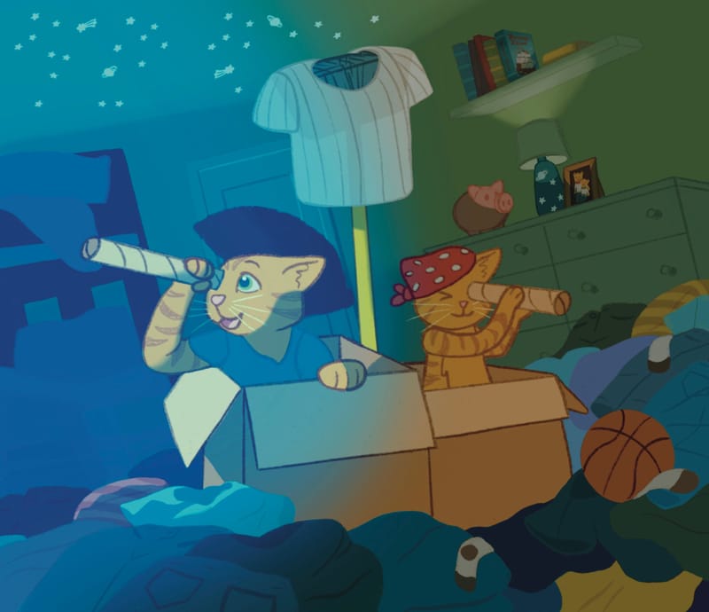
Also, I drew this on Procreate so I had to use different techniques for some of it. But I think it's going well! I had an "ah-ha" moment when I saw rim lighting as an option, and same moment when I saw how moonlight through a window would help explain what they are looking at out of view. Sometimes I'm so set on what colors I want to use I don't think to mess with it further. But seeing the changes made it very clear on where it was unfinished, so I'm very glad that I get to make those changes myself now.
-
This post is deleted! -
-
@kayleenartlover Great image! Fun to see how you continue to revise it.
-
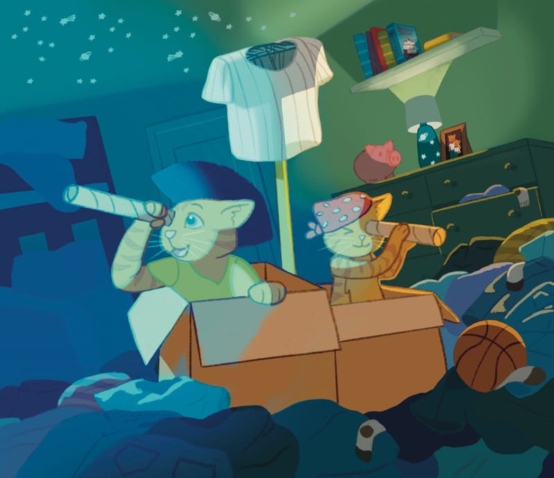
I’ve got a few different options that I’m trying to decide on, then I just need to finish painting over the lamp area.
-
@davidhohn Thanks! I’ve learned a lot and I’m excited to add this to my portfolio once it’s finished!
-
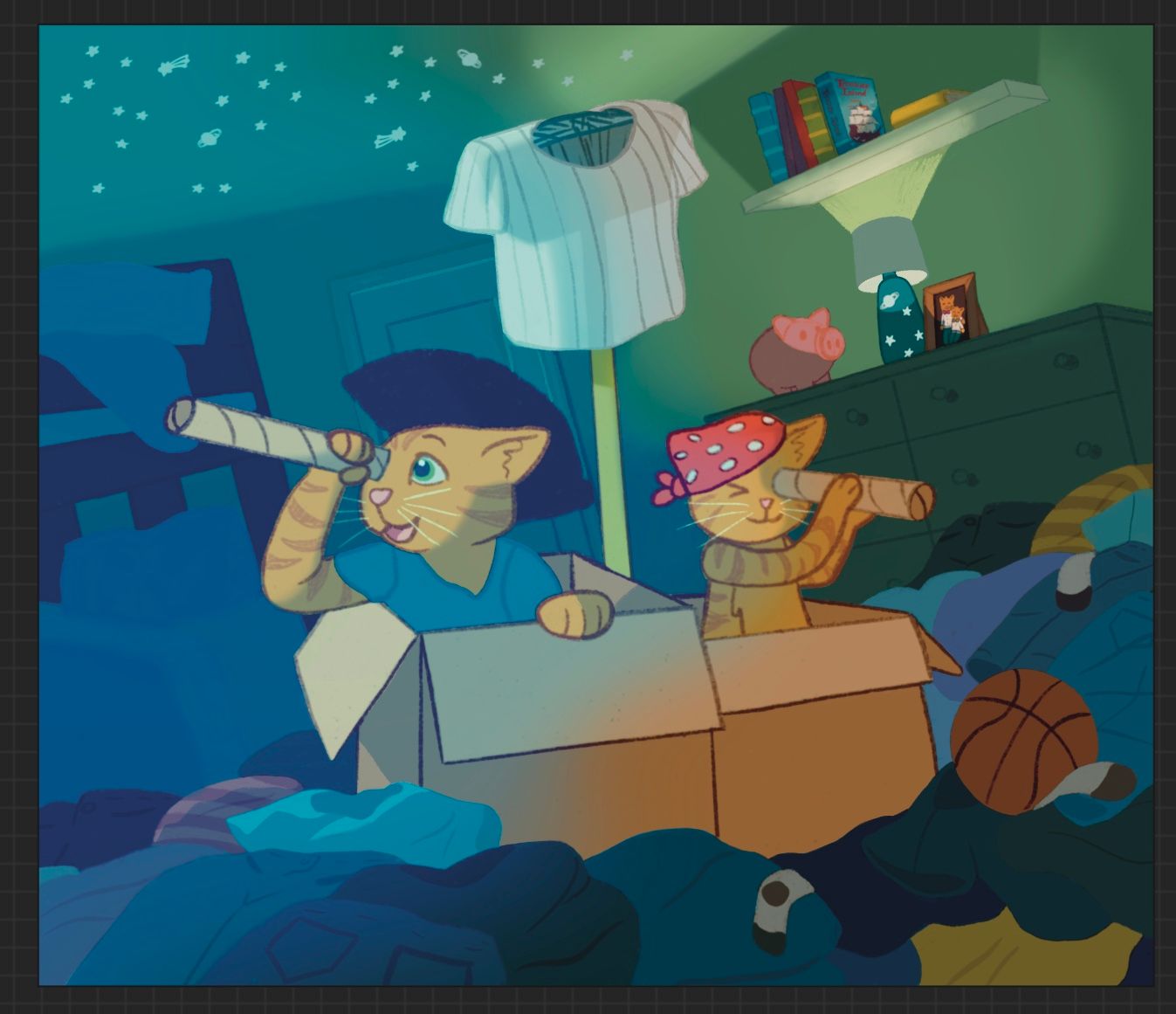
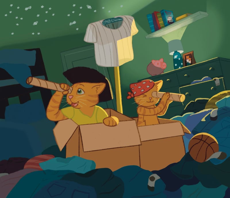
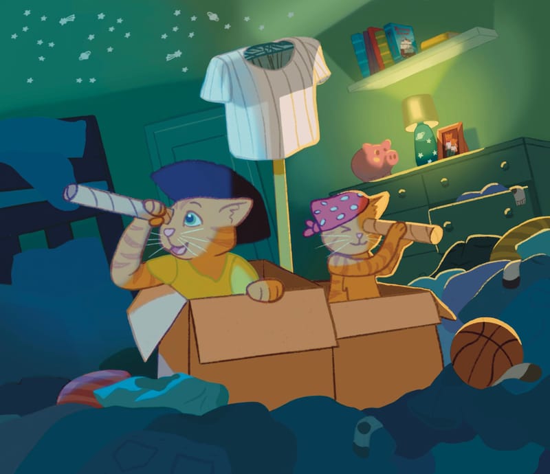
Okay so I am still not sure which way to go with this illustration. Here was what I made with the original color palette before adding any shadows. So you can see what color everything was, like how the dresser, shelf, door, and beds were all white.
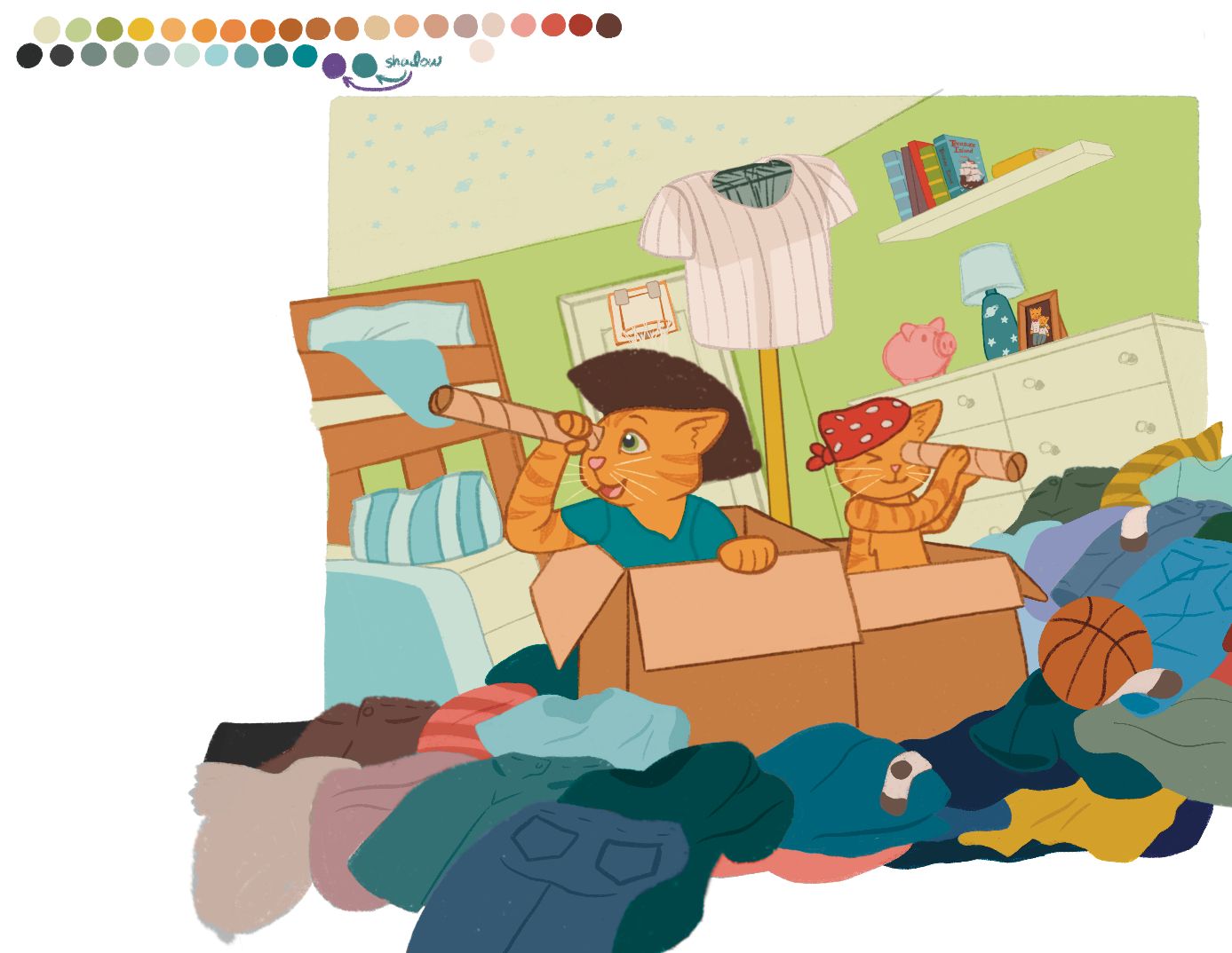
With that in mind, that is why the background was darker green, and I didn’t figure out yet what else to do with lighting when I was at this stage:
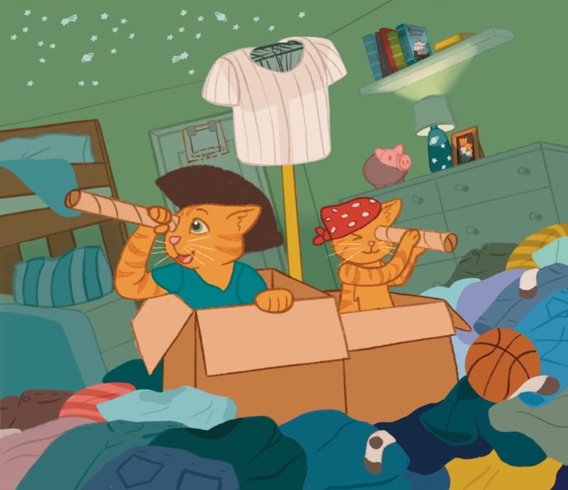
Now that I’ve been trying to push the shadows more and create a more finished look, I’m wondering if it’s too far away from my original colors that I find appealing. Can you tell if the dresser is white under the shadow? Do the cats look appealing?
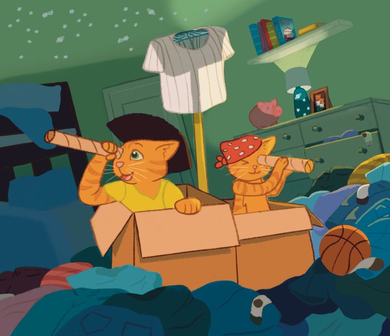
I still need to fix the lamp area, making the light glow through the lamp shade, but I want to know which version I should go with before I do that because I’m gonna want to call it done once I finish that spot. Do I need to backtrack on any of the shadows? Is one clearly better than the other? -
-
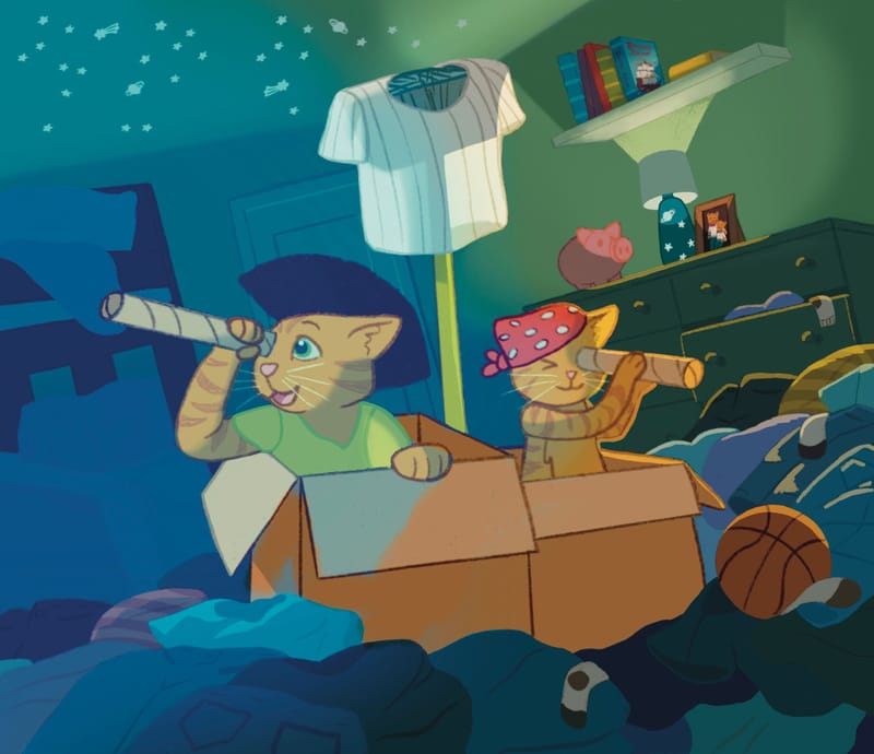
@kayleenartlover Super fun piece, and it’s great to see you working so hard on it.
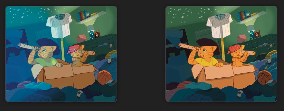
To me, the dresser does not read as white. I think there are two things that might be working together against you here:
-
One is that the cats and bed in the foreground do not have the same value or hue of shadow placed on them (i.e. the cats are still pretty bright orange and the bed is very blue compared to the dark greenish shadow in the BG.) I think the left thumbnail above you have is better at making the characters fit into the scene overall.
(This one seems like a stretch but I thought I’d throw it out there.) -
The other (probably more prominent) is that the value of the dresser is lower than the value of the wall behind it. I know the lamp is casting some light on the wall, but the way it’s framed, most of the wall we see is quite light and to me, it makes the dresser appear dark.
Ways to help might be:
-
The lamp light could be dimmer, making the wall darker. I think that the main light source seems to be coming from the moon outside and this is really pretty. Maybe the lamp light being dimmer could even help the mood of the piece somewhat.
-
Try to lighten the value of the dresser.
-
Try to darken the foreground characters some. (This would be my last resort.)
Just to be clear, I do not think these “issues” take away from the piece at all - just addressing the dresser problem. The piece seems really nice and cohesive already and I like the colors you’ve chosen.
-