November 2023 Submissions - How To Fix Your Art
-
Hi everyone,
This is my submission for the prompt ‘flight’.
Cant figure out how to make this piece more engaging and less empty.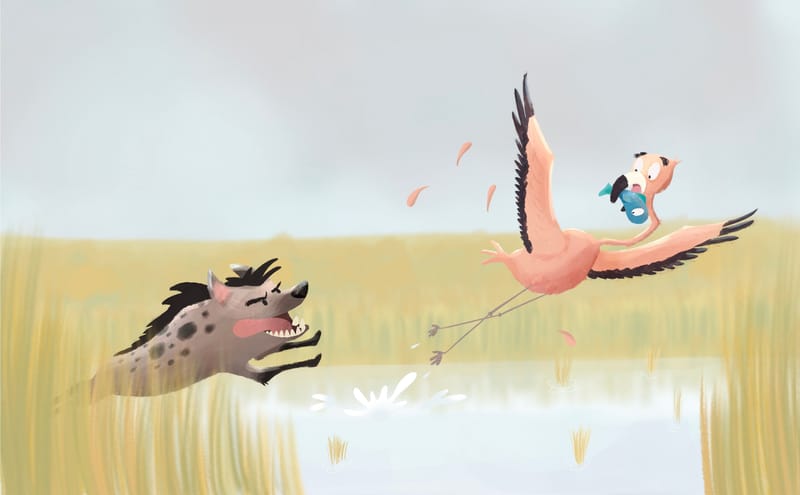
-
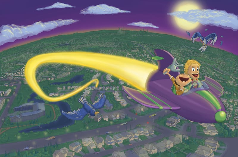
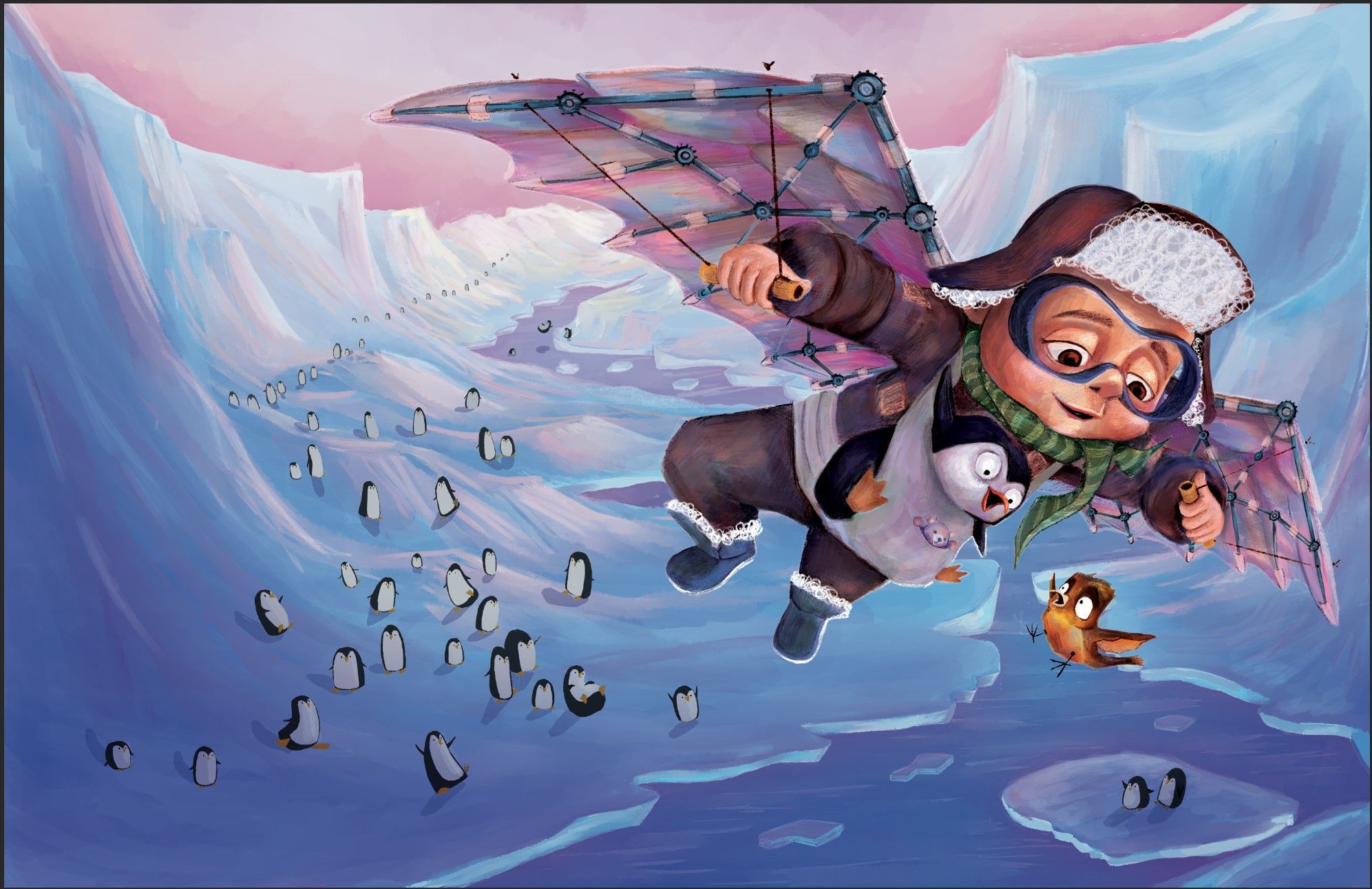
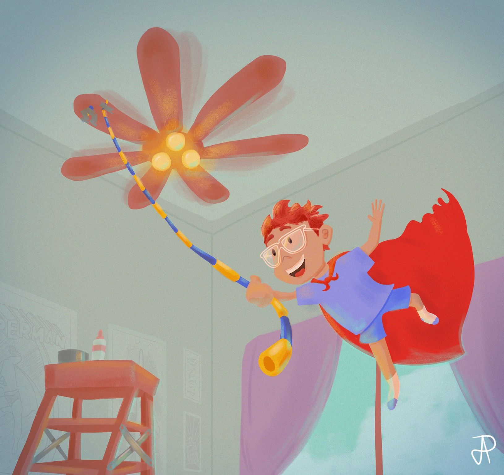
Hi everyone, here's my submission for 'Flight'. It's a double page spread for a book I'm working, the text would sit in the lower left hand side. I have to admit I'm feeling a whole lot of 'imposter syndrome' posting into this group with so much amazing art. As per the instructions, this is a finished piece, but any feedback is appreciated!
-
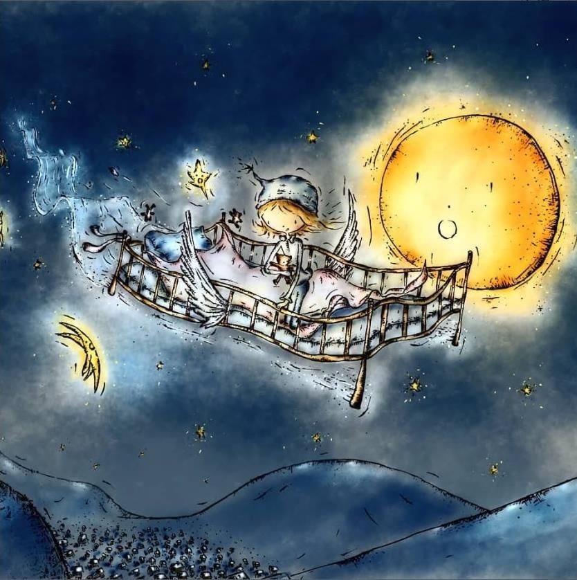
A slightly older work, but suitable for this prompt

-
Here is my submission to the prompt "flight".

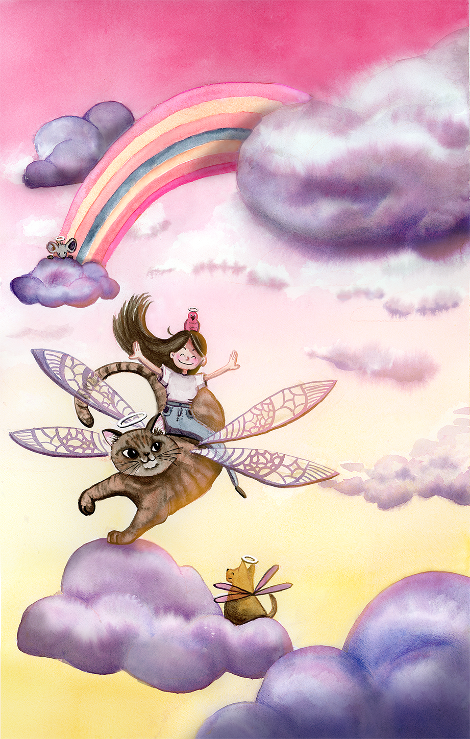
-
Heres my submission for HTFYA November
-
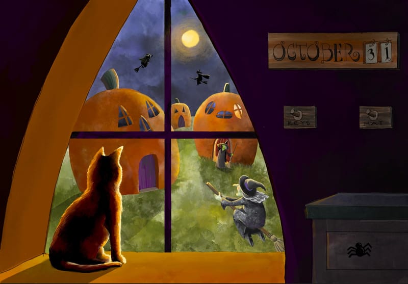
Flight! Gave up two days of Inktober to focus on this one. Had fun with the lighting.
-
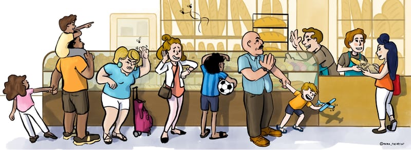
Hey guys, I shoehorned the prompt into my own october art challenge where i am doing a few different things in tandem to hone in on my illustration weaknesses and discover new ways to work. My biggest struggle is my most recent bout of “how the kek do I render stuff!?” I am mostly a drawer of flat more cartoony figures, but my brain’s default rendering setting is realistic Painting (renaissance era) which i am not nor ever have been good at. I have been trying to embrace flat cell shading and color contrast, but i always feel i should add highlights and halftones and shadows—realistic modeling you know?
I am realizing that you can use shadows to ground characters and connect them to backgrounds without needing to go full on realistic, but figuring out how to do that in my work is difficult. This is my most recent attempt at figuring that out. I ended up making a screen layer on top of everything, and selecting the local color of each element and painting some sort of indication of where the light is hitting them.Any and all instruction, philosophizing, critique, information, or diagnosis is appreciated.
Which svs learn class would you prescribe me?Edit: here is another piece I forgot i had, but it fit the prompt and i couldn’t help but share—its going to be the cover of a little zine I'm making about tips for traveling that i learned during my experience traveling to France with my husband, baby, and sister. I suppose i should put passports somewhere to make that clearer. #1 thing i relearned: flying is a nightmare.
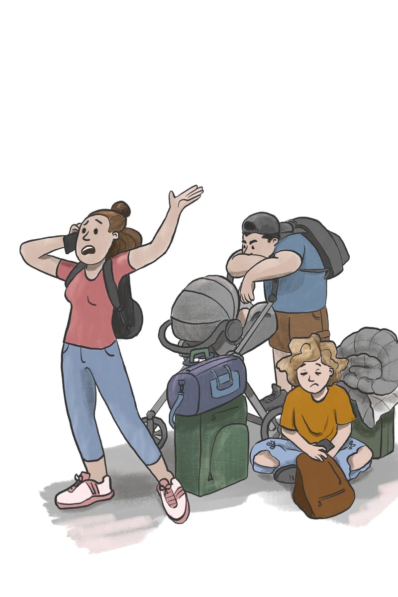
-
I've loved admiring all the submissions. Looking forward to the next installment of HTFYA.
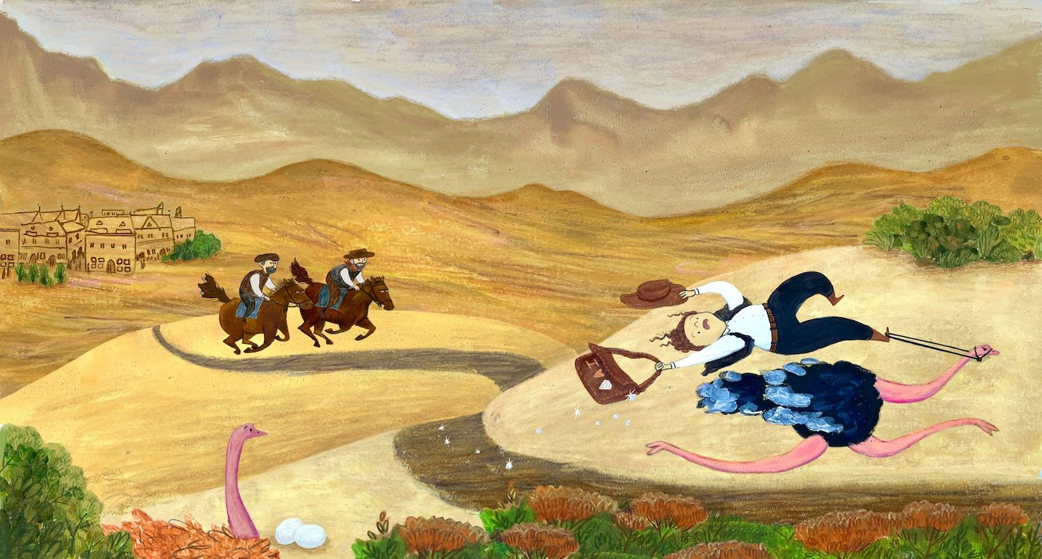
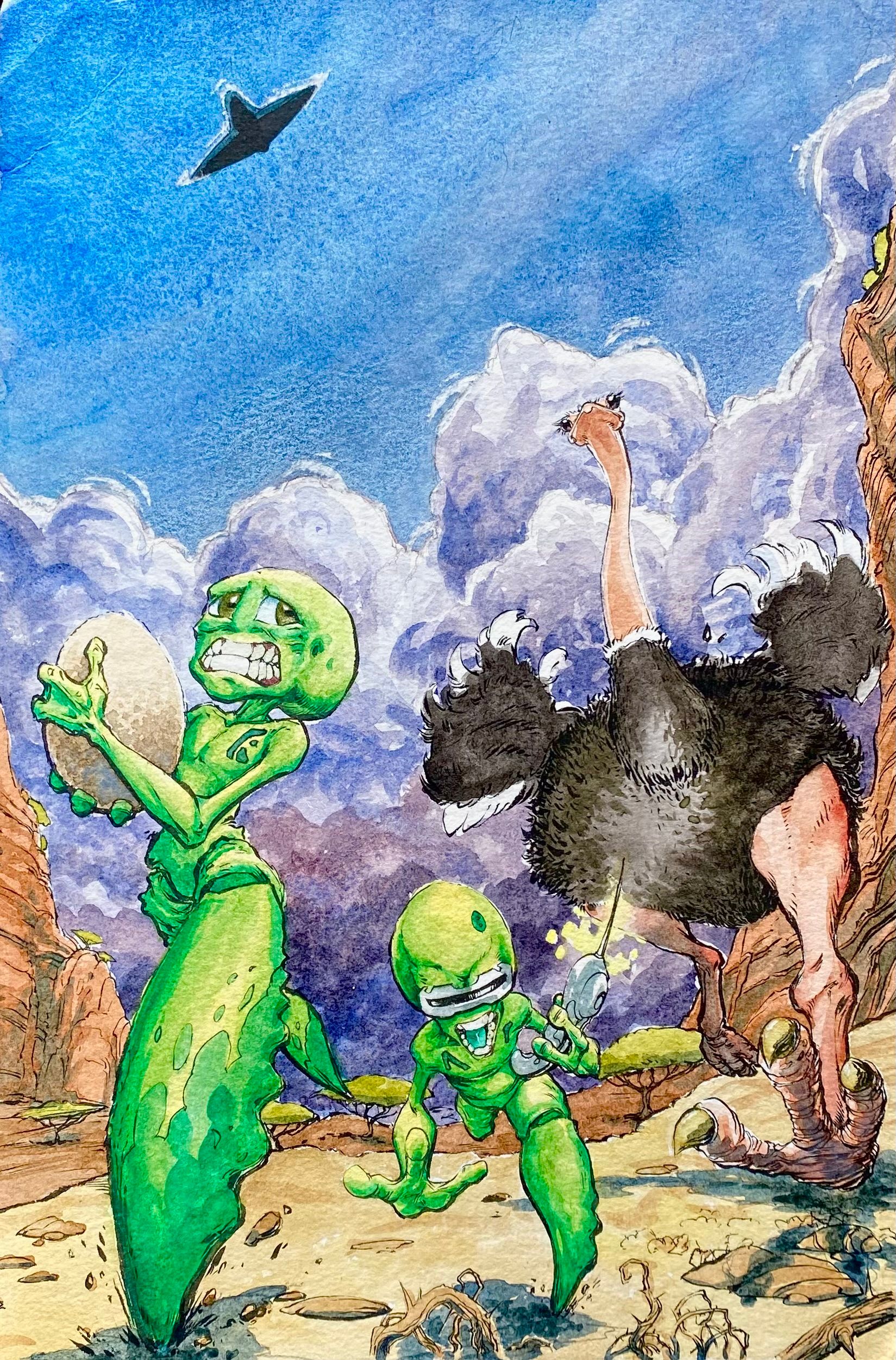
(Just because ostriches are faster than horses, doesn't mean they make a good getaway vehicle.)
-
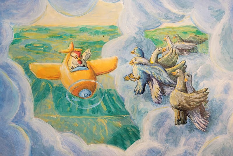
Had a lot of fun with this one. I am sure there are many improvements that could make it better!
-
@MerryMary This came out fantastic!!
 So cool to see your sketch previously and now it's rendered out!
 -
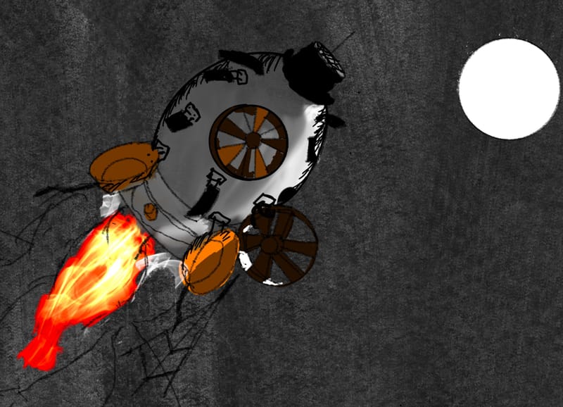
-
-
@alexw thanks so much!

-
@Annika-Wenzel @AngelinaKizz Beautiful wings, both of you!

-
@Malachi-Hudelson great work!
-
Here is my submission for "Flight" HTFYA in November! 20 hours of work!
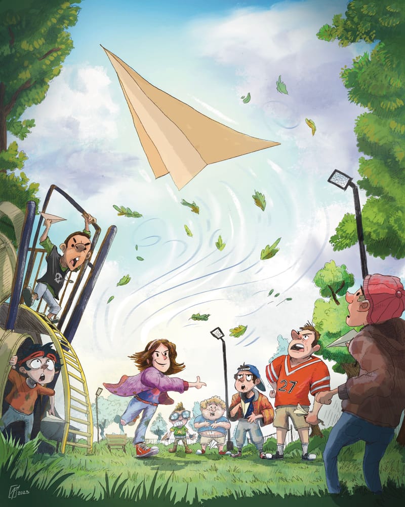
EDIT: I was given some great advice to provide the black and white version. I really tried to understand how black and white values translate into color. I realized that sky is not light grey but close to 30-40% grey it seems.
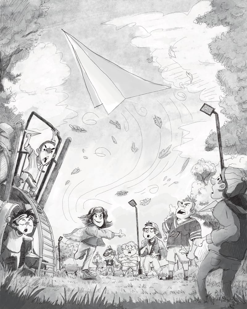
Looking forward to the critique!
-
-
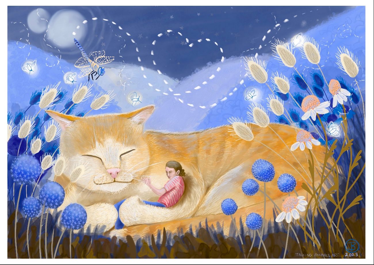
@AustinShurtliff - it’s lovely to see all the different interpretations:) - I would love some feedback on mine- this is part of a series I am doing on a story of Catworld- any and all feedback appreciated thank you- this was done in procreate- thanks! Tamzin
-
-
