Society of Visual Storytelling

    SVSLearn Forums

    • Register
    • Login
    • Search
    • Recent
    • Tags
    • Popular
    • Users
    • Groups
    • Search

    Jack Leapt: Lets share our inspiration and WIPs!!

    General Discussion
    15
    52
    4693
    Loading More Posts
    • Oldest to Newest
    • Newest to Oldest
    • Most Votes
    Reply
    • Reply as topic
    Log in to reply
    This topic has been deleted. Only users with topic management privileges can see it.
    • kayleenartlover
      kayleenartlover last edited by

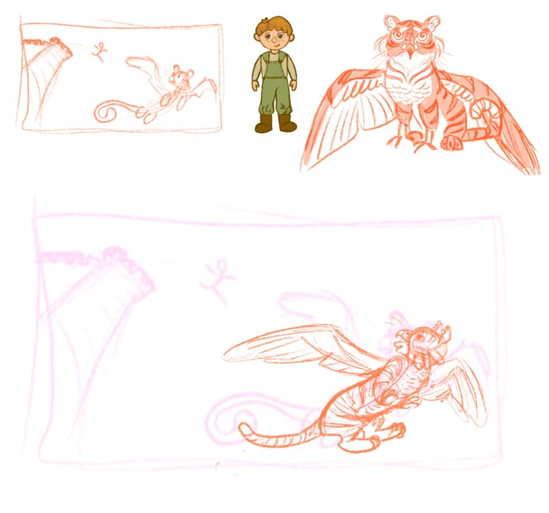
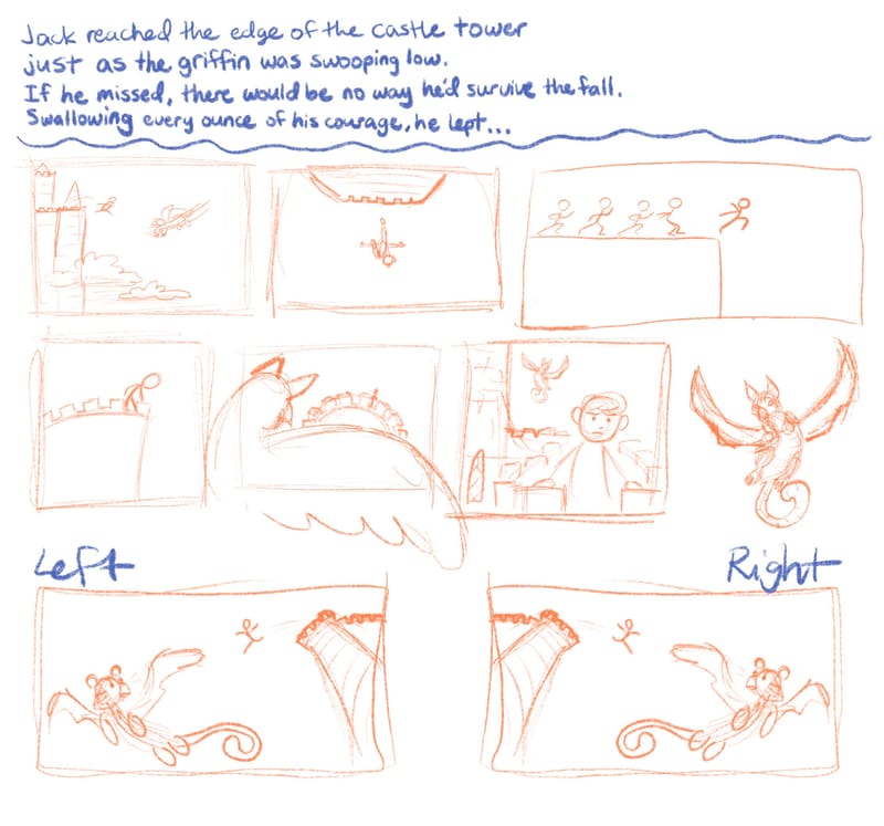
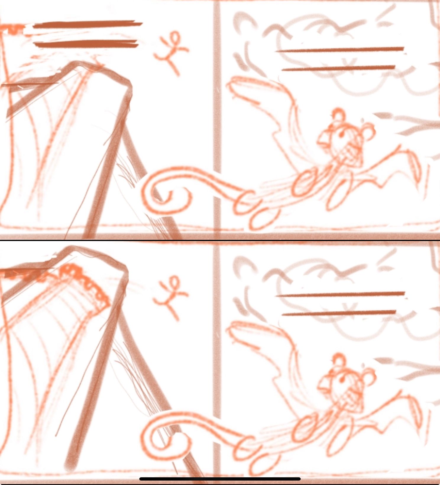
      I think I’m liking the composition on the bottom thumbnail, but not sure which version to do, with the griffin on the left or right?
      IMG_6055.jpeg

      Fey Realme jenn 2 Replies Last reply Reply Quote 1
      • Fey Realme
        Fey Realme @kayleenartlover last edited by

        @kayleenartlover those look great! Action should generally read left to right, so i recommend the right version! Cant wait to see it!

        Blog: mamatheartist.blogspot.com
        Coloring page newsletter: https://bit.ly/Color-in

        1 Reply Last reply Reply Quote 2
        • jenn
          jenn @MarcRobinson last edited by

          @MarcRobinson Ooh, very cinematic! this scene reminds me of the golden eagle who saves Gandalf. And just as epic.

          studiojcd.com
          she/her/hers
          Insta/Twitter: @chengdesautels

          MarcRobinson 1 Reply Last reply Reply Quote 0
          • jenn
            jenn @kayleenartlover last edited by

            @kayleenartlover I agree, the Right one. These panels look great, it is very clear what is going on, there's a nice rhythm to the angles and zooms.

            studiojcd.com
            she/her/hers
            Insta/Twitter: @chengdesautels

            1 Reply Last reply Reply Quote 1
            • jenn
              jenn @J. Morgan Looney last edited by jenn

              @J-Morgan-Looney the 2nd one with the arrow pointing to it could work. Maybe the hind legs of the griffin could bend forward a little and the lasso be nearly hooked on. The lasso could still be open/slack or whatever the technical lassoing term is. I like how everything is silhouetted. And I just happened to see a turkey vulture for the first time a couple days ago. They are magnificent! Nice choice.

              studiojcd.com
              she/her/hers
              Insta/Twitter: @chengdesautels

              J. Morgan Looney 1 Reply Last reply Reply Quote 0
              • MarcRobinson
                MarcRobinson @jenn last edited by

                @jenn hey thanks Jenn I appreciate it.

                1 Reply Last reply Reply Quote 0
                • J. Morgan Looney
                  J. Morgan Looney @jenn last edited by

                  @jenn thanks for the input. Started moving in the direction of Jack riding the gryphon, but I think I will revisit the lasso pose with your feedback!

                  https://www.instagram.com/looneysketches

                  1 Reply Last reply Reply Quote 0
                  • skeletortoise
                    skeletortoise last edited by

                    Hello all,

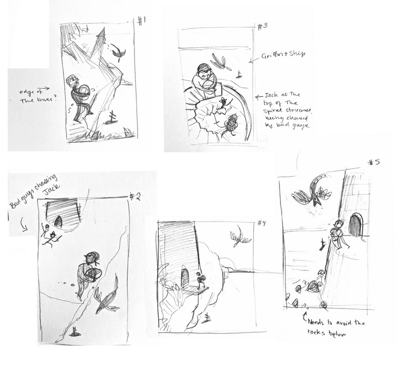
                    My idea this month is to draw a pirate who has just stolen from the gold hoard in a tower. I’ve interpreted the “swooping low” as the griffin being in pursuit of Jack and Jack has to jump to get away, though in a couple of comps I played with Jack being chased by other pirates and the griffin is helping him.

                    I’ve done some composition sketching, but I’m concerned not everything is lining up with the prompt. Will it look like he’s trying to jump to the ship instead of just into the water? Will it look like the griffin is his friend? Is it a problem if Jack isn’t exactly at the edge of the tower but instead outside of it? Any feedback would be appreciated!

                    As a clarifying note: in #1, 4, 5 the griffin is after him, and in #2, 3 the griffin is helping him while bad pirates are chasing him.
                    IMG_1569.png

                    1 Reply Last reply Reply Quote 0
                    • kayleenartlover
                      kayleenartlover last edited by kayleenartlover

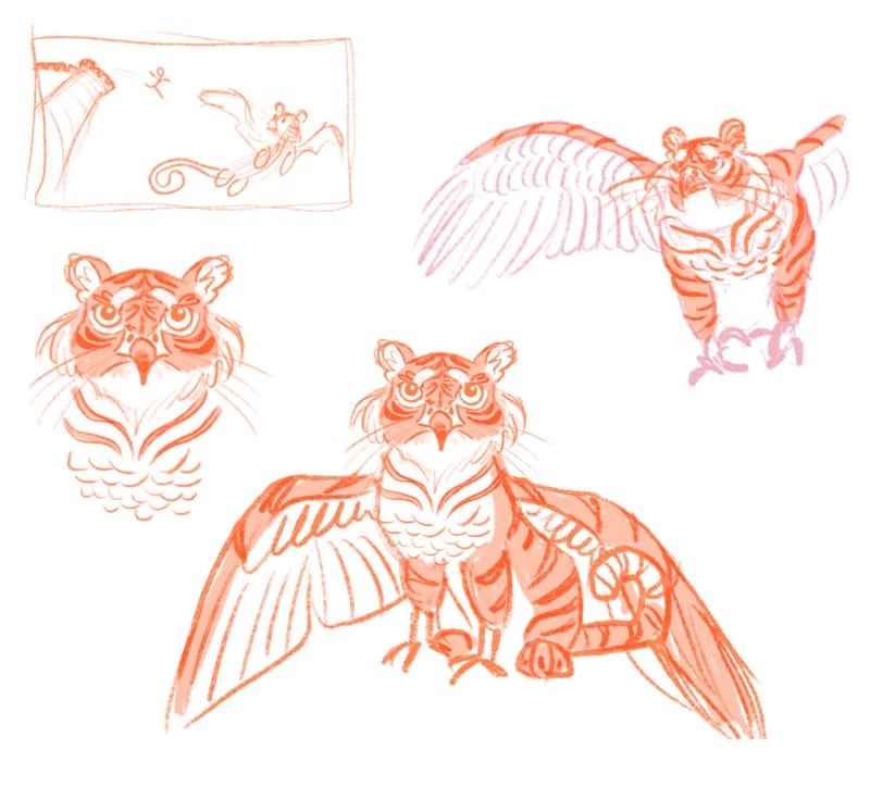
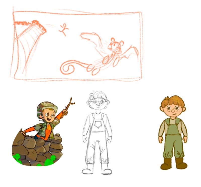
                      I designed Jack even though he'll be pretty small in the final illustration, next is just the griffin before putting it all together
                      EBC7ADF7-641E-4403-8121-23332E695FF1.jpeg

                      Fey Realme 1 Reply Last reply Reply Quote 1
                      • Fey Realme
                        Fey Realme @kayleenartlover last edited by

                        @kayleenartlover that is great! You might consider adding a cloud and a bit more castle to fill in the negative space. I think this is perfect for a book spread, especially if you leave space for text, you have already avoided the gutter beautifully!

                        Heres what i mean about the castle and the sky
                        IMG_4342.jpeg

                        Blog: mamatheartist.blogspot.com
                        Coloring page newsletter: https://bit.ly/Color-in

                        1 Reply Last reply Reply Quote 1
                        • kayleenartlover
                          kayleenartlover last edited by

                          Just working on the griffin before make slight changes to the background. Thanks for all the comments and critiques ❤️
                          0A1D9A25-BD05-4E18-9ADA-78FE94AF422B.jpeg B4A104FD-E14E-408A-AB27-ED40F726ED81.jpeg

                          Julia Hegetusch 1 Reply Last reply Reply Quote 1
                          • Julia Hegetusch
                            Julia Hegetusch @kayleenartlover last edited by

                            @kayleenartlover hi. I love yout tiger griffin design

                            https://moanamaureen.com

                            kayleenartlover 1 Reply Last reply Reply Quote 1
                            • Jason Crowley
                              Jason Crowley last edited by

                              sketch.jpg

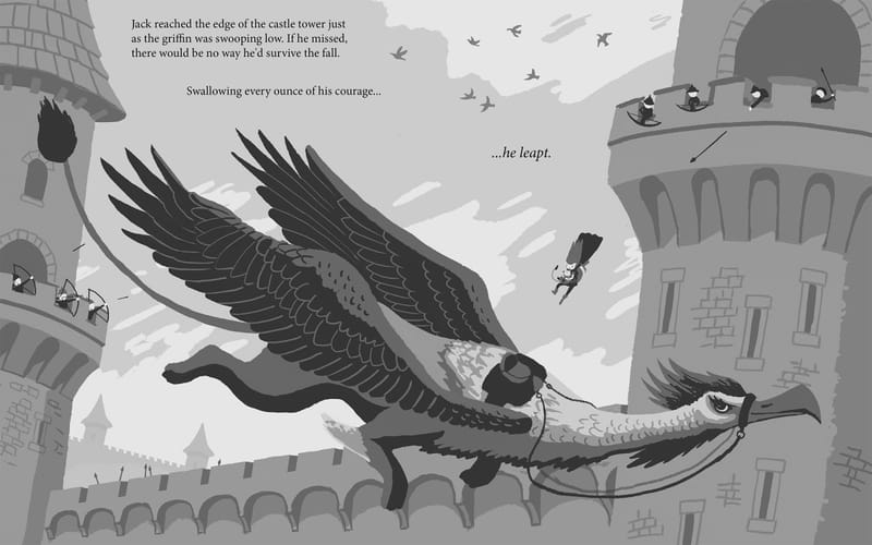
                              Here's my sketch before I move to the final. I'll be rendering this in pencil then scanning into Photoshop and colouring in behind in the pencil.

                              Sooooo much reference needed for me to get this basic looking image together, as I'd never drawn pretty much everything in the image 😅

                              I wanted the text to mirror the 'falling' of the character by spacing it out in vertically staggered slices.

                              I've designed this to picture book dimensions and have accounted for the gutter in the middle so nothing of importance is cut off.

                              Some process stuff:
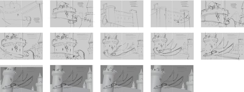
                              thumbs.jpg
                              Thumbs

                              I ended up doing a basic blender model of the castles to help me visualise camera angles and the like. I find this a super useful approach for interiors and buildings.

                              I flipped the composition eventually so the griffin is facing right and so that the text can be read left to right.
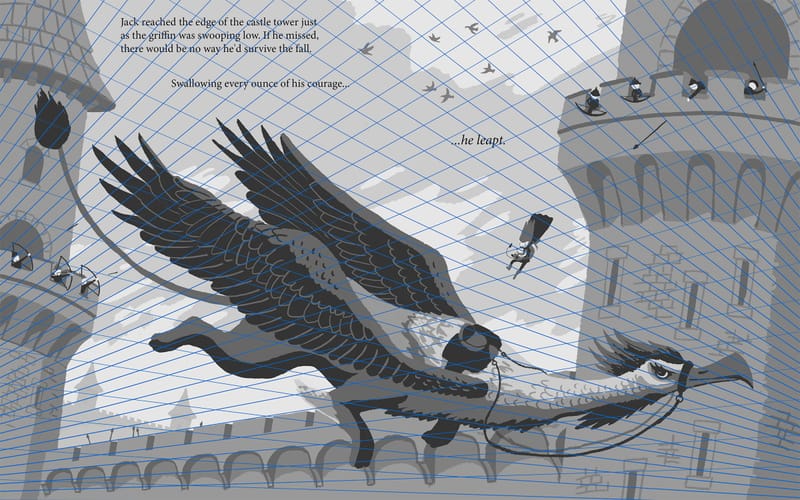
                              VPs.jpg

                              Here's the two point perspective guides put in place.
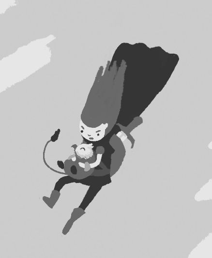
                              character.jpg

                              I wanted the reason that the character was escaping the castle was to save the captured baby griffin and return it to its mother. I thought about cropping this in so this can be clearly seen but I figure in the context of a book this would be emphasised in another section. I also felt that showing the griffin in full would make a more dramatic composition.

                              https://www.jasoncrowley.art
                              https://www.instagram.com/jason_crowley/

                              Larue 1 Reply Last reply Reply Quote 2
                              • kayleenartlover
                                kayleenartlover @Julia Hegetusch last edited by

                                @Julia-Hegetusch Thanks!

                                1 Reply Last reply Reply Quote 0
                                • kayleenartlover
                                  kayleenartlover last edited by

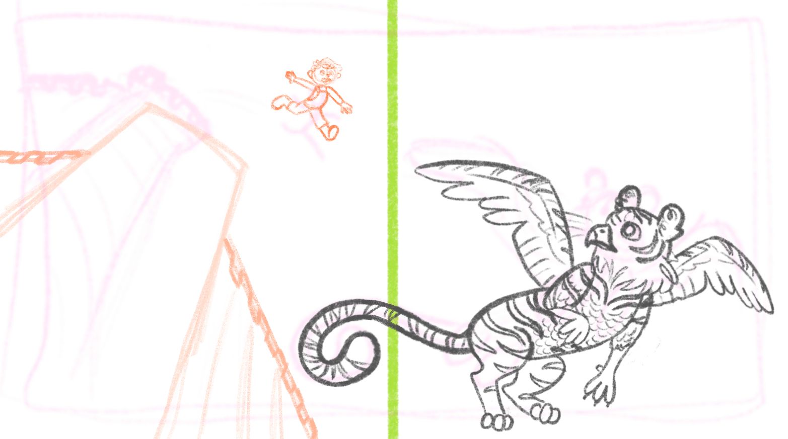
                                  would love any tips on Jack if he looks too stiff,
                                  I'm thinking the threat at the top of the tower will be the Giant from the beanstalk fairytale...
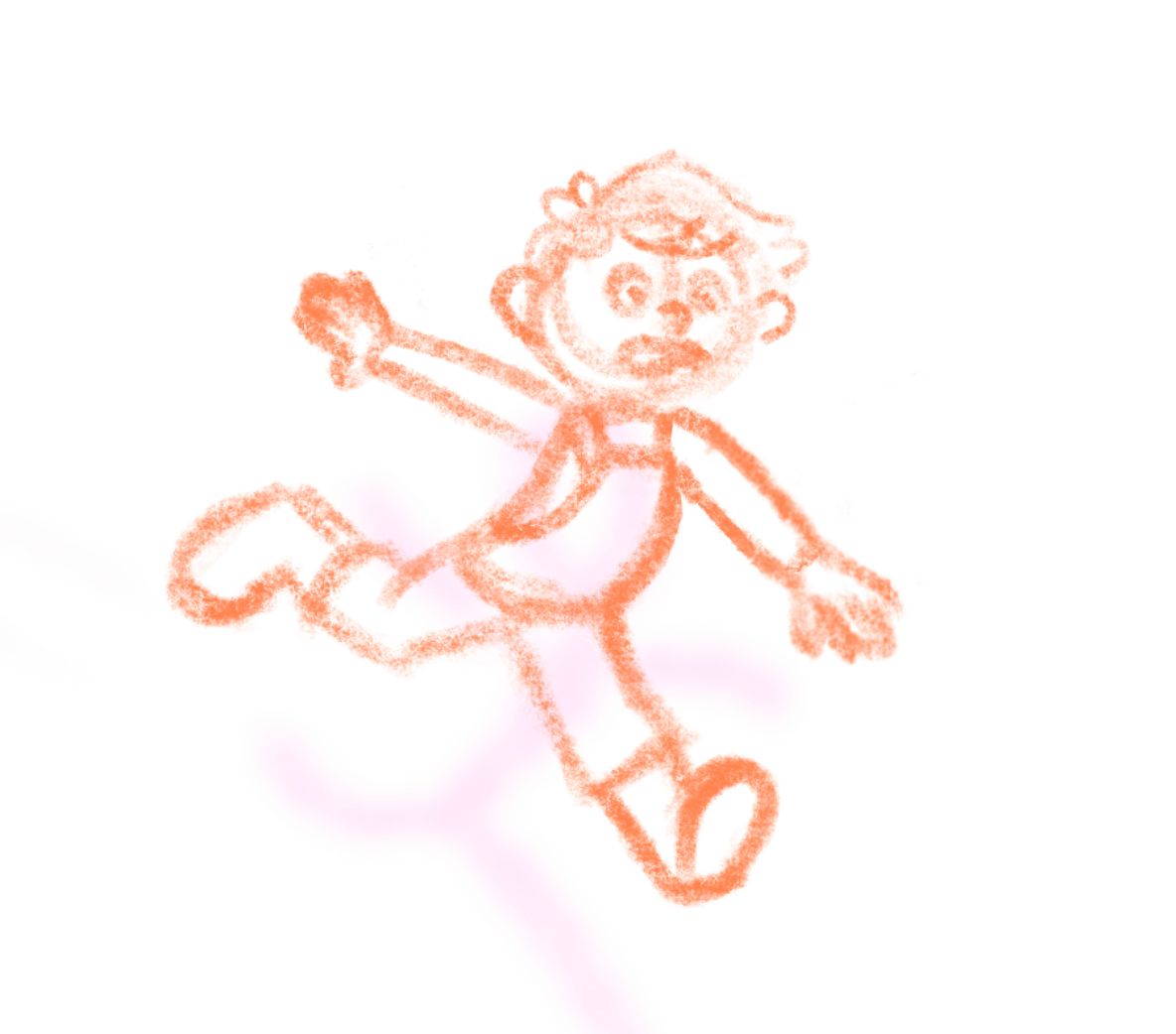
                                  3EE93569-F545-457F-BC2A-968F23321480.jpeg 1DE4439E-D25E-41C6-A228-49DE5ECFE8C3.jpeg

                                  MarcRobinson 1 Reply Last reply Reply Quote 0
                                  • Larue
                                    Larue @Jason Crowley last edited by

                                    @Jason-Crowley
                                    Looks like an adventure time character...love it!

                                    1 Reply Last reply Reply Quote 1
                                    • MarcRobinson
                                      MarcRobinson @kayleenartlover last edited by

                                      @kayleenartlover I love the low down angle of the illustration! It's super dynamic. Remember to avoid symmetry in the pose. Also keep the head off the centre line too. At the moment the character is very upright, and the limbs are out like a star almost. Try going "too far" with the pose, then reigning it back if you need to. Try having the head lower, more bent body and limbs all over the place. You might hit a fun pose by accident.

                                      kayleenartlover 1 Reply Last reply Reply Quote 1
                                      • kayleenartlover
                                        kayleenartlover @MarcRobinson last edited by

                                        @MarcRobinson I think I was going for this being his jump but if his head is lower it would be more like the falling part of the leap. I had a hard time finding reference photos for the pose. If you or anyone else have ideas on what I can use as reference that would be great

                                        1 Reply Last reply Reply Quote 0
                                        • Fey Realme
                                          Fey Realme last edited by

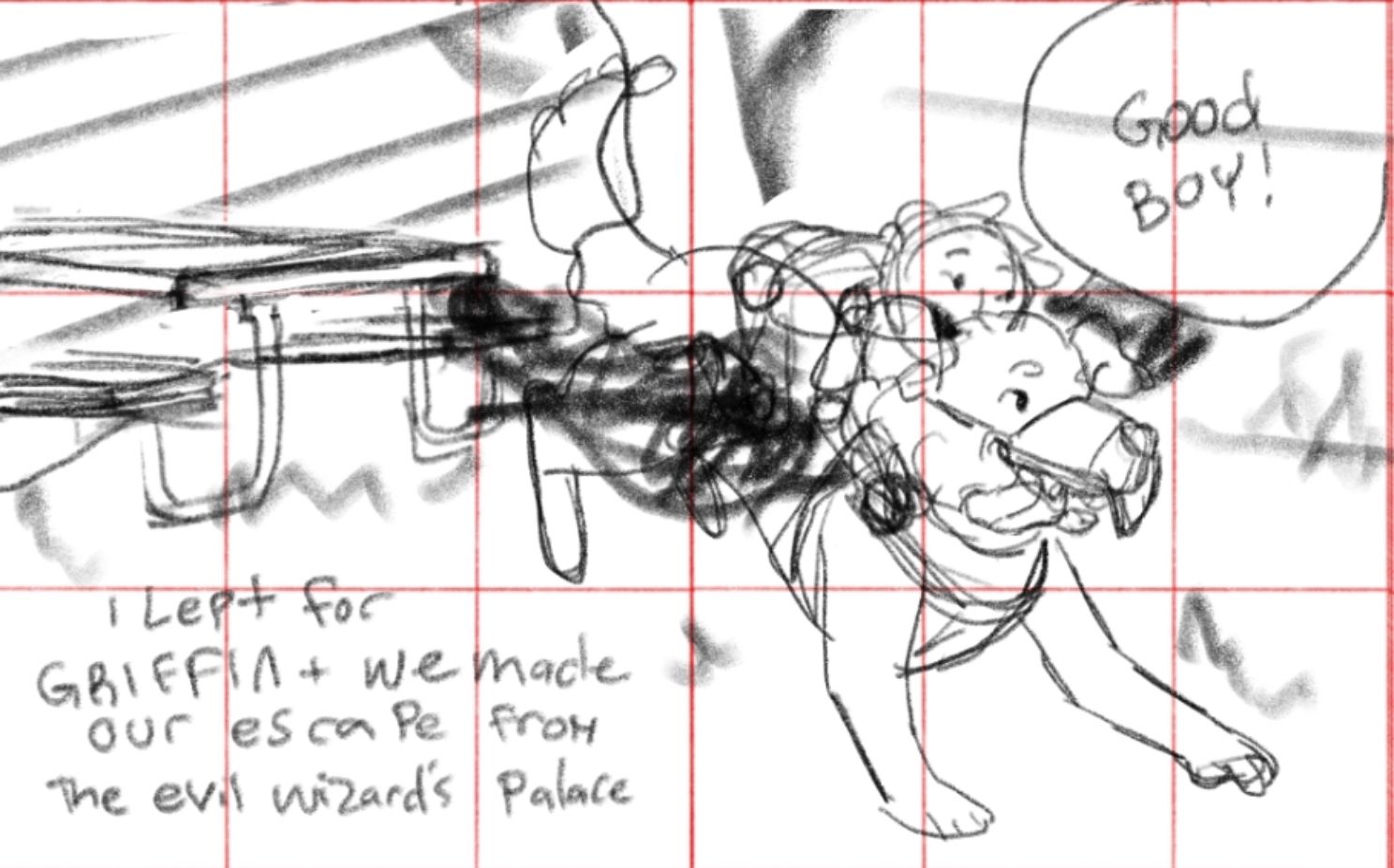
                                          Hey yall after lots of internal struggles with my story this is the direction im going for my image— any feedback is welcome!
                                          Text will read “I lept for Griffin and we made our escape from the evil wizards palace”
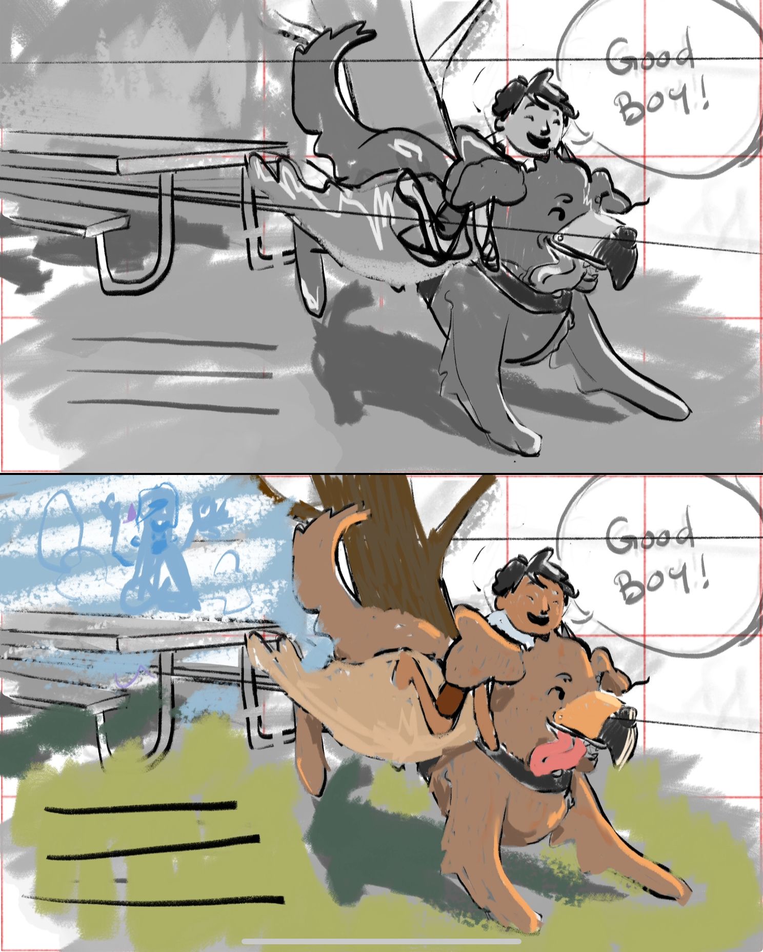
                                          IMG_4355.jpeg IMG_4356.jpeg

                                          Blog: mamatheartist.blogspot.com
                                          Coloring page newsletter: https://bit.ly/Color-in

                                          Larue 1 Reply Last reply Reply Quote 1
                                          • Katt
                                            Katt last edited by Katt

                                            Hey guys,
                                            I'm uploading my APril progress...I excluded my thumbnails and am putting up where I'm at now.
                                            This is my second HTFYA, and doing this has actually been really helpful to see how fast/slow I work, where I get stuck, and also to be prompted with a storyline that isn't one of my 'darlings'. I decided also with April, I was going to attempt to return to some of my older more traditional styles (per the post i made about that here https://forum.svslearn.com/topic/13858/traditional-digital-disconnect-i-need-help-with-cohesive-art-style-and-direction?_=1711403790151.
                                            I will be printing this piece out and adding some more watercolor and ink over the linework, but I just want to know what y'all think I can work on.

                                            *so some questions tho- should I flip the pic around, so the action is going left to right?

                                            • is the cliff light/dark enough?
                                              *I considered leaving some blank space for text
                                              *and per Jake's critique, I gave the boy some fingers and a little more detail

                                            Here is my '1st draft/sketch' of what I wanted to do...
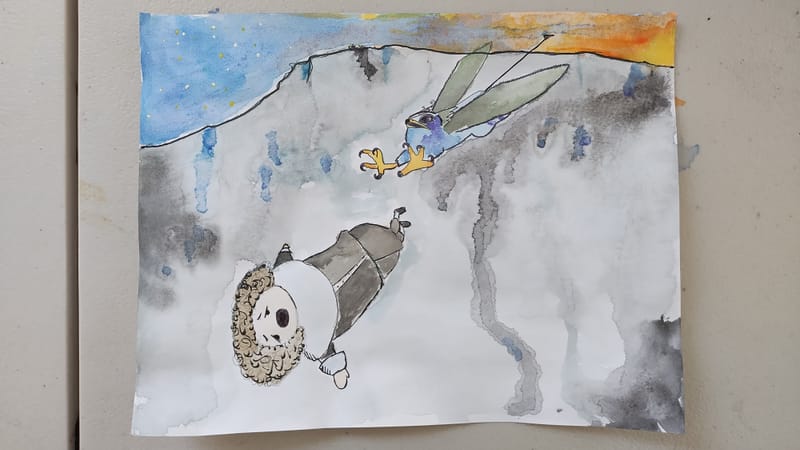
                                            IMG_1609.jpeg

                                            *and here is where I'm at now, with the exception of going over with watercolor and ink
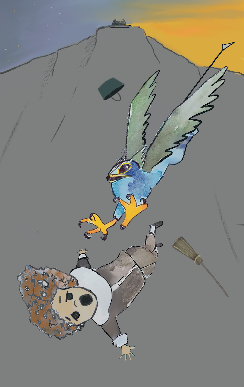
                                            IMG_1615.png

                                            Thoughts? Things to improve? Thanks so much have a great week.

                                            Larue 1 Reply Last reply Reply Quote 1
                                            • First post
                                              Last post