June 2024 Submissions - How To Fix Your Art
-
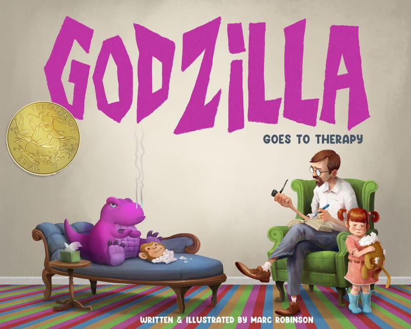
Text is not my strong point at all. But in order to get this done in time with all the hectic life stuff going on, I decided on a simpler text design. Originally I was going to have the title spelled out with items on a shelf, but I wasn't going to get that finished. Anyways, I'm loving everyones designs so far. And also, if you can't tell, I MASSIVELY struggled with the girls face. Realistic kids are hard! -
@MarcRobinson I love the color you chose for Godzilla and matching the color for the title was a good choice.
-
@MarcRobinson the caldecott medal is a nice touch
 ha love it!
 -
@kayleenartlover hey thanks, I'm glad that came across and worked.
-
@MerryMary ha thanks! I was also going to put some "reduced" stickers on there too. But I guess it'd be too busy looking.
-
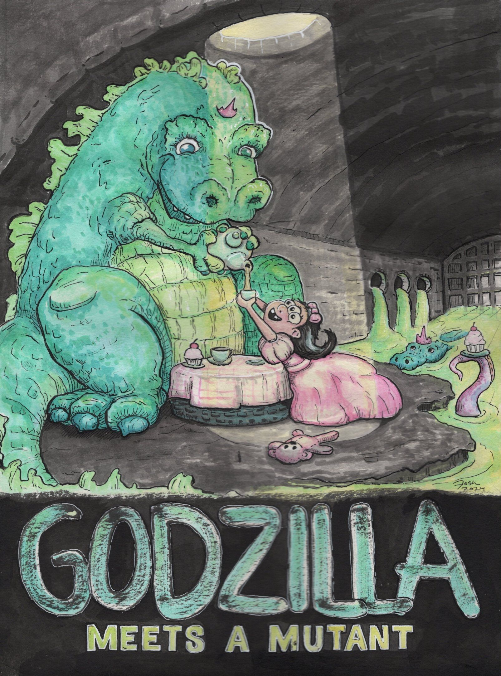
Natasha Banks, Godzilla Meets a Mutant.
-
Why does the tea party with Godzilla always result in destruction?
Here comes my submission for this month's How To Fix Your Art. I did a ton of iterations and thumbnails for this one, spent a fair amount of time planning the watercolor too, deciding where to add the masking, what to paint first, and so on!
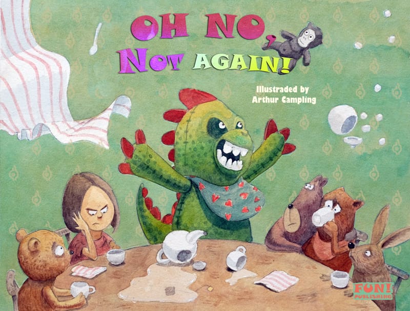
https://www.arthurcampling.com/
https://www.instagram.com/arthur.the.artist/Edit: Don't know how to replace the image, but there is a misspelling there.
-
Here's my submission for June's HTFYA:
 )
) -
-
@jahn
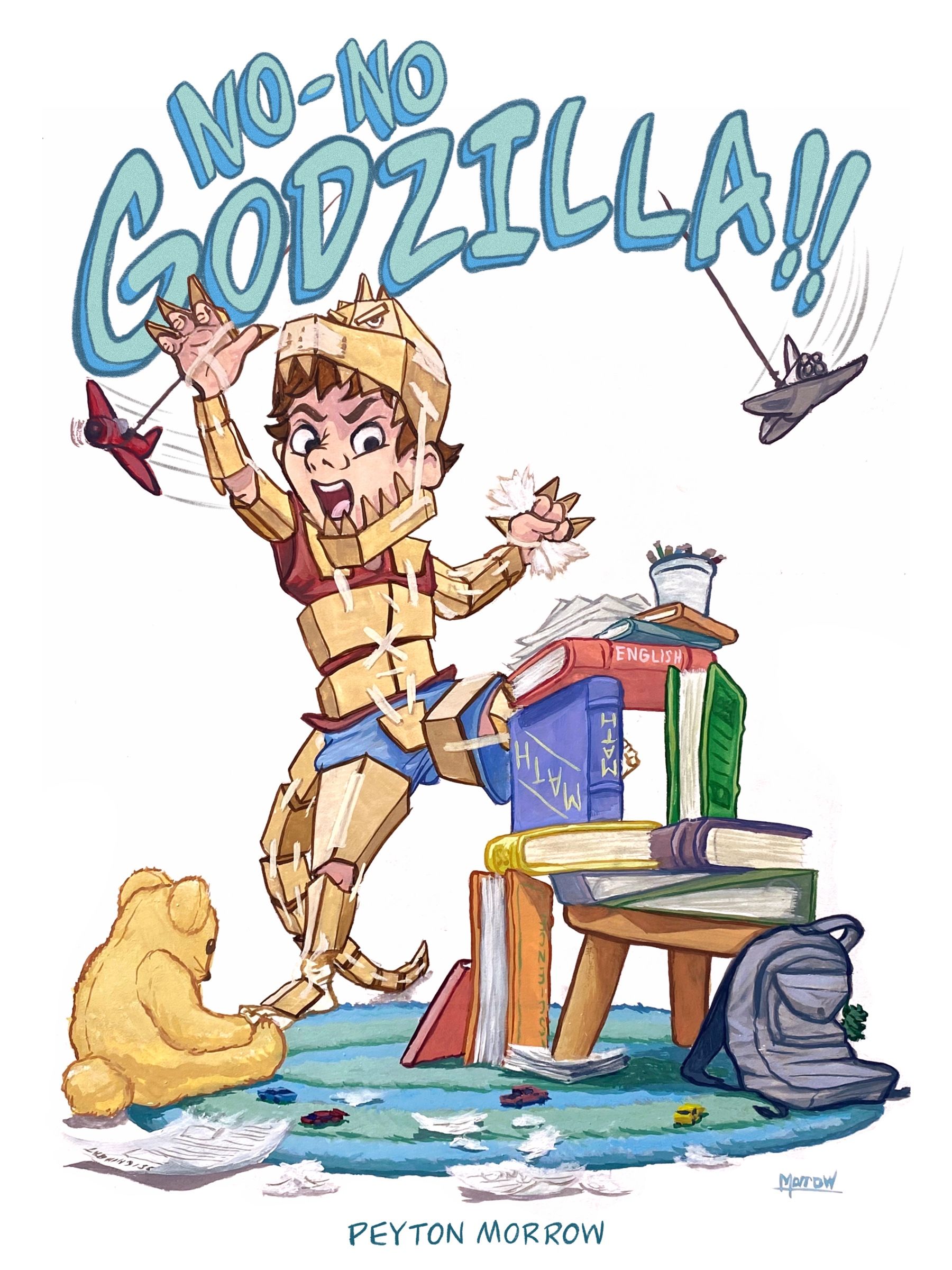
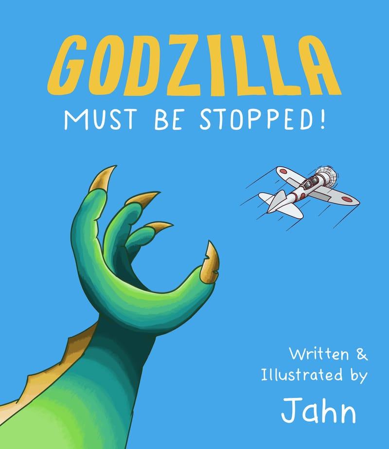
For this prompt, I started with reading about the history of the Godzilla character, and after seeing that he was rooted in the Japanese response to being nuclear bombed, I thought there would need to be a bit more serious destruction theme to the book. I thumbnailed out several ideas, trying to come up with images that implied Godzilla rather than showing him directly. For example, one idea was to show the "aftermath" where a little girl was kneeling on the ground next to a large crater in the shape of the monsters foot, and the surrounding neighborhood was destroyed. Another idea was to show a child in a car seat looking out the window as the family flees the city, with a silhouette of the monster destroying the city skyline. These two ideas seemed overly complicated visually, so I thought through simpler ideas. I landed on this one, where Godzilla's size and montrousness is implied by his hand, and the airplane is clearly trying to escape destruction. I picked the bright colors to bring more appeal to a younger audience, and fortunately since this is just a cover I didn't have to decide what kind of content would be in the book and how to portray destruction in a way that kids could understand and accept. -
@Jason-Crowley i got my money on Rob. This looks fantastic Jason!
-
Hey Everyone, I am loving the Godzilla Illustrations on here! Even though I always back King Kong in the fights
 Great prompt this month!
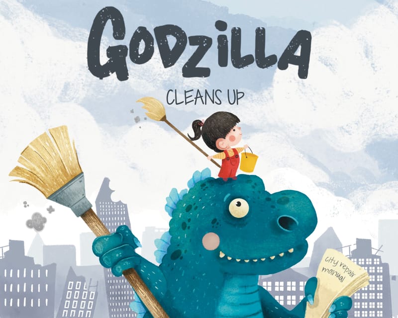
With this one I imagined Godzilla causing mayhem and he bumps into a little girl who tells him off and teaches him it's important to clean up after himself. They then work together to clean up the city, under her instruction of course.
-
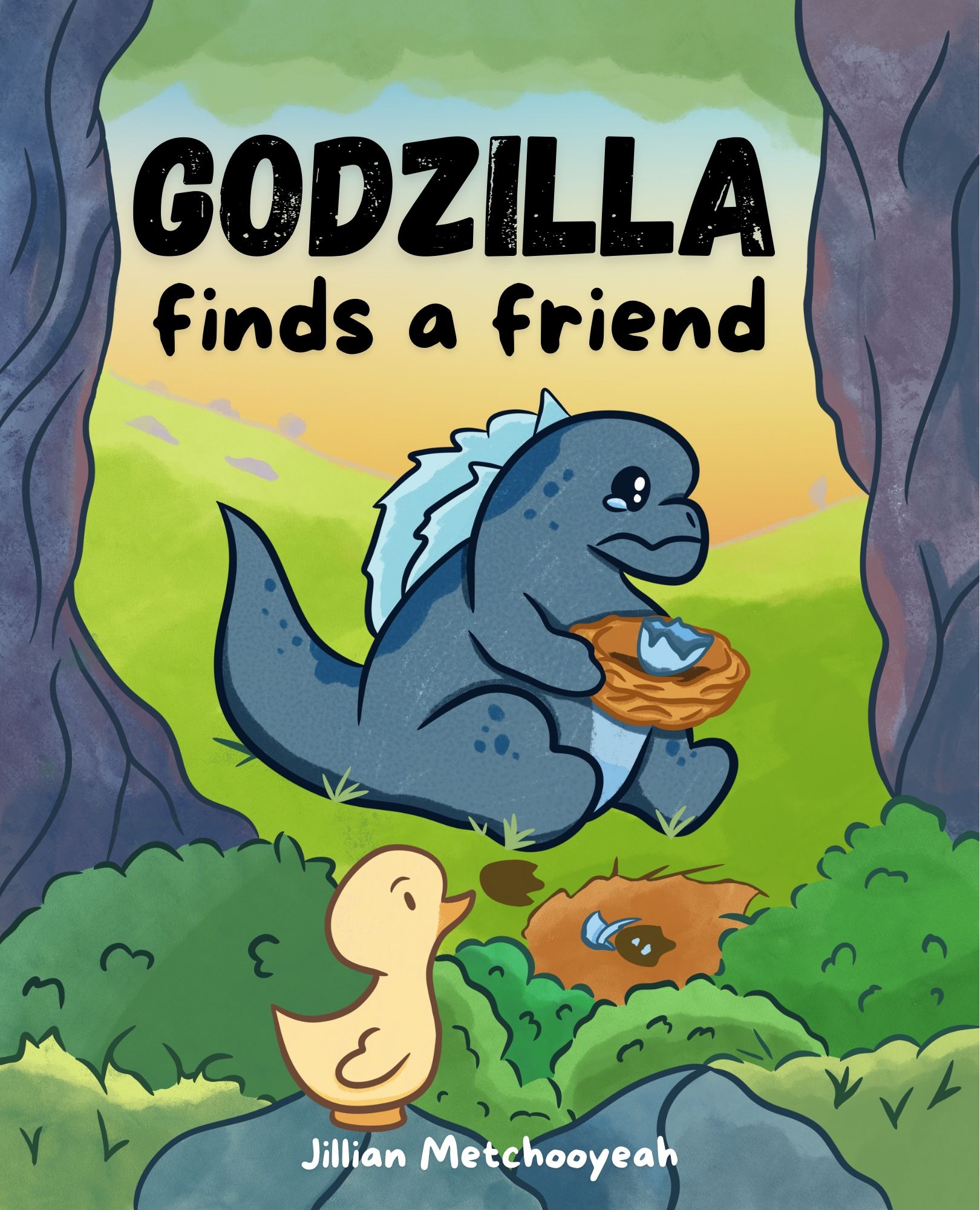
Here is my submission for June. Everyone’s’ submissions look amazing!!
-
@pmxart Rob is pretty fearsome!
-
@Megan-Majewski I would love this on a t shirt!
-
@AustinShurtliff Hi, Austin; I think I'm finally on the forum. I can read the posts, and I hope you get this reply. As a newbie, I do not see how to upload my HTFYA prompt. Perhaps it's closed? I did email you the jpeg, but I can't see anywhere that says upload.
I will go back to the YouTube channel and look for the live stream on this prompt...
Cheers
A -
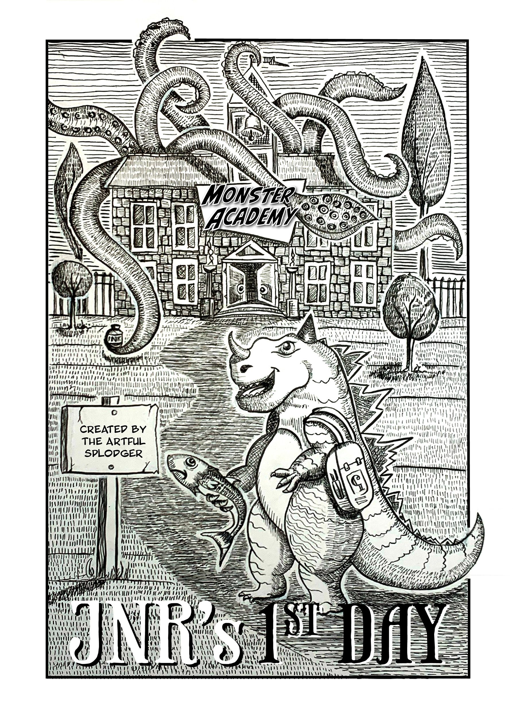
My June HTFYA - and my first one!
-
@Zachary-Schrage
Fantastic! You've made him a loveable character! Line work is incredible. You definitely have a recognizable style. -
@Larue I was going to add that electric fire from his/her/thing mouth and get the sign edge burning up, but I thought it crossed the midpoint and was making the whole thing too busy...
Thanks for the comment. This is my first submission, and I'm keen to see how this works. I really like the SVS education and pod/videocasts.
Cheers
A -
@MarcRobinson
Love this.You're really good at giving everything weight. Your shadows really make the Dad and Godzilla "sit" in their chairs. Good job of use of buzy carpet not looking busy and over powering the piece.
May ask about your process and medium?