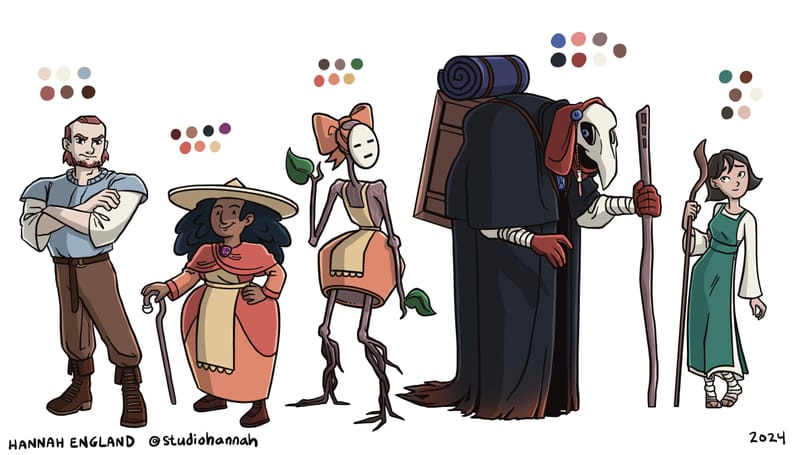
Crit Welcome: Character Designs x5!
-
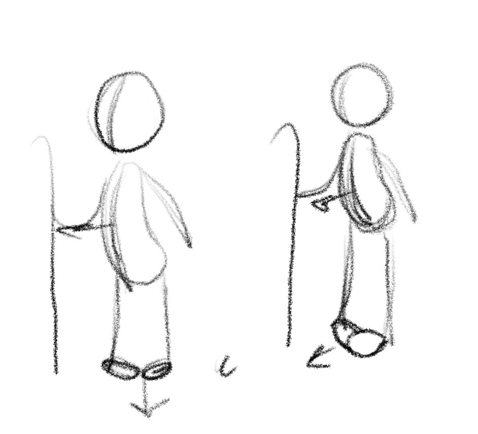
Really solid drawing, I also love the beast. Reminds me of owl house. I think the maiden lacks a little personality. Maybe change the pose or facial expression to give us some information she just feels generic. Her feet are also facing us head on, but the rest of her body is 3/4, so she feels twisted. I would also suggest drawing the whole body under the clothes, for example, the stick girl’s left leg (my left), if you continue to follow the direction it’s going it doesn’t connect with body, and it makes the thigh longer than the other. Really love them, you did a great job recreating characters that are so iconic.
-
@Meg-Clayburn Thanks for the feedback! A note on her feet - they're supposed to be twisted as she was born with a disability. She and the "beast" character have a kind of parallel story in my version.
I was thinking she lacked a little personality but then... I was tired and stopped trying haha! I'll put some more thought into her. She is the main character so I want her to be interesting!
-
@Mimi-Simon All great feedback, thank you! Ok the horizon line thing... NO WONDER I STRUGGLE WITH LINEUPS. I got into the habit early on of trying to draw the characters in the perspective as if I'm around waist height but also drawing their feet flat, and it always looked wrong to me but I couldn't figure out why. I might do another version of these guys to push those poses and give them some more dynamism. Thank you!
I do like muted colors lol
-
@StudioHannah I got the turned in feet suggested a disability, that read well. I more mean which way they are facing. At a 3/4 view there should be some overlap. Maybe this drawing helps get across what I’m trying to say? Or I’m just crazy.


-
I love these! I don't have any suggestions... just noting your clean lines and fantastic characters. Love that Beast... the mask is great! Very cool

-
Great character designs, they are all very unique to each other, and it's easy to see which character they are representing in Beauty & the Beast.
-
@StudioHannah These are really cool! My favorite is the stick armed one.
Can I make a suggestion though? The two characters on the ends have a similar color palate with the various shades of browns. Maybe you could give the girl some orange or red on her outfit to be more visually distinct.
I don't know if this is on purpose, but to me the bully looks very similar to a lot of high school bullies in pop culture. Blond hair, square face, jock look, etc. Maybe consider changing his design somewhat so he doesn't look quite so much like a classic bully. -
@Meg-Clayburn Aaaah oh, I see what you mean. The drawing helped!
-
@AthenaBeana They come from the same town so I wanted to keep the "we come fro the same poor-ish area and only have so many colors of clothing to choose from" look but I can definitely mess around with them to make them more unique. Thanks for the suggestions!
-
Thanks to everyones advice I did a second round for these characters with a bunch of adjustments and I think they look a lot better!

-
@StudioHannah great second round for the character lineup! I love how diverse and unique the cast is, all of the character's silhouettes would be easily recognizable not to mention the clear shape language with them.
-
@StudioHannah I love how you are improving! Working on a character sheet too! And building maquettes
 So fun
 -
@ArtistErin I've designed characters and I've sculpted, but I've never made a maquette. You would think that would have crossed over for me by now hahaha - I hope yours go well! I want to see them them you're done!
-
@_sadira_ Thank you so much!
