May Third Thursday - bouncing ideas
-
These are not composition sketches, but the kind of awfully ugly doodles I do when I am jostling ideas. I thought I bounce them to you, for advice on the different options - hoping they are clear enough to be read at this stage...
I opened two cookies and I think I am going to do both and pick the most successful one for the submission. I actually really like this month's challenge - everybody is going to have something different!My first cookie read: "You will have long and healthy life".
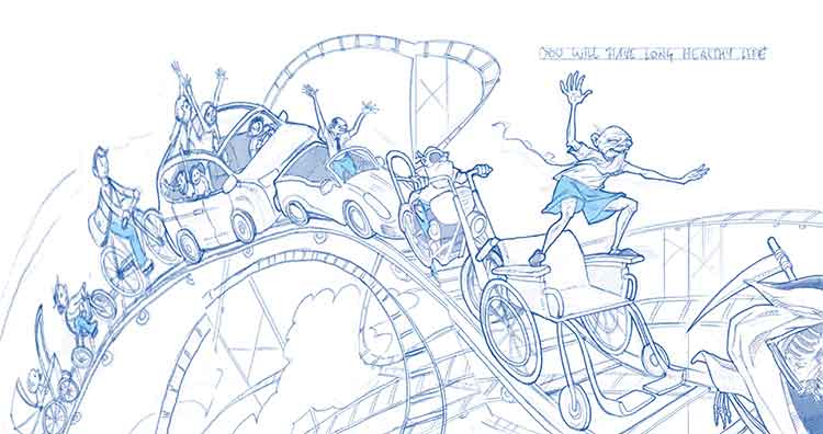
After the first dismal reaction, I started having this image in my head of the same person at different stages of life, bouncing across a row of trampolines: from infant to old man. I did two more variations: a roller coaster with different vehicles on (from pram to wheelchair) and a marathon race with the racers of increasing age and the oldest one crossing the finish line.The second cookie read: "A frivolous gift is a gift, nonetheless".
I have two ideas for this one. The first is pretty obvious from the sketches, I think. The second involves a tomboy girl who is given a very frilly pink dress and wears it over her overalls.What do you think, which is the strongest idea in either case? Are they illustrating the concept of the fortune cookies?


-
Nice! Your thumbnails and concepts are looking great @smceccarelli!
I love the rollercoaster one the most for your first cookie concept, and the composition has a nice flow to it.
For the second, I'm not sure your concepts speak to me as much when it comes to thinking of the definition of frivolous. Here's one definition: 'not having any serious purpose or value'. I certainly think you're somewhere along the lines of it but I would push it further. I think in both you're saying that the gift has no serious value to the character receiving it, but to take it even further I think you could come up with something that REALLY has no value (to anyone) and there's an opportunity for some humour. Like, what if there was one character who was assembling his/her own bicycle, but then a caveman-type character gifted them a square wheel? Anyway, just a thought. If you were to proceed with one of the ones you have though, I'd say the first with the flowers as a gift read the best to me from a storytelling angle.
Can't wait to see your progress!
-
@DanetteDraws Thank you very much for your thoughts! Indeed, I am realizing that I am using the definition of "frivolous" derived from the Italian language ("frivolo"), which is strongly related to something pretty and fashionable but of scant practical value. Maybe I need to rethink how well I understand the message!
-
I like number 2 the roller coaster for your fist one. I like 1B for the second one and it looks like it would be fun to draw.
-
Great ideas! I think your concepts for #1 are all stronger than those for #2; I really like the idea of illustrating the journey through a lifetime, and personally my favourite is the one with all the vehicles - it's got a lovely flowing rhythm with that swirl, going smaller to bigger..also that flow illustrates the feel of a 'rollercoaster' ride through life, even if it's actually a road/pavement that's shown...and also a lot of fun to see all the different vehicles from pram to wheelchair
 A lot of drawing but it would really be a fantastic piece
For the second one, I agree that maybe it would be good to push it further with the concept..here's another way to look at the phrase - to me a frivolous gift could be something that is not necessary for life, but nevertheless something that the person really likes and is delighted by - eg, the difference between being given something boring but useful (a saucepan or something) and giving, say, a shoeaholic some super silly shoes that they've wanted for ages. Maybe that person really doesn't need any more shoes and it doesn't match anything in their wardrobe but that frivolous gift totally makes their day. So you could make it about the little things in life that make us happy, aside from all the 'useful' stuff. But obviously, you could see it other ways too as already suggested. Good luck with it, looking forward to seeing more!
-
These are fantastic ideas! I like the trampoline ideas the most of all your thumbnails. However, I love the gesture of the girl in 2b and the perspective in 2 with the tree. They are all interesting and well created.
-
I really like the first fortune the best and I think all of your ideas really convey it. I want to like the rollercoaster idea the most because I think it would be fun to see all the different vehicles and I think they would help identify the age of each person. The only thing I would be worried about is having too many focal points but that just may be me because I have trouble with that.
-
Thanks all for your notes on "frivolous". I did some usage search and I totally get your point - thank you Dulcie and Danette for the lesson in English vocabulary!
Here is my revised idea: a mermaid gets some fancy shoes as a (birthday?) gift. I though she would be delighted, even if the gift is totally useless for her. Do you think this works?
I am not sure it should be a full illustration or just a vignette or a spot. Your input on the thumbnails as well as the idea in general is greatly appreciated!

-
I like #5 the best.
-
Your ideas look great. I think the roller coaster idea would be great fun and I also like the trampoline idea. great job
-
@smceccarelli #4 and ou could have a few of her fishy friends giving her quizzical looks...
-
For me #3 and #5 seem to hit the mark.
-
I love the idea! I like the simplicity of number 3....
-
Love this idea @smceccarelli! I think a number of you compositions work, but I like #3 best. It reminds me of a scene in the Little Mermaid where she's singing about various do-dads she's collected. What's great about all her treasures too is that she guesses at their use and does strange things with them (like combs her hair with a fork) - so getting across that 'I LOVE this thing - but what IS it?' would be great. Suggestion: maybe she's got a look of pure love on her face, but then there's a fish or some other sea creature who's eyeing it up skeptically next to her
-
Thank you all! Now I feel like I have solid ideas for both and can move on...one at a time...
-
@smceccarelli I love these latest ideas! Really, really nice, it's difficult to choose which thumbnail - I actually like #4 a lot, because I could see the lighting/values working really well to highlight the shoe as focal point. But as others have said I also like 3a and 3b - beautiful shapes with the mermaid's tail and swirling hair.
If you do choose #3 I wonder if the crop could be extended upwards just a tiny tiny bit, so that the shoe hits more of the 'third' in composition terms - it feels a little high for such an important focal point. But I like the way the mermaid is holding it upwards to admire it - really nice gesture so wouldn't change that.
I agree with @DanetteDraws, it also reminds me of the Little Mermaid where she places such a high value on little trinkets that she doesn't understand...I love that you took the shoe idea and took it further by making the recipient a mermaid who could never wear a shoe but loves the gift anyway. Can't wait to see the next version!
-
I have been fighting with every inch of this drawing - and it probably shows....I really need training with turning things in my head and this viewpoint was very challenging. And also the receding sizes, I am not sure it works. It does not need to be correct perspective, but at least believable.
Looking forward to input before I proceed to color!

-
very nice line work
-
Wow, this looks amazing! Gorgeous linework…I have no critique at all, just want to say how nice it looks already...I love the elderly man balancing on his wheelchair

-
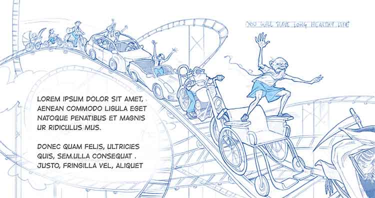
The line drawing is awesome. On the first side of the spread there is that big empty space with the clouds in the middle. (It almost looks like an area left there on purpose for text) You could put some of that fake text in there and i think that would solve the whole problem. Or you might start your roller coasters of characters from the bottom corner there. I did a quick dirty Photoshop warp to see how it might look. There would still be a little gap there but you would be taking up more of the page and we'd get to see those characters a little larger.Anyway it looks great there just seems to be something need in the middle there. 

