Society of Visual Storytelling

    SVSLearn Forums

    • Register
    • Login
    • Search
    • Recent
    • Tags
    • Popular
    • Users
    • Groups
    • Search

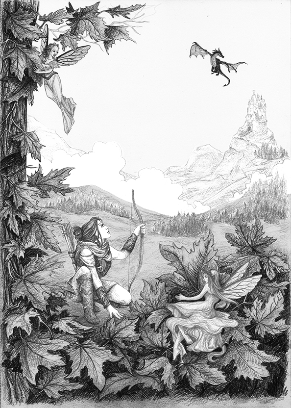
    Value studies for fantasy illustration

    Sketchbook
    14
    24
    9403
    Loading More Posts
    • Oldest to Newest
    • Newest to Oldest
    • Most Votes
    Reply
    • Reply as topic
    Log in to reply
    This topic has been deleted. Only users with topic management privileges can see it.
    • audrey dowling
      audrey dowling @Jana last edited by audrey dowling

      good points, thanks for your advice

      website: https://audreydowling.wordpress.com/
      twitter: https://twitter.com/audreydowling
      facebook: https://www.facebook.com/Audrey-Dowling-Artist-Illustrator-498582176906242/timeline/?ref=bookmarks

      1 Reply Last reply Reply Quote 0
      • lmrush
        lmrush Pro SVS OG last edited by

        Wonderful composition I love it, I like 3. I was trialing a quick way to paint values, not sure if it came from an SVS video I watched a long time ago, or somewhere else. I put a multiplied toned layer over my sketch and erase at different opacities, I really like it , anyway wanted to share that.

        Lisa Rush
        www.lisarushgallery.com
        www.facebook.com/ArtbyLisaRush/
        www.instagram.com/lisarush11/

        1 Reply Last reply Reply Quote 2
        • korilynneillo
          korilynneillo @audrey dowling last edited by

          @audrey-dowling What a fantastic sketch!

          I agree with posts above and would go with value option 4 if it were my painting. I'd definitely use color to push the fairy out of the ivy, and maybe even tie her colors in with the hunter's colors.

          instagram: instagram.com/korilynneillo
          Twitter: @korilynneillo
          Portfolio/shop: korilynneillo.art

          1 Reply Last reply Reply Quote 2
          • Chip Valecek
            Chip Valecek SVS Team SVS OG last edited by

            Before reading what anyone said or what you posted 3 popped out first to me. So I like option 3 the most. 🙂


            https://www.instagram.com/chipvalecek/
            https://www.facebook.com/cvalecek
            http://www.cshellmedia.com/

            1 Reply Last reply Reply Quote 1
            • anthemsweet
              anthemsweet last edited by

              I think four, because not too many competing focal points. Easier to read.

              https://www.etsy.com/shop/anthemsweet?ref=hdr_shop_menu

              1 Reply Last reply Reply Quote 0
              • audrey dowling
                audrey dowling last edited by audrey dowling

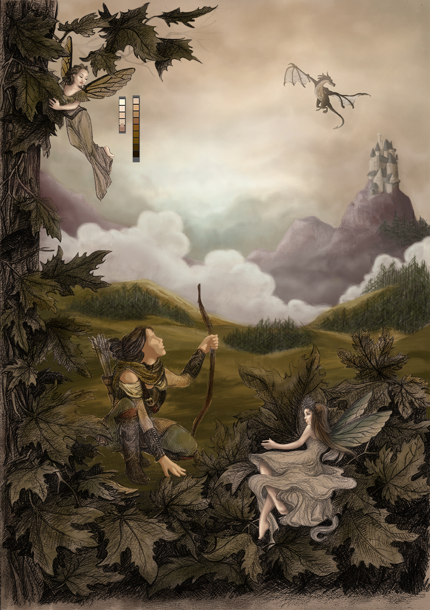
                Hi! here's my final sketch after I edited the values in photoshop
                it's hard to stick to the value study, especially with the hunter against the fields...
                what do you think? would you do anything differently?
                0_1485176990026_sketch.jpg

                website: https://audreydowling.wordpress.com/
                twitter: https://twitter.com/audreydowling
                facebook: https://www.facebook.com/Audrey-Dowling-Artist-Illustrator-498582176906242/timeline/?ref=bookmarks

                1 Reply Last reply Reply Quote 3
                • audrey dowling
                  audrey dowling last edited by audrey dowling

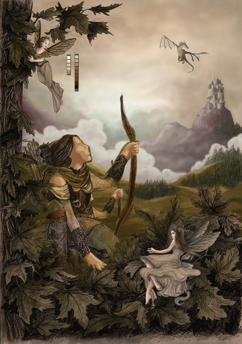
                  here's where I am so far... (don't mind the skin swatches, I forgot to hide the layer ^_^ )
                  this is my most ambitious project in terms of digital painting so far. I can feel the sweat!
                  but I can already see that it won't be as good as I would like it to be... 😕
                  0_1485987086581_dragon-hunter.jpg

                  website: https://audreydowling.wordpress.com/
                  twitter: https://twitter.com/audreydowling
                  facebook: https://www.facebook.com/Audrey-Dowling-Artist-Illustrator-498582176906242/timeline/?ref=bookmarks

                  RobinSlee 1 Reply Last reply Reply Quote 4
                  • lmrush
                    lmrush Pro SVS OG last edited by

                    I think it is looking fantastic, keep sharing!

                    Lisa Rush
                    www.lisarushgallery.com
                    www.facebook.com/ArtbyLisaRush/
                    www.instagram.com/lisarush11/

                    1 Reply Last reply Reply Quote 1
                    • evilrobot
                      evilrobot SVS OG last edited by

                      This is really beautiful. Wonderful job so far.

                      http://www.palacioillustration.com/

                      https://www.scbwi.org/illustrator-gallery/illustrator-detail/?illustrator_id=84142

                      https://www.pinterest.com/evilrobot2/pins/

                      https://twitter.com/MyEvilRobot

                      1 Reply Last reply Reply Quote 1
                      • RobinSlee
                        RobinSlee @audrey dowling last edited by

                        @audrey-dowling Dont give up. Keep at it. Everything is digital so you can go back and forwards as much as you like.

                        Site: Idrawcreatures.com
                        Shop: RobinSleeDesigns.etsy.com

                        1 Reply Last reply Reply Quote 1
                        • Lee Holland
                          Lee Holland last edited by

                          looking good so far. keep going.

                          https://www.facebook.com/pages/Lee-Holland-illustration/285517801577676?
                          https://www.instagram.com/lee_holland_illustration/
                          http://lholla56.wix.com/lee-holland

                          1 Reply Last reply Reply Quote 1
                          • Kevin Longueil
                            Kevin Longueil SVS OG last edited by

                            @audrey-dowling Hello Audrey - this is a really nice image! I think for me I would like to see the scale of the main character change just to see how it might look - if she were twice a large as she is now it would bring her face up into the area where clouds would be her backdrop - this would give a nice "dark on light" and help establish her as the main focal point in the circular composition - I think you did a very nice job on the figure and her hands for sure but one thing that keeps grabbing my eye is the position of her left hand on the bow which seems stiff somehow and does not look natural - I would shoot a quick reference photo of a volunteer and have them assume this pose but hold the bow in a comfortable manner - I think it is because the bow is straight up and down and away from her body that it has a strange feel to it - this piece really is looking great though so feel free to ignore 🙂

                            Portfolio: kevinlongueil.com
                            https://www.instagram.com/kevinlongueil/

                            audrey dowling 1 Reply Last reply Reply Quote 1
                            • audrey dowling
                              audrey dowling @Kevin Longueil last edited by

                              @Kevin-Longueil you're right Kevin, I will try your ideas, thanks (bloody hands give me a hard time every time!)

                              website: https://audreydowling.wordpress.com/
                              twitter: https://twitter.com/audreydowling
                              facebook: https://www.facebook.com/Audrey-Dowling-Artist-Illustrator-498582176906242/timeline/?ref=bookmarks

                              1 Reply Last reply Reply Quote 0
                              • audrey dowling
                                audrey dowling last edited by audrey dowling

                                I don't like the proportions if I make the hunter big enough so the head reaches the clouds
                                0_1486118158214_dragon-hunter2.jpg

                                but I can make her slightly bigger and put a fog on the trees in the background. I kind of like that, as the trees were too "visible" to my liking before. it goes against my value study though...
                                0_1486118234091_dragon-hunter3.jpg

                                what do you think?

                                website: https://audreydowling.wordpress.com/
                                twitter: https://twitter.com/audreydowling
                                facebook: https://www.facebook.com/Audrey-Dowling-Artist-Illustrator-498582176906242/timeline/?ref=bookmarks

                                Kevin Longueil RobinSlee 2 Replies Last reply Reply Quote 1
                                • Bob Szesnat
                                  Bob Szesnat last edited by

                                  Cool image.
                                  I would say your concern is right on, about the two competing figures being the same value. I am guessing you want the hunter to stand out more than the fairy. I would draw more attention to the hunter, make her stand out more and blend the fairy more into the leaves surroundings her.

                                  An Illustrator loving this Artist community.
                                  www.bobszesnat.com | https://www.facebook.com/bobszesnatart/

                                  1 Reply Last reply Reply Quote 0
                                  • Kevin Longueil
                                    Kevin Longueil SVS OG @audrey dowling last edited by

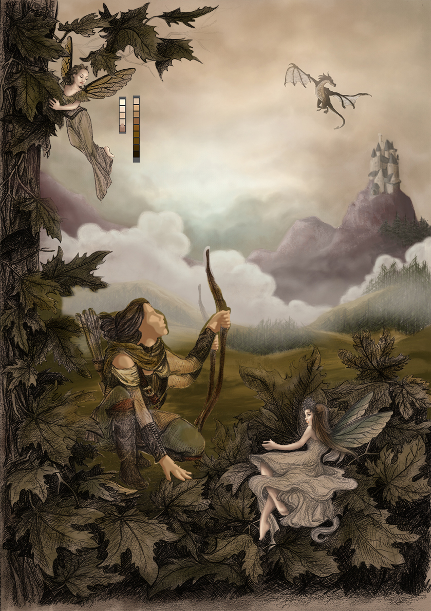
                                    @audrey-dowling I do like it with the scale change and the value change behind her face for sure 🙂

                                    Portfolio: kevinlongueil.com
                                    https://www.instagram.com/kevinlongueil/

                                    1 Reply Last reply Reply Quote 1
                                    • natiwata
                                      natiwata SVS OG last edited by

                                      This is really beautiful work! You've got mad drawing skills, and the crosshatched style, depth, and color pallet is really storybook feeling and detailed.

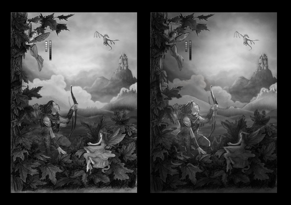
                                      I think one way you might make the image feel more cohesive and bring some focus to the composition would be to structure your values a little more dark(foreground) to light(background). Someone else pointed out that the values on the main character and the fairies are similar and they do kind of compete for your eye. What about bringing the fairies more into the foreground and using some rim light to help define the layers of depth a little more? I played with it a little just to see what I could get with a few value changes. Hope this is helpful, it's really beautiful work whichever direction you decide!!!

                                      0_1486171709501_Untitled-1.jpg

                                      Nat Iwata
                                      www.iwataillustration.com

                                      1 Reply Last reply Reply Quote 4
                                      • RobinSlee
                                        RobinSlee @audrey dowling last edited by

                                        @audrey-dowling A value study is just that, a study. It is not the final image. Feel free to change anything in a composition that is not working. The study is only there to inform you of the choices that you have and to see what is NOT working. I may do several studies (small scale) to see what works and what does not, before I enlarge the image and take it further. It is a confidence issue, do not be afraid to change things, right up until you call it done! Good luck. Oh, and if you want me to do a rough paint-over let me know.

                                        Site: Idrawcreatures.com
                                        Shop: RobinSleeDesigns.etsy.com

                                        1 Reply Last reply Reply Quote 0
                                        • audrey dowling
                                          audrey dowling last edited by

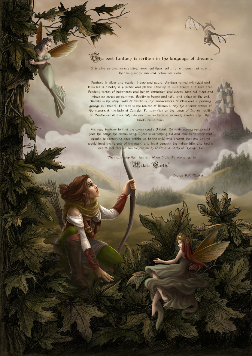
                                          I think I'm finished!
                                          I'll let it sit for a while now, just to make sure I'm happy with it
                                          Feel free to critique, but I'm telling you, if you find something too long to fix, I won't do it! 😃 (re my post on working speed and getting fed up towards the end)
                                          0_1487190108676_dragon-hunter-wip3.jpg

                                          website: https://audreydowling.wordpress.com/
                                          twitter: https://twitter.com/audreydowling
                                          facebook: https://www.facebook.com/Audrey-Dowling-Artist-Illustrator-498582176906242/timeline/?ref=bookmarks

                                          MOO 1 Reply Last reply Reply Quote 4
                                          • holleywilliamson
                                            holleywilliamson SVS OG last edited by

                                            It looks beautiful! You did a great job controlling the values. I do see the hunter first but then I get curious about what the fairy in the front is looking at. What do you think about having the fairy look at the hunter to draw us back to her?

                                            https://www.instagram.com/holleywilliamsonart/
                                            http://holleywilliamson.com

                                            1 Reply Last reply Reply Quote 1
                                            • First post
                                              Last post