Do you have an image I can critique?
-
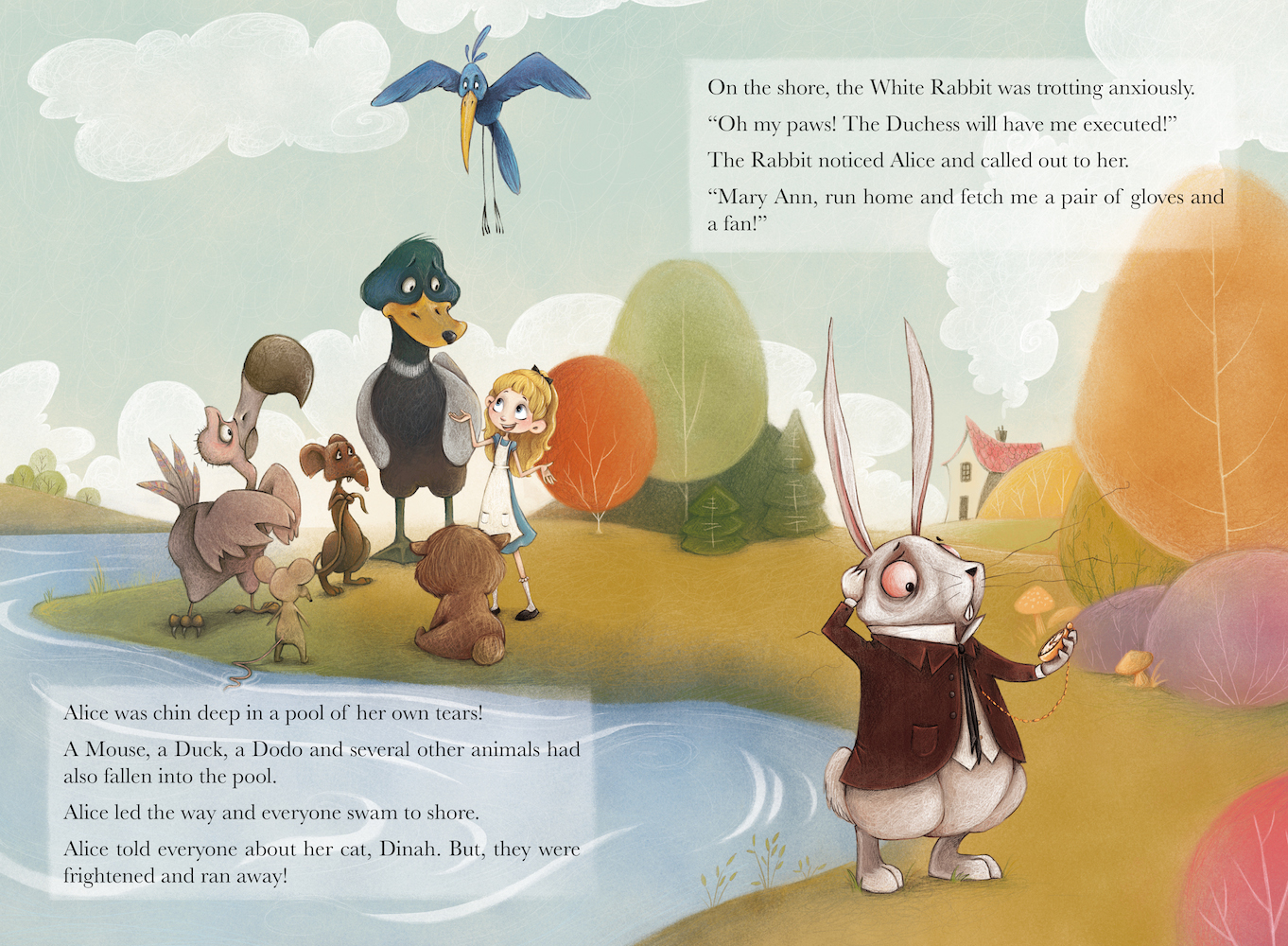
Hey guys, Thank you for all the images - I just finished video #2 and I'll keep pulling from this thread for future videos! https://www.youtube.com/watch?v=ntSIaIkzaTo&t=2449s
-
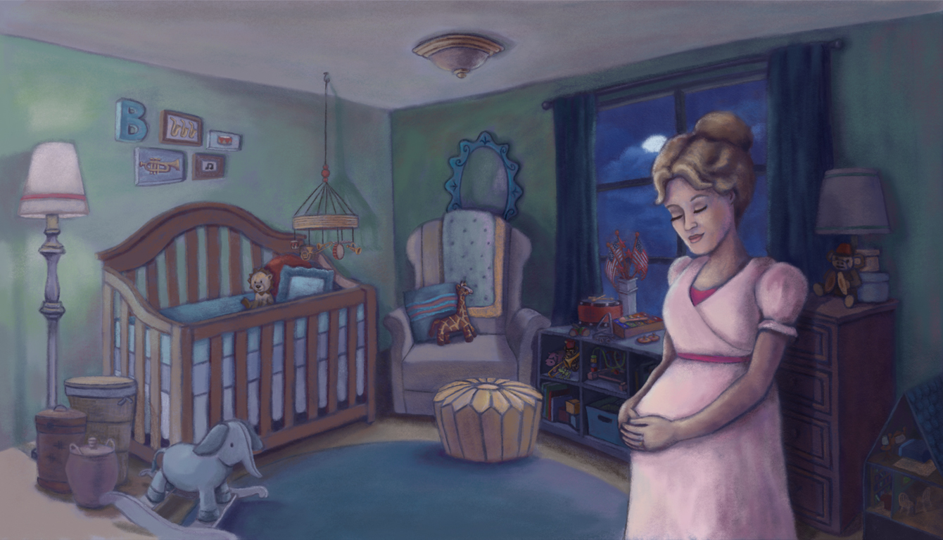 This is an almost 50 things painting. I was also trying to work on lighting. It is interpreting the song "Goodnight my Someone" from Music Man as a lullaby. My name is Holley Williamson. I don't have a website but my instagram is https://instagram.com/holleywilliamsonart
 -
Hi, Will. Thanks for all your videos--I love them! I did this acrylic paint/colored pencil vignette in response to Illustration Friday prompt "snail." But it's part of a bigger idea I have for a series of little pictures of cute fairies/pixies doing cute/funny/clever jobs in nature. This one is running a snail shell wash. I would love a link to my website. http://anthemsweet.blogspot.com/

-
Hello! I'm new here, so I'm sorry if I'm doing everything wrong.
I made this one after I just found you on youtube (thanks for the videos, by the way!) and you were talking about focal points and values and stuff. I'm pretty new to all this, and were unfamiliar with the terms that is now so obviously something I should be thinking about.
It really inspired me to challenge myself, and I decided to make a black and white picture, something that I never really tried out before.
It's inspired by my crazy mom, and my little brothers idea to make the book "Goddammit EvaMärta"(that's her name). I'm hoping this can be the first page in that book, but that's all up to the brother. They live in a messy house full of cats and tea cups and are doing just fine. But mom is often doing things that would make you go "goddammit EvaMärta".
The text says "sometimes the mom sings opera at breakfast"(in swedish) and it's made with watercolor and ink.

I might use this to apply for an illustration job, so a critique would be just awesome. But of course, only if it would be helpful for you in demonstrating some points.
Oh, and if you would choose it, no need to stay anonymous. Here's that link https://emblagranqvist.wordpress.com/Again, thank you for making all the videos. They're motivating and helpful, they've given me a lot of confidence and a lot to think about, and I can't thank you enough.
Embla
-
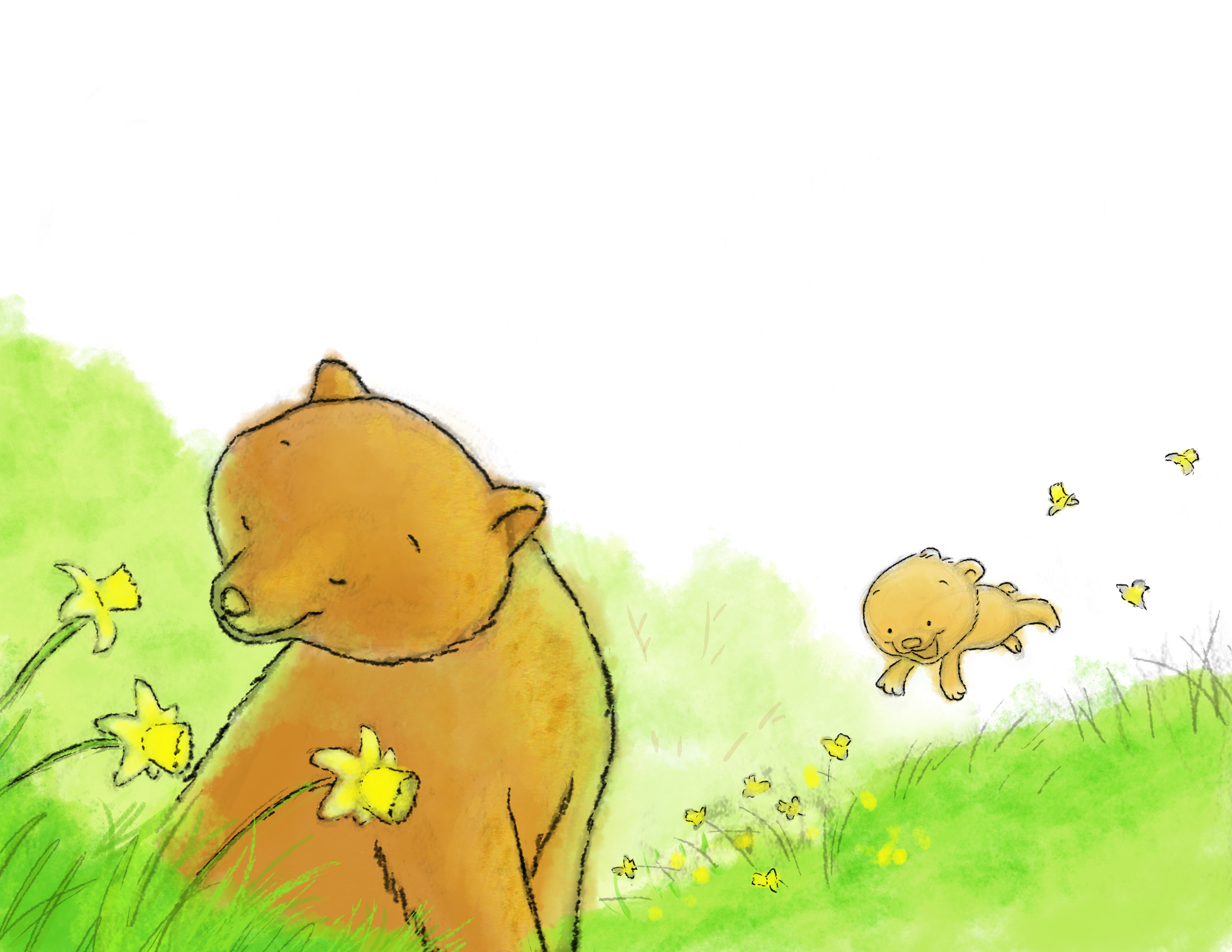
Here is one of mine, I would love feedback if you get the chance.
The concept of the piece: this is an image for a story I've written about a mother bear showing her baby bear the world by the seasons. The text for this page is "Gently nodding daffodils." Mama is calming breathing in the flowers while her cub is romping through them in the background. You can credit me by name if you choose this one for critique or keep it anonymus, still working on getting enough work together for a website. Thanks.
-
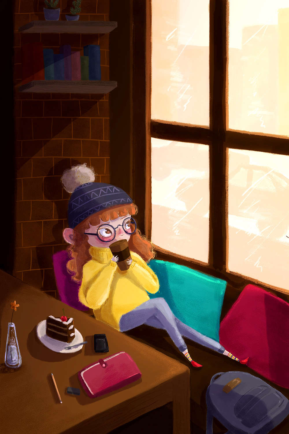
Hi Will! Thank you for this chance
") I hope it’s not too late, so here's my submission.
I hope it’s not too late, so here's my submission.
For this piece I just wanted to practice light and shadow since that topic it’s very intimidating for me; for this piece I wanted to show a girl relaxing in a coffee shop, I wonder if the light suit the afternoon sun I had in mind or maybe it’s too bright? I hope I can get some feedback from you, Thank you!
PD: Sorry for my bad english ^^
https://www.instagram.com/maricarmenbrenis/
-
Hi Will Terry
I was totally fascinated by your Critique Videos in your channel in Youtube so I wanted to submit my own illustration to consider for critique. This piece is the first spread from my Children book Dumpster Dive Princess.
In this page Milli-girl, his little brother and cat are in their living room feeling bored. Nothing to do inside so they decide to leave outdoors looking for adventure. Thank you for these critique videos. I'm learning from others critiques so much as well.

All the best from Finland
Elli Maanpää -
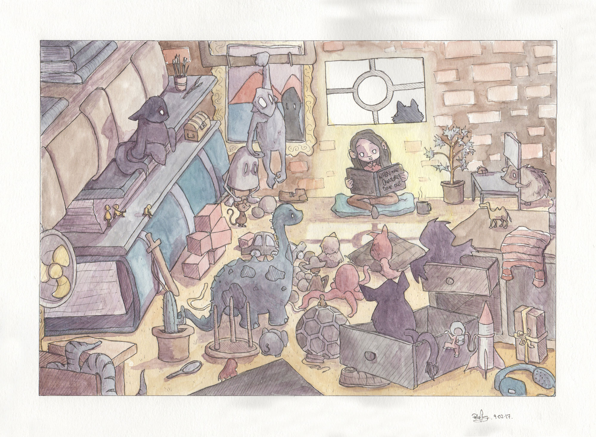
Hi Will,
Loving the critique videos, they are really helpful.
This is my first draw50things I did when your challenge came out. The concept is a little girl reading to all the monsters and toys in her room.
My course that I'm doing for uni lets you do an 'independent project' which is pretty flexible so I chose to do two more 'draw50things'
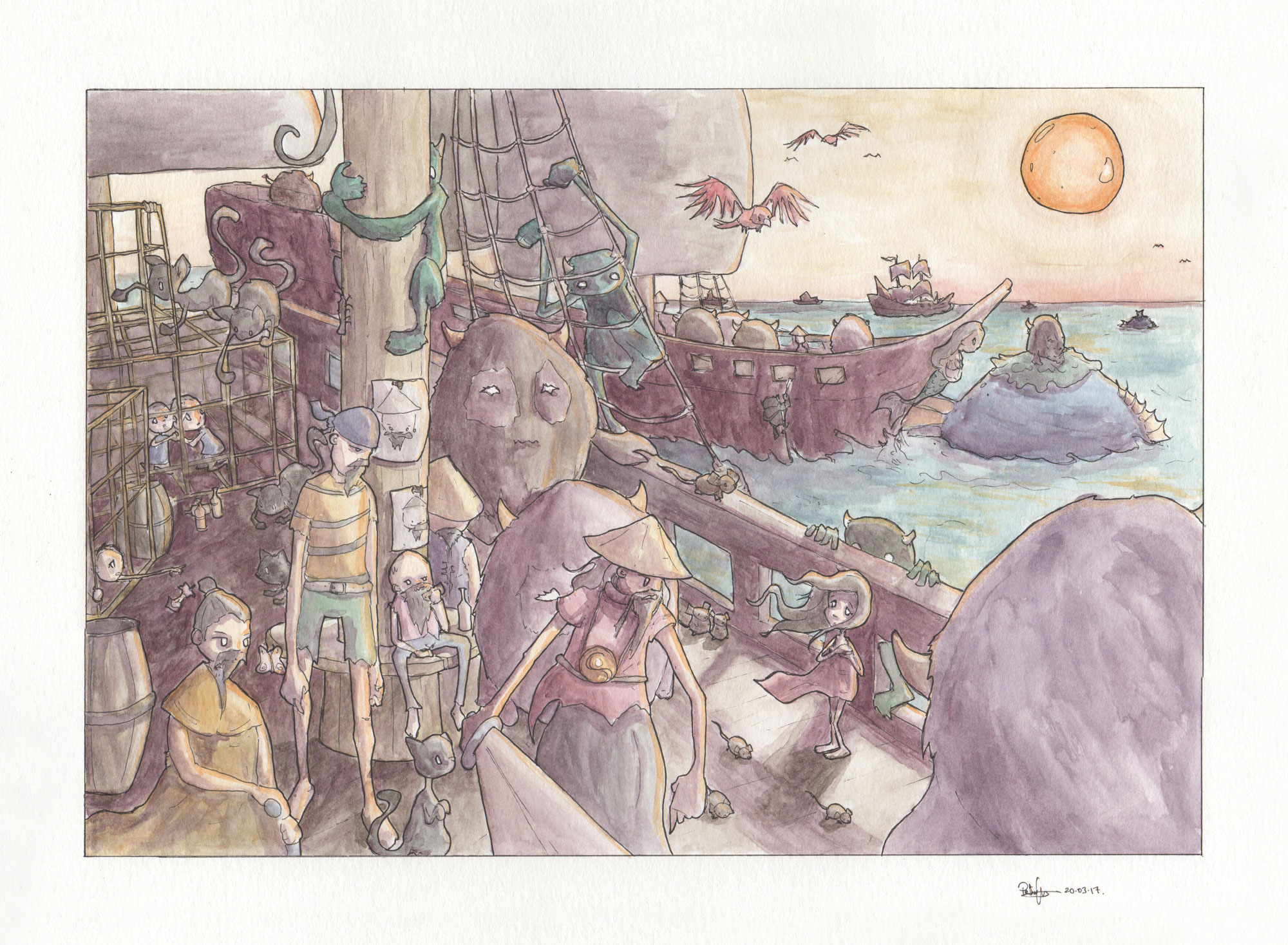
This concept is a pirate fleet that has just gone on a raid and now they are looking for another place to invade.
This concept is of a space explorer who is returning to a planet that he visited before.
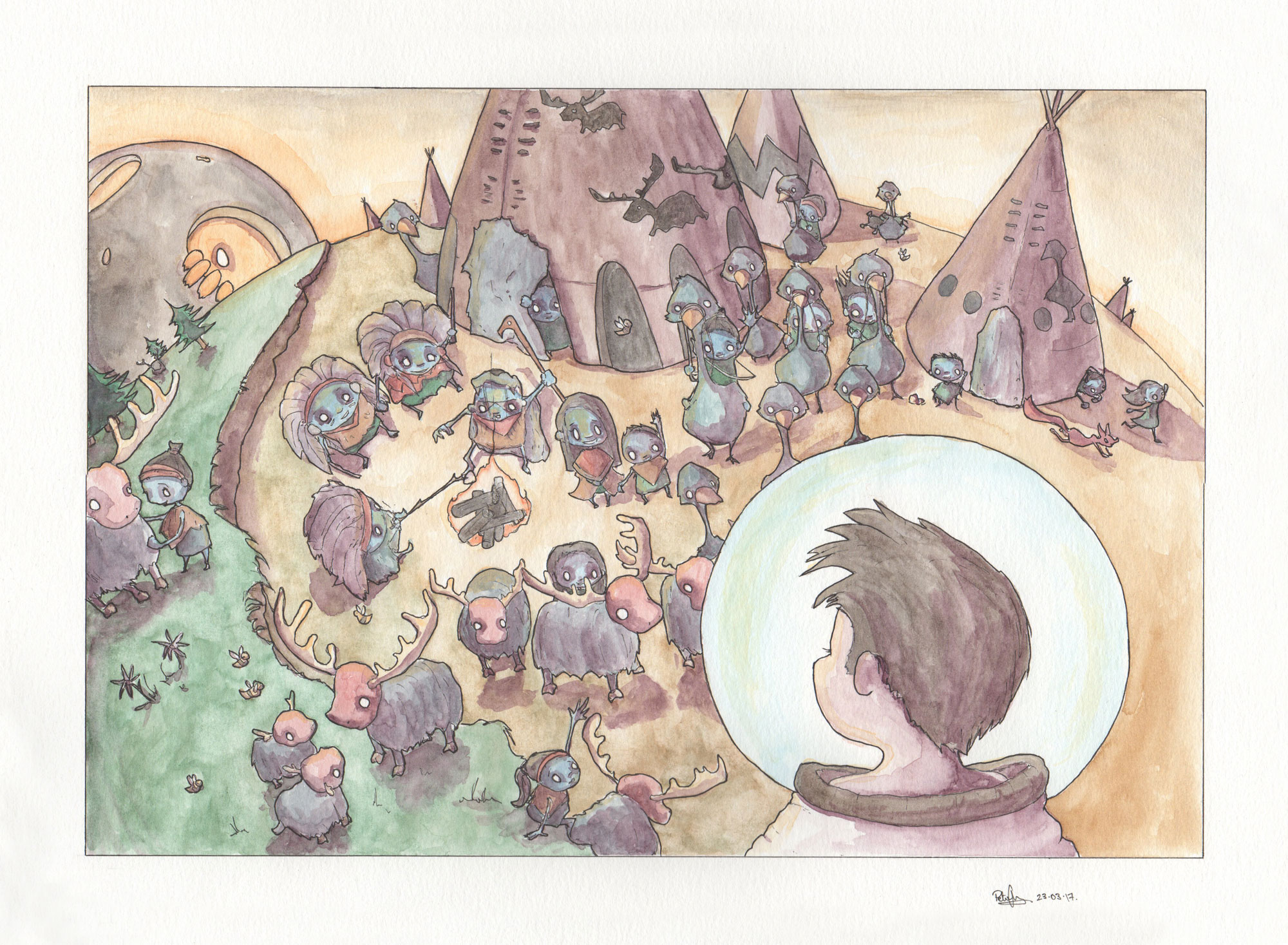
These are all watercolour and ink.Love what you're doing
my instagram is https://www.instagram.com/sliproot
Peter Cheong -
@will-terry-art
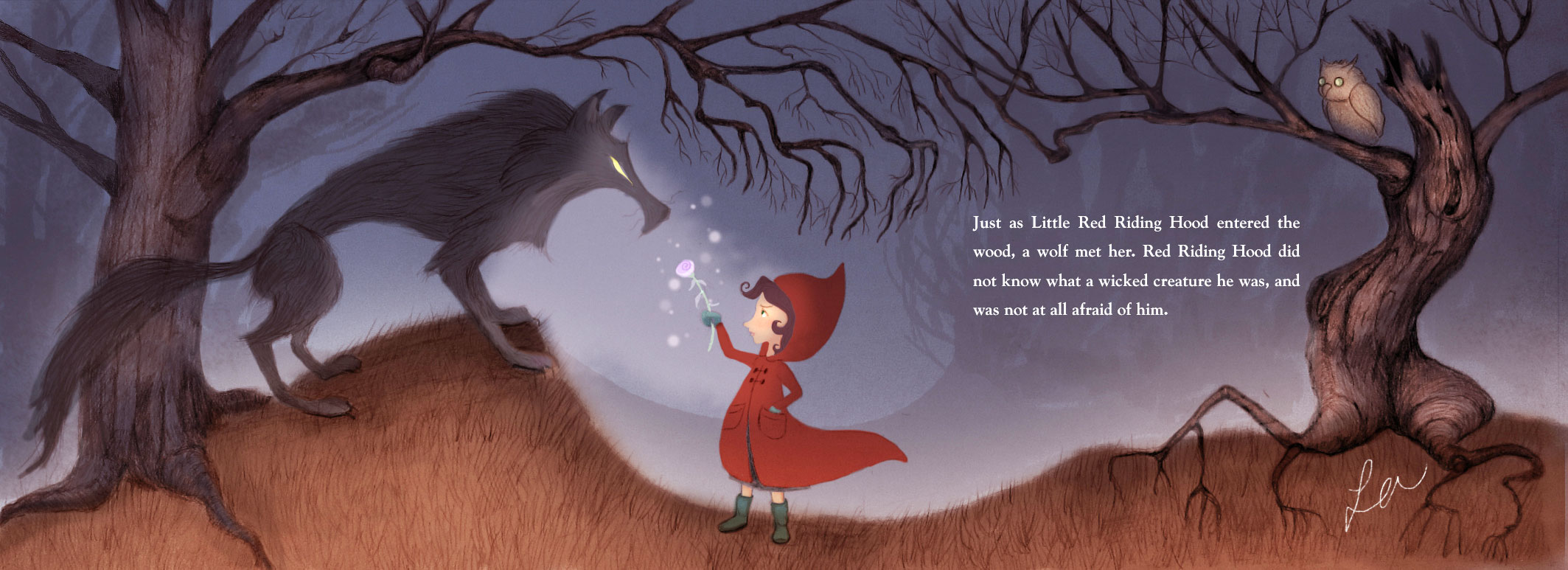 Concept is Little Red Riding Hood, running into the big bad wolf but is largely unaffected. I'm just starting out so I'll be anonymous, please. Just so you know, you and Jake are now the voices in my head when I illustrate. It's awesome! Re-uploaded with color adjustment.
 -
Hi @Will-Terry ,
Thank you for giving us this opportunity!
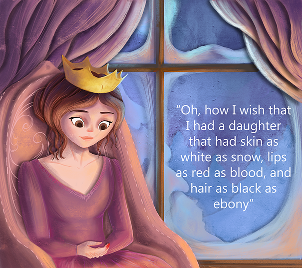
This is page from Snow White, Where the queen mother is dreaming of a baby girl.
-
Hi @Will-Terry - thanks so much for doing these critiques! I'll post one of my own illustrations shortly too.
But first, I want to chime in to counter something you suggested in @mag's critique in your second video. I hope you don't mind
I thought I'd wear my graphic designer hat and offer you (and anyone who reads this!) my view on how I'd fix the text overlapping the tree that differs from what you did in your video Will.I absolutely agree with what you've said 100% about designers liking symmetry and order and not overlapping text on objects, etc - no issues there! For this image in particular though, if I were the art director or designer on the job I wouldn't go back to Mag to ask her to change the size of the tree on the right so that text isn't overlapping. Why? Because I think it's the text that's been placed in there poorly rather than the illustration not having left enough space for the text. I think she's left plenty!
So a bit of a lesson on placing in text - you don't want your line lengths to be too long. It affects legibility and also - again, wearing my designer's hat - looks ugly and unbalanced. I did a quick fix in Photoshop of BOTH text boxes to a couple of the lines I felt were too long. Comparing to the original, hopefully you can see that my Photoshopped version is tidier with better balance (although the lightened rectangular boxes behind the text are definitely unbalanced now! I'd make those smaller comparatively - and OMG I was SO happy in the video when Will blurred out the edges around those boxes! And now, in addition to blurring the edges, that big orange tree can come IN FRONT of the lightened area and be totally unobstructed).
Not that I think illustrators need to be experts at placing in text - that's what the designer is for after all - but I don't think it ever hurts to present the graphic design side of things as best you can. It can only make your illustrations/portfolio look that much more polished and professional!
Mag's original:
My Photoshopped (with line lengths changed):
Will, I hope you don't mind me chiming in with my two cents!
https://danettebyatt.com
Twitter @DanetteDraws
Instagram @DanetteDraws -
Oh and @mag - GORGEOUS illustration! I love your character design and soft textures.
-
@DanetteDraws No - I don't mind at all - I hope I convey in my videos that there are multiple ways to fix problems - yours is a great way to solve it - thank you!
-
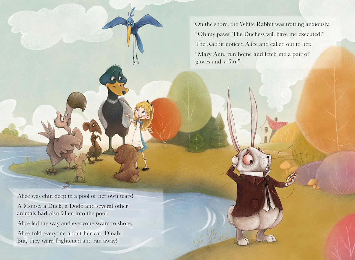
The concept for this one is a child that finds a magical crystal in the forest. I'm just a beginner looking to improve. Thanks!
-
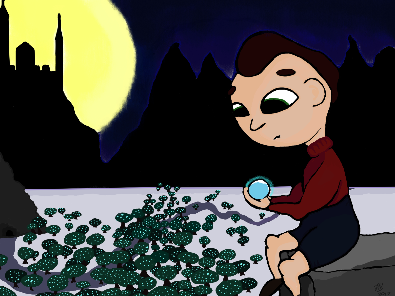
Hi Will, I really appreciate you wanting to critique people on your spare time. Even though its a character on a white background, please see if you want to critique my image.
This piece I did for a book of alphabets that is going to be published in the tribal languages (as a dictionary with Bengali and English) in the Chittagong hill tracts of Bangladesh. One image is Dragonfruit. So I made this illustration instead of just drawing a dragonfruit.My problems :
I did pay a lot of attention to the composition which I think I struggle a lot with. Since this project is unpaid, I would really like to put it on my portfolio. But I don't really like my "go and render everything" style that's just what I learned when I picked up the tablet.
I have a hard time adjusting to screen light. The image 1 is my first painting. When I posted it to instagram I saw it looked too dark and then I brightened it up (second version) And now my eyes are so blind I don't know what is wrong but I feel like something is missing and I cannot point out why.
I do'nt mind being called out: I'm @nazubahere on instagram and Neeya Lutarruq on facebook
image 1:
Image 2: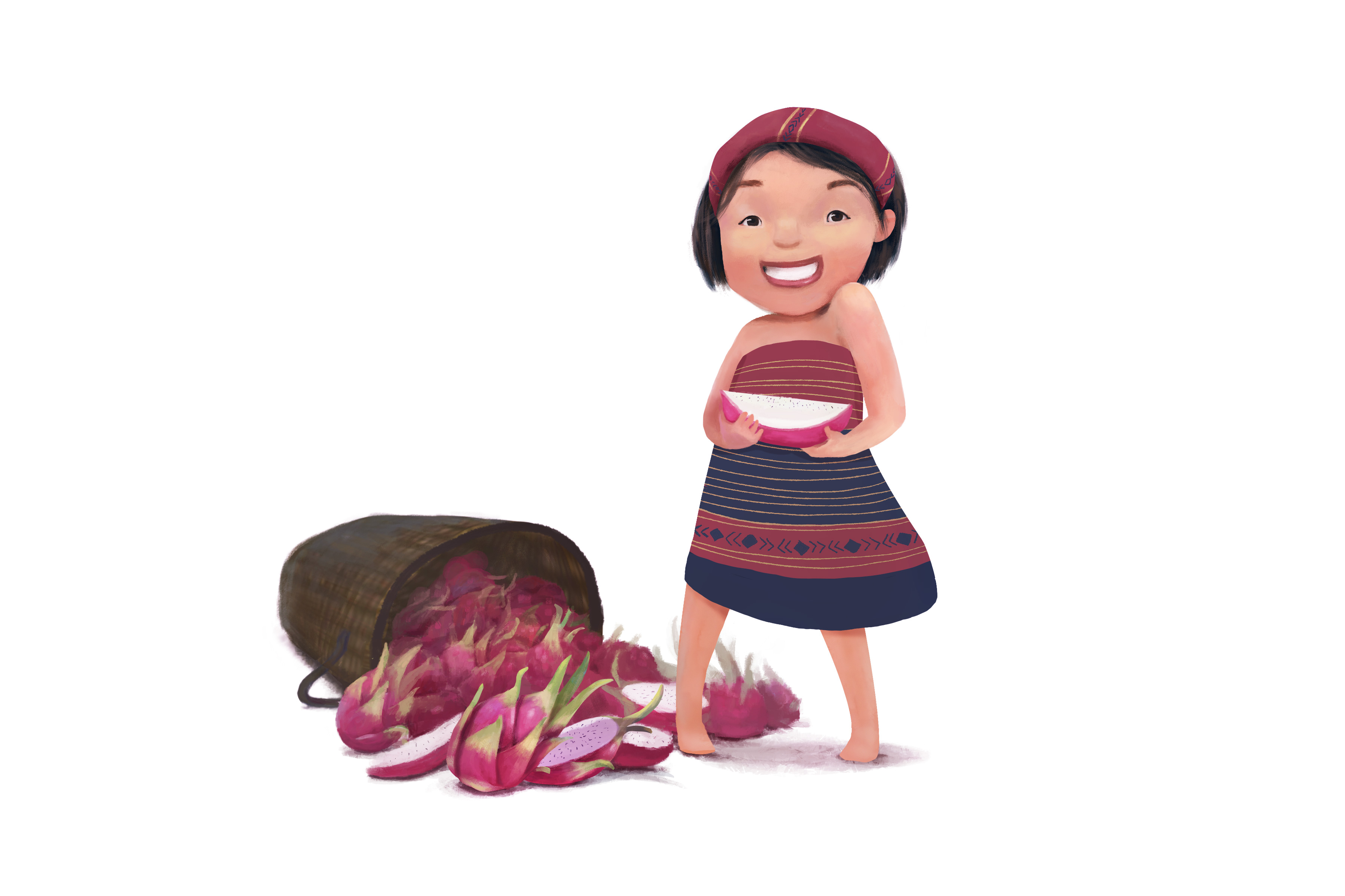
I really appreciate your time.
Nazuba -
Hi Will,
Can you please add the link to your critiques to this first post so I can find it easily? I'm kind of techno challenged. Thanks! -
@Nazuba That is adorable! I love it.
Marsha Ottum Owen
-
@Marsha-Kay-Ottum-Owen Thank you Marsha! I actually did an initial sketch and thought it out which is something I am just starting to do.
-
@Nazuba really like the quality/sharpness of this rendering. The dress print looks great and the characters emotion really shows well.
-
@Tyson-Ranes Thank you! The dress is inspired by the traditional tribal dress of the Chittagong Hill tracts people so that the kids who read it can identify with it.