Do you have an image I can critique?
-
Hi Will,
Loving the critique videos, they are really helpful.
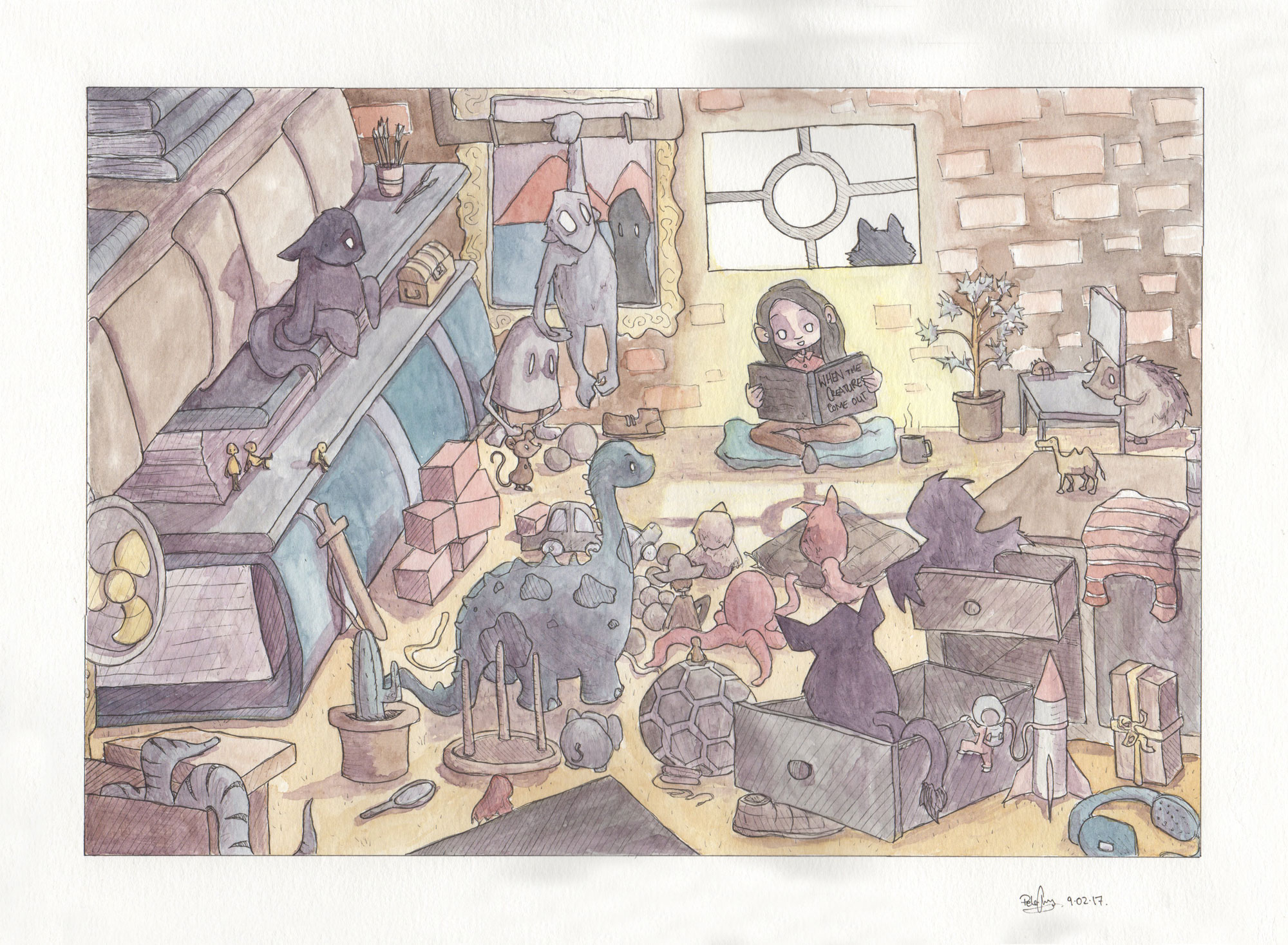
This is my first draw50things I did when your challenge came out. The concept is a little girl reading to all the monsters and toys in her room.
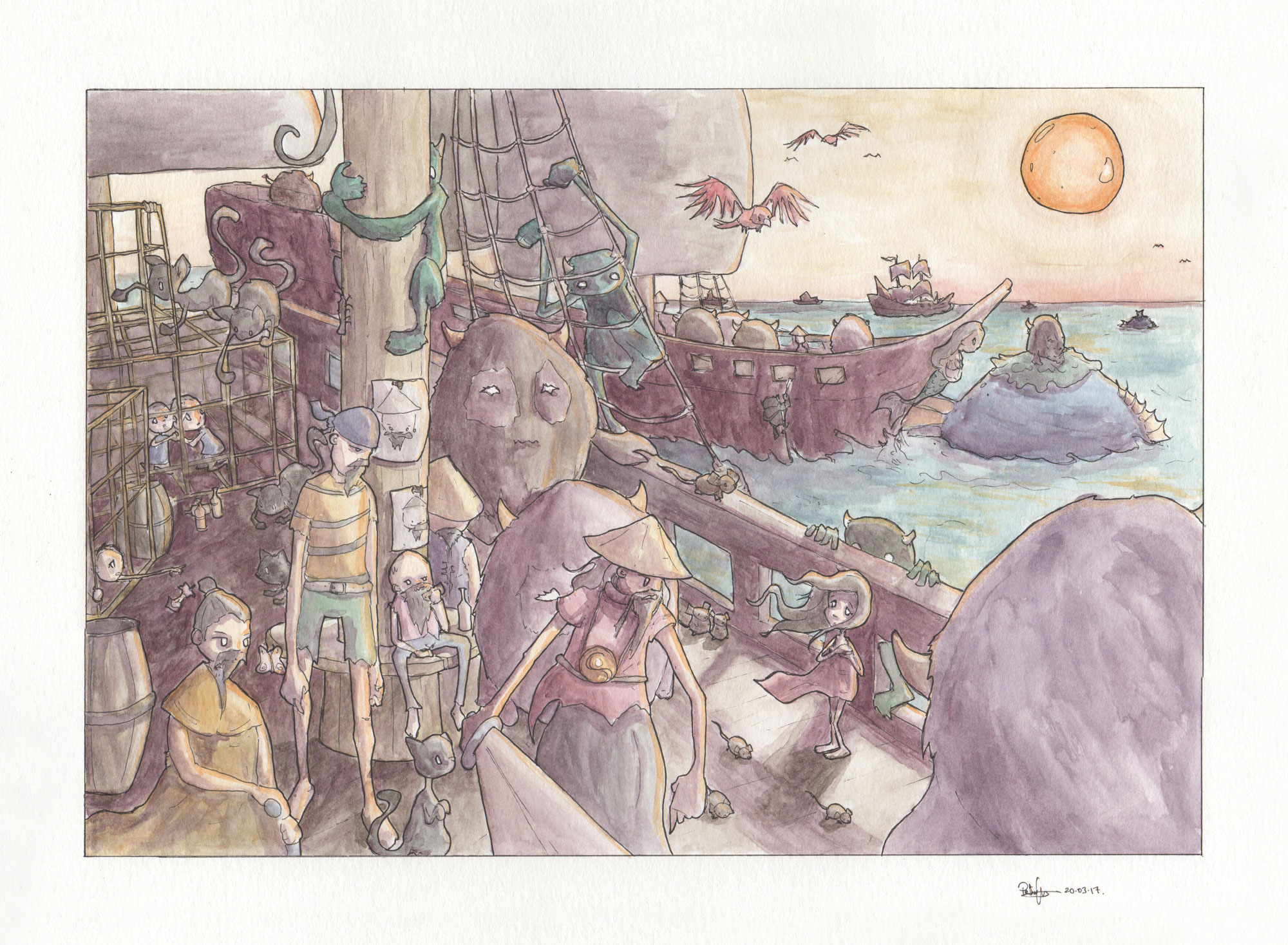
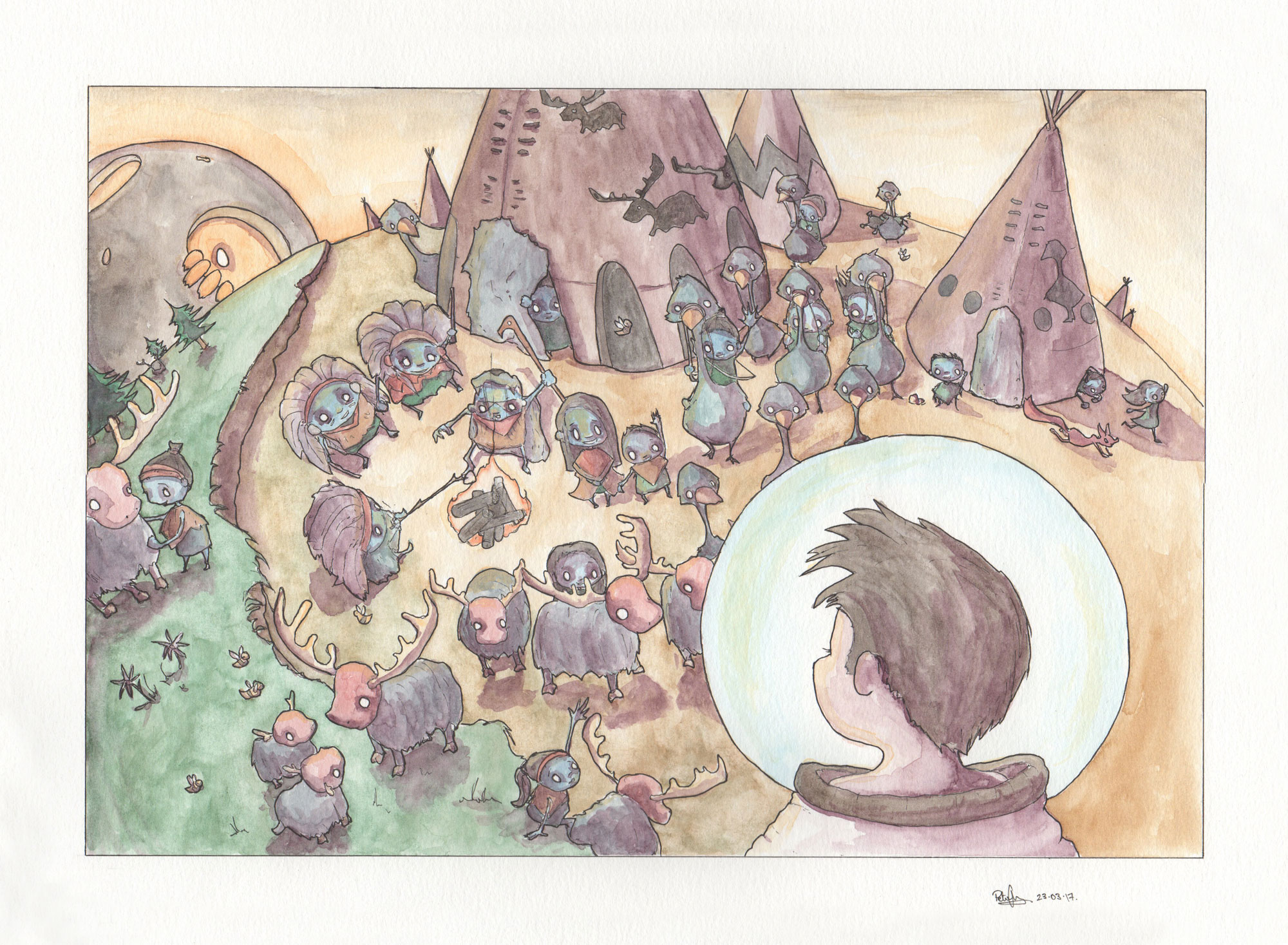
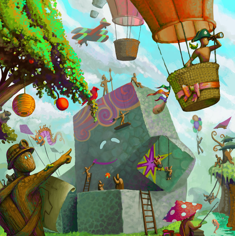
My course that I'm doing for uni lets you do an 'independent project' which is pretty flexible so I chose to do two more 'draw50things'
This concept is a pirate fleet that has just gone on a raid and now they are looking for another place to invade.
This concept is of a space explorer who is returning to a planet that he visited before.
These are all watercolour and ink.Love what you're doing
my instagram is https://www.instagram.com/sliproot
Peter Cheong -
@will-terry-art
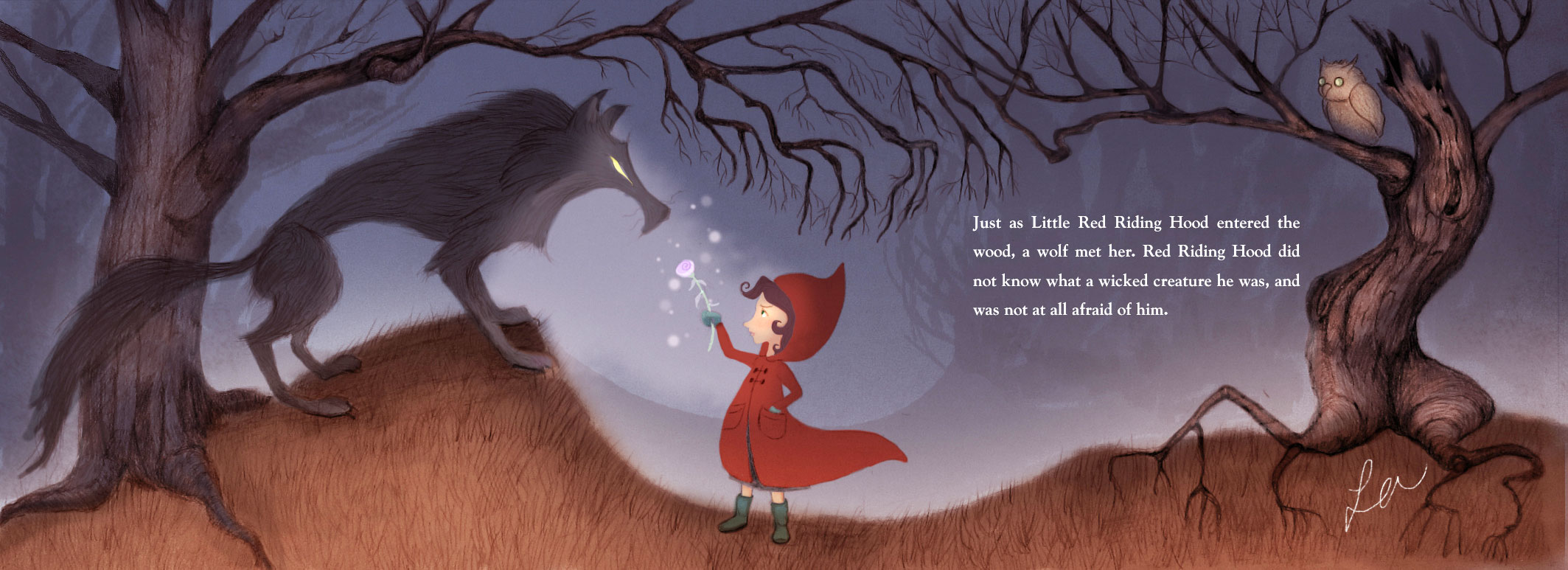 Concept is Little Red Riding Hood, running into the big bad wolf but is largely unaffected. I'm just starting out so I'll be anonymous, please. Just so you know, you and Jake are now the voices in my head when I illustrate. It's awesome! Re-uploaded with color adjustment.
 -
Hi @Will-Terry ,
Thank you for giving us this opportunity!
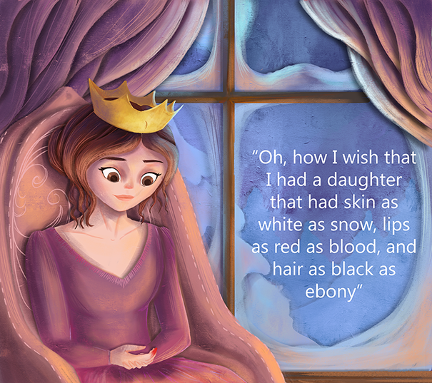
This is page from Snow White, Where the queen mother is dreaming of a baby girl.
-
Hi @Will-Terry - thanks so much for doing these critiques! I'll post one of my own illustrations shortly too.
But first, I want to chime in to counter something you suggested in @mag's critique in your second video. I hope you don't mind
") I thought I'd wear my graphic designer hat and offer you (and anyone who reads this!) my view on how I'd fix the text overlapping the tree that differs from what you did in your video Will.
I thought I'd wear my graphic designer hat and offer you (and anyone who reads this!) my view on how I'd fix the text overlapping the tree that differs from what you did in your video Will.I absolutely agree with what you've said 100% about designers liking symmetry and order and not overlapping text on objects, etc - no issues there! For this image in particular though, if I were the art director or designer on the job I wouldn't go back to Mag to ask her to change the size of the tree on the right so that text isn't overlapping. Why? Because I think it's the text that's been placed in there poorly rather than the illustration not having left enough space for the text. I think she's left plenty!
So a bit of a lesson on placing in text - you don't want your line lengths to be too long. It affects legibility and also - again, wearing my designer's hat - looks ugly and unbalanced. I did a quick fix in Photoshop of BOTH text boxes to a couple of the lines I felt were too long. Comparing to the original, hopefully you can see that my Photoshopped version is tidier with better balance (although the lightened rectangular boxes behind the text are definitely unbalanced now! I'd make those smaller comparatively - and OMG I was SO happy in the video when Will blurred out the edges around those boxes! And now, in addition to blurring the edges, that big orange tree can come IN FRONT of the lightened area and be totally unobstructed).
Not that I think illustrators need to be experts at placing in text - that's what the designer is for after all - but I don't think it ever hurts to present the graphic design side of things as best you can. It can only make your illustrations/portfolio look that much more polished and professional!
Mag's original:
My Photoshopped (with line lengths changed):
Will, I hope you don't mind me chiming in with my two cents!
https://danettebyatt.com
Twitter @DanetteDraws
Instagram @DanetteDraws -
Oh and @mag - GORGEOUS illustration! I love your character design and soft textures.
-
@DanetteDraws No - I don't mind at all - I hope I convey in my videos that there are multiple ways to fix problems - yours is a great way to solve it - thank you!
-
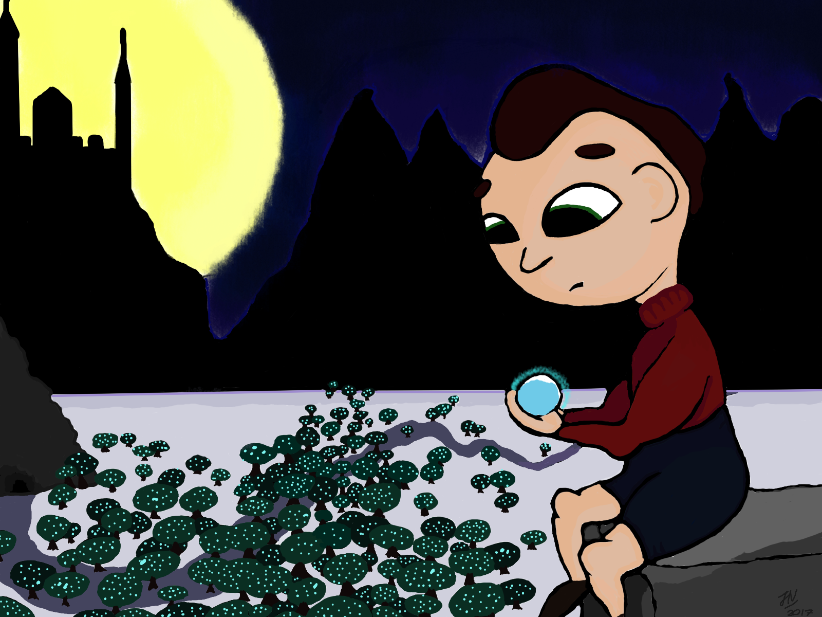
The concept for this one is a child that finds a magical crystal in the forest. I'm just a beginner looking to improve. Thanks!
-
Hi Will, I really appreciate you wanting to critique people on your spare time. Even though its a character on a white background, please see if you want to critique my image.
This piece I did for a book of alphabets that is going to be published in the tribal languages (as a dictionary with Bengali and English) in the Chittagong hill tracts of Bangladesh. One image is Dragonfruit. So I made this illustration instead of just drawing a dragonfruit.My problems :
I did pay a lot of attention to the composition which I think I struggle a lot with. Since this project is unpaid, I would really like to put it on my portfolio. But I don't really like my "go and render everything" style that's just what I learned when I picked up the tablet.
I have a hard time adjusting to screen light. The image 1 is my first painting. When I posted it to instagram I saw it looked too dark and then I brightened it up (second version) And now my eyes are so blind I don't know what is wrong but I feel like something is missing and I cannot point out why.
I do'nt mind being called out: I'm @nazubahere on instagram and Neeya Lutarruq on facebook
image 1:
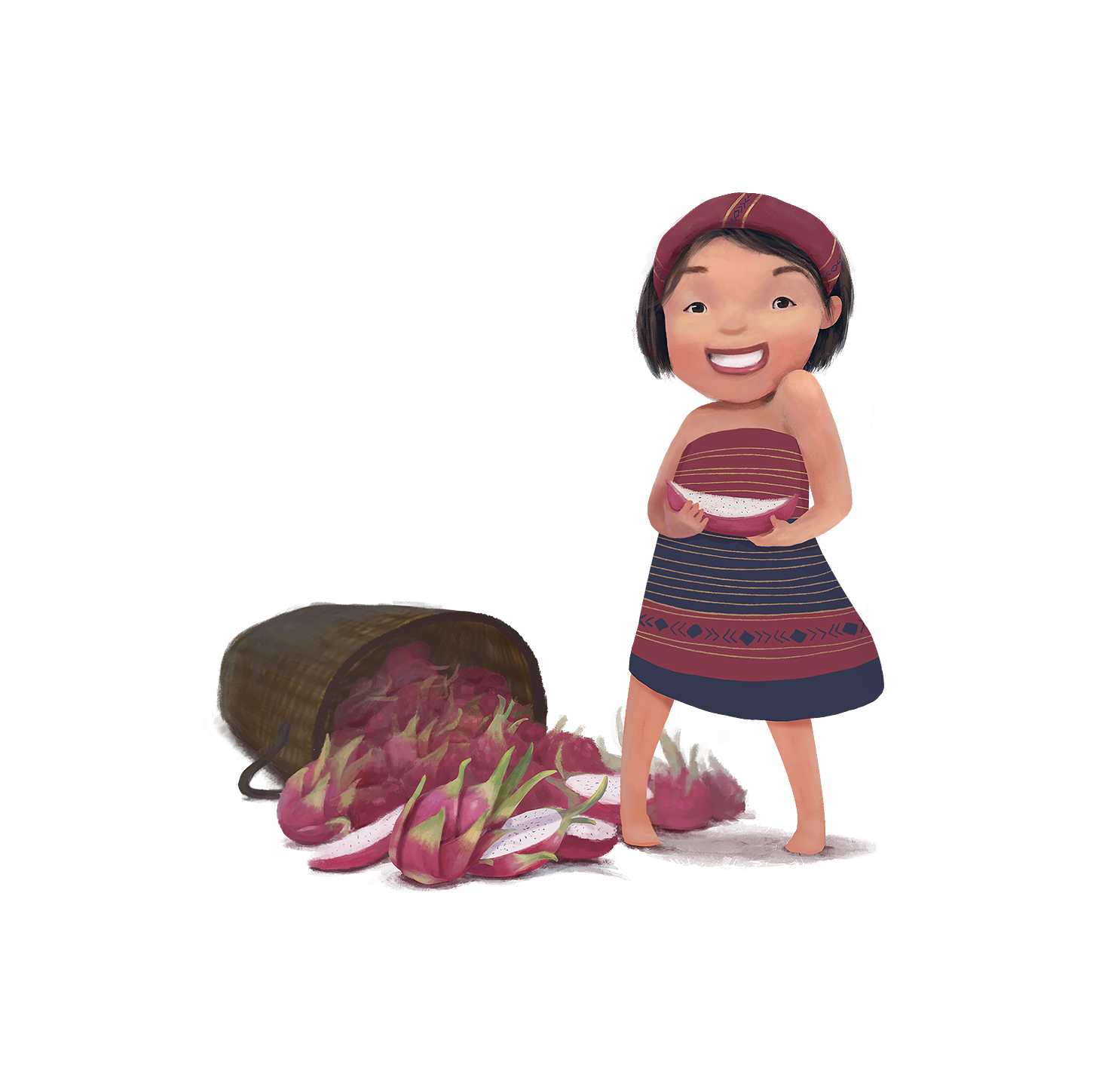
Image 2: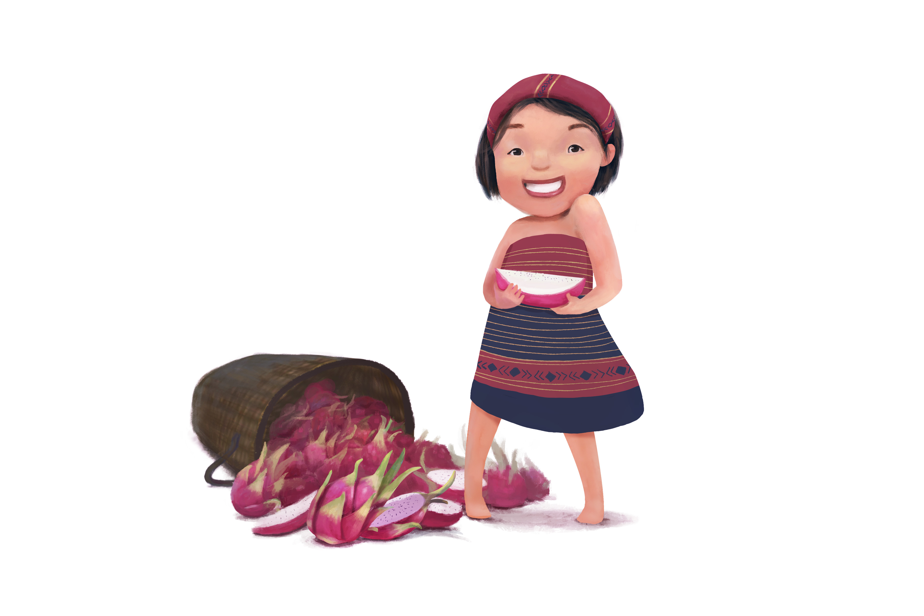
I really appreciate your time.
Nazuba -
Hi Will,
Can you please add the link to your critiques to this first post so I can find it easily? I'm kind of techno challenged. Thanks! -
@Nazuba That is adorable! I love it.
Marsha Ottum Owen
-
@Marsha-Kay-Ottum-Owen Thank you Marsha! I actually did an initial sketch and thought it out which is something I am just starting to do.
-
@Nazuba really like the quality/sharpness of this rendering. The dress print looks great and the characters emotion really shows well.
-
@Tyson-Ranes Thank you! The dress is inspired by the traditional tribal dress of the Chittagong Hill tracts people so that the kids who read it can identify with it.
-
@will-terry-art I watch your channel all the time (even as I type this) - and I thought I would submit myself to your criticism.
My book has published but i think a second edition may merit some changes - at any rate, my last page in the book (SPOILER hahahah). If you have time or inclination, there it is.
This started to remind me of your #draw50things challenge. This does not have 50 things and was not designed for that but I really want to do that (after i finish another book cover and a YA book - clients come first) -
I recently discovered your channel via Jack Parker. Love your work!
I'd like to submit a piece I did for a weekly art blog I'm a part of, The Line it is Drawn on comicbookresorces .com. The artists of the blog do mash-ups and other art based on a theme of the week and people are encouraged to tweet in their suggestions. So this piece is from "Make a six-year-old a superhero" week. My entry, Splatter Punk, the perky, giggly monster hunter, was a time/style challenge for me as I"m really trying to up my game to get work done faster and still retain quality.Thank you !
www.rltpress.com
twitter @rltpress
instagram @gbearpdx
facebook gene guilmette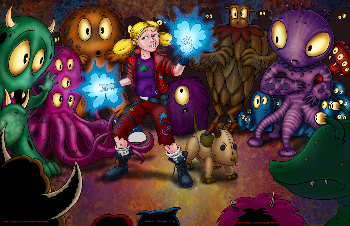
-
After following @Will-Terry for over four years, I was inspired to become a children's book illustrator. I wrote a small story about my depression in 2012 and here is the new front/back cover for the book. I would love your feedback. I really want to get this right.
-
@Nazuba I may not be the illustrious Will Terry but I wanted to throw my two cents in on this one because I love it!
First off, I don't see a whole lot of difference between your images so I laid them on top of another and I see that your Image 2 is a little more saturated and a tad lighter. #2 is better that way because it will probably print nicer.
But then I got thinking about that red fruit... beautiful work there. It's just a shame that it matches her dress so closely that it disappears! I ran a quick look at the dress as if it were green (i dont know if those colors you have are culturally significant, so if they are... forgive me.) Since green is complimentary to red, I chose it and it works! Just an idea.
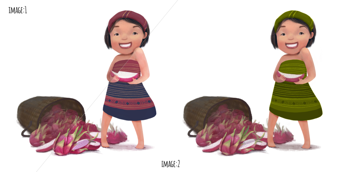
Thanks for letting me mess around with your stuff. I really like the piece.
-
u do bring the "the illustrious" tho @Bob-Crum
-
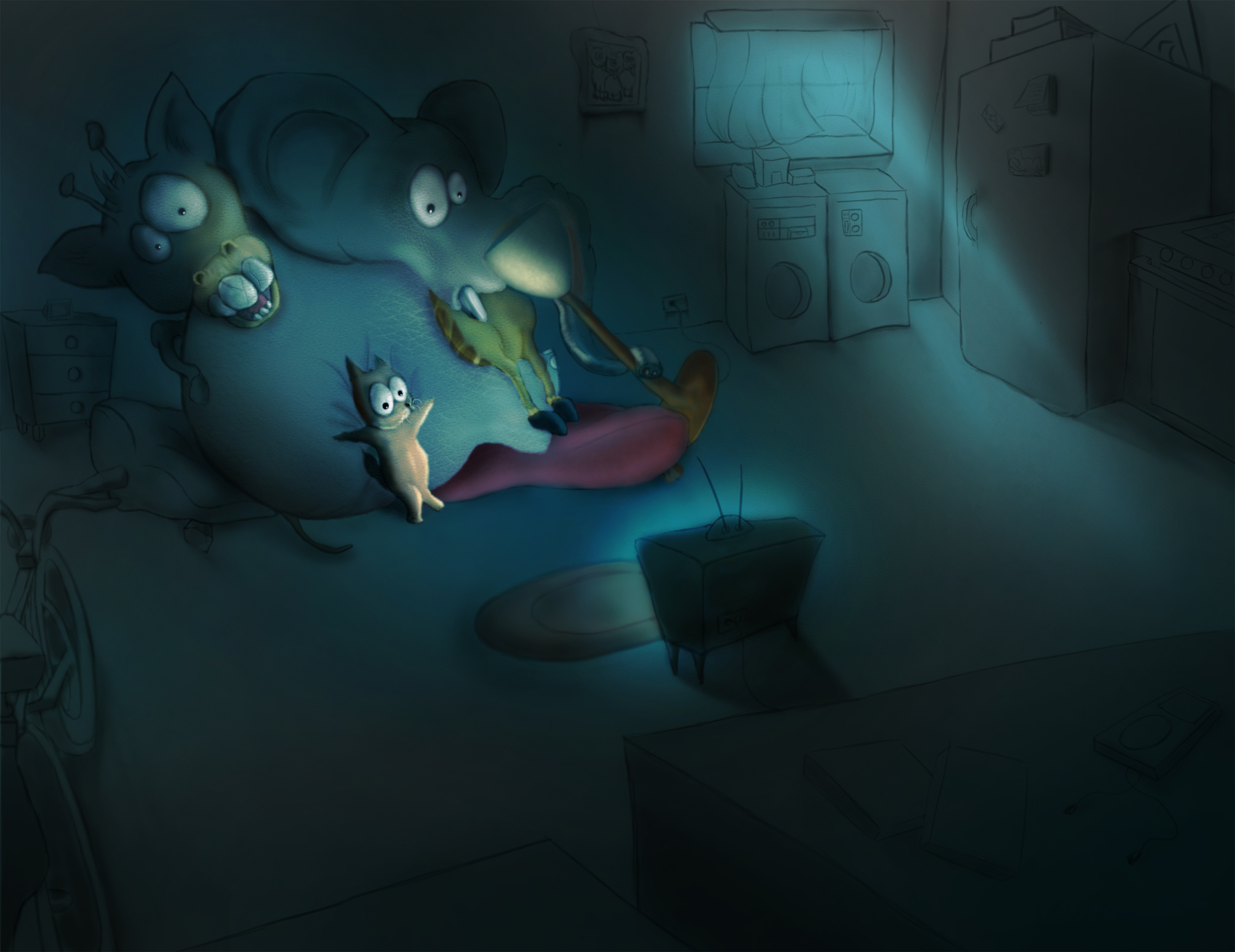
Hi Will, your work inspired me, after 30 days of being a student at SVS, i did my first complete digital painting and i hope you will give me some critiques.
the concept is kinda simple, three teenage friends like to gather at the elephant basement and hang out all the time, however this time the movie is way more scarier than expected, i was trying to capture the reactions under the influence of a scary dark night.
thank you.
-
@Sami-K I just uploaded my 3rd critique video! You can check it out here - I hope my comments are helpful for anyone watching. https://www.youtube.com/watch?v=ak_I15yFDeU
SVS Instructor
http://willterry.com/