JUNE ILLUSTRATION CONTEST: TREEHOUSE
-
This is my entry.
It's the treehouse of little Carlos, whose family lives on the junkyard his father works on. Even though they are poor, they are a happy family utilizing anything they can find on the yard. His father made this treehouse for Carlos, just to give him something for his own: a nice little retreat in which Carlos spends his time reading (and learning from) books found at this junkyard which makes him feel like the richest boy on the planet. And sometimes a kid just wants to swing...
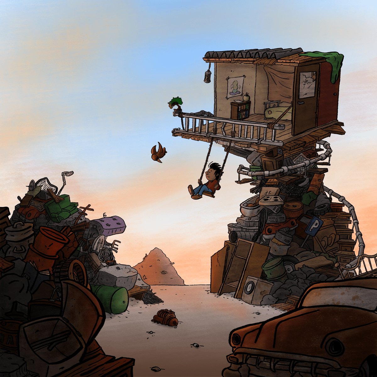
I wanted to give it a warm, but also dusty feeling, in my thread someone said: hopefull, which is the general feeling I want to express. I also added a bonsai tree to it, just to get more of that treehouse feeling :).
Hope you like it!
You can see a big version on my website: dscomics.nl or by clicking here
You can also add me on Instagram where I posted some fases of this project (user: dscomicsnl). -
I may do another one (and retire this one, if the other is better) but I will call it a day on this one - was fun experimenting with a new process (at least for a reasonable part of the time ;-))!
-
@smceccarelli Love the changes you've made! Such a beautiful piece!
-
@Kevin-Longueil Thank you! Turning the boy around was a really good tip.
-
@smceccarelli Much better with the kid going away from us! Very nice piece!
-
@Dennis-Spaans Hi Dennis, I love this one - very creative take on the prompt and really nice things happening already. Would you mind if I gave you a critique? I shy away from just doing it without permission since it's not WIP.
-
@Will-Terry Hi Will, thank you for your reply and kind words. Of course I am open to critique! Would it be ok to adjust and re-enter? I'm curious what I can do better :).
-
@Dennis-Spaans Oh - yes - you can always re-enter... but you might not agree with my suggestions
 ...
... -
@Will-Terry hehe, well your suggestions are highly appreciated, and Im curious what they are and if I'm able to do them ;).
-
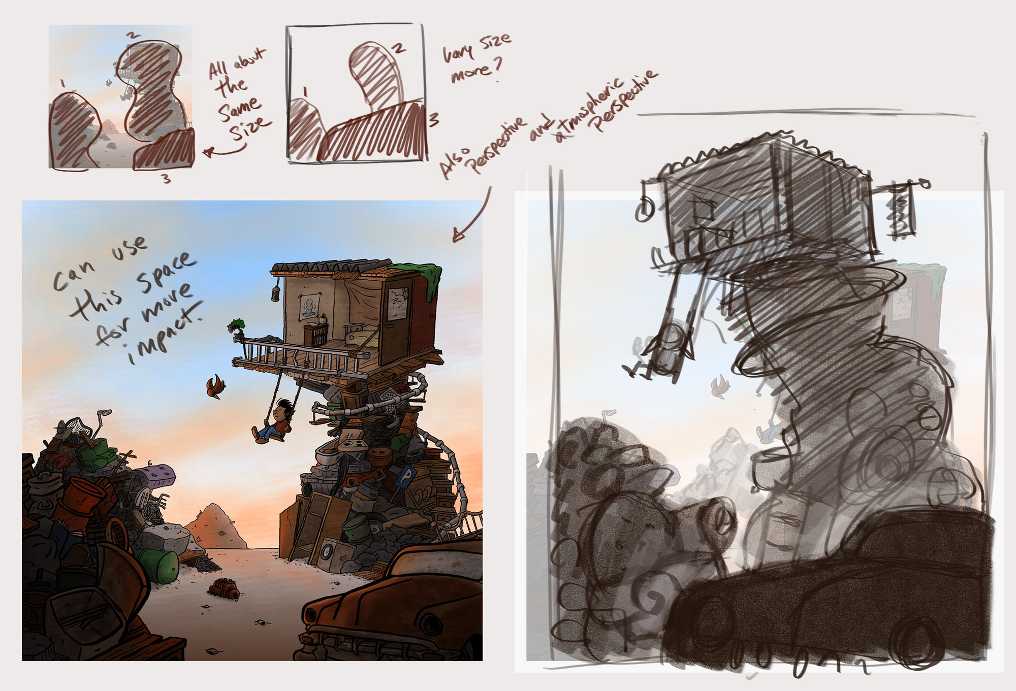
Hi Dennis - Again - I really like your image - thank you for letting me make a few suggestions...don't feel like you have to use them.

-
@Will-Terry Hi Will. Thank you for your suggestions. I can see your point. I like using the space more like you suggest so I will look into that. And even though the house itself is tilted forward in my drawing (on purpose) your suggestion gives me reason to adjust the perspective as well, so you're looking at the bottom of the house.
Again thanks, and I hope I can adjust it in time ;).
-

Hey guys!
So here is my entry. I was trying the best I can to think outside of the box. So here is a character I designed from back in grade school, Cpt. Weird Beard. I figured if he was to have a tree house, it may look a little something like this. I always like to draw night time images because I remember as a kid that bedtime was lame, haha. And always imagined nightfall being a whole new world and mysterious. There were a few things I wish I added, like a parrot frantically clutching onto weird beards shoulder as they zip down the slide. and maybe a kid fishing from the crows nest. Would love to hear feedback. thanks! -
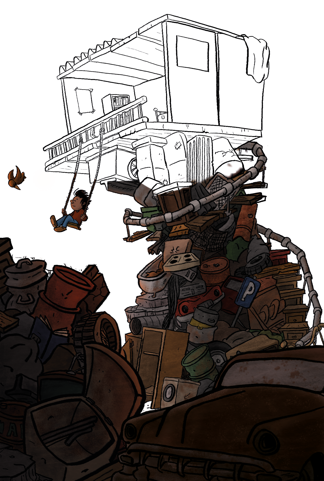
@Will-Terry Hey Will, so I've been playing with your suggestions and came up with this. Am I going in the right direction, following your advice? Somehow the first looks a bit more peaceful, but I dont like the negative space in it, so the composition of this one is better. ALso, I like to see the house from the bottom, it looks indeed more logical (even though some perspective lines are still a bit off - which I'll fix ;)).
Anyway, thanks a lot for the guidance/tips :).
-
@Dennis-Spaans WOW! so much better!

-
@Will-Terry Thanks!! I actually altered it more, pushing the left side more to the back. Im not done yet of course with coloring, but I'm quite happy to close the day with this piece. But I don't want to flood this thread with my stuff, so i posted in my own thread if you're interested: WIP Treehouse on abandoned junkyard
-
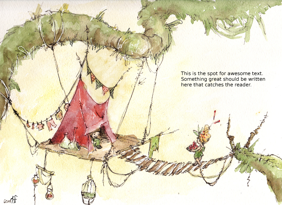
Hey all. I've been MIA for long awhile. I'm on the brink of throwing in the towel on ALL things art. I canceled my Photoshop subscription. I moved my studio with the intention of just turning it into my 'office', I canceled my web domain and just have a free Wix site. I've spent the last 4 months searching for a 'real' job. Ya know 9-5 with benefits and PTO... but....I just keep being drawn back.
Well this assignment spoke to me. I set some limits on how much time I would put into it. 4 hours Max including sketch design. Limited color palette and simple media. This little piece is ink and water color then digitally enhanced.
-
@Katrina-Fowler Really nice to see you back! - your work is so good....you must not realize how good it is...or believe it when folks tell you - i still remember Lee saying some Extremely positive things about your work when you won the Third Thursday - it was something to the effect of "9 or 10 more images like this and i see a book deal" - i may not be remembering correctly - but i remember thinking Wow she is awesome and he is right - anyways..i hope i'm not making things worse somehow - This new piece looks great! Really nicely done!
-
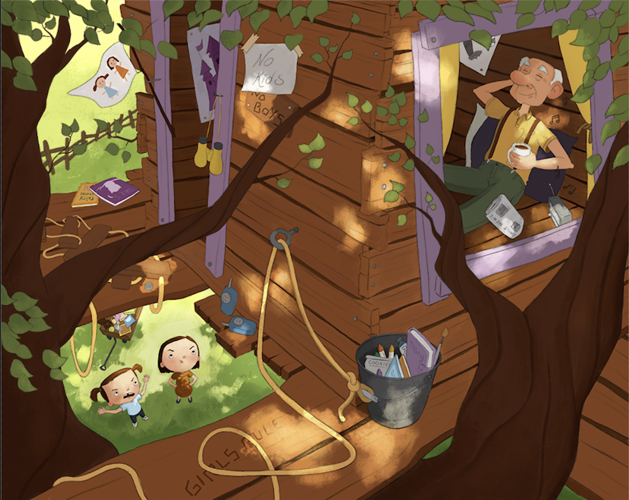
Here is mine!!
Last minute critiques always welcome
-
@smceccarelli this came out really nice!
-
@Katrina-Fowler This is great! I'm a sucker for ink and watercolor. I really like the simplicity.
Kinda confused at your "throwing in the towel" comments, but then, I'm new here. Obviously fodder for a new thread. Perhaps you'd like to share?
