Society of Visual Storytelling

    SVSLearn Forums

    • Register
    • Login
    • Search
    • Recent
    • Tags
    • Popular
    • Users
    • Groups
    • Search

    Tree house WIP

    General Discussion
    11
    45
    9727
    Loading More Posts
    • Oldest to Newest
    • Newest to Oldest
    • Most Votes
    Reply
    • Reply as topic
    Log in to reply
    This topic has been deleted. Only users with topic management privileges can see it.
    • Jose Ramos
      Jose Ramos @Doha last edited by

      @Doha Hi my friend, Yes I agree about the light, maybe now is better, I´ve made the changes that Guillerme told me.
      Sunset light and a bit more exagerate the bunny expression.
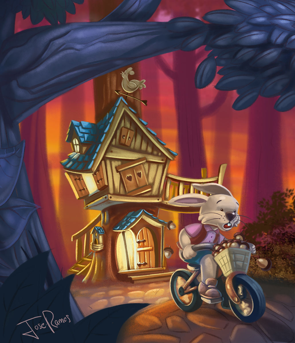
      0_1497888296665_treehouse2.jpg

      1 Reply Last reply Reply Quote 2
      • Jose Ramos
        Jose Ramos @Chip Valecek last edited by

        @Chip-Valecek hahaha, it was the most cartoon style. 🙂
        Thanks Chip!

        1 Reply Last reply Reply Quote 0
        • evilrobot
          evilrobot SVS OG last edited by

          @Jose-Ramos looks good the only thing I see is that you are getting some tangents with the rabbit's ears and the tree house railings. Nice work.

          http://www.palacioillustration.com/

          https://www.scbwi.org/illustrator-gallery/illustrator-detail/?illustrator_id=84142

          https://www.pinterest.com/evilrobot2/pins/

          https://twitter.com/MyEvilRobot

          Jose Ramos 1 Reply Last reply Reply Quote 1
          • Jose Ramos
            Jose Ramos @evilrobot last edited by

            @evilrobot said in Tree house WIP:

            ree house railings. Nice work.

            Hey, Thanks a lot...how do you think I can fix it?

            1 Reply Last reply Reply Quote 0
            • tombarrettillo
              tombarrettillo last edited by

              Not sure if anyone has mentioned this, but the treehouse is brighter than the rabbit, which draws me to the treehouse first. Perhaps tone down the light in the doorway and window, and some of the glow on the house, and have a ray of the sunset focused on the rabbit. Also, took me a second to realize the bar dividing the doorway was in fact one of the posts holding up the porch roof. I would move the door opening to be more centered under the roof peak so as to avoid that confusing split.

              https://www.youtube.com/@tombarrettart

              Jose Ramos 1 Reply Last reply Reply Quote 0
              • Jose Ramos
                Jose Ramos @tombarrettillo last edited by Jose Ramos

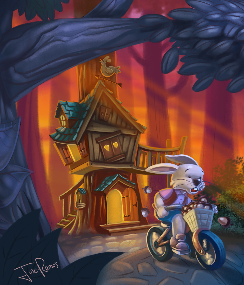
                @tombarrettillo Hi Tom, yes I agree with your comments.
                The treehose is not so bright like before, some glow around the tree and house has been added.
                And the sunshine is there too, maybe is it so soft?
                I´ve improved the doorway ...what you think? 😉
                0_1497906252977_treehouse2.jpg

                S 1 Reply Last reply Reply Quote 0
                • tombarrettillo
                  tombarrettillo last edited by

                  Very nice! Light and colors are good. My only pic (and it is a very small one) would be the small bit of light coming thru at the corner of the gray tree.

                  https://www.youtube.com/@tombarrettart

                  1 Reply Last reply Reply Quote 0
                  • S
                    smithdraws @Jose Ramos last edited by

                    @Jose-Ramos What about taking down the tree house and background color saturations about 5 to 10 percent? It would give some atmospheric perspective and help focus attention on the character. Also what if the rabbit's expression was, "determined," rather than scared? Scared seems like he is running away from something. Isn't he actually determined to save his friend? Great job by the way!

                    https://www.instagram.com/joshuasmithdraws/?hl=en

                    Twitter handle: @smittyjosh

                    1 Reply Last reply Reply Quote 0
                    • Jose Ramos
                      Jose Ramos last edited by

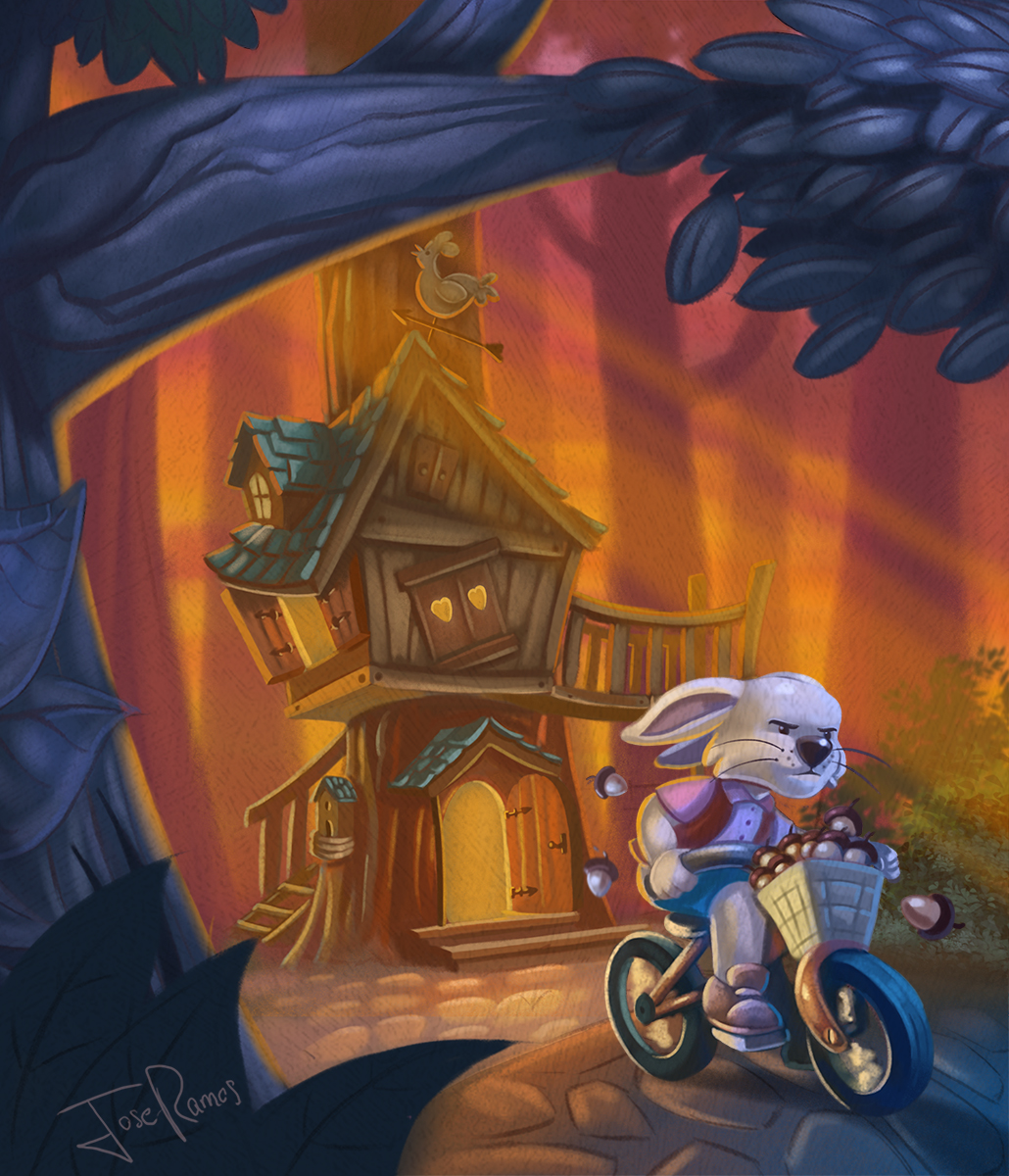
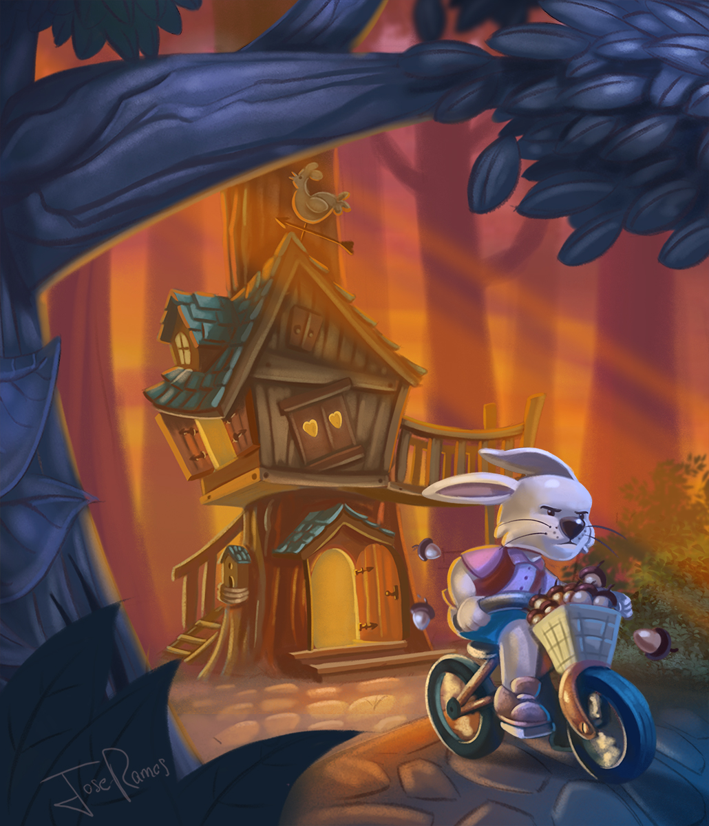
                      Hey, thanks guys for your advices, they´re welcome. 😉
                      I´ve added a light coming thru at the corner of the gray tree, and desaturated the background 10%, I´ve created a layer of orange solid with opacity 20%, so the atmospheric felling is better.
                      The character expression now is determined, so I think is better than scared. 🙂
                      0_1497944420059_treehouse2.jpg

                      S 1 Reply Last reply Reply Quote 4
                      • S
                        smithdraws @Jose Ramos last edited by

                        @Jose-Ramos Awesome 👏

                        https://www.instagram.com/joshuasmithdraws/?hl=en

                        Twitter handle: @smittyjosh

                        Jose Ramos 1 Reply Last reply Reply Quote 1
                        • evilrobot
                          evilrobot SVS OG last edited by

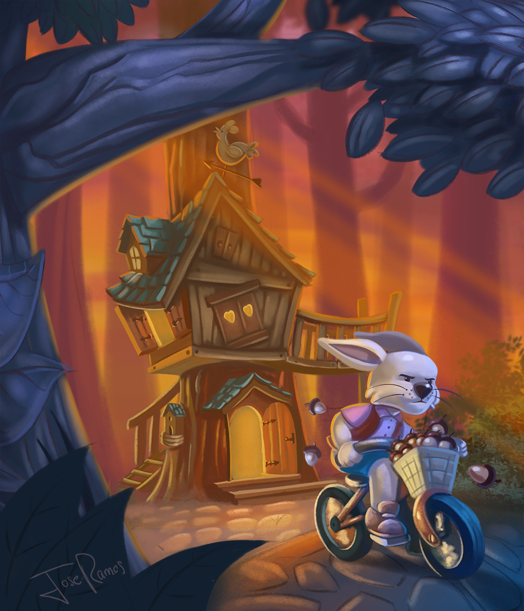
                          This is looking great. You solved the problem with that top ear but I still see the tangent with the bottom ear and the the bottom rail. I'd make that ear come out and drop lower than the bottom rail. Right now they are curving together almost making one continuous line.

                          http://www.palacioillustration.com/

                          https://www.scbwi.org/illustrator-gallery/illustrator-detail/?illustrator_id=84142

                          https://www.pinterest.com/evilrobot2/pins/

                          https://twitter.com/MyEvilRobot

                          Jose Ramos 1 Reply Last reply Reply Quote 1
                          • Jose Ramos
                            Jose Ramos @smithdraws last edited by

                            @smithdraws Thanks dude!

                            1 Reply Last reply Reply Quote 0
                            • Jose Ramos
                              Jose Ramos @evilrobot last edited by

                              @evilrobot Aaaaah, now I see what you wanted to say.I know what tangent means. Thanks and check it out.
                              0_1497975270178_treehouse2.jpg

                              aska 1 Reply Last reply Reply Quote 4
                              • aska
                                aska @Jose Ramos last edited by

                                @Jose-Ramos its such a cool picture that i have to make you consider another change...;) i like the bluish colours more, they look more deep... are you sure about red colours? I know, that everyone has different taste and opinion so dont worry about my opinion,, if you dont agree

                                Aska
                                www.mugaska.com
                                https://www.instagram.com/mugaska/
                                https://www.etsy.com/uk/shop/mugaska

                                Jose Ramos 1 Reply Last reply Reply Quote 0
                                • Jose Ramos
                                  Jose Ramos @aska last edited by

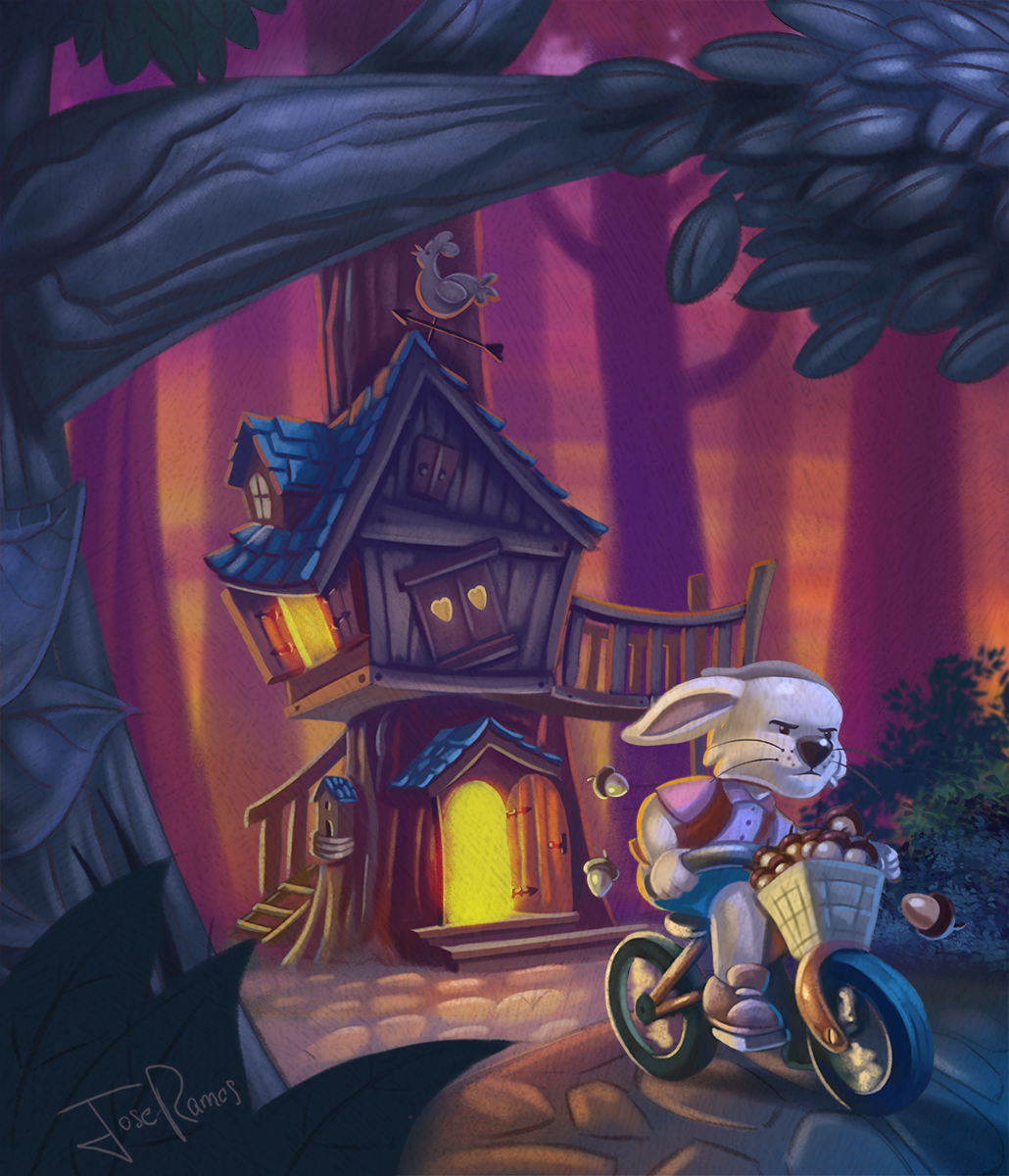
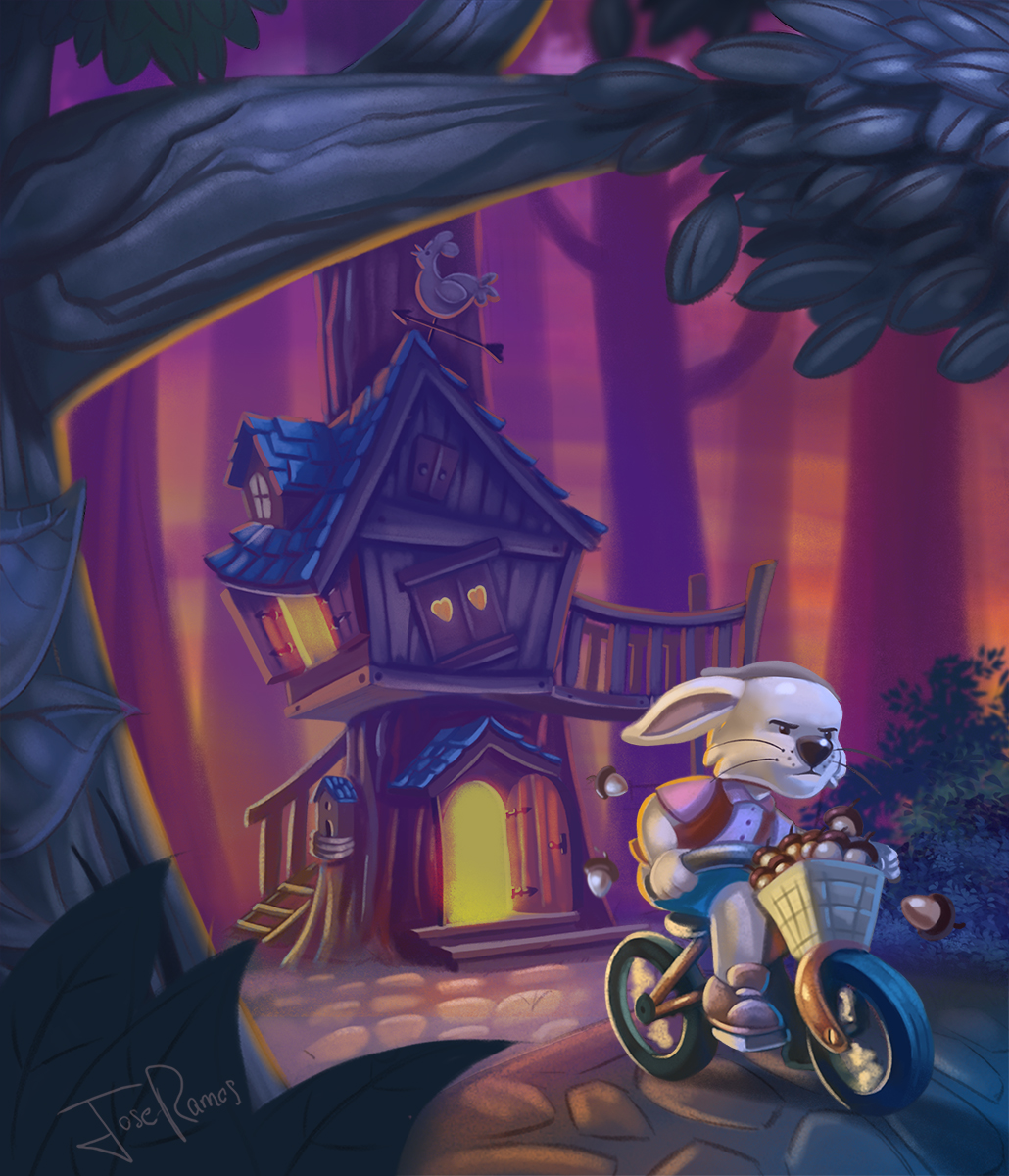
                                  @aska Hi Aska, thans for your comment, well, I´m not sure about red colours, but they do not dislike me either.
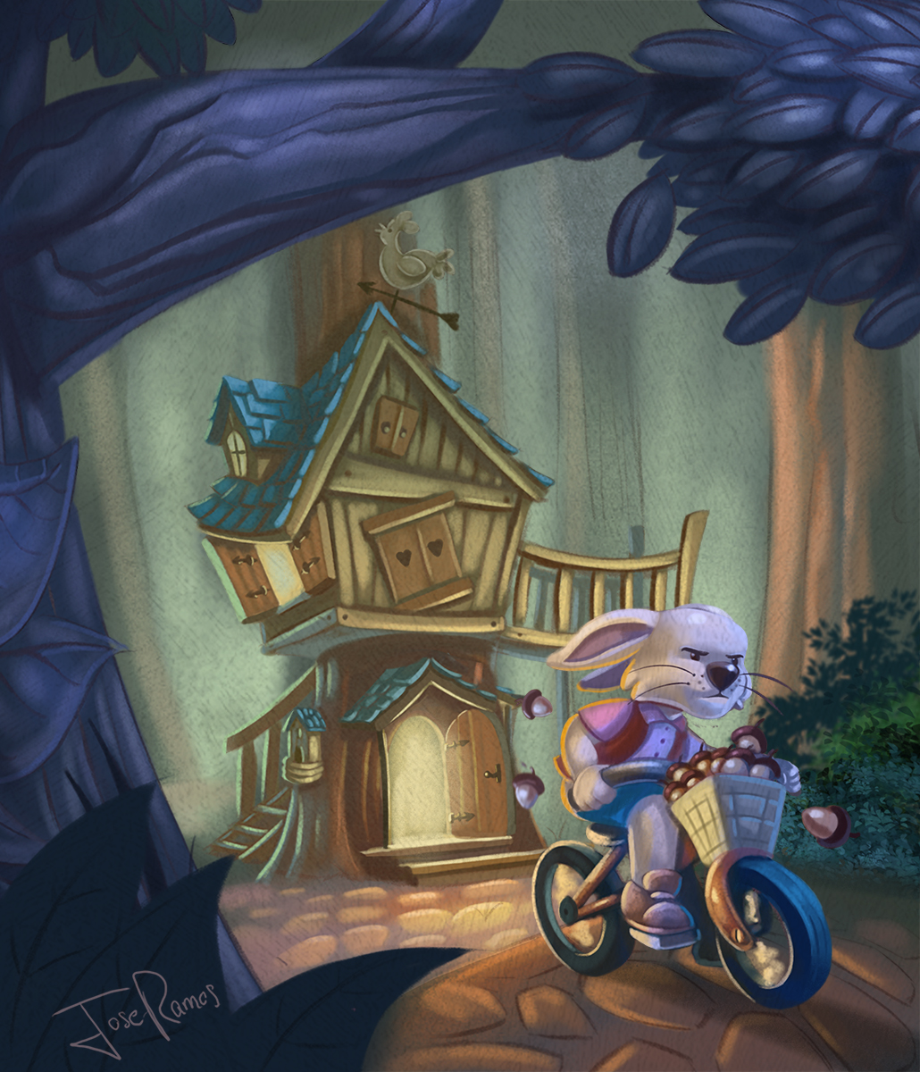
                                  I´ve tried to change the background color, and make it more late in time...I mean, more night time.
                                  which do you like more? 😉
                                  0_1497987919331_treehouse3.jpg

                                  1 Reply Last reply Reply Quote 0
                                  • aska
                                    aska last edited by

                                    Still blue ... 🙂 I looked closer at all versions and I think that, what drawns me to the blue version is texture and delicate look. Also Iam not sure of strong reflections on the tree in the last two versions. Perhaps you could tone your colours down a bit, add texture and make the reflections a bit more delicate? Its really a cool picture tho and cam impressed how easily you change rabbit expressions without changing the rabbit itself 🙂

                                    Aska
                                    www.mugaska.com
                                    https://www.instagram.com/mugaska/
                                    https://www.etsy.com/uk/shop/mugaska

                                    Jose Ramos 1 Reply Last reply Reply Quote 0
                                    • Jose Ramos
                                      Jose Ramos @aska last edited by

                                      @aska Hey, thanks for your great advices Aska, the blue version is the last one that I uploaded right?....Thanks a lot!

                                      aska 1 Reply Last reply Reply Quote 0
                                      • aska
                                        aska @Jose Ramos last edited by

                                        @Jose-Ramos its the first coloured version from 2 days ago (bluish, greenish background)

                                        Aska
                                        www.mugaska.com
                                        https://www.instagram.com/mugaska/
                                        https://www.etsy.com/uk/shop/mugaska

                                        Jose Ramos 1 Reply Last reply Reply Quote 0
                                        • Jose Ramos
                                          Jose Ramos @aska last edited by

                                          @aska Ok, I´ve added texture, and I think I have 3 options, A,B,C... 😉 My favourite is B.

                                          0_1498039075324_a.jpg
                                          0_1498039082325_b.jpg
                                          0_1498039141560_c.jpg

                                          NoWayMe 1 Reply Last reply Reply Quote 0
                                          • NoWayMe
                                            NoWayMe @Jose Ramos last edited by NoWayMe

                                            @Jose-Ramos Wow! This is really progressing well! I vote for B 🙂

                                            I would suggest adding a little more space between the top of the treehouse and the big branch of the tree in the foreground (maybe that branch could be slightly smaller ?). Right now it feels a little crowded.

                                            I think the story is funny, but not perfectly clear in your image. Changing his expression helped a lot! I am thinking what if you would add a letter flying in the distance (a ransom letter) It would be like he read the letter, grabbed his bike and left fast to collect acorns and left the letter behind him. It's a little hard to explain! I will try to do a paint over tonight if it's not clear!

                                            And maybe his worm friend could be sitting on his shoulder ? looking terrorized.

                                            But I really love where you are taking this 🙂

                                            noemiegionetlandry.squarespace.com
                                            noemie_illustration on Instagram

                                            1 Reply Last reply Reply Quote 0
                                            • First post
                                              Last post