Tree house WIP
-
@Jose-Ramos its such a cool picture that i have to make you consider another change...;) i like the bluish colours more, they look more deep... are you sure about red colours? I know, that everyone has different taste and opinion so dont worry about my opinion,, if you dont agree
-
@aska Hi Aska, thans for your comment, well, I´m not sure about red colours, but they do not dislike me either.
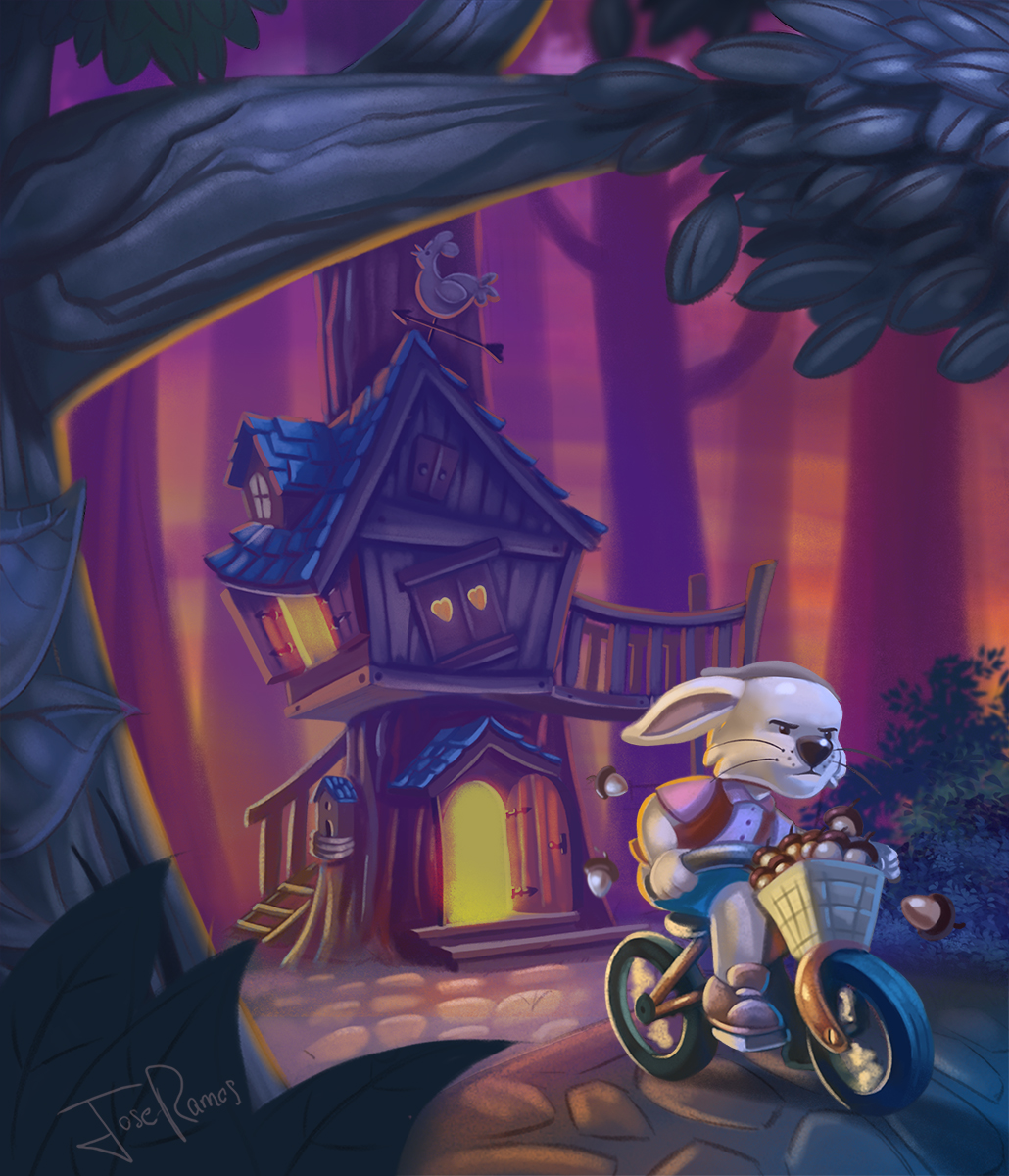
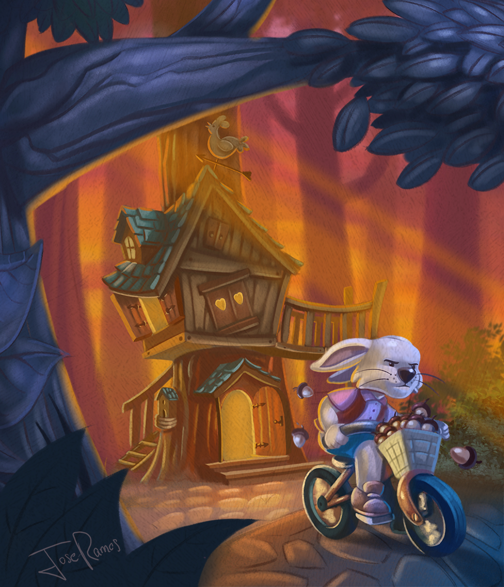
I´ve tried to change the background color, and make it more late in time...I mean, more night time.
which do you like more?")
-
Still blue ...
") I looked closer at all versions and I think that, what drawns me to the blue version is texture and delicate look. Also Iam not sure of strong reflections on the tree in the last two versions. Perhaps you could tone your colours down a bit, add texture and make the reflections a bit more delicate? Its really a cool picture tho and cam impressed how easily you change rabbit expressions without changing the rabbit itself
I looked closer at all versions and I think that, what drawns me to the blue version is texture and delicate look. Also Iam not sure of strong reflections on the tree in the last two versions. Perhaps you could tone your colours down a bit, add texture and make the reflections a bit more delicate? Its really a cool picture tho and cam impressed how easily you change rabbit expressions without changing the rabbit itself -
@aska Hey, thanks for your great advices Aska, the blue version is the last one that I uploaded right?....Thanks a lot!
-
@Jose-Ramos its the first coloured version from 2 days ago (bluish, greenish background)
-
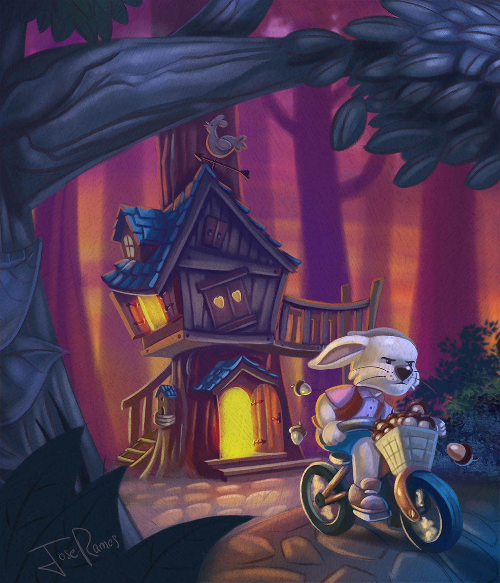
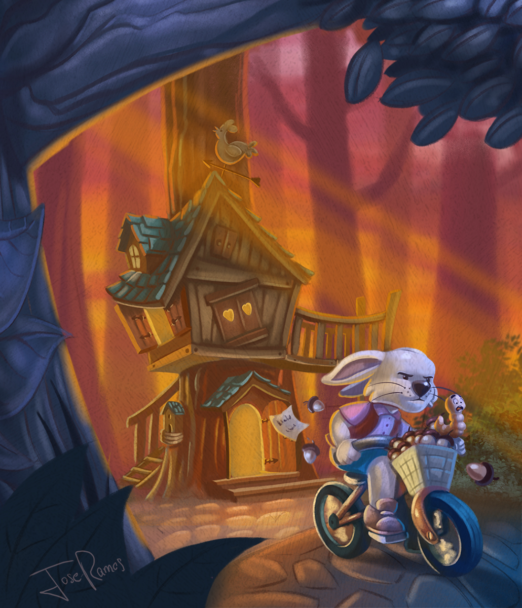
@aska Ok, I´ve added texture, and I think I have 3 options, A,B,C...
My favourite is B.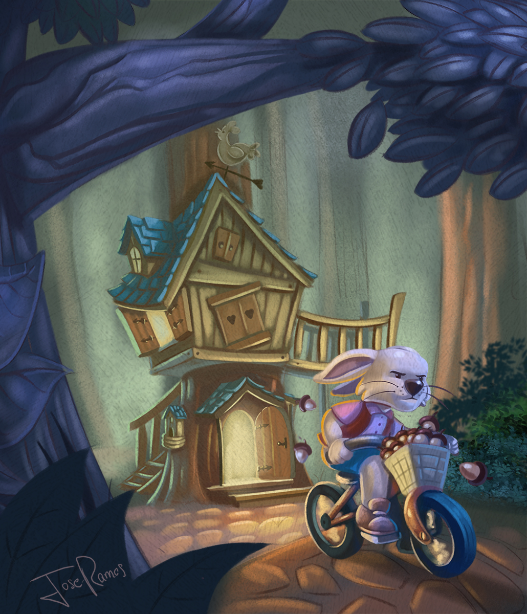
-
@Jose-Ramos Wow! This is really progressing well! I vote for B
I would suggest adding a little more space between the top of the treehouse and the big branch of the tree in the foreground (maybe that branch could be slightly smaller ?). Right now it feels a little crowded.
I think the story is funny, but not perfectly clear in your image. Changing his expression helped a lot! I am thinking what if you would add a letter flying in the distance (a ransom letter) It would be like he read the letter, grabbed his bike and left fast to collect acorns and left the letter behind him. It's a little hard to explain! I will try to do a paint over tonight if it's not clear!
And maybe his worm friend could be sitting on his shoulder ? looking terrorized.
But I really love where you are taking this
-
Lovely comp! Love the colors of all of them. I really like the last one. I have another suggestion, The Rooster with the arrow, I should point him towards the rabbit. Then It draws your eyes inwards, now its pointing towards the branch (out of the illustration) . I think you really don't want to put attention there. A worm friend makes the illustration more fun, Kids love litte jokes or 'easter eggs'. Good luck, your almost there!
Leontine
"A picture is worth a thousand words."https://leontineillustrator.com
https://www.instagram.com/leontine.illustrator/
http://www.facebook.com/leontineillustration -
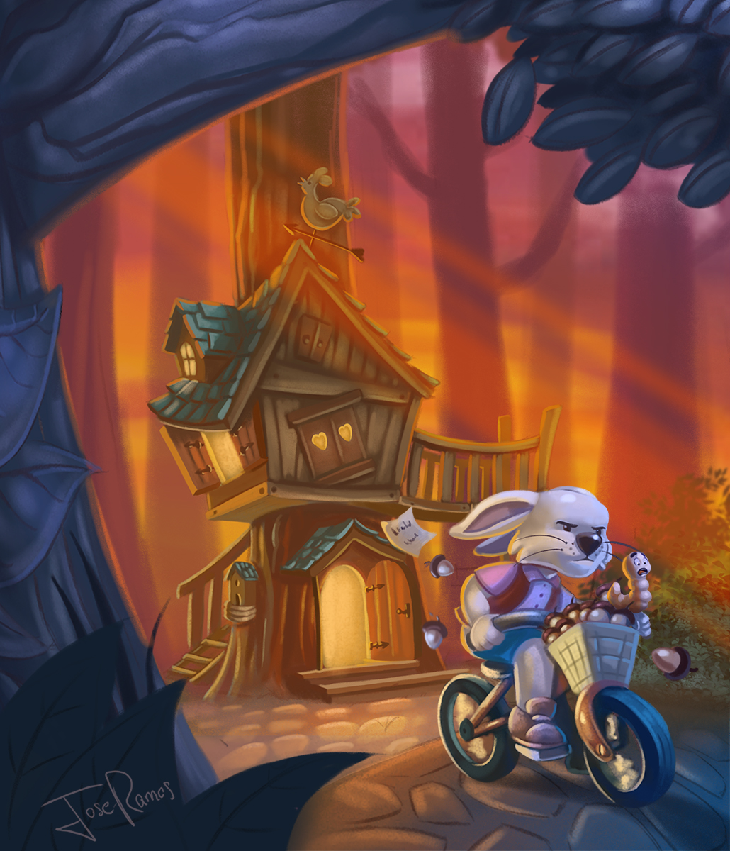
Worm, letter and more space on yhe top
-
I don't think it needs any texture. Kind of muddies it up a bit, especially the characters
-
@Jose-Ramos Love the worm LOL his face is priceless.
-
I think you´re right about the texture Tomb, I´ve took it out.
Thanks Chip!
-
@Leontine Thanks Leontine!
-
I think it's perfect!
-
@Doha Thanks Doha!
, and I really appreciate all the comments, they have been very hekpful. -
Yeah, I think you pulled it off. Looks fantastic.
-
This is a fantastic image, love it!
-
Thanks guys!
-
@Jose-Ramos love the worm!