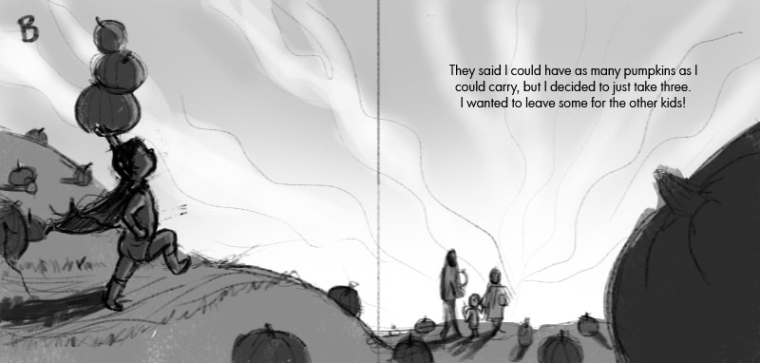
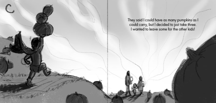
Reworking an old piece- pumpkin patch- rendering stage
-
-
I just realized his arm probably wouldn't be swinging that way if his legs were like that, in version c. Oops.
-
@tessw If you did go that route I like B where you can see his face and the confidence he has.
-
Version B looks very cool. However, i think i like the original more. He is more childish there and its cute.
-
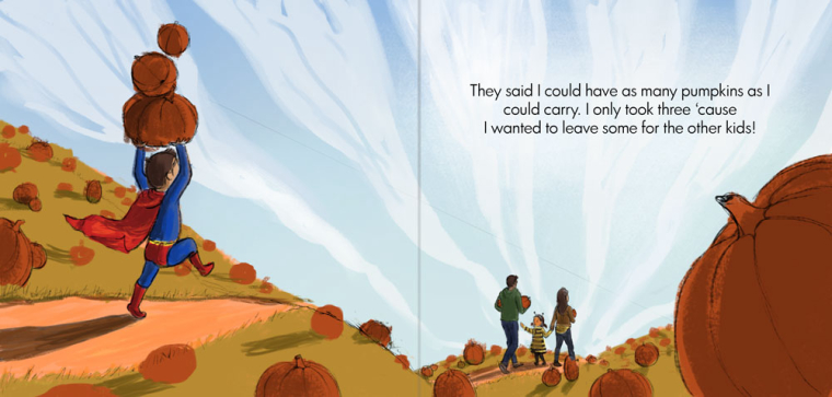
Laying in some colors. . . I'm always nervous starting the colors!
-
@tessw
There is so much about this that is working and that I relate to. Firstly I'm a big Superman fan so there's that Composition is easy to read and interesting. I don't mind that there is some ambiguity in the story; meaning, is he actually a super kid or just super imaginative? I live that last line of text and how the image plays with that. Just a side note that having the boy enter from the left is a good move as it sticks to the cinematic rule of thumb that "good guys," enter from the frame from the left. If you watch star wars, Vader tends to enter from the right and Jedis from the left. Just a fun factoid
  Well done so far!
 -
@smithdraws OMG I love analyzing cinematography. There's so much psychology in it. I didn't even know this!
-
@withlinesofink It makes sense to me to study cinematography since it's the ultimate form of sequential art. A picture book or comic is just a time lapse.
-
Very nice!
Although, you might want to rethink the clouds. They really transfer the focal point from the boy carrying the 3 pumpkins to his family. The way it is now. I see the family before the boy (even if he is much bigger and brighter - directional lines are very powerful).
Otherwise, nice work!! Definitely MUCH better composition than your original!
-
@nowayme Aw man! I really wanted to try out those clouds. Guess I'll have to save them for another piece. But, good point. I'll play around with the clouds. Thanks for the feedback!
-
@smithdraws said in Reworking on old piece- Composition help.:
@tessw
There is so much about this that is working and that I relate to. Firstly I'm a big Superman fan so there's that Composition is easy to read and interesting. I don't mind that there is some ambiguity in the story; meaning, is he actually a super kid or just super imaginative? I live that last line of text and how the image plays with that. Just a side note that having the boy enter from the left is a good move as it sticks to the cinematic rule of thumb that "good guys," enter from the frame from the left. If you watch star wars, Vader tends to enter from the right and Jedis from the left. Just a fun factoid
  Well done so far!
Thanks! Good thing @Kevin-Longueil and @Chip-Valecek set me straight as far as him entering from the left. Didn't want him to be a bad guy.

-
Making progress. Still need to refine the shading, unify the cast shadows color-wise, and add bounce light from the ground and fill light from the sky, among other things. Is there anything you can see that I need to look out for as I complete this piece? How does the sky look without clouds?
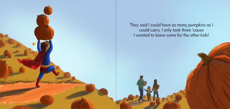
Also I was wondering, if I end up putting this on a portfolio website, do I include the text and gutter or do I leave them out?
-
@tessw Really shaping into a strong piece. What if you painted in clouds that directed toward the boy? I'd keep the text because the art and text play off of each other. I'd ditch the gutter.
-
@tessw This looks GREAT! As far as putting it up on your site, I would think the text is fine but remove the gutter line. But then again I may be wrong about that. I just think it would look great without the division in it.
-
@tessw Love this composition and perspective. Also love the characters poses.
-
@tessw said in Reworking an old piece- pumpkin patch- rendering stage:
do I include the text and gutter or do I leave them out?
The AD at Random House who reviewed my portfolio said to leave out the gutter unless you're showing 2 pages together (like 2 illustrations). But having text is always AWESOME because it shows you understand what's needed for a book. If you can design the text well, that's even better.
-
Thanks for your help, everyone! What do you think? Any changes or additions?
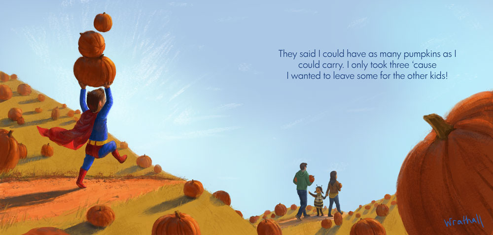
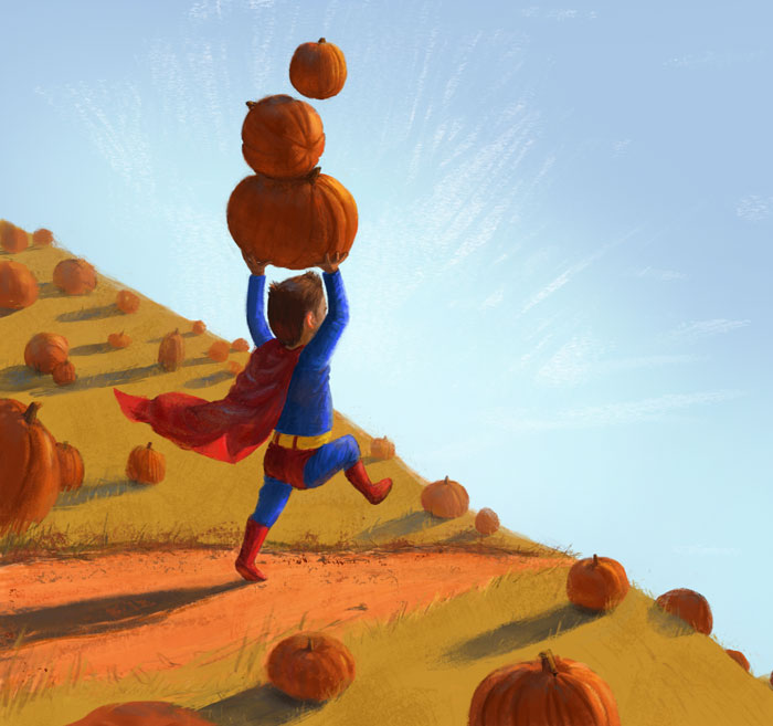
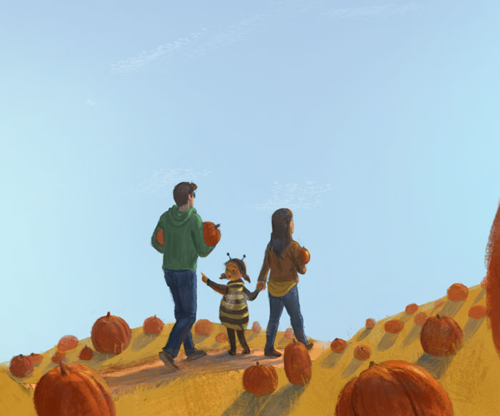
Also, I have another question. I've started to think of a book idea for this character, but it's kind of based on superman and his powers. Like super speed, laser eyes to carve his pumpkins, broccoli kryptonite, "flying" on his trampoline, etc. That's kind of a no-no though, right? Because it would be a rip off of a copyrighted character. I'd probably have to change the costume and his powers?
-
Oh, and would you put a signature on this piece since it has text like a book spread? It looks kind of odd to me.
-
@tessw this is such a joyful piece! It makes me think of my little almost 2 year old boy! This really captures a great moment.
-
@tessw said in Reworking an old piece- pumpkin patch- rendering stage:
That's kind of a no-no though, right? Because it would be a rip off of a copyrighted character.
Well, this can be tricky. I wonder if @Lee-White Might be thinking about a copyright/licenses/intellectual property lecture at any point.
Anyways, here's my feeling/understanding- yes you can use Superman as an inspiration. But definitely come up with your own character. Alter the costume, hair/skin color. Super strength is a common power, but maybe replace laser eyes with, like, invisibility. Things like that. See how much you CAN tweak without losing your story, because the more you change, the better. Before starting the story I would even sit down and go through the whole character design and development process to make sure you 1.) Have a clear paper trail for how you created and developed this character and 2.) have a solid character that feels clear and fleshed out in the story so you can't accidentally fall back on your original inspiration.
