Alice in Wonderland - illustration series
-
Hi All,
I have not posted artwork on the forum for a very long time...now it´s again time to get some feedback from the awesome community here.
I am preparing (sketching, thumbnailing, etc...) for the five illustrations to submit to the Bologna showcase. I have decided to do a new set of illustrations because I want to experiment with a new style variant and five seems the right number to do so - two birds with one stone. I have picked “Alice in Wonderland” as theme.
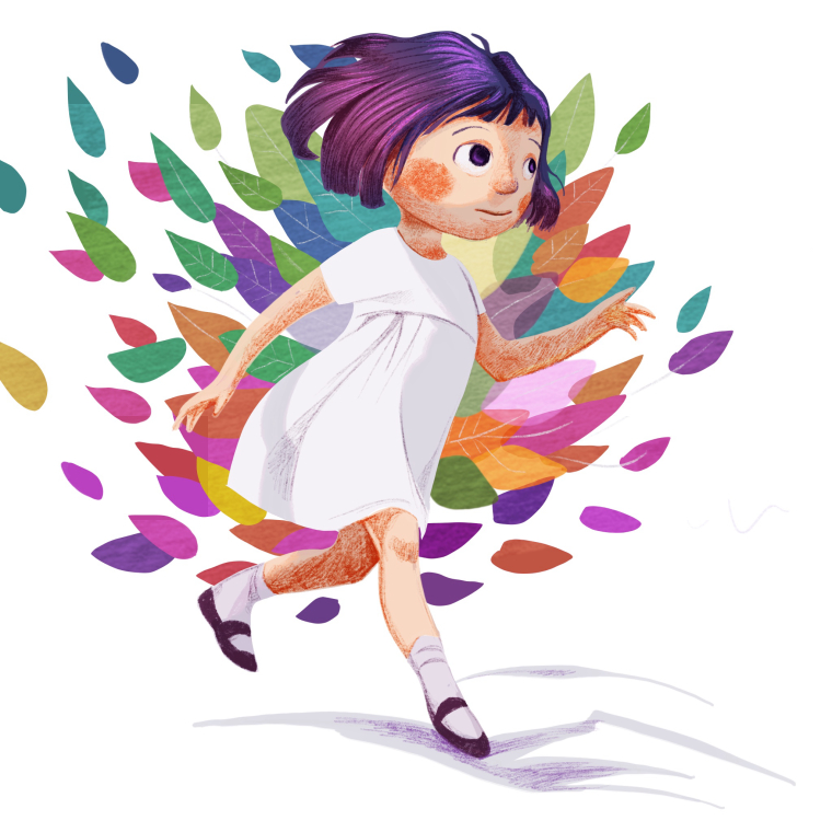
Yesterday I have started color and rendering tests, and this is the very first test. I want a style that preserves some level of rendering and light treatment but is more graphic than what I have done so far - allowing the introduction of more surreal and design-driven elements. The background here does not represent anything in particular, just testing to see how the figure combines with flat shapes.
I would really appreciate feedback and suggestions!
-
@smceccarelli Alice in Wonderland! Can't wait to see where you go with this! For feedback i'm not sure what you are looking for - are you just wondering if the rendered figure is working with the flat shapes? I think it is for sure. If you are looking for critique on the image (but i am thinking you are not) i would say a couple of things - for me i keep getting stuck on her hands and want another finger to suddenly sprout there to put my brain at ease - she seems realistic enough to get all of her digits and has a missing finger feel to her - the other thing that jumps out is lighting - it seems like she may be lit by many different color lights - if the mid-tone of her hair is its local color it would imply that there is a warm light (shifting toward red on our left) and a cool light (shifting to blue) on our right ...which looks great! but this lighting does not carry over to the face, arms and legs, where the mid-tone shifts cooler on our left and warmer on our right - not sure why the hair reminds me of Mary Blair (maybe the colors?) but i really like the hair and the color and lighting of it - so for me i think keeping the warm light (shifting toward red) on our left and the cool light on our right for the whole figure (and maybe adding a mid-tone to the drapery?) would be my feedback....me giving color and light critique to you is a bit laughable so feel free to ignore
") really looking forward to seeing your Alice in Wonderland pieces!!
really looking forward to seeing your Alice in Wonderland pieces!! -
I think overall you have a style that is working quite well! I agree with Kevin on the fingers, though. I also feel like the hair texture doesn't seem to me to fit with the texture of the rest of the figure--it seems smoother and shinier, whereas the rest is a bit more "matte" and rough, if that makes sense. I love the purple color though! (Says the girl with blue hair...
")
Overall, awesome! I always love your work, I'm excited to see where you go with this.
-
@smceccarelli for some reason each time I look at this the textures on her arms/legs almost makes me think she is very scraped up and raw or perhaps burned. Not sure but that texture is very rough and high contrast right now or the saturated red/orange color of it looks blood like to me.
-
On first look, I just think it is adorable and colorful. I am reading others comments and looking more carefully. It is quite a contrast between the rough and the graphic but, I wonder how it would look if you mixed them together a bit more. Like the shadow under her. That rough little bit of purple on the shadow. What if you added just a touch of the rougher texture into the smooth more graphic portions? Well, actually you kind of did with the leaves. I guess if it were just a bit less drastically different? I think the colors look good otherwise. I always love your work
-
@kevin-longueil Thank you so much, all your points are spot on. I would normally pay more attention to light color, so this is more to see if I can do light/shadow treatment at all! With more graphical element, volume rendering can quickly look out-of-place. I have tried to keep it more cell-shading like here, but definitely need to pay attention to colors more. Mary Blair was one of the many artists I studied to try to define a more graphical style, so it´s good you spotted a connection!
@Sarah-LuAnn @Marsha-Kay-Ottum-Owen @Rich-Green thanks a lot. Clearly I have to work more on the blend of texture and graphic treatment, this is very helpful feedback! On to the next test! -
Very cute and colorful! The only thing that jumps out for me is the strong texture on her skin. It almost looks hairy
I"n not bothered by the number of fingers, though. And I love her hair! -
Fun Design! Looking forward to seeing more of your experiments!
-
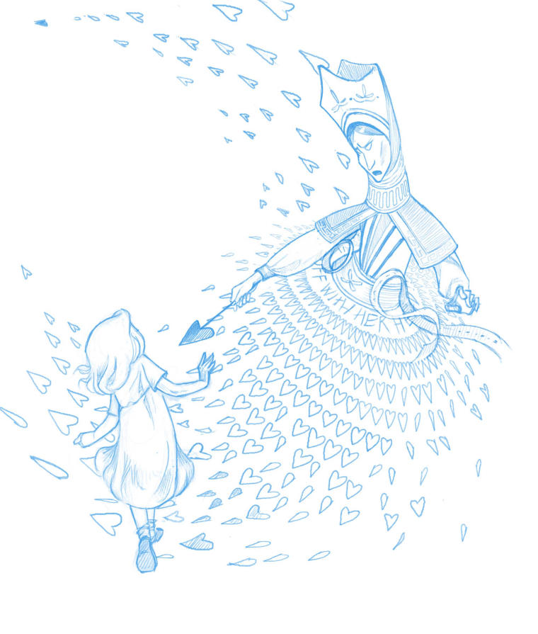
Pencil of the first of the five illustrations: "Off with her head! Feedback welcome!
-
@smceccarelli Love the costume design of the Queen!! - for feedback my first thought is that if you were to take Alice's feet and legs and flip them horizontally so that her left foot was leading that her pose would work better with the twist in her torso and shoulder girdle - one other thought is that the Queen could possibly be made to be more menacing? here are my random thoughts on this....Maybe increase the Queen's scale a bit? Make her shouting more pronounced? Overlap a couple of hearts behind Alice to show more danger? Increase the diameter of the scepter's handle slightly? Possibly increase the scale of the Queen and arch her a bit over or toward Alice....I'm liking the arching toward her idea
none of these ideas are important really - they are just thoughts along the line of how to make the Queen more menacing which does not necessarily need to happen - This is a beautiful drawing!! -
@kevin-longueil You´re a star, all your comments are spot on! I will implement them all!
-
Wow the queen is amazing! Quick note, Alice looks like her left hand is flipping us off.
-
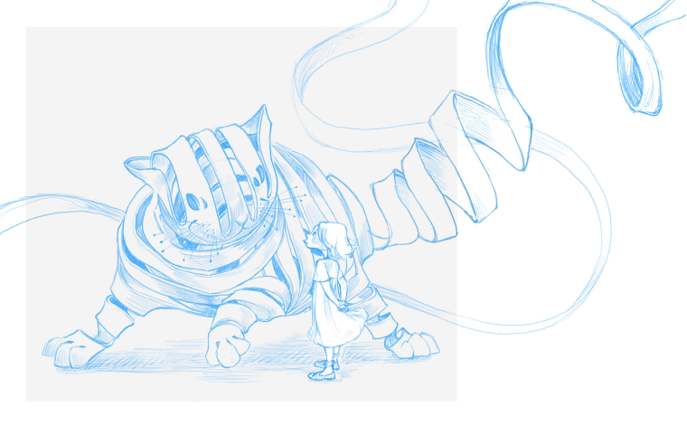
Second illustration pencil pass - the Cheshire cat.
-
I really like this style. It is very whimsical and professional. Alice and Wonderland is such a tried and true staple of children's books that it can look very samey. You have made it your own. Good luck.
-
@smceccarelli Love it!
-
Great project, I love this style looking forward to seeing more
-
I love this take on the Cheshire Cat.
-
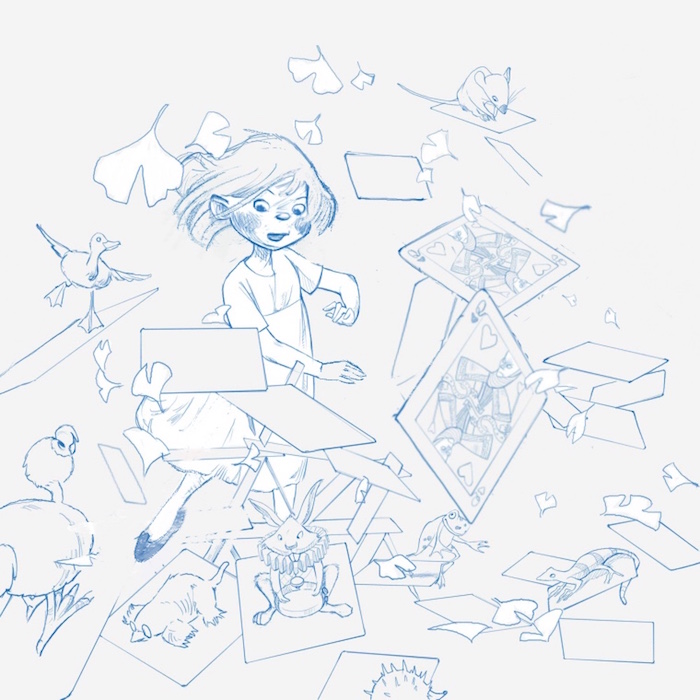
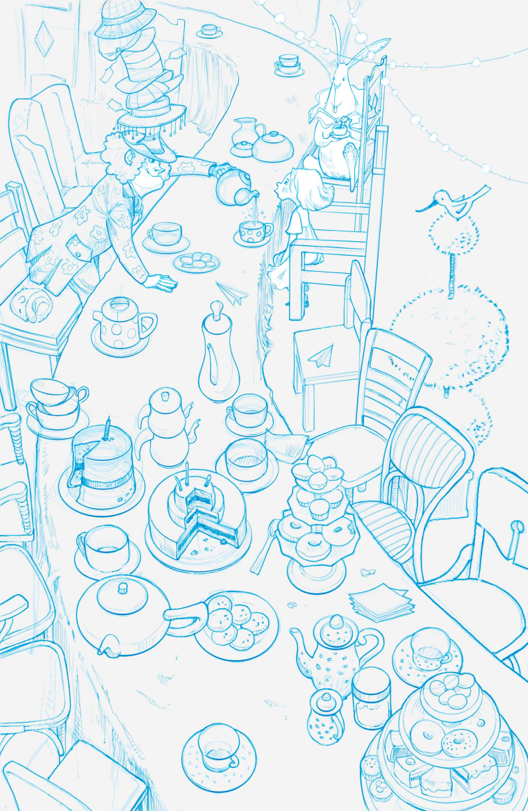
Well, this one was a difficult birth - 50 things all over again, and the perspective drove me nuts. Feedback on composition is highly welcome and if you spot any mistakes in the perspective...I am too tired to see them.
-
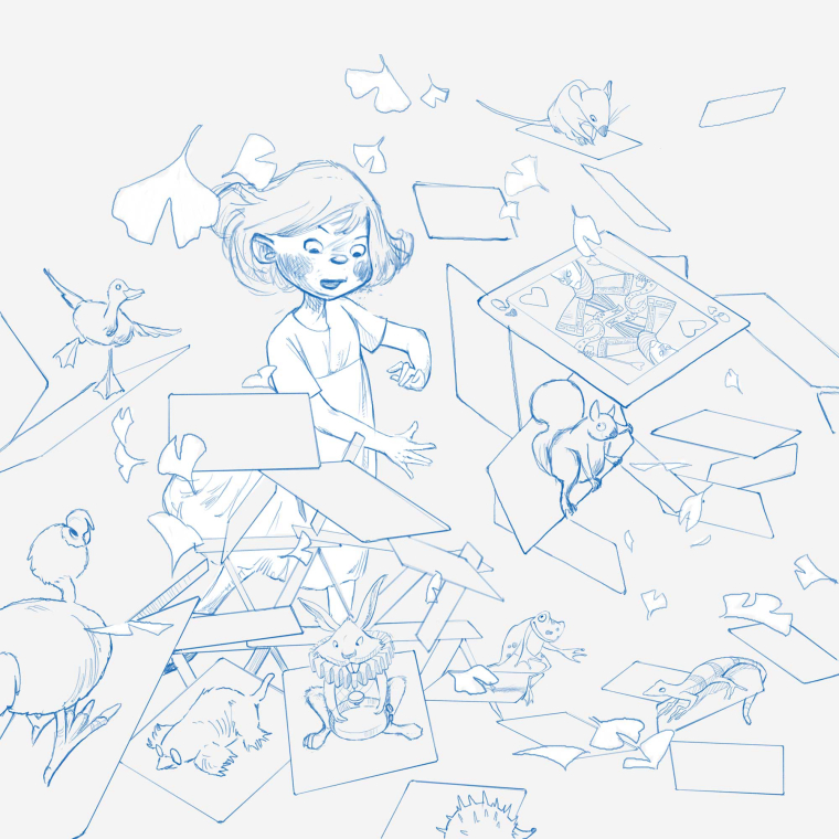
No 4 - "You are only just a bunch of cards"...The card figures are going to be done at the color stage, as it is easier to trace them directly from real cards. Almost time to start thinking about color...one more pencil to do.
-
@smceccarelli Your drawings are so nice!! For feedback on the Tea Party i am wondering if The Mad Hatter and Alice could be closer to us? Maybe more clutter in the background too unless it is supposed to be less cluttered there - i have not read this in a while so i don't remember the details of the Tea Party very well but the drawing is great.
For the "dashing the house of cards" drawing i had a few thoughts - it might be good to see a bit more of Alice especially one of here feet - i feel like she just swatted the cards away and that her eyes should be on the spot that she just hit...it looks like she is looking at her hand and it is making her hand seem very important - i thought that maybe making the most pronounced of the cards be closer to the bottom right of a rule of thirds composition might look good so i tried it really quickly to see - possibly changing her hand to be slightly more closed? I was wondering if the hair could add to the sense of movement or slight twirling that i am imagining that she just did and thought that raising her hair away from her neck might help with the sense of motion - really great work as always! (love the Ginko leaves