Creative composition class - Jeff's Dinosaur WIP Critique please :)
-
I've been doing the creative composition class and got to the point where Jake Parker is showing how he develops thumbnails and Will T says to pause to work on the prompt before watching the rest.
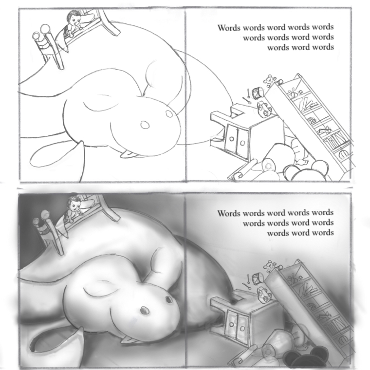
The prompt is: Jeff's dinosaur had grown so big that he didn't know how he'd get him out of the house. Here are my thumbnails, initial sketch from thumbnail and a quick value study.
The idea I've chosen to develop is Jeff's Dino curled up to sleep beneath his bed and then he wakes up in the early hours to find his Dino has grown enormously!
I'm itching to paint this one but I want to go through the whole process instead to jumping ahead.
Do you have any thoughts on how I can make this better?
Thank you
X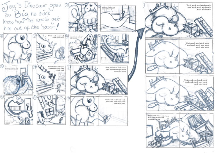
-
This is looking good! I think I would have chosen the same concept to develop out of the thumbnails above. I like the story line of the little dinosaur falling asleep under the bed. It's something you can really picture happening as you read the story and see the illustration.
I think the anatomy of the dinosaur could use some work. I can't really tell if that's a hind leg or a fore leg. Is the bed on its shoulder, or the back? Is the part on the right it's back or it's hind-quarters? How does the tail come around under the neck? I would suggest drawing-through on each of the body parts to help them connect in a logical manner. Have you watched the Drawing Animals course? I just watched this class, and learning/thinking about the bone structure of an animal has helped me see how the different parts should connect and bend.
I like the furniture and other items being tumbled over by the expanding dinosaur. I'm not sure about the bookcase falling toward the dinosaur, however. I don't see how that would have happened from this image, unless the whole room is shaking from the dinosaur's movement--but that doesn't really make sense, since the bed is still on top. Maybe if you had the tail where it could have lashed around and knocked things about in different directions, it could look more plausible. I want to see a reason why the items are toppling off the bookcase right at this moment.
I think the overall composition is very good. You can't miss the main point, & it has 1st, 2nd & 3rd read/hierarchy of the different elements on the page. There is a good balance of detailed area vs. open area, and the text has a good space that fits well with the image. You also did a good job of drawing the eye around the page & always bringing it back into the middle.
I think with a few adjustments, this could be a really great portfolio piece.
-
@miriam Thank you Miriam! Your a star! This is super helpful and given me quite a few things to think about to push it to make it better. I’m going to do some more thumbnailing & Dino drawing to see how I can resolve the things you’ve brought up. thanks again
")
-
@rachy Your thumbnails look really humorous. I know that eager feeling of wanting to jump right to painting, but you're doing it a better way, with lots of planning on the front end, to save time and fixes on the back end.
The way you've organized your thumbnails, though, would benefit from a traditional storyboard structure. Here's an example of one I've used (that Lee White might have shared in one of the SVSLearn tutorials):
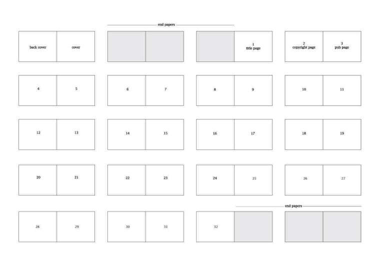
By using this structure, you'll be thinking of each spread layout, and noticing the pacing and progression more. This book dummy layout is for the standard 32 page book, but other standard lengths are 16, 24, and 48 pages, so you can modify it as needed.