Society of Visual Storytelling

    SVSLearn Forums

    • Register
    • Login
    • Search
    • Recent
    • Tags
    • Popular
    • Users
    • Groups
    • Search

    Redesigning (standardizing?) my webcomic characters. Critiques and suggestions most appreciated

    Artwork
    6
    13
    1388
    Loading More Posts
    • Oldest to Newest
    • Newest to Oldest
    • Most Votes
    Reply
    • Reply as topic
    Log in to reply
    This topic has been deleted. Only users with topic management privileges can see it.
    • braden H
      braden H last edited by

      My webcomic's primary purpose is to make me draw at least a page every week. Over the last 300 pages or so I've kinda played around with style from page to page. Once I start up the next chapter I really want to try and be consistent with character design.

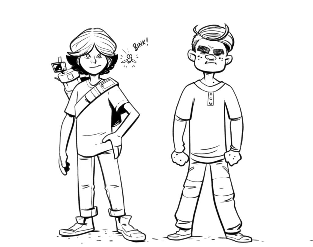
      So what do you think? Lines too thick? Too thin? (the second guy's legs look a little wonky, but ah well). More sets of eyes are most appreciated 🙂

      alt text

      Chip Valecek 1 Reply Last reply Reply Quote 0
      • Sarah LuAnn
        Sarah LuAnn SVS OG last edited by

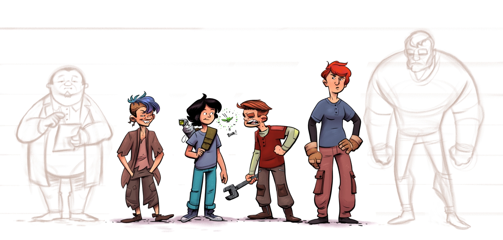
        These look good to me, but it would be easier to give feedback if there were a few different poses for each character, to get more of a feel for their personality as well as consistency in design.

        sarahluann.com

        braden H 1 Reply Last reply Reply Quote 4
        • Chip Valecek
          Chip Valecek SVS Team SVS OG @braden H last edited by

          @art-of-b the lines look good, a little fuzzy but that is prob due to the compression of the upload. Most of my images uploaded into the forums get fuzzy. As far as the boys legs, they are short. Maybe if you lifted his waist up, i believe the waist should come around the middle of the forearm.


          https://www.instagram.com/chipvalecek/
          https://www.facebook.com/cvalecek
          http://www.cshellmedia.com/

          1 Reply Last reply Reply Quote 1
          • Buddy Skelton
            Buddy Skelton last edited by

            I like the style. The boys feet look too small from what I'm seeing compared to the other character. Good start though.

            Instagram: @StepOne_DrawCircle

            braden H 1 Reply Last reply Reply Quote 1
            • braden H
              braden H @Sarah LuAnn last edited by

              @sarah-luann

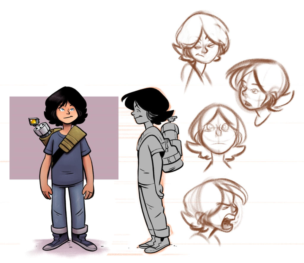
              Doing a character reference sheet for each character is probably something I should do anyways. I think I'll do that sooner rather than later. Thanks 🙂

              1 Reply Last reply Reply Quote 0
              • braden H
                braden H @Buddy Skelton last edited by

                @buddy-skelton

                Thank you! getting proportions right is one of the reasons I'm trying to really nail down the designs.

                Those ARE tiny feet XD

                1 Reply Last reply Reply Quote 0
                • braden H
                  braden H last edited by

                  Adding a couple of extra poses/characters as suggested. Also kinda changed a few things already... (damn you, consistency).

                  Other than keeping character references, does anyone have any tips for staying consistent from page to page?

                  alt text

                  alt text

                  Chip Valecek Jon Anderson 2 Replies Last reply Reply Quote 5
                  • jimsz
                    jimsz last edited by

                    Looks good! Are you using photoshop?

                    http://www.kidstimestudio.com - http://www.kidstimestudio.com/100days

                    braden H 1 Reply Last reply Reply Quote 0
                    • Chip Valecek
                      Chip Valecek SVS Team SVS OG @braden H last edited by

                      I am not great at staying consistent, but I feel what helps is if you do all your sketching on one day, then inks on another and then color on another that will help. If i go page by page, i start to see a shift in how I am painting/inking.


                      https://www.instagram.com/chipvalecek/
                      https://www.facebook.com/cvalecek
                      http://www.cshellmedia.com/

                      braden H 1 Reply Last reply Reply Quote 2
                      • braden H
                        braden H @jimsz last edited by

                        @jimsz

                        Thanks! I'm using Corel Painter instead of photoshop. Weird choice, I know, but I'm used to the program at this point.

                        1 Reply Last reply Reply Quote 0
                        • braden H
                          braden H @Chip Valecek last edited by

                          @chip-valecek

                          Thanks for the advice! This is the advice I got from the how to make graphic novels vid as well. I think the next chapter I'll definitely give it a try.

                          1 Reply Last reply Reply Quote 1
                          • Jon Anderson
                            Jon Anderson SVS OG @braden H last edited by

                            @art-of-b These look good and I really like the expressions. As for consistency part of the trick is drawing the characters repeatedly over and over instead of just doing a couple of character references alone. The more you draw and put them in different poses and angles you'll begin to commit the shapes and quirks that make up that character to memory so that it's easier to draw them when it matters. Keep it up!

                            instagram.com/jonandersonillu

                            braden H 1 Reply Last reply Reply Quote 2
                            • braden H
                              braden H @Jon Anderson last edited by

                              @jon-anderson

                              Thanks! I suppose once I commit to drawing them the same from page to page the designs will kinda cement themselves.

                              1 Reply Last reply Reply Quote 1
                              • First post
                                Last post