Hidden WIP
-
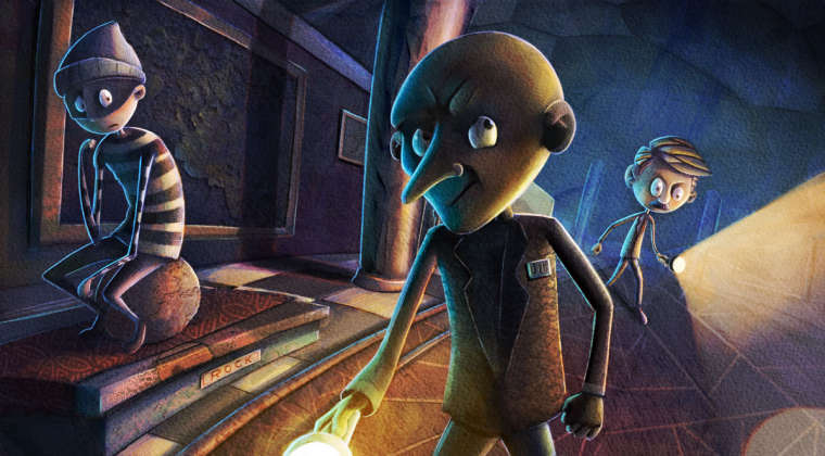
@eric-castleman You've already put in a ton of effort on this so I am hesitant to say what I'm about to say. You mentioned that it probably isn't working based on how you feel and that got me to look at the composition more closely. What if you switched the robber and the column so that the robber is midpicture with the guard? That would take out the big dividing line down the middle that the column makes and shift it to the left. With it being foreground it could take up that side without needing much detail or creating an eye trap. As it is now you have both characters on the edges of the image and what's happening between them just isn't as interesting. Maybe that's why you feel like you're having to force yourself through it.
I would totally feel bummed if I had to wreck a pic I had been working so hard for so long. If you really are struggling and ready to move to something fresh it might benefit you to put this away for a new project and come back with fresh eyes. This is a really cool concept and lends itself nicely to your painting style. Hopefully you'll come up with something you'll really be happy with.
-
@jon-anderson thanks for your perspective on this. I think what bothers me about this piece isn’t the piece itself, but that I am not able to figure out when a piece might be failing earlier rather than later. That drives me bonkers more than a single piece not working out I guess. I really need to get some good material on design.
What I have noticed about my work is that when it comes to design, if I have less going on my pieces work way better, but that severly limits me. I have been trying to get more items in an image, as well as mutliple characters in a scene, and when I do that, this sort of situation rears its head. Any thoughts this sort of problem?
-
@Jon-Anderson makes some good points and suggestions.
I've noticed a pattern that you may be developing- this piece and the going away to college piece are very similar composition wise. You have the composition with the two main elements on either side, with a very strongly contrasted architectural element in the center. For this piece it's the pillar, for the college one it's the house. Just pointing out a tendency you may have, so you can think about how that's influencing your decision making in the future.
As far as things that may help in the future: have you taken the Creative Composition class and the Draw 50 Things class here at svs yet? I think that may help. Even if you don't plan on doing a 50 things piece, a lot of Will's info in it is very helpful. Additionally, what is your preliminary process for your pieces? Do you do any small rough thumbnails? You may also think of doing some master studies where you focus on the placement of things and how they choose to contrast certain areas.
-
@tessaw yeah, I’ve watched those classes quite a few times. My design just has started to get worse, and I cannot understand why. I still go through all the same steps, and in the design/thumbnail stage and when in those stages I feel as confident about a piece as I did before.
The interesting thing about this situation is that I just finished a piece for Highlights, and my drawings, thumbnails and finished work was dead on. I have no clue why I could pull that off wheh I needed to but this stuff isn’t working. Driving...me....bonkers lol
-
Ok, I think I figured out what I am forgetting. There is basically no overlapping. When I don’t consider this, I think what tends to happen is that the indivual items in a piece have no relationship, or feel as though they are propped a certain way for the viewer. All of my succesful work has had succesful overlapping...I now realize that I totally ignored that aspect in this design.
-
@eric-castleman I don't think I'm far enough along in the experience category to offer meaningful suggestions for where you are. Personally, I'm refocusing my efforts toward more simplified work with the intention to get good at that then broaden my scope to more complexity as I go. I think your work is well beyond that stage. Maybe a small adjustment in how much you're trying to do could be the trick? Hopefully the experienced folk can encourage you in the right direction.
-
Oh, glad you could identify what the problem is. Maybe as you discover these things you tend to miss, put it on a list, so you can refer back that list if you get into a weird place again.
-
@tessaw yes, I just wrote down my steps on my thumbnail master copy lol.
-
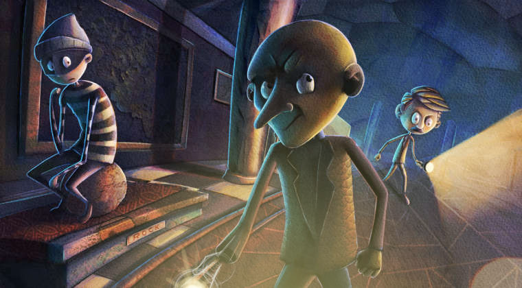
Alrighty, so this is my fix. I decided to add in another guard. I think this helps sell the idea of the robber is hiding, as well as fixes the issue of very little overlapping going on. I am working in the value atm, but hopefully it comes out alright.
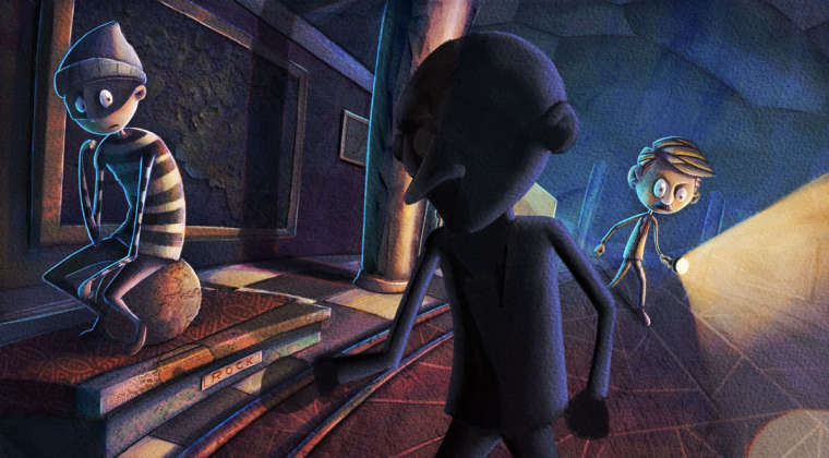
-
still WIP
-
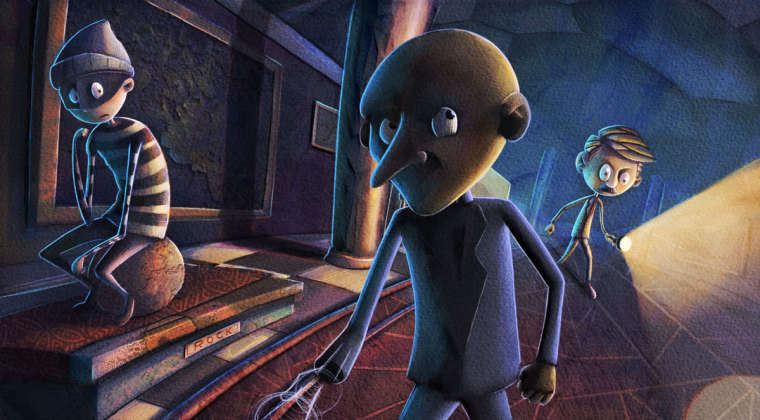
might be hitting this with a bit too much back light idk
-
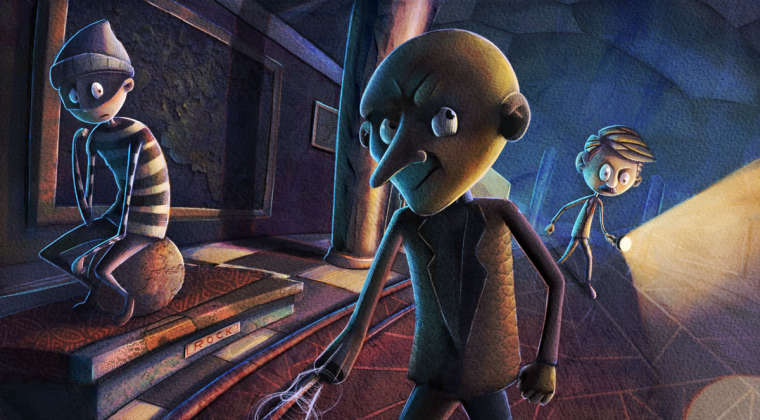
I definitely think the fixes the composition problems. The sightline of the hiding thief really moves your eye around the page now. I am not sure what is going on with the hand of the middle guy. What is he holding?
-
@eric-castleman I like the new addition. Not sure where that back light would be coming from on him, maybe turn the flashlight on the back ground. Also his facial expression almost seems that he is also trying to get away from the other guard. And (clears throat) add a guard hat on him

-
Well done to finish after the deadline. I'm doing the same!
-
@chip-valecek haha. Ya know, I was thinking that a bald night guard would drive you crazy.
-
Lol @Chip-Valecek I think he's right if you want them to look like security guards. Right now they look like mob men or some other kind of criminals.
Suggestion: A large round flash light glare from the middle guy's flashlight, washing him out a bit? It will a) soften contrast on him and b) create a cool lighting effect, almost like we're in the scene.
This is turning out pretty cool! I like your addition of baldy, it feels almost cinematic.
-
I'm wondering, how much sketchbook time are you getting? And specifically drawing from life? I find that I see the biggest jumps improvement in my composition etc. after I spend a good period of time drawing all the things around me. Taking my sketchbook with me everywhere, drawing restaurants drawing buildings drawing people in bars. Use a pen, keep it fast, but the act of paying attention to the big elements, the important things, perspective etc. will start bleeding into your work
-
@stringfellowart is my perspective off? I tend to always used warped perspective. Idk.
-
still gotta add the tie. Anywho, I like the lighting idea, and will probably bring that out more before I am done with this one.
