Hidden (revisted) WIP
-
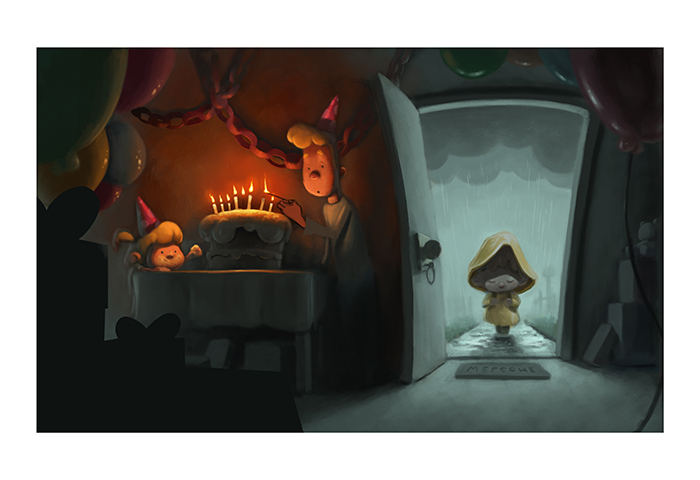
Thank you for all your comments, working towards getting it finished and almost there. A few things left to paint and a still need to give the foreground a little bit of definition, but hopefully it's getting there...
@bnewman Thanks! I agree it's a bit too dark, slowly adding in light's but don't want to lose the contrast and yeah there were probably too many candles for such a small child

@lmrush thanks, the last warm and cool piece I did was too depressing for most so I needed something a bit happier!
@Johanna-Kim I'm surprised you like my line work, I hate my line work and feel it's a area I need to improve upon a lot lol I've tried to work on balancing the colors a bit more and although it's not done I hope they work better than the last version.
-
Personally, I think the more somber tone with a bit more muted colors works really well. I have a fondness for this kind of contrasting moods though and it depends on what feeling you want here of course. The multi-colored candles also work well together with the bright light source and draw the eye in.
-
I think the letiers on the welcome mat should be flipped. Great illustration.

-
Great progress but it’s still too dark for me. I still ca’t quite make out some of the objects. Perhaps lighten the interior of the house a bit. I hope this helps.
Portfolio: nyrrylcadiz.com
Instagram: https://www.instagram.com/nyrryl_cadiz/
YouTube: https://www.youtube.com/channel/UCbJCF1Im8ZO7hpGWTKOJMuA -
@nyrrylcadiz it's good you cant make out some of the objects. Objects falling off into shadow is a strong way of focusing the composition
-
@gary-wilkinson Hey Gary, I LOVE this concept! Makes me want to make a 3d scene based on it, it has such a great mood!
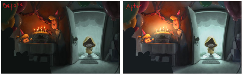
I hope you don't mind, but I took the image and played with it a bit in Photoshop, mainly messed with the exposure and curves to give it a bit more light overall. Can't wait to see the final version!
-
@rcartwright i guess you’re right but you can still lighten the interior without stealling focus from the main subject. For example, coloring the interior with a lighter but muted, cooler color. It just helps the illustration to be more readable.
-
This post is deleted! -
Again, thanks for everyone's comments and suggestions. I'm calling the piece done as it's a time sink to get it perfect, but im happy with how it has turned out, hope it's appealing:
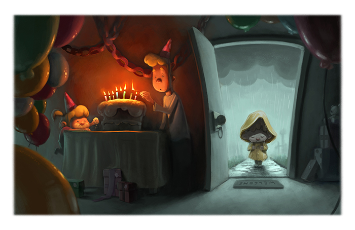
@Jason-Bowen good catch, I flip the image a lot and forget I wrote it the wrong way
@JulPer It would be great to see it modeled up
") Thanks for the adjustments. I think pushing the exposure slightly was a good idea.
Thanks for the adjustments. I think pushing the exposure slightly was a good idea. -
Gary, this turned out great! I love the mood of this piece, the little sister is great, and the balloons are so shiny!
-
@gary-wilkinson YES! That teal lighting you did on the right side really makes thing more easy to read and the lighting on the ballons is subtle but does wonders to the whole illustration.
-
It turned out awesome! I agree that the reflections on the balloons framed the whole thing in a really good way.
-
Dude! Love this! Now this is what I call illustrator eye candy!
-
Oh wow! This really turned out.
I'm still struggling with light and colour so this kind of thing is inspiring
-
@gary-wilkinson It turned out awesome! I really like it, it still keeps the original mood without being too dark. Great work!