Does this look too digital?
-
@eric-castleman Thanks for the tip! I struggle with adding texture when I work digitally. I'll redouble my efforts now.
-
@art-of-b Let me first say that I love your character! great drawing skills, emotions, and values.
that said...only in digital media can you mix styles/brushes in 1 illustration and keep every thing so clean and separated. the characters look like paper cut outs which is not a bad thing in itself but it is if you want it to look traditional.
If you use ink, grey marker/pencil and charcoal, they will have to bleed into each other or smudge a little. also you won't normally find a white halo around the boy unless you purposefully pick it out with a kneaded eraser or something.
my suggestions:
-
avoid using the blur tool on edges.
-
try to find list item a textured brush that mimics charcoal and shade most of your darks with it. lowering the opacity or flow could help a little with adding a softer edge to your smoke.
-
keep the smoke behind the boy lighter to match the same tone as the halo or make the gradation more gradual over a larger distance.
I hope this helps
-
-
@eric-castleman Oh wow! That's really good to know about texture. I think that what I consider too much texture almost everyone else considers way too little XD.
I'll have to try and up the texture a fair bit from now on
-
@justin-moss said in Does this look too digital?:
try printing out the lines of the illustration and using charcoal to create the smoke
Good suggestion! I am, however, far too lazy. Digital has ruined me in some ways...
-
Thanks Heidi! Rest assured everything'll be more blended and less cut-out once it's done (lots of work left to do on the characters and such).
-
@adc 'Very Bill Watterson' is one heck of a compliment! Thanks
")
-
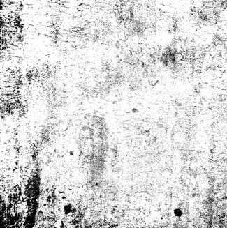
@art-of-b I think by texture they meant real images of texture like grunge and rust that you can blend with your image using layer modes.
-
@kevin-longueil said in Does this look too digital?:
I would love to watch process videos of your work!
I keep meaning to do that. Don't have time right now, though
-
@heidigfx Right! I keep forgetting I use textures like that :)_
I'll try that once I'm near the end of my whole process.
I've tried using textures with layer modes in the past (waaaaay back when I was starting digital) but I could never make it look natural. It always looked kind of tacked on when I tried it.
-
Awesome advice, thank you
-
@art-of-b less is more
") when it comes to textures, lowering the opacity of the texture layer can help. Use a mask and erase some of the texture to confine it to a certain area. Your work is amazing, we're talking specific style now, you got this... i don't need reassuring
when it comes to textures, lowering the opacity of the texture layer can help. Use a mask and erase some of the texture to confine it to a certain area. Your work is amazing, we're talking specific style now, you got this... i don't need reassuring 
-
Wonderful image: characters, shapes, line quality: all awesome!
I’d recognize it as digital because of the regularity of the texture...but I’m not sure everybody would. I do digital art exclusively, so I know how the brushes look like and recognize them when I see them.
Applying overlay textures is a common way of avoiding that and I do it myself. An excellent source of textures is Textures.com. You need an account, but after you login you can download up to 16 mid-res textures for free per day. If you want high res, you need to pay something, but mid-res is often enough. Another source I found recently is called PixelSurplus. It´s a marketplace, so you buy the files, but there are quite a few freebies and there´s a guy there who specializes on textures.
Applied textures have a problem though: they don’t follow the forms, so they don’t really look as if they were made by hand. I can definitely recognize them too, though it’s not so easy if it´s done well.
The best approach to avoid the “digital look” for me is to use highly textured brushes that have an inbuilt texture “variance” in their stroke. Many of Kyle´s brushes are like that, so I tend to use them exclusively. Also avoiding to “clean up” too much - leave the edges a bit irregular, leave the pencil strokes partly visible, etc...
There are other tricks with colors and process, but maybe the subject of another post! -
@smceccarelli which are some of your favorite Kyle Brushes?
-
Thank you for the advice. I'll be sure to check out textures.com
One of the problems I have is that I use Painter, and instead of building paper texture into the brush it applies a paper texture to the whole canvas. This is cool in some ways, but in others it's frustratingly regular.
-
@chip-valecek Took a screenshot of my "fav" folder
I use these for 99% of my art.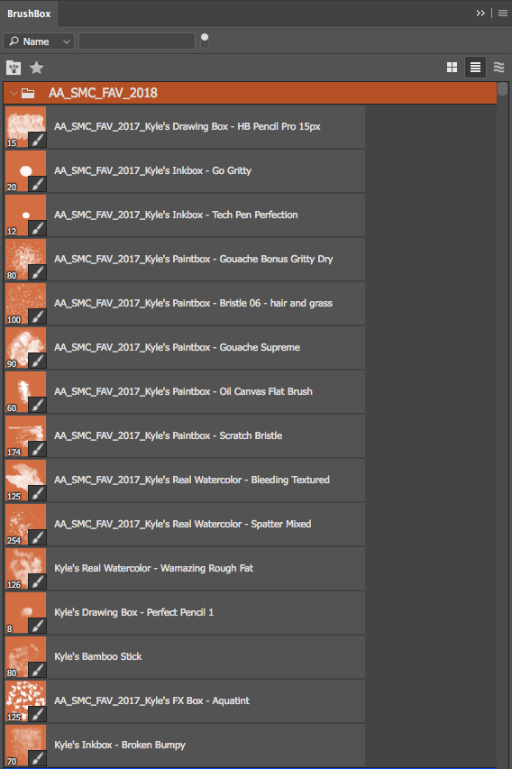
-
@eric-castleman I thought your “music’ entry was watercolor! How did you achieve that texture digitally? I will be first in line to buy one of your books when you are published—just Love your work.
-
@eric-castleman This is really excellent advise. Im still working on texture myself.
-
@bichonbistro Thanks for the nice compliments. I use a lot of texture, and I do not use many tools to paint faster. I treat it like a piece of paper, and limit myself to using basic brushes for painting, and for the details I use the basic pencil. I think the trick is that when I use texture I try my best to be spontaneous. One thing traditional has over digital are the accidents that come with it, such as not being able to control the water flow completely when doing watercolor painting, as well as exactly how each brush stroke will look when painting with oils. So when I drop in texture, I try my best to turn off my brain and just go with it. I start warping the scanned image without much thought, and when something clicks I stop, and I try to make sense of it.