2ND TAKE- Misunderstood Monster WIP
-
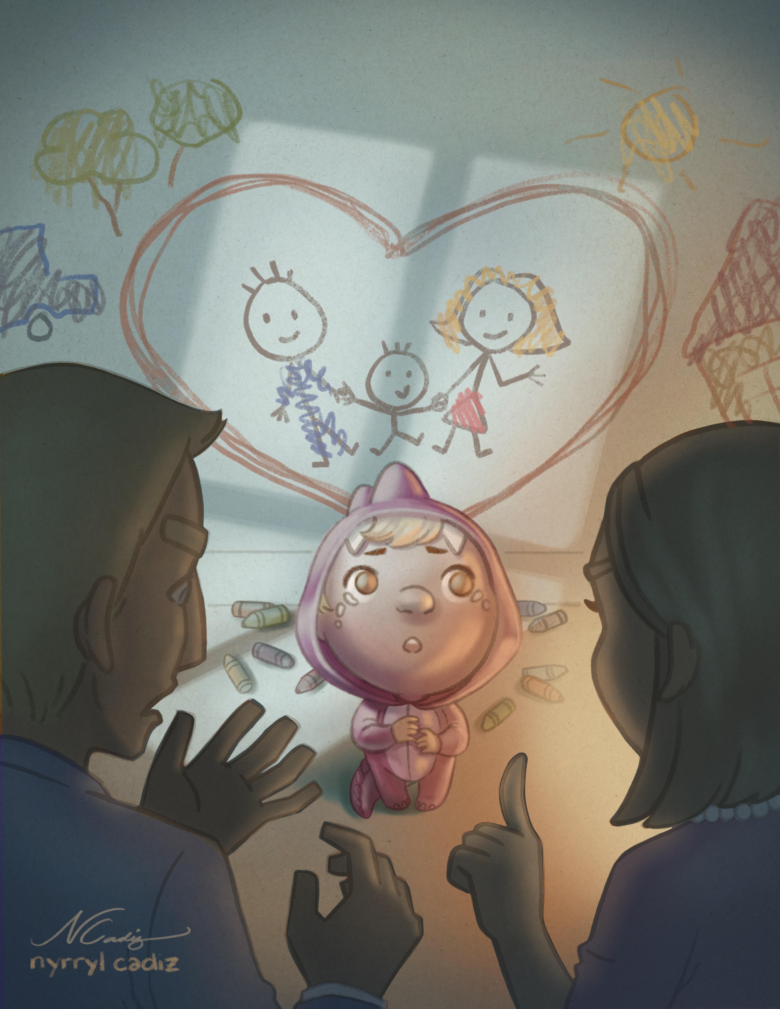
One small thing to consider would be changing the color of the gray/brown outlines on the crayon drawings. Right now if I were to see the car, tree, sun, or house out of context I would tell you that they looked like they were colored-in by a kid, but not necessarily drawn by one. They're kind of giving off a coloring book vibe. If you change the outline to the same colors as the scribbles and maybe make the outlines a little messier I think it will look more like a kid that size drew them. Here's a cool article on kid's art at different stages of development: http://www.artjunction.org/young_in_art.pdf
Taylor Woolley
(Formerly Taylor Ackerman / StudioLooong)
Website: www.woolleystories.com
Instagram: https://www.instagram.com/woolleystories/ -
@studiolooong hi! Yes, i see what you mean. I’l definitely work on that. Thank you so much!
-
I did a quick edit on the piece. Here it is. I removed the brown outlines on the wall sribbles and got rid of the words. I hope you guys like it. Please let me know what you guys think. Thanks.
Portfolio: nyrrylcadiz.com
Instagram: https://www.instagram.com/nyrryl_cadiz/
YouTube: https://www.youtube.com/channel/UCbJCF1Im8ZO7hpGWTKOJMuA -
Amazing!!!!
-
@kathrynadebayo Thanks, Katheryn!
-
@nyrrylcadiz It looks SO GOOD
-
Great work @nyrrylcadiz ! That kid is super cute. I do think that the text above the heart works better but both are great

-
@eli Thank you so much! I’m very happy you like it.
-
@gary-wilkinson Thank you! It means a lot coming from you.
-
I love your picture, its splendid!

-
@ailantan Thank you so much!
-
This painting looks great! It's making me feel guilty for getting mad at my kids. Very effective!
SVS name: @dlarmantrout
Instagram: @dlarmantrout -
@dlarmantrout wow... To know that your work could reach other people on a deeper level is very moving. Thank you so much!
-
@nyrrylcadiz it turns out so good! the kid is super cute!
")