Misunderstood Monster (vote)
-
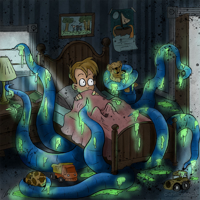
B, Cool idea! A looks a little like a cut out to me.
-
I like B best, too. The white line just adds a little confusion for me.
-
I think in this case option B works best, here.
They're both good, but I'd definitely go with the version without outlines.
Maybe softer outlines? Like on their own layer at 30% opacity using a nice green-ish colour?
-
I like B too. The slime is really fun. There should be more slime in kids books!
-
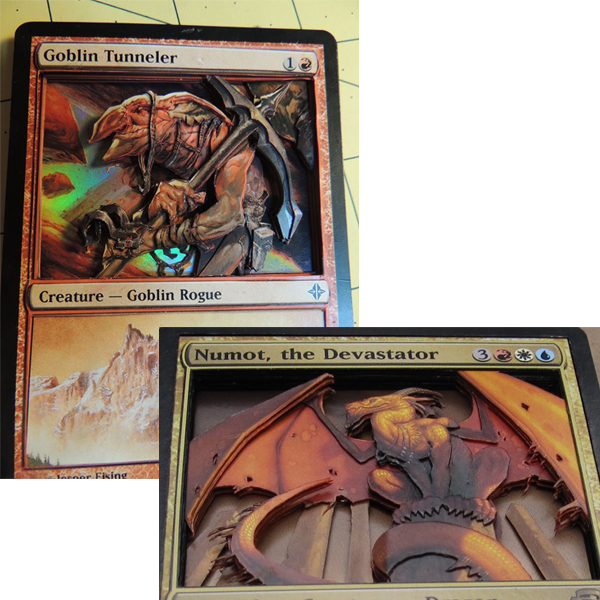
I think style A has potential to look like a 3D layered paper style and is worth exploring. It reminded me of these 3D Magic cards some people make with several cutout layers to give it depth:

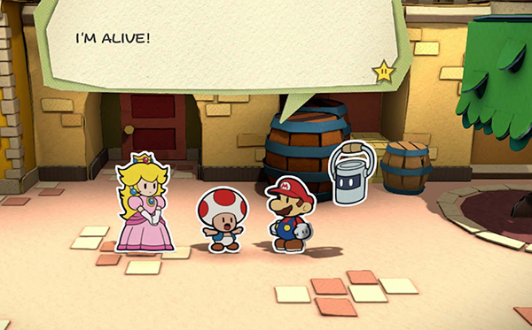
Or Paper Mario! It could be a fun look.

-
Wow Chip, I really love how this one turned out! The color palette, linework, and subtle texture are really appealing. I first viewed this on my phone and liked A initially, but after looking at it on my desktop, I'm leaning toward B. I am sort of wondering what it would look like with the dark splatters on A, but without the white outlines. Something about those splatters gives it a lot of energy and interest.
-
I vote for B, although I do like the splatters.
-
I want to like A but I’m going to vote B.
This turned out really good.


-
I like B too.
-
They both great! but I prefer B

-
