Society of Visual Storytelling

    SVSLearn Forums

    • Register
    • Login
    • Search
    • Recent
    • Tags
    • Popular
    • Users
    • Groups
    • Search

    Nightmare Before Christmas critique please

    Artwork
    2
    6
    597
    Loading More Posts
    • Oldest to Newest
    • Newest to Oldest
    • Most Votes
    Reply
    • Reply as topic
    Log in to reply
    This topic has been deleted. Only users with topic management privileges can see it.
    • holleywilliamson
      holleywilliamson SVS OG last edited by

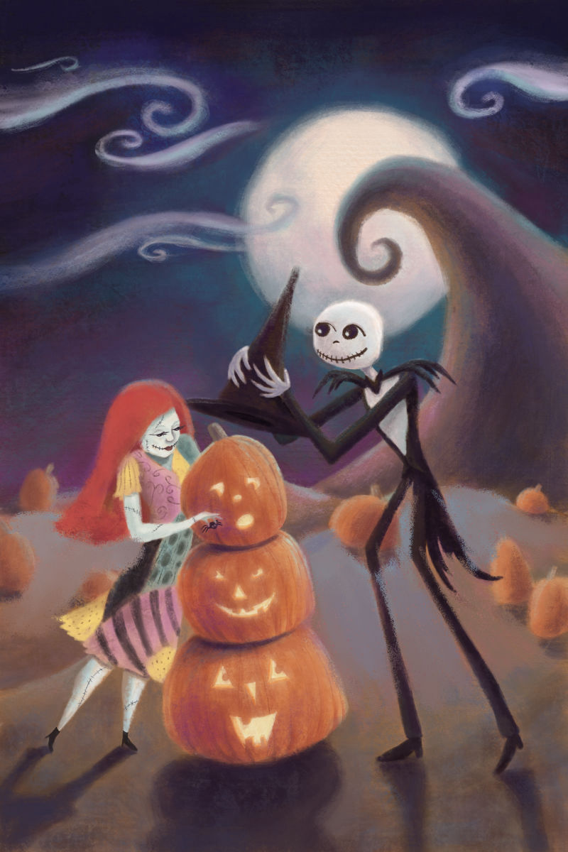
      I meant to get this done before Halloween but I got sick this last month. Let me know what you think about this fan art. The poses, the color and value balance especially
      0_1541193693999_CD030CEA-AA18-4588-A81D-E631A8D352CC.jpeg

      https://www.instagram.com/holleywilliamsonart/
      http://holleywilliamson.com

      1 Reply Last reply Reply Quote 2
      • TwiggyT
        TwiggyT last edited by

        Hi Holley!

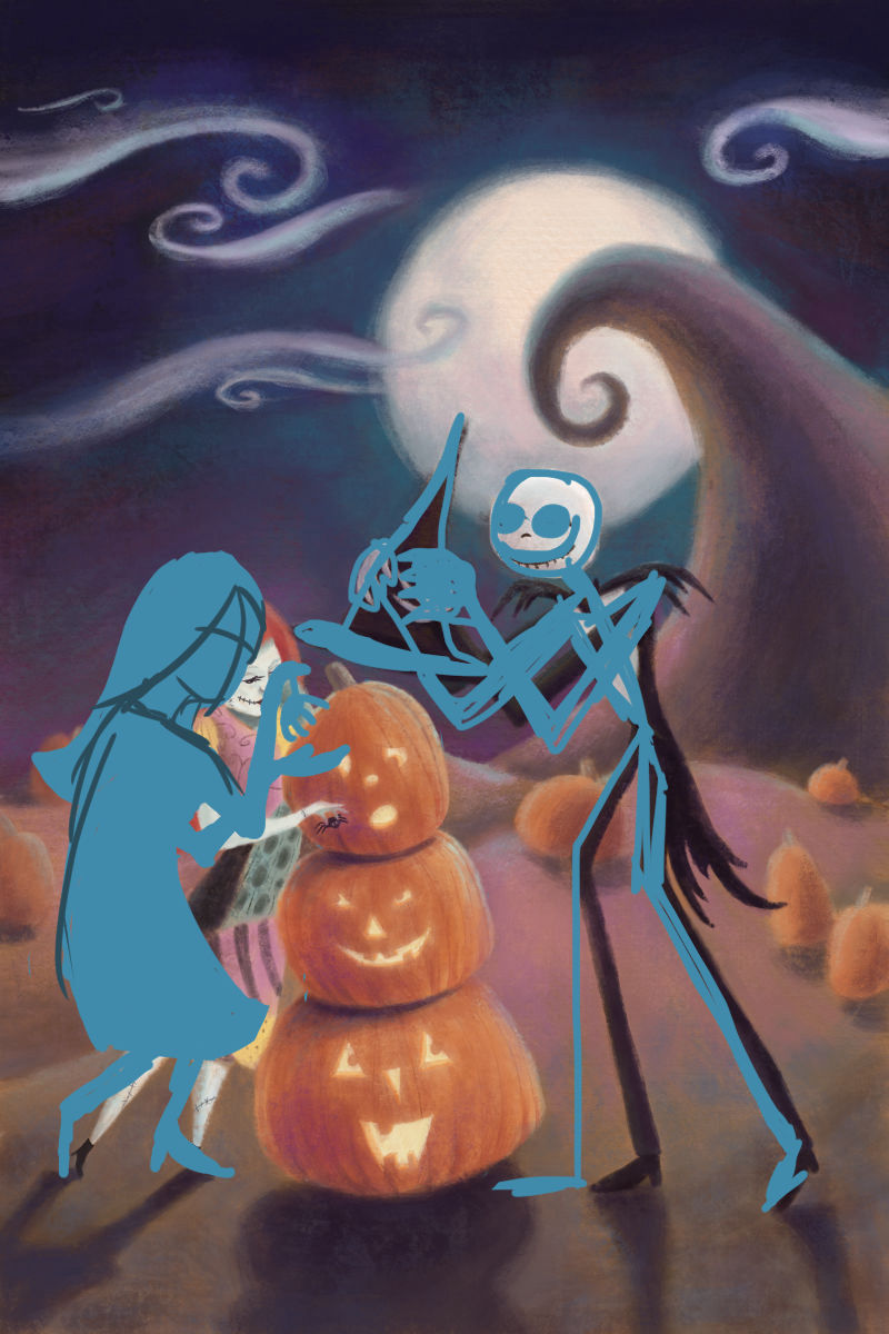
        I did a little draw-over; I hope you don't mind.

        Jack's pose is really good, and there are only slight tweaks that I would make with his arms.

        Sally's pose is a bit more ambiguous, and what she's doing isn't clear at first glance. I'd move the spider up a bit and reposition Sally so that she reads more clearly in silhouette. As it is her head and shoulders are hunched, and Sally moves more freely than that in the movie (sometimes with or without limbs, ha ha).

        Here's my draw-over. My Sally drawing is pretty crappy, but hopefully it illustrates what I mean.

        0_1541361801239_1541193714594-cd030cea-aa18-4588-a81d-e631a8d352cc-resized.jpg

        http://twiggyt.com
        Instagram: www.instagram.com/twiggyt_art/
        Twitter: @twiggyt_art

        1 Reply Last reply Reply Quote 4
        • TwiggyT
          TwiggyT last edited by

          I thought of something else concerning color. In the foreground you have a lot of pink immediately behind Jack and Sally, and that's drawing my eyes away from them. If you cool that down it will help them both stand out more:

          0_1541362148233_1541193714594-cd030cea-aa18-4588-a81d-e631a8d352cc-resized2.jpg

          Your shadows look great, and the rest of the background looks really nice. I think cooling that bit of foreground down will help pull things together.

          http://twiggyt.com
          Instagram: www.instagram.com/twiggyt_art/
          Twitter: @twiggyt_art

          holleywilliamson 1 Reply Last reply Reply Quote 2
          • holleywilliamson
            holleywilliamson SVS OG @TwiggyT last edited by

            @twiggyt thanks for taking the time to do the draw overs. I will have to play around some more. Good call on the color.

            https://www.instagram.com/holleywilliamsonart/
            http://holleywilliamson.com

            1 Reply Last reply Reply Quote 1
            • holleywilliamson
              holleywilliamson SVS OG last edited by

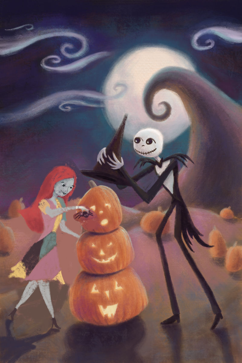
              So Sally is really rough but is this pose better?
              0_1541715010660_E14BDFD3-34F6-4294-B751-CF3BFB1C4DAA.jpeg

              https://www.instagram.com/holleywilliamsonart/
              http://holleywilliamson.com

              1 Reply Last reply Reply Quote 2
              • TwiggyT
                TwiggyT last edited by

                That reads a lot better!

                http://twiggyt.com
                Instagram: www.instagram.com/twiggyt_art/
                Twitter: @twiggyt_art

                1 Reply Last reply Reply Quote 1
                • First post
                  Last post