Society of Visual Storytelling

    SVSLearn Forums

    • Register
    • Login
    • Search
    • Recent
    • Tags
    • Popular
    • Users
    • Groups
    • Search

    Business cards

    General Discussion
    8
    10
    565
    Loading More Posts
    • Oldest to Newest
    • Newest to Oldest
    • Most Votes
    Reply
    • Reply as topic
    Log in to reply
    This topic has been deleted. Only users with topic management privileges can see it.
    • Adrian K
      Adrian K last edited by

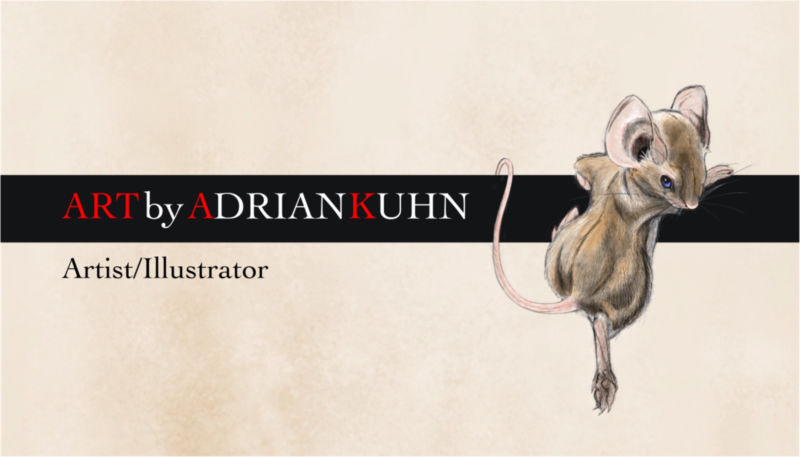
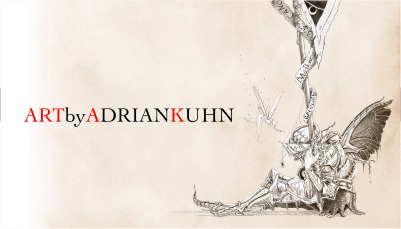
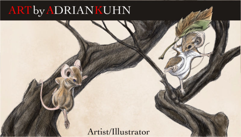
      So I’m finally getting around to making some business cards but can’t decide what to use, I’ve come up with 3 options. Please let me know which you like or if you have any suggestions, I’m all ears. I will have my website and other info on the back.

      2_1544682625085_663D5068-B58B-4847-BC80-9576C972E514.jpeg 1_1544682625085_DB9E49FB-FFB8-4EC0-A2BE-4AB9A25244B1.jpeg 0_1544682625085_03AF1FA5-4C09-4078-BE4D-279E2461F248.jpeg

      https://www.artbyadriankuhn.com
      https://facebook.com/artbyadriankuhn
      https://www.instagram.com/artbyadriankuhn

      sigross 1 Reply Last reply Reply Quote 1
      • Nyrryl  Cadiz
        Nyrryl Cadiz SVS OG last edited by

        Of I were to choose, i’d go with either the first or the thrid one. I prefer them more because of the mice. Now if I were to choose between the 2, I would really like to go with the first one because it’s more professional looking.

        Portfolio: nyrrylcadiz.com
        Instagram: https://www.instagram.com/nyrryl_cadiz/
        YouTube: https://www.youtube.com/channel/UCbJCF1Im8ZO7hpGWTKOJMuA

        1 Reply Last reply Reply Quote 2
        • sigross
          sigross @Adrian K last edited by

          @adrian-k I think the first one is the best because the cheeky mouse is interacting with your title. If your details are on the back have you tried one version with just an image, without any text on the front? After all a business card is like a mini postcard.

          www.grossiebazaar.com
          www.sigross.com
          www.instagram.com/sigross/

          1 Reply Last reply Reply Quote 1
          • rcartwright
            rcartwright last edited by

            I like the first one, the second one is also nice but the image may not read well in a small version. One the third one the words at the bottom look like they will land outside the safety zone, not sure if you have downloaded your printers template yet.

            Cheers

            https://www.scbwi.org/members/richard-cartwright/
            https://www.instagram.com/richardwcartwright/
            https://www.pinterest.ca/richcartwright3/art-of-richard-cartwright/
            https://www.richardwcartwright.ca/

            1 Reply Last reply Reply Quote 1
            • burvantill
              burvantill Moderator last edited by

              I like the first one. It’s cute and readable. 👍

              Lisa Burvant
              www.lisaburvant.com
              Instagram & Twitter & SVS: @burvantill

              1 Reply Last reply Reply Quote 1
              • Erin.Cortese
                Erin.Cortese Moderator last edited by

                As an experienced graphic designer (of 15 years) I can say hands down the first option. The first design communicates clearly and effectively, and it is also the most aesthetically pleasing. Great design!

                1 Reply Last reply Reply Quote 1
                • Adrian K
                  Adrian K last edited by

                  Thanks all, I was leaning towards the first, but then second guessed myself.

                  https://www.artbyadriankuhn.com
                  https://facebook.com/artbyadriankuhn
                  https://www.instagram.com/artbyadriankuhn

                  1 Reply Last reply Reply Quote 0
                  • jthomas
                    jthomas last edited by

                    Since everyone picked the first one I must be an art director cause that's what I like. Lol

                    But the Graphic designer in me asks about the Red A and K. Is it significant? It's slightly distracting when I read the name. But overall this is an awesome card. Any cardstock in mind?

                    To Thy Self be True

                    Adrian K 1 Reply Last reply Reply Quote 0
                    • Adrian K
                      Adrian K @jthomas last edited by Adrian K

                      @jthomas, there is a two part significance, first I’m associating “ART” with my name, drawing a parallel between the product and me. Second, I’ve seen too many examples out there where because everything is in caps, it’s hard to distinguish where one word/name ends and the next begins. As for card stock, I’ll be going for one with a soft (velvet like) feel.

                      https://www.artbyadriankuhn.com
                      https://facebook.com/artbyadriankuhn
                      https://www.instagram.com/artbyadriankuhn

                      1 Reply Last reply Reply Quote 0
                      • KathrynAdebayo
                        KathrynAdebayo last edited by

                        The first design looks great to me too. In case it's of any assistance to you, I thought I'd mention that when I first saw the little mouse (on a small screen), I thought the inner ear was the eye, the tip of that ear the nose, and the shoulder blade and elbow the ears... but then there were additional features (the real face) that my mind was confused by for a few seconds until I zoomed in and realized the correct orientation of the little fellow's head. Since these will be printed small, I thought I'd share my experience for what it's worth. Thank you for sharing these choices and your decision making process with us. 🙂

                        1 Reply Last reply Reply Quote 1
                        • First post
                          Last post