Creative Composition Critique
-
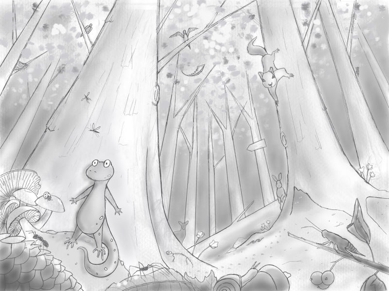
Here is my refined sketch for the creative composition assignment. This is my first large composition, so I am looking for feedback in all areas. Any feedback is helpful! This composition took me a long time, so I am at the point where I just can't see it clearly anymore. Thanks

-
So cute! Maybe push the contrast in the lizard and squirrel so the eyes go right to them? I would put the images darkest dark onto the lizard. Or they may "pop" extra with color depending on your strategy. The narrative and design and perspective are really stand out though.
Poor lizard! I feel afraid on his behalf!
-
The feeling this evokes is great and the characters are fun. I think the perspective does a ton for what you are trying to communicate.
I am working through "Creative Composition" as well and one thing I think is that you need to push the values stronger. Your spectrum of value is pretty small no really dark darks and no really light lights. I would agree with @ThisKateCreates that pushing the value contrast in the lizard and squirrel would create more focus.
Otherwise, I am loving it.
-
@thiskatecreates Thanks, I don’t know why I am so afraid to use higher contrast! I always tiptoe around tonal values. I’m working digitally so I shouldn’t be afraid of making a mistake. I should probably spend a lot of time experimenting with it here. I would never have thought of using the darkest dark on the lizard though, I am going to give that a try!
-
@inkandspatter I tend to like to use the most saturated color or the darkest dark and/or lightest lights in the area of focus. I think you the foreground (or sometimes plane of focus) usually claims both the darkest dark and lightest light and values compress in mid and background. You could compress in the dark range /low key for the background trees for an eerie feel or move higher key if you want a light, fun forest idea.
I'm not sure the best way to add contrast to the squirrel and keep him further back though. If you do a low key bg you could make him lighter against it and that would draw the eye. You also have several branches and the tree shapes pulling the eye to the squirrel.
It does feel like having the lizard draw the eye first and then the squirrel tells the story well though.