January BIG WIP-- Feedback/Critique Welcome!
-
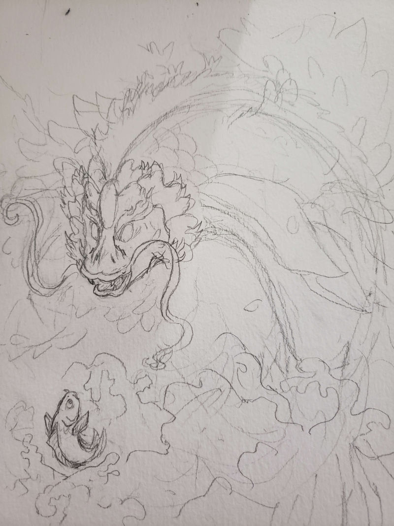
For this concept, I wanted to go with an illustration. The basic gist of the story is based on the Chinese folklore of the Dragon Gate of the Yellow River. It is said that if a carp was to swim upstream and jump the gate, they would become a dragon.
So, the large figure I am not sure what he is, either a spiritual guardian of the gate, or an unsuccessful carp stuck in spiritual realm magic limbo. I am leaning on the last idea. Either way, the character questions the small carp for his reasons for crossing the gate and assesses whether he would make it. I wanted to have the idea that the concept of BIG isn't necessarily in the large figure's size, but of the large question he poses. Does the small carp took the perilous journey to become a dragon to misuse the new form, to act as a god, for protection, to help others, to prove others wrong, etc.
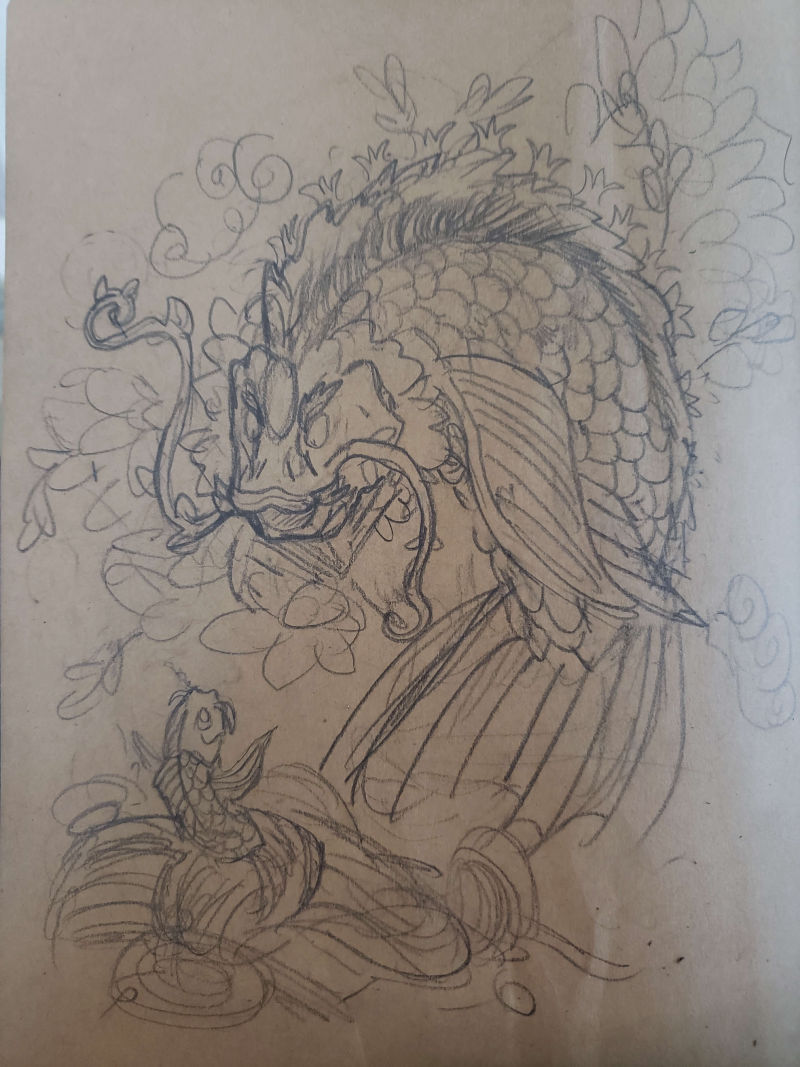
The first picture is the new WIP.
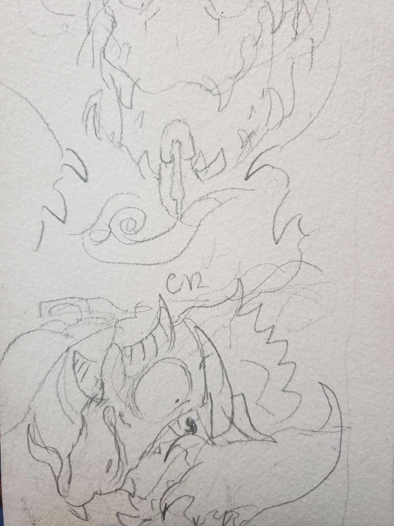
The second picture is the original sketch idea I made months ago. The plant sketches were to symbolize that the large figure was a deceased spirit of warning whose physical body was now full of growing plants, to show how long ago all that was, the plants making up what would have been dragon parts.
In the new WIP I incorporated more "draconic" features on the large figure. It reflects the second idea, as somehow he almost became a dragon but something happened, either whether he was physically stopped by reasons beyond his control, or due to some gods antics/magic/"not worthy enough" aspect that prevented a full transformation. He isn't accepted by the world of fish or of dragons or of the gods, but definitely hunted by the world of man. He's probably spiteful and bitter.I also wanted to incorporate more "traditional Chinese style art style".
The small carp is just a young 2 foot carp.I am planning to make an accompanying short story with the elements described! Thanks for your time and consideration!
-
@rinovarka I love the style and story. This could come out very nice. One thing I would say is that you might want to watch the balance on this one. With both faces on the left side you are going to need something to balance it back over to the right. One thing you could do it move the guardian's head to the top right thirds hot spot?
Just a thought, take it for what it is worth. I will enjoy seeing this one come along.
-The Prairie Fox
https://www.instagram.com/theprairiefox
https://www.theprairiefox.com -
I would urge you to try playing with blocking in some values. You might find that the balance of lights and darks might indicated what details you need to include, and if that means relying on plants or draconic elements to help suggest your story. There's a lot of "line action" going on in the sketch right now at this stage, and simplifying that by blocking in some basic light and dark areas might be useful tool for you to experiment with.
-
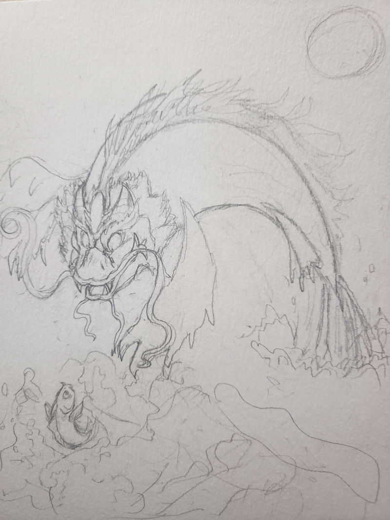
So I was playing around with the concept of perspective here and I was wondering...would this piece look better at a different angle?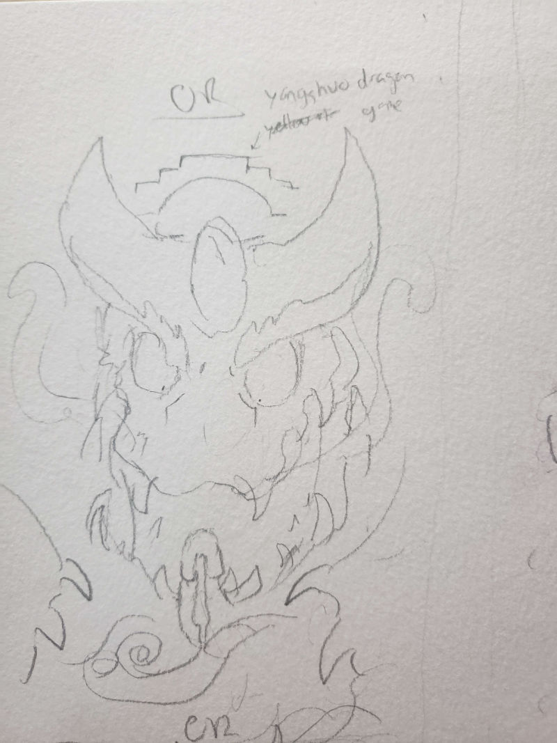
I decided to go with the idea that the focus is being the largeness of the other figure, and to make more threatening features on him. However I am wondering how to pose him?
By far the piece I am already working on would be the easiest for me to complete coloring wise I think, not sure if it is the best choice.
Im also think maybe adding the Dragon Gate may help, as it shows how far the carp is from his goal, compared to the large dragonfish and the waves of the river itself.
-
@theprairiefox So after watching some of Will Terry's Composition 2.0 Class. I haven't gotten to the Balance part, but regardless, I went and changed some of the layout of this piece.
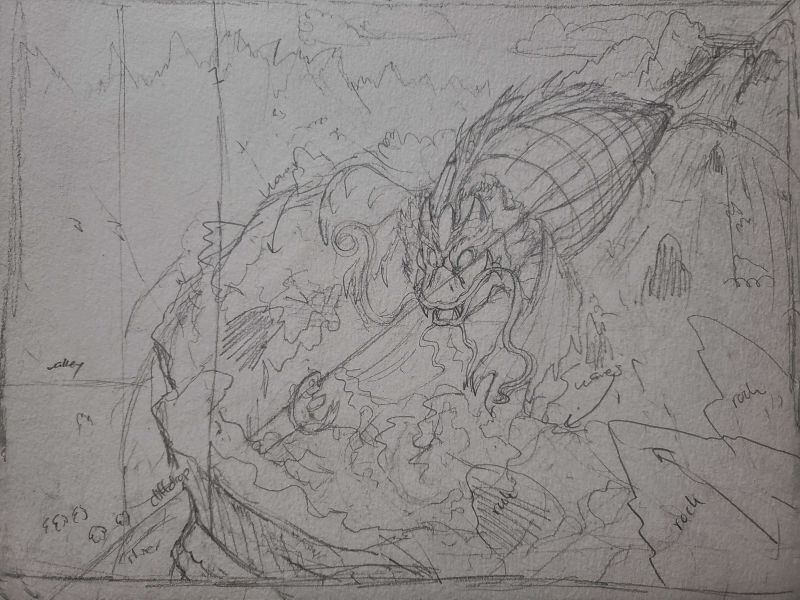
I wanted to make perspective happen in the piece to make it more dynamic to recede into the top right corner where the Dragon's Gate is. I also wanted to make it look like the waves are acting like the larger figure's fins to push the carp off the cliff.
Im not sure if its better to cut the picture off at the "1" line or add the rest of the background. Im biased to create the whole image, backgrounds in all, but what do you think?
-
I love the unique idea!
I would personally cut it off at the #1 line so that you don't have a waste of visual space, if you know what i mean?
-
@rinovarka I like the further out crop lines because part of the bg design leads back into your image and draws the eye to the main figure. It's ok to have a resting spot for the eyes in a composition in my book.
-
@rinovarka I think that if you trim at the "1" line it will put the guardian's face smack dab in the middle of the composition if you leave it as it is. Which I don't think is what you want. Now, if you did trim at "1" and also you positioned the guardian more upright (like your earlier renditions) I think you could get the guardian's face in the top right thirds hot spot (a which is a good thing). And the fish would be in the lower left hot sport making those 2 focal point reinforce each other.
I would agree with @ThisKateCreates that if you like the guardian more horizontal like you have him the larger BG does work because the cliff is bringing the eye back into the characters.