Society of Visual Storytelling

    SVSLearn Forums

    • Register
    • Login
    • Search
    • Recent
    • Tags
    • Popular
    • Users
    • Groups
    • Search

    BIG Entry WIP composition

    Artwork
    12
    37
    2359
    Loading More Posts
    • Oldest to Newest
    • Newest to Oldest
    • Most Votes
    Reply
    • Reply as topic
    Log in to reply
    This topic has been deleted. Only users with topic management privileges can see it.
    • Aaron Pierce
      Aaron Pierce last edited by

      I'm so digging this entry lol The composition and layout is great, and I love the idea. The idea of normal sized being big is a lot of fun 😃

      Aaron "Aarpie!" Pierce
      https://apierceinkandlead.com
      https://www.facebook.com/aaronpierceart/
      https://www.instagram.com/apierceart/

      1 Reply Last reply Reply Quote 1
      • theprairiefox
        theprairiefox last edited by

        Very fun, and good progress. Can't wait to see more.

        -The Prairie Fox
        https://www.instagram.com/theprairiefox
        https://www.theprairiefox.com

        1 Reply Last reply Reply Quote 1
        • ArtofAleksey
          ArtofAleksey last edited by

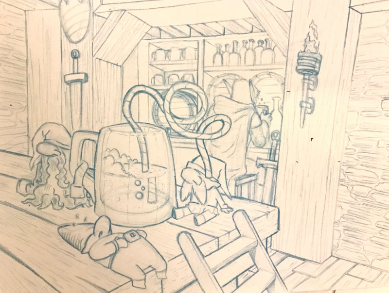
          Ok redrew it on pencil. For space reasons i omitted the wizard and bucktooth gnomes but I think it still looks good.
          Next step is inking.
          0_1547022903973_A9FABFF6-2008-463A-AFFE-7263E44409AE.jpeg

          instagram and twitter: @artofaleksey
          alekseyillustration.com

          ThisKateCreates theprairiefox Johanna Kim 3 Replies Last reply Reply Quote 4
          • ThisKateCreates
            ThisKateCreates @ArtofAleksey last edited by

            @swordofodin This is going great!

            https://www.instagram.com/thiskatecreates

            1 Reply Last reply Reply Quote 1
            • theprairiefox
              theprairiefox @ArtofAleksey last edited by

              @swordofodin I like the simplified version you got going on now.

              You might want to watch the straw in the gnomes eye. It looks a little funny ending there. Might want to just shorten it up a bit.

              And personally I thought the extremely fat gnome from the early picture was a bit more fun, but is your call.

              Looking good!

              -The Prairie Fox
              https://www.instagram.com/theprairiefox
              https://www.theprairiefox.com

              ArtofAleksey 1 Reply Last reply Reply Quote 1
              • ArtofAleksey
                ArtofAleksey @theprairiefox last edited by

                @theprairiefox awesome thanks!!

                instagram and twitter: @artofaleksey
                alekseyillustration.com

                1 Reply Last reply Reply Quote 0
                • Coreyartus
                  Coreyartus Moderator last edited by

                  This is looking so great!!! I can't wait to see a values treatment!! Very very cool--thanks for sharing your process with us!!

                  Children's Illustration Portfolio: https://www.coreyartusillustration.com
                  Art Portfolio: https://www.coreyartusimagery.com
                  Mastodon: https://mindly.social/@Coreyartus
                  Pixelfed: https://pixelfed.social/Coreyartus

                  1 Reply Last reply Reply Quote 1
                  • chrisaakins
                    chrisaakins last edited by

                    I feel that the straw is creating a tangent with the barrel behind it. Perhaps you could simplify the straw or remove it altogether (Although I like how it reads whimsically) Or maybe put a spout on the tankard!

                    Chris Akins
                    www.chrisakinsart.com
                    www.instagram.com/chrisakinsart/

                    1 Reply Last reply Reply Quote 1
                    • Johanna Kim
                      Johanna Kim SVS OG @ArtofAleksey last edited by

                      @swordofodin This drawing is so funny. Your composition also works really well. Re: how well the concept matches the prompt "Big", I had to think about it a bit to make it match, but it works with the following sample text: The gnomes mistakenly thought that their bellies were big enough for a full mug of ale. Suggestion: the gnome closest to the viewer lying down is hilarious and is what instantly caught my eye. I like how round his belly is. Consider emphasizing beer guts on the other two, as well. Or showing one of them doing a big beer belch.

                      http://www.johannakim.com
                      http://instagram.com/johannahkim/

                      ArtofAleksey 1 Reply Last reply Reply Quote 0
                      • ArtofAleksey
                        ArtofAleksey @Johanna Kim last edited by

                        @johanna-kim cool thanks for the tips

                        instagram and twitter: @artofaleksey
                        alekseyillustration.com

                        1 Reply Last reply Reply Quote 0
                        • ArtofAleksey
                          ArtofAleksey last edited by

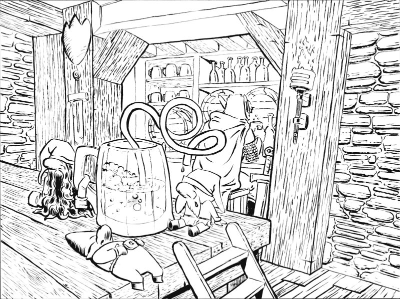
                          Ok i finished inking it. I messed up on a few places which I’m going tk fix on my ipad before coloring it. But here is the inked version:

                          0_1547276603256_3D982FB9-D505-466A-9A6C-8A2F8388423D.jpeg

                          instagram and twitter: @artofaleksey
                          alekseyillustration.com

                          1 Reply Last reply Reply Quote 3
                          • Nyrryl  Cadiz
                            Nyrryl Cadiz SVS OG last edited by

                            Your gnomes are looking awesome

                            Portfolio: nyrrylcadiz.com
                            Instagram: https://www.instagram.com/nyrryl_cadiz/
                            YouTube: https://www.youtube.com/channel/UCbJCF1Im8ZO7hpGWTKOJMuA

                            ArtofAleksey 1 Reply Last reply Reply Quote 1
                            • ArtofAleksey
                              ArtofAleksey @Nyrryl Cadiz last edited by

                              @nyrrylcadiz thanks! I cant wait to color this

                              instagram and twitter: @artofaleksey
                              alekseyillustration.com

                              1 Reply Last reply Reply Quote 0
                              • LauraA
                                LauraA SVS OG @ArtofAleksey last edited by LauraA

                                @aleksey I am just now seeing this, but I really like the version with the darkened room! I like the overall environment. And I rather like the concept of the two staggering gnomes with their arms around each other. I like the others too, though.

                                My main advice at this point would be to make sure you keep eye going towards the gnomes. Although I like the torch light, maybe if it were obviously a light source for the gnomes, or else threw them into sharp silhouette, it would put more focus on them.

                                P.S. Oh wait, the inked version didn't load the first time. Now I see it. It does look good! You can do the focus part with color and value.

                                Instagram: https://www.instagram.com/lauraintorino/
                                http://lauraaldersonart.com/

                                ArtofAleksey 1 Reply Last reply Reply Quote 1
                                • ArtofAleksey
                                  ArtofAleksey @LauraA last edited by

                                  @lauraa hah thanks. Yeah I really liked the staggered gnomes too but I didnt compensate for size when i redrew it in pencil so they had to go. But they will always have a warm place on my ipad.

                                  I think instead of a torch I should have done a little candle next to the gnomes. But we’ll see what happens.

                                  Normally I would redraw it. But seeing as I want to do other work after this that has a higher priority, I’m just gonna go with it.

                                  instagram and twitter: @artofaleksey
                                  alekseyillustration.com

                                  1 Reply Last reply Reply Quote 0
                                  • NizhoniWolf
                                    NizhoniWolf last edited by

                                    Looking great so far @Aleksey !

                                    If you don't mind me asking, i was wondering if you digitally 'planned' all of your work on computer first? I saw that you did several sketches and a grey scale version which showed where the light and shadow sources where and I'm wondering if that helps you when you come to colour it traditionally? I'm asking because i need to learn colour etc, and it seems to be a quicker way to plan out illustrations and something worth trying ^_^

                                    Good luck for this months prompt!

                                    Find me on Facebook and instagram under NizhoniWolf, for my sketches, musings and W.I.P's!

                                    ArtofAleksey 1 Reply Last reply Reply Quote 0
                                    • H
                                      hugowee last edited by

                                      This is so clever and well done. I cannot wait to see it in its final version! I also was wondering if you did some sketching on paper and then worked digitally? Thanks!

                                      1 Reply Last reply Reply Quote 0
                                      • ArtofAleksey
                                        ArtofAleksey @NizhoniWolf last edited by

                                        @nizhoniwolf @hugowee hi thanks I’m glad you like it! So the new way I started approaching my art (might change once photoshop comes out for the iPad) is I do some composition sketches first on my ipad using procreate. I then make slightly more refined sketches on a new layer. After that I do values also on ipad. When i good general sense of the image I start sketching on paper, which may take several attempts depending on how happy I am with it. The Aaracokra sketch took 2, the adventure kid took 1 because it was a simpler design and I spent more time on the character design on the ipad. For this gnome contest entry I didnt redo it even though i wanted to because this does seem to be a more time consuming process. After the pencil sketch I do an ink over it with my brush pens. Then I scan it and put it into photoshop to get rid of the red or blue pencil lines and then send it to my ipad and finish coloring it on procreate.

                                        instagram and twitter: @artofaleksey
                                        alekseyillustration.com

                                        NizhoniWolf ThisKateCreates 2 Replies Last reply Reply Quote 1
                                        • NizhoniWolf
                                          NizhoniWolf @ArtofAleksey last edited by

                                          @aleksey Thanks for explaining your process for me ^_^

                                          Find me on Facebook and instagram under NizhoniWolf, for my sketches, musings and W.I.P's!

                                          ArtofAleksey 1 Reply Last reply Reply Quote 1
                                          • ThisKateCreates
                                            ThisKateCreates @ArtofAleksey last edited by

                                            @aleksey You get good sensitivity with your line work using the brush pens. Nice!

                                            https://www.instagram.com/thiskatecreates

                                            1 Reply Last reply Reply Quote 1
                                            • First post
                                              Last post