Society of Visual Storytelling

    SVSLearn Forums

    • Register
    • Login
    • Search
    • Recent
    • Tags
    • Popular
    • Users
    • Groups
    • Search

    Watercolor bat - color question

    Artwork
    12
    30
    2465
    Loading More Posts
    • Oldest to Newest
    • Newest to Oldest
    • Most Votes
    Reply
    • Reply as topic
    Log in to reply
    This topic has been deleted. Only users with topic management privileges can see it.
    • demotlj
      demotlj SVS OG @ThisKateCreates last edited by

      @thiskatecreates That does help. I’ll play around with this in Procreate before I go to the watercolors..

      Laurie DeMott
      instagram.com/demotlj

      1 Reply Last reply Reply Quote 1
      • demotlj
        demotlj SVS OG last edited by

        Here is my rough Procreate version. Getting closer but still not loving it and not at all sure I have the skills to reproduce this in watercolor. This may be one of those paintings I just chalk up as a learning experience.
        0_1547261452079_3D163E9B-A7B0-4C99-AE53-549E9DCAB780.jpeg

        Laurie DeMott
        instagram.com/demotlj

        1 Reply Last reply Reply Quote 2
        • ThisKateCreates
          ThisKateCreates last edited by

          That's cute. In watercolor you can use something like chinese white that has a bit of opaqueness blended into the color on the mountains to soften them over the ink and do the same over the back inked bats. Then use more watered down colors in the back and midgrounds than in the foregrounds.

          You can also up your color harmony by having a bit of whatever color you use in the sky greying out the front bat's orange.

          I give up on way too much stuff, so it's hypocritical, but I really think you can get it if you have time!

          https://www.instagram.com/thiskatecreates

          1 Reply Last reply Reply Quote 0
          • Coreyartus
            Coreyartus Moderator last edited by

            Might you put in a moon to indicate the source of light? Then you could make the mountains lighter because they're lit by the moon. If It's the whitest part of your rendering, having Evelyn contrast with it as a darker colored object might bring more attention to them both because the juxtaposing contrast will attract the eye. Just a thought... 🙂

            Children's Illustration Portfolio: https://www.coreyartusillustration.com
            Art Portfolio: https://www.coreyartusimagery.com
            Mastodon: https://mindly.social/@Coreyartus
            Pixelfed: https://pixelfed.social/Coreyartus

            1 Reply Last reply Reply Quote 0
            • L
              laura last edited by laura

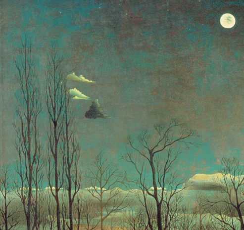
              Your question made me think of Henri Rousseau's work: he painted night scenes which are very colourful and only the moon in the sky, the cool grey/blue sky and very high contrast shadows let you know it's night time. I know his art isn't for everyone's taste, but you might want to look it up for reference.

              www.instagram.com/annahojarual

              demotlj 1 Reply Last reply Reply Quote 0
              • demotlj
                demotlj SVS OG @laura last edited by demotlj

                @laura said in Watercolor bat - color question:

                Henri Rousseau

                I looked him up and actually found this detail of one of his paintings ("A Carnival Night"). Is that a bat (or just a cloud?)
                0_1547295594025_Screen Shot 2019-01-12 at 7.19.03 AM.png

                @Coreyartus I had debated putting the moon in there and it may help make Evelyn look less pasted on. Right now the contrast between her color and the lack of color in the background is too great I think and a source of light might pull those elements together.

                @ThisKateCreates Your comments have really helped me get through my typical, "I can't paint" frustration, and instead I've decided I'm going to use this as a study and do a bunch of paintings in different styles and probably different compositions. We'll see where it goes.

                Laurie DeMott
                instagram.com/demotlj

                ThisKateCreates 1 Reply Last reply Reply Quote 0
                • ThisKateCreates
                  ThisKateCreates @demotlj last edited by

                  @demotlj I know that frustration too well!! Good luck. I can't wait to see the results.

                  https://www.instagram.com/thiskatecreates

                  1 Reply Last reply Reply Quote 0
                  • NizhoniWolf
                    NizhoniWolf last edited by

                    Some great advice floating about!

                    I'm excited to see what you come up with ^_^

                    Find me on Facebook and instagram under NizhoniWolf, for my sketches, musings and W.I.P's!

                    1 Reply Last reply Reply Quote 0
                    • demotlj
                      demotlj SVS OG last edited by demotlj

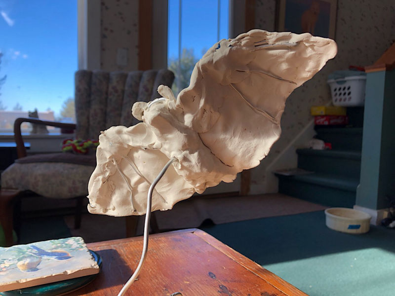
                      So I went completely back to start, watched the SVS video on sculpting characters by Dan Mortensen, made a crude clay model of my bat, and took pictures of it as if it were flying into a setting sun. I immediately saw all of the anatomical and shadow errors I had made in my previous drawing! (I had made a model before but I did it quickly and did’nt think to light it.) If nothing else, I’ve learned a lot about bat anatomy. 0_1547489072894_5BAEFF89-1469-4A93-9422-1C7CA5E54C5C.jpeg
                      Laurie DeMott
                      instagram.com/demotlj

                      ThisKateCreates Sas 2 Replies Last reply Reply Quote 7
                      • ThisKateCreates
                        ThisKateCreates @demotlj last edited by

                        @demotlj Very nice!

                        https://www.instagram.com/thiskatecreates

                        1 Reply Last reply Reply Quote 0
                        • demotlj
                          demotlj SVS OG last edited by

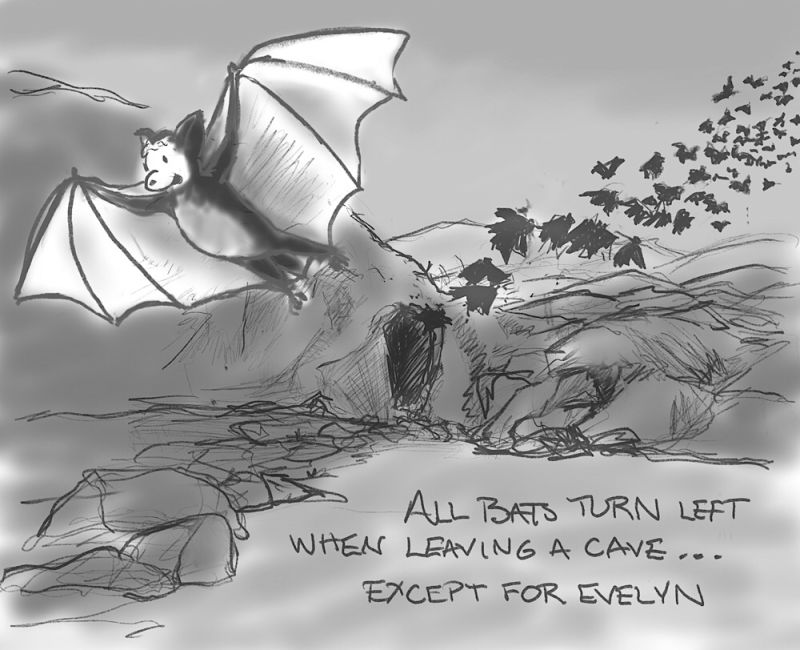
                          Here’s a redesign of the composition. I didn’t like the emptiness of the original with the bat just hanging in the air and I thought this might anchor her more. Any thoughts?
                          0_1547513657649_8B471F85-6947-48F3-AFBD-1FE67C96653F.jpeg

                          Laurie DeMott
                          instagram.com/demotlj

                          kaitlinmakes 1 Reply Last reply Reply Quote 3
                          • kaitlinmakes
                            kaitlinmakes @demotlj last edited by

                            @demotlj
                            Oh yes! So dynamic!
                            And I think you could totally do this is watercolor. It helps me to do studies about half the size, so the pressure of a final piece isn't on me. And I know we're supposed to layer slowly with watercolor, but maybe try one where put the correct value down for each part of the illustration with a single wash. For example, if the main part of the bat shadows are a level 8 dark, mix up your color and use less water to achieve that value/saturation in single strokes of shadow shapes. Just for fun! It just looks like you're a little hesitant to use a lot of color at once, as I am, and this might help push you past your comfort zones.

                            https://www.instagram.com/kaitlin.kahn.art
                            Https://www.kaitlinkahn.com

                            demotlj 1 Reply Last reply Reply Quote 2
                            • demotlj
                              demotlj SVS OG @kaitlinmakes last edited by

                              @kaitlinmakes I’m definitely hesitant going too dark in watercolors because I worry that I’ll blow it and can’t undo it. I also have done better with watercolor in my sketch book than in full size paper because it’s less intimidating so I’ll try both of your suggestions. Thanks.

                              Laurie DeMott
                              instagram.com/demotlj

                              1 Reply Last reply Reply Quote 2
                              • chrisaakins
                                chrisaakins last edited by

                                I definitely think that last one works. It has a good silhouette.

                                Chris Akins
                                www.chrisakinsart.com
                                www.instagram.com/chrisakinsart/

                                1 Reply Last reply Reply Quote 2
                                • demotlj
                                  demotlj SVS OG last edited by demotlj

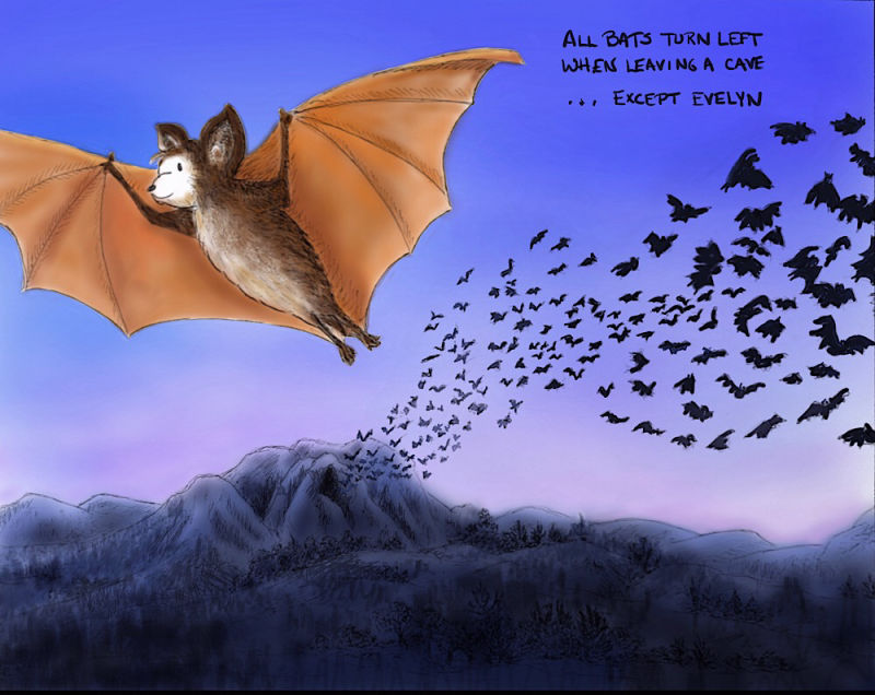
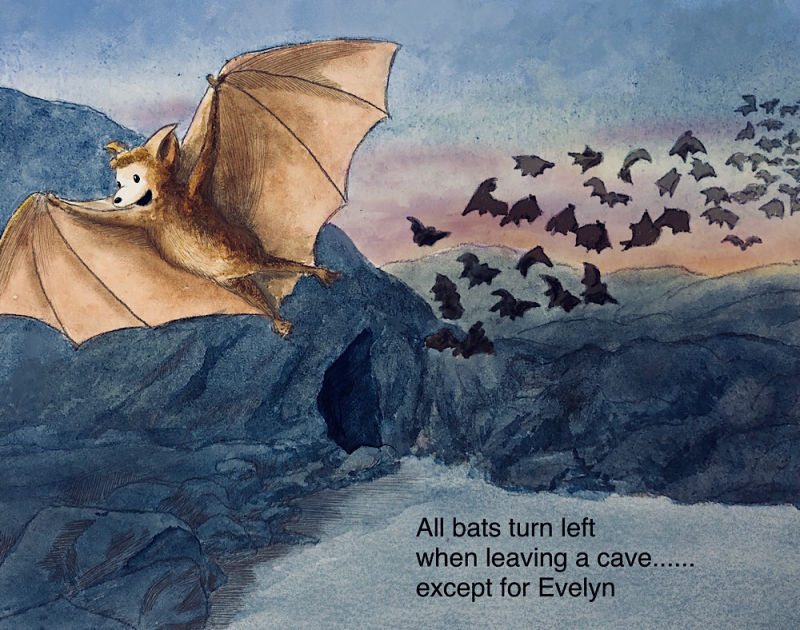
                                  I tried a watercolor version which I tweaked in Procreate but I’m not thrilled with it. I’ll probably also try it as a straight digital and then I’m going to move on because I’m getting a little tired of it! (The font is just a quick placeholder.)
                                  0_1547867560662_6ACCE662-23CA-45EF-8CEF-5FDC35AC63C8.jpeg

                                  Laurie DeMott
                                  instagram.com/demotlj

                                  1 Reply Last reply Reply Quote 7
                                  • Debra Garcia
                                    Debra Garcia last edited by

                                    The colors and composition on the final are wonderful. Look back at your original, and then this one again; the improvement is astounding. Your hard work has definitely paid off. Love it!

                                    https://www.instagram.com/febbieg/

                                    Art isn't life, life is art.

                                    demotlj 1 Reply Last reply Reply Quote 0
                                    • Sas
                                      Sas @demotlj last edited by

                                      @demotlj What a very clever idea!

                                      https://www.instagram.com/sasmakkinje/

                                      1 Reply Last reply Reply Quote 1
                                      • demotlj
                                        demotlj SVS OG @Debra Garcia last edited by demotlj

                                        @debra-garcia Thanks for your compliments. I am still frustrated that I wasn't able to get the blues as dark as I wanted in watercolor (I was using mostly ultramarine) without making them too gray. I had to resort to Procreate to darken them while retaining some vibrancy. Color mixing is definitely a challenge for me as a newcomer to watercolors.

                                        Laurie DeMott
                                        instagram.com/demotlj

                                        1 Reply Last reply Reply Quote 0
                                        • kaitlinmakes
                                          kaitlinmakes last edited by kaitlinmakes

                                          Oh! You nailed it!
                                          Evelyn reads so well against her background - those blues of the ground and sky are so rich! And her warm colors really make her pop.
                                          A disgression - I think sometimes with watercolor we try and make the paint do something that it just can't do - it's not acrylic or oil, and it just can't accomplish the same vibrancy that those mediums can produce. It's got a mind of its own - but we do get a softer story with it, and that beautiful gradation of color when we do wet in wet. What kind of watercolor do you use?
                                          I agree with what was said - the improvement is night and day and I'm so glad you decided to retackle this subject - the choice to change up the composition was perfect.
                                          How does the piece look if you flip it horizontally? I feel like I heard that an image is stronger if it reads left to right for western markets. What if Evelyn flew right and everyone else flew left?

                                          https://www.instagram.com/kaitlin.kahn.art
                                          Https://www.kaitlinkahn.com

                                          demotlj 1 Reply Last reply Reply Quote 0
                                          • demotlj
                                            demotlj SVS OG @kaitlinmakes last edited by

                                            @kaitlinmakes I’m using Windsor Newton pan and Daniel Smith tube paints, mostly Ultramarine, Burnt Sienna, and Burnt Umber.

                                            I agree with you about the left to right thing but the problem is that it is actually a fact that bats all turn left going out of a cave. I read it on a “strange animal facts” site (that I hope is trustworthy) and that sparked the idea for me. I actually tried to figure out how to flip it so Evelyn would be heading to the right both physically from the cave and on the page as well but then I couldn’t show her face or the cave opening without some really clever compositional camera angles that my brain couldn’t manage.

                                            Laurie DeMott
                                            instagram.com/demotlj

                                            kaitlinmakes 1 Reply Last reply Reply Quote 1
                                            • First post
                                              Last post