Society of Visual Storytelling

    SVSLearn Forums

    • Register
    • Login
    • Search
    • Recent
    • Tags
    • Popular
    • Users
    • Groups
    • Search

    BIG- WIP

    Artwork
    12
    34
    2226
    Loading More Posts
    • Oldest to Newest
    • Newest to Oldest
    • Most Votes
    Reply
    • Reply as topic
    Log in to reply
    This topic has been deleted. Only users with topic management privileges can see it.
    • K
      Kat SVS OG last edited by

      Purple one for sure!

      1 Reply Last reply Reply Quote 1
      • Coreyartus
        Coreyartus Moderator last edited by

        The purple one's colors seem both more "dangerous" and more "fantastical". Regarding too much yellow in your portfolio, maybe you can pull the yellows into a blue-ish color? Does it have to be during the day? Can it be at night?

        Children's Illustration Portfolio: https://www.coreyartusillustration.com
        Art Portfolio: https://www.coreyartusimagery.com
        Mastodon: https://mindly.social/@Coreyartus
        Pixelfed: https://pixelfed.social/Coreyartus

        Nyrryl  Cadiz 1 Reply Last reply Reply Quote 1
        • ThisKateCreates
          ThisKateCreates last edited by

          The first one looks really good too if you want a yellow break. I think the last one is more polished so it just shines.

          https://www.instagram.com/thiskatecreates

          1 Reply Last reply Reply Quote 1
          • Nyrryl  Cadiz
            Nyrryl Cadiz SVS OG @Coreyartus last edited by

            @coreyartus @ThisKateCreates @inkandspatter @Kat thank you so much for the input. I really appreciate it. I’ll give a night time setting a try and something more blue.

            Portfolio: nyrrylcadiz.com
            Instagram: https://www.instagram.com/nyrryl_cadiz/
            YouTube: https://www.youtube.com/channel/UCbJCF1Im8ZO7hpGWTKOJMuA

            1 Reply Last reply Reply Quote 0
            • Nyrryl  Cadiz
              Nyrryl Cadiz SVS OG last edited by

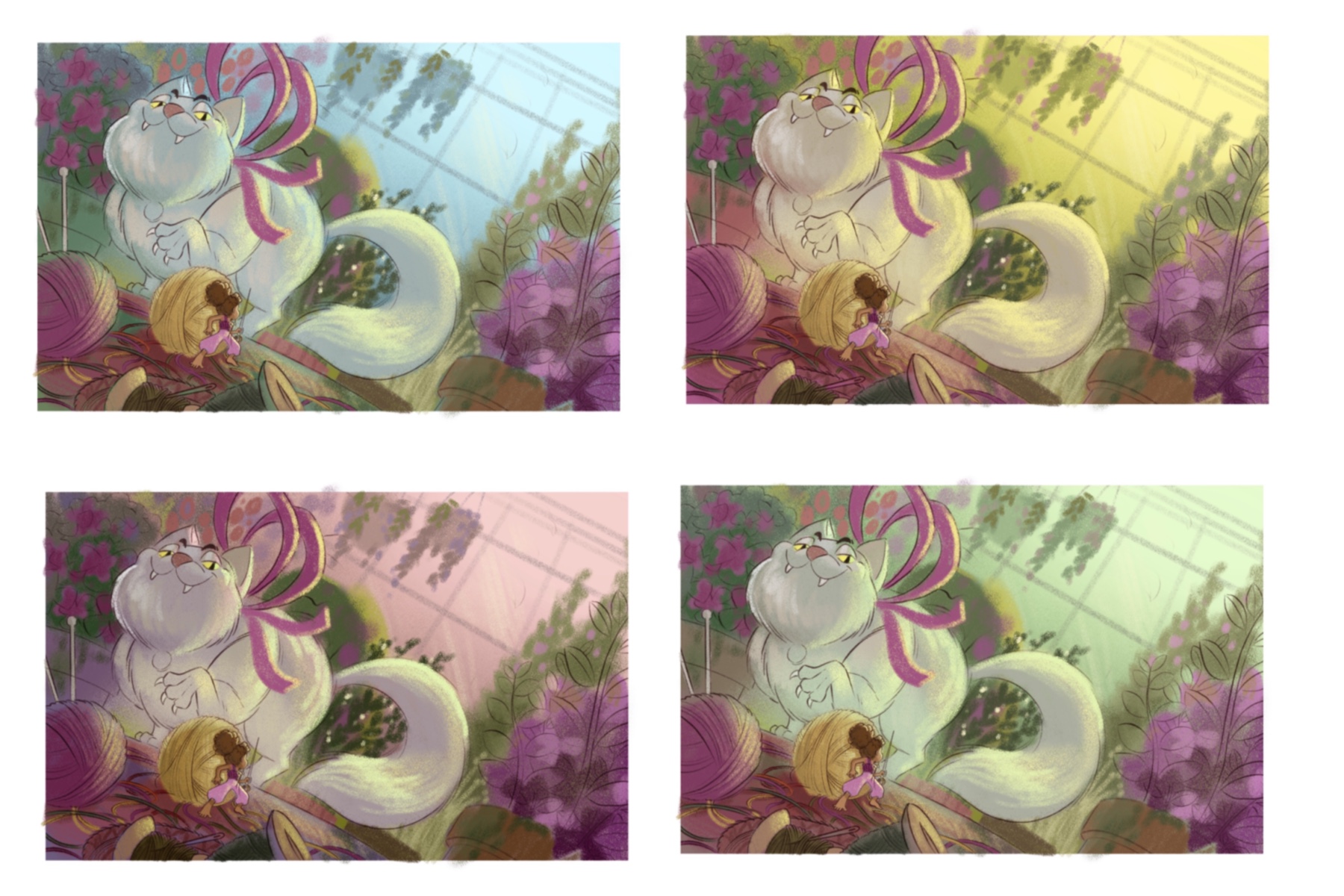
              Hi everyone! I’ve been tinkering around with my color comps, adjusting their hues, saturation, brightness and what not and I think I’ve made my decision. Of the four color comps I have below, i really really like the green one at the bottom. For me it really just gives the atmosphere a chilling, scary, and unnerving feeling. It gives me a horror movie feel which is kinda what I wanted for this piece. What do you guys think?

              0_1547450843728_05353EEE-AFE2-497E-BC2D-AD6C18C800A7.jpeg

              Portfolio: nyrrylcadiz.com
              Instagram: https://www.instagram.com/nyrryl_cadiz/
              YouTube: https://www.youtube.com/channel/UCbJCF1Im8ZO7hpGWTKOJMuA

              1 Reply Last reply Reply Quote 3
              • Nyrryl  Cadiz
                Nyrryl Cadiz SVS OG @maloe.art last edited by Nyrryl Cadiz

                @rinovarka haha 😅 I know the feeling! I’m not a cat person. I always have this slight fear of cats given what they’re capable of. They hunt rodents, birds, fish, etc. They’re natural born hunters! Just imagine if they’re 20 feet tall! Lol 😂

                Portfolio: nyrrylcadiz.com
                Instagram: https://www.instagram.com/nyrryl_cadiz/
                YouTube: https://www.youtube.com/channel/UCbJCF1Im8ZO7hpGWTKOJMuA

                1 Reply Last reply Reply Quote 0
                • Nyrryl  Cadiz
                  Nyrryl Cadiz SVS OG @Johanna Kim last edited by

                  @Johanna-Kim @Braden-Hallett thanks for your votes!

                  Portfolio: nyrrylcadiz.com
                  Instagram: https://www.instagram.com/nyrryl_cadiz/
                  YouTube: https://www.youtube.com/channel/UCbJCF1Im8ZO7hpGWTKOJMuA

                  1 Reply Last reply Reply Quote 0
                  • LauraA
                    LauraA SVS OG last edited by

                    I like these! I like the bottom right one for slight creepiness, and the top left one for sheer harmony of color. I think for it to be horror movie, you might have to take down the saturation of the purple a bit on the bottom right. I'm not sure, though.

                    Another thing I'd keep an eye on is Thumbelina. Putting the focus on a small figure is such a challenge! Just make sure she doesn't start to look like another hydrangea at first glance.

                    I like the off-kilter angle, the colors, and the overall composition. The figure of Thumbelina in the line drawing is fun and has good perspective. And I like the rhythm and line work in the yarn. Nice!

                    Instagram: https://www.instagram.com/lauraintorino/
                    http://lauraaldersonart.com/

                    Nyrryl  Cadiz 1 Reply Last reply Reply Quote 1
                    • Nyrryl  Cadiz
                      Nyrryl Cadiz SVS OG @LauraA last edited by

                      @lauraa hi! Thanks for the suggestions. Yeah, i really need to desaturate that purple plant at the corner. As for the upper blue piece, i also really like the colors. It’s my second choice actually. However, given that I wanted a more scary atmosphere, i think the lower green piece conveys it better. I am going to save that blue comp’s color palette. I think it would be great for a bright, upbeat illustration. I’ll try my best to make thumbelina read clearly but i’m scared i might not do it properly. With all the elements going on, i’m having doubts if i can really make her stand out. I’ll give it a try. Thank you again!

                      Portfolio: nyrrylcadiz.com
                      Instagram: https://www.instagram.com/nyrryl_cadiz/
                      YouTube: https://www.youtube.com/channel/UCbJCF1Im8ZO7hpGWTKOJMuA

                      LauraA 1 Reply Last reply Reply Quote 1
                      • LauraA
                        LauraA SVS OG @Nyrryl Cadiz last edited by

                        @nyrrylcadiz Oh, I didn't say that well. I meant the purple in the whole bottom right color scheme, though it's true that most of it is at the bottom right. What comes to mind when I think of bright colors becoming creepy is how clouds get when there's about to be a tornado or other very severe storm. That's not a very technical description, but you probably get the idea. You think, "Oh, something's just not right about that color!" That said, now I'm running of the mouth and I'm sure whatever you do with it will be fine! 😆 Look forward to seeing the next step!

                        Instagram: https://www.instagram.com/lauraintorino/
                        http://lauraaldersonart.com/

                        1 Reply Last reply Reply Quote 1
                        • Nyrryl  Cadiz
                          Nyrryl Cadiz SVS OG last edited by Nyrryl Cadiz

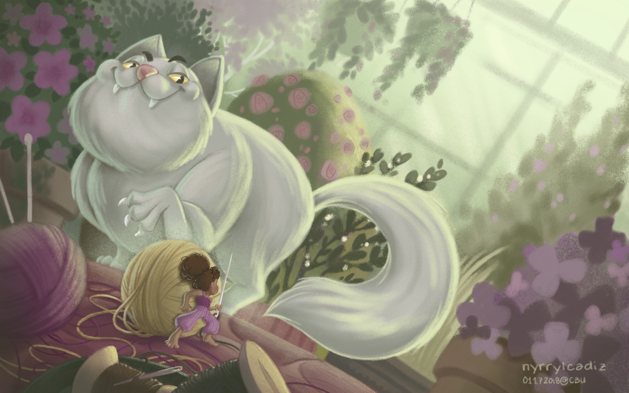
                          Hi guys! I just finished working on my Big piece. Please let me know if you have any critiques or suggestions. I truly appreciate it. Thank you.

                          0_1547720824379_18E6FD9F-79F2-4B1D-9C12-C7E5437F79CA.jpeg

                          Portfolio: nyrrylcadiz.com
                          Instagram: https://www.instagram.com/nyrryl_cadiz/
                          YouTube: https://www.youtube.com/channel/UCbJCF1Im8ZO7hpGWTKOJMuA

                          1 Reply Last reply Reply Quote 3
                          • Nyrryl  Cadiz
                            Nyrryl Cadiz SVS OG last edited by

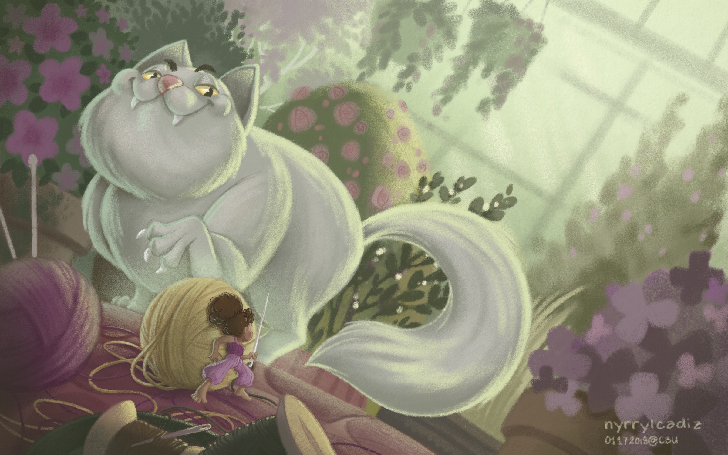
                            Hi! It’s me again! Here’s a new version. I edited the threads on the floor. They were too cluttered 😅

                            0_1547726937004_8EBF0016-44BD-453D-A51E-F3C4CCCD613F.jpeg

                            Portfolio: nyrrylcadiz.com
                            Instagram: https://www.instagram.com/nyrryl_cadiz/
                            YouTube: https://www.youtube.com/channel/UCbJCF1Im8ZO7hpGWTKOJMuA

                            Erin.Cortese ThisKateCreates evilrobot 3 Replies Last reply Reply Quote 7
                            • Erin.Cortese
                              Erin.Cortese Moderator @Nyrryl Cadiz last edited by Erin.Cortese

                              @nyrrylcadiz This turned out great! There is something bothering me about the cat though, I just can’t put my finger on it. It’s not anything to do with design or perspective (those are great), I think it’s in the contrast or edges. The girl is so sharp and crisp with great colour and contrast, and the cat doesn’t seem to have the same level of sharpness. The cats body seems almost too soft and marshmallowy, maybe it just needs some sharper fur edges jetting out here or there? I’m not sure. Hope this helps. Really nice work!

                              1 Reply Last reply Reply Quote 1
                              • ThisKateCreates
                                ThisKateCreates @Nyrryl Cadiz last edited by

                                @nyrrylcadiz That face on that cat though! Scary!

                                https://www.instagram.com/thiskatecreates

                                1 Reply Last reply Reply Quote 1
                                • evilrobot
                                  evilrobot SVS OG @Nyrryl Cadiz last edited by

                                  @nyrrylcadiz This is coming along really nice! Love the texture brushes you are using giving it a nice pastel look.

                                  http://www.palacioillustration.com/

                                  https://www.scbwi.org/illustrator-gallery/illustrator-detail/?illustrator_id=84142

                                  https://www.pinterest.com/evilrobot2/pins/

                                  https://twitter.com/MyEvilRobot

                                  1 Reply Last reply Reply Quote 1
                                  • Nyrryl  Cadiz
                                    Nyrryl Cadiz SVS OG last edited by

                                    @inkandspatter @evilrobot @ThisKateCreates thank you!

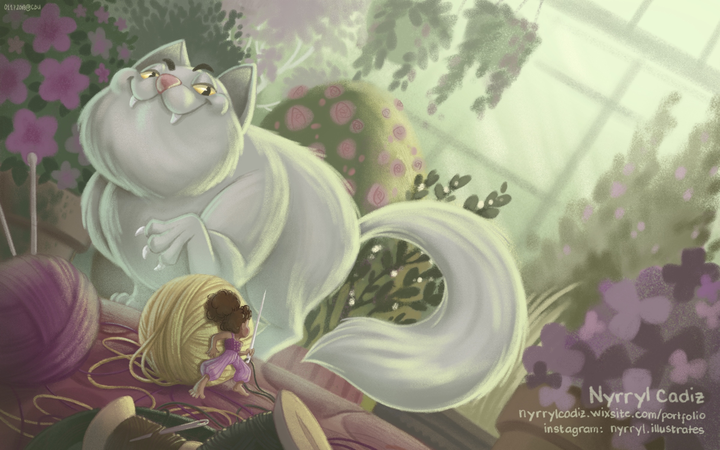
                                    Hi, everyone! Here’s my final piece. I hope you like it.

                                    D0F396F4-CC5D-43CE-B8A5-8707EBFC27D5.jpeg

                                    Portfolio: nyrrylcadiz.com
                                    Instagram: https://www.instagram.com/nyrryl_cadiz/
                                    YouTube: https://www.youtube.com/channel/UCbJCF1Im8ZO7hpGWTKOJMuA

                                    Erin.Cortese 1 Reply Last reply Reply Quote 8
                                    • Erin.Cortese
                                      Erin.Cortese Moderator @Nyrryl Cadiz last edited by

                                      @nyrrylcadiz It’s incredible! I love the lighting and perspective, it creates such a great tension.

                                      1 Reply Last reply Reply Quote 2
                                      • ?
                                        A Former User last edited by

                                        Wonderful work @nyrrylcadiz , that cat's face is just brilliant! I love the colours too 😃

                                        1 Reply Last reply Reply Quote 2
                                        • Nyrryl  Cadiz
                                          Nyrryl Cadiz SVS OG last edited by

                                          @inkandspatter @hannahmccaffery thank you, guys! I’m very glad you like it.❤️

                                          Portfolio: nyrrylcadiz.com
                                          Instagram: https://www.instagram.com/nyrryl_cadiz/
                                          YouTube: https://www.youtube.com/channel/UCbJCF1Im8ZO7hpGWTKOJMuA

                                          1 Reply Last reply Reply Quote 0
                                          • First post
                                            Last post