big WIP looking for suggestions!
-
@juliemillardart This is a really cute piece, and I really like the painting style. The lighting toward the top seems great, but seems like something weird is happening at the bottom. Maybe if the light formed a cleaner edge at the bottom it would help - a soft circle from a spot light, or gentle fade to dark? I agree with @KathrynAdebayo about the mice, I didn't see them immediately either and I think they could benefit from stronger contrast or edges. What if you used darker linework like you did for the elephants?
-
@juliemillardart Great piece. Definitely says "Big" to me. It feels like the lighting needs to be better defined. Since the mice have clear shadows, then the elephants too should have clear shadows. It's tricky, though, because you want to be able to read the mice and they're currently so nicely defined at the bottom. When I first saw this, I thought of a circus setting, but then it could also be a zoo. In those instances, artificial lighting could be happening, like overhead ceiling spots of light. You could play around with having 2 subtle rays of light directed down to the mouse below and see what arrangement of elephant shadows works best.
-
Cute concept! Beyond what others have said so far, I think one issue is the elephants. The right elephant's back left leg is on the same plane as the front right leg, perspective things as such. The elephant's body language could be more dynamic, e.g., trunks could look bent in a way to show stress. As far as lighting go, I think the idea that the two mice having their own natural spot light effect made between the elephant's shadows, could be cool. Looking forward to how this piece turns out!
-
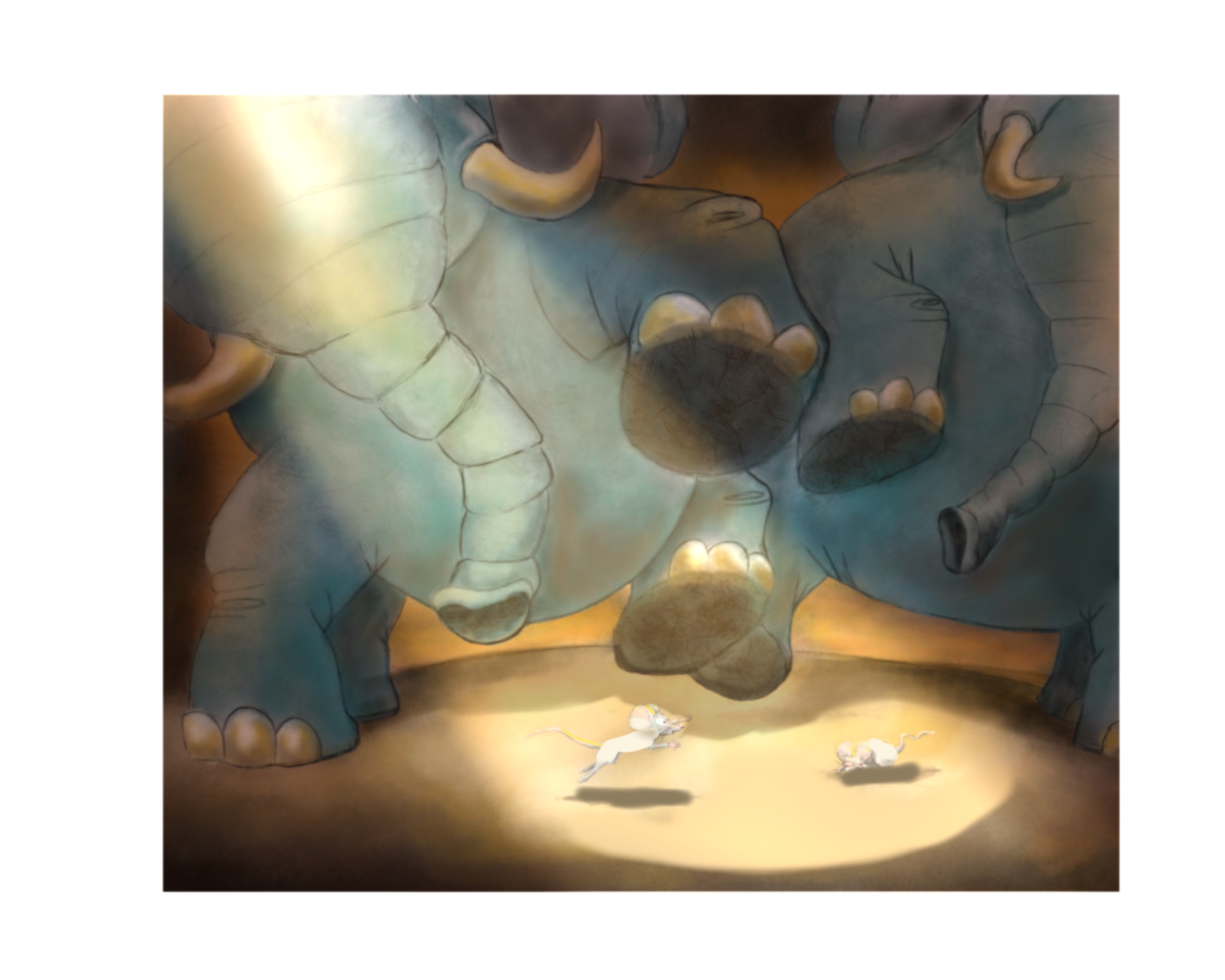
Thank you for all of the great suggestions! They helped me come up with these changes.
 ️! What do you all think? Better? I really am happy with how it turned out
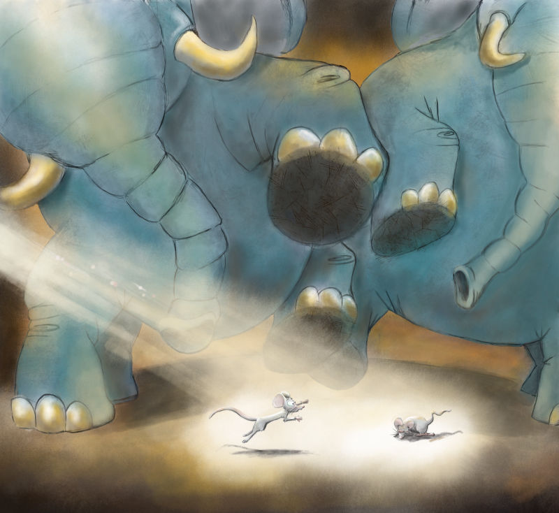
-
@juliemillardart In the first version my eyes went right to the elephant legs and I barley noticed the mice, in this version the mice are definitely the focal point. Big improvement!
-
@inkandspatter thank you!
-
@juliemillardart This is such a fun composition! Indeed what has been stated above, about the mice dissappearing a bit into the backgroundcolor could maybe be solved if you put more shading from the elephants feet on the bottom? Making the underground more darker and that way making the mice pop?
-
Hi! I think you’re doing a great job on the piece. I really like that you added a spot light on the mice. They make them stand out. However, i do think it’s angle is too low. I also think thatyou can still push the piece by darkening the surroundings outside the spot light. Here’s my quick paint over of your piece. I really hope this helps.
-
@juliemillardart
Well you picked a very difficult lighting situation") I did a quick and dirty paint over just to show how I might try and handle it. First you are getting a bit muddy in the colors it has some to do with the values and some to do with your lighting. I'd use a cool light and a warm shadow on this it will help with the mud. Then I'd put the elephants in shadow make them almost like a silhouette. Push the background brighter to make them stand out. I think you need to add some kind of foreground element to help frame the mice. Then you need to make the brightest part of the whole image around those mice like you already are doing make it look like the light is hitting right there from somewhere above and give the mice a strong rim light.
I did a quick and dirty paint over just to show how I might try and handle it. First you are getting a bit muddy in the colors it has some to do with the values and some to do with your lighting. I'd use a cool light and a warm shadow on this it will help with the mud. Then I'd put the elephants in shadow make them almost like a silhouette. Push the background brighter to make them stand out. I think you need to add some kind of foreground element to help frame the mice. Then you need to make the brightest part of the whole image around those mice like you already are doing make it look like the light is hitting right there from somewhere above and give the mice a strong rim light. 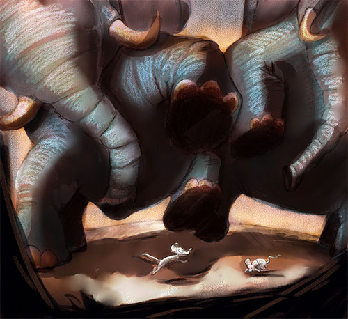
-
@evilrobot thank you for the suggestions. I posted my entry before I saw your post or I would have changed it according to what you suggested.