BIG Composition Problems
-
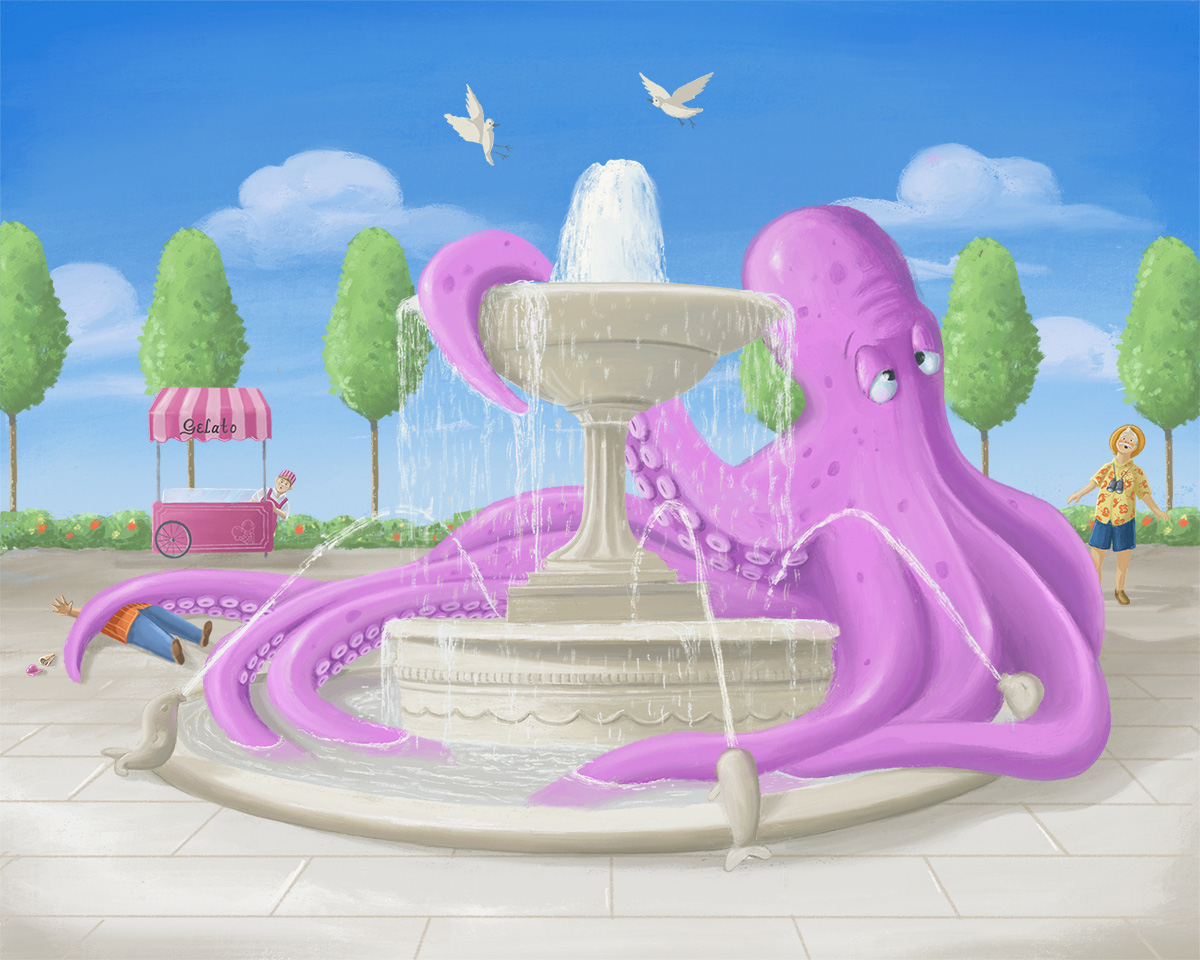
Hi Everyone, I have backed myself into a corner with my "Big" composition. I had several problems with my compositions early on, and rather than quit, I decided to paint freely and experiment without being so rigid. At first it worked, and before I knew it I was really far into completing a composition that was not planned properly from the beginning. Now I have a large composition that seems to be growing by the minute, and I can't find a way to finish that I'm happy with. Lesson learned, I will work smaller in the future and thoroughly plan my compositions! But now I need to finish, and I just can't seem to find my way to the end.
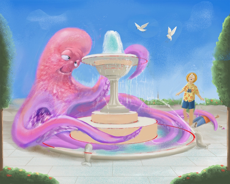
Can anyone help me with some advice for the foreground? I don't need ideas for subject matter, I just need to find some shapes that work in this perspective and with my current layout. I have one example below that Im working with, but I'm not happy with it yet. I would like to have larger objects in the foreground but can't figure out how to use the space. Also...it may be there is an entirely different problem Im not seeing?
-
@inkandspatter This is hysterical. I didn't notice the poor dude on the left at first -- that's great! I like your solution of having the lady and her arm break into that foreground section because yes, it needs a little something. Another option is to put in some darker foreground bushes/flowers like you have in the background, just to provide some framing. Also, is the octopus hot? Maybe some sweat trickles to emphasize that idea? Just wondering what the story is there. I'm also wondering if you could play with cropping it, getting rid of much of the foreground anyway.
-
Nice concept! I find it funny how the people are getting trampled by that octopus of yours. I especially like that guy being squished by the tentacle. Perhaps you can have a tentacle weighing down on the lady in the pool for added effect? I would really like to see where you’ll take this piece. Keep up the good work!
Portfolio: nyrrylcadiz.com
Instagram: https://www.instagram.com/nyrryl_cadiz/
YouTube: https://www.youtube.com/channel/UCbJCF1Im8ZO7hpGWTKOJMuA -
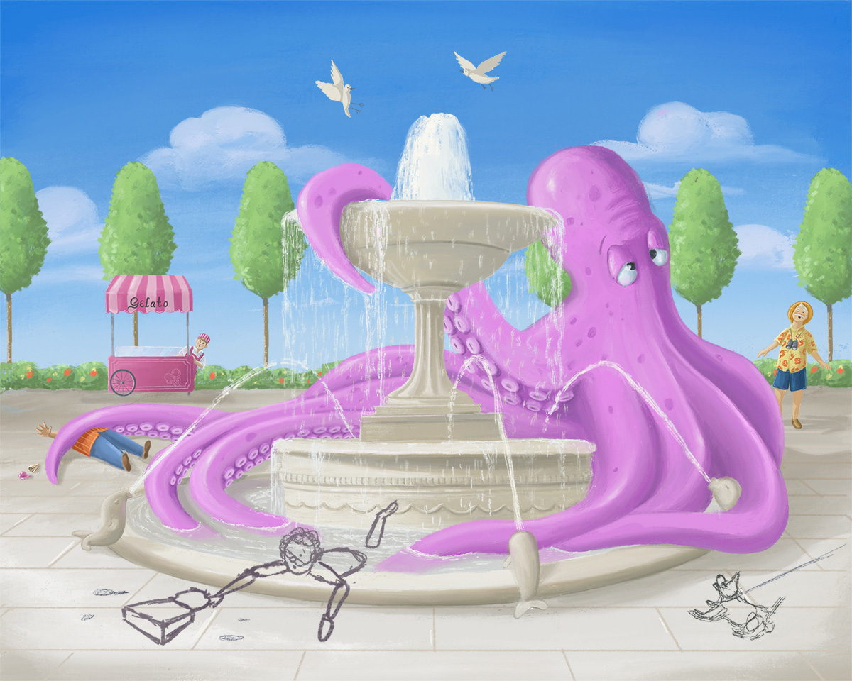
I was also going to suggest cropping it as @Laurel-Aylesworth did. That might also help bring the background characters a little more quickly to the viewer's attention. It's a great picture, and I love the expression on the octopus' face.
-
@Laurel-Aylesworth Thank you!!! I had tried trees and bushes with no luck, but something clicked when I read your post. Originally the trees kept covering my characters at the back or creating tangents (I had them inset). Explaining it as “framing” in your post made me position them in a completely different way! I haven’t figured out the other characters yet, but I have my foreground!
-
@nyrrylcadiz I like the tentacle suggestion, that is a great idea! If I decide to keep her in I will definitely add that.
-
Does the foreground work? I am finding it so hard to see it clearly now, not sure if this is an improvement.
-
Yes. The bushes and trees do seem to make the picture's flow better.

-
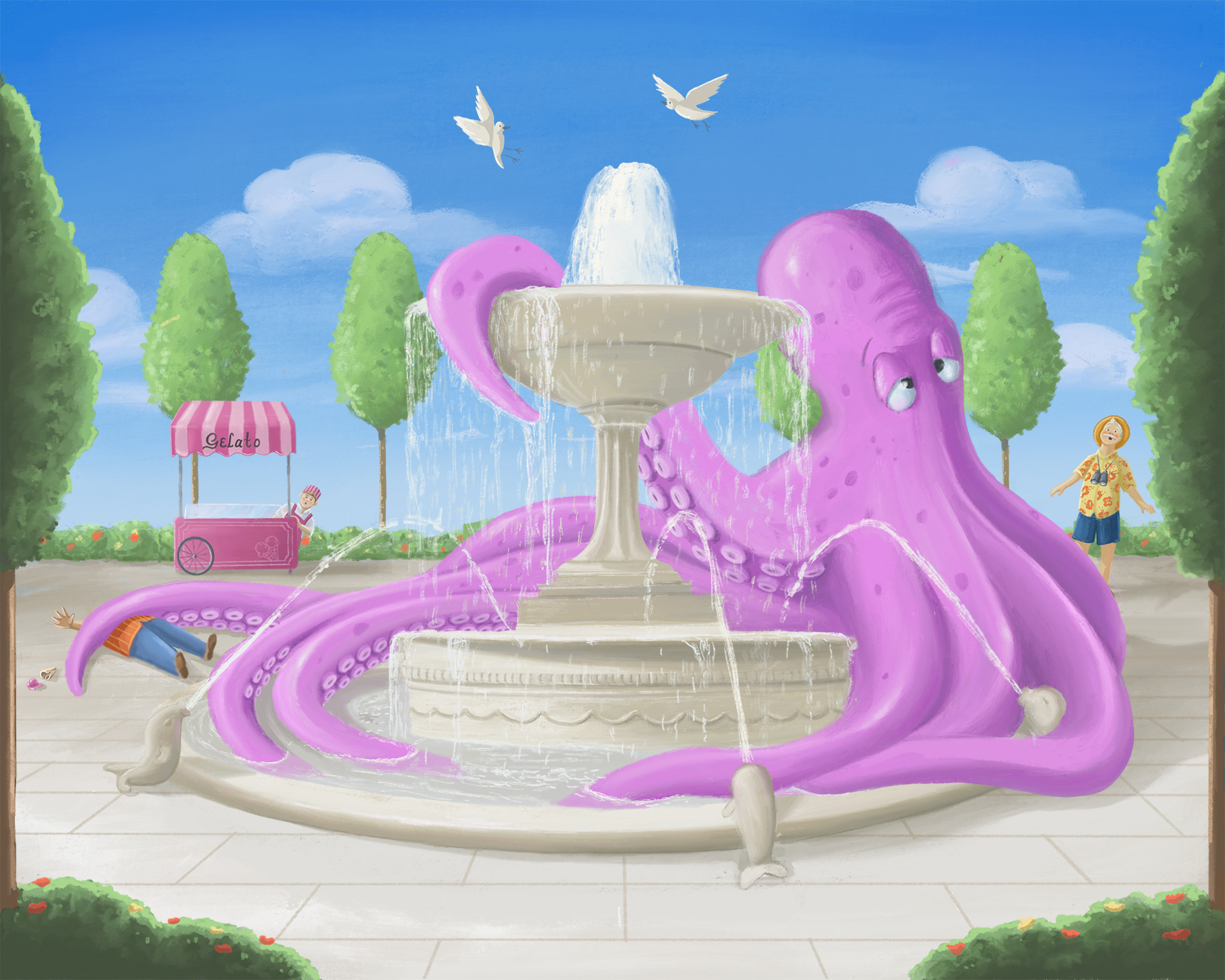
@inkandspatter I'm gonna vote that a treetrunk on the edge is an odd crop but the framing is nice. If going so formal and symmetrical I would move the trees to each have their trunk fully within the picturend plane forming a frame.
-
@ThisKateCreates
Or going along with this, maybe take the trunks out completely?
Love how this simple fix nailed down the whole picture!
So whimsical! -
@kaitlinmakes I'm kinda torn on this one. The level of symmetry in the trees and environment aren't very "dynamic" and give a formal gardens look, which is exaggerated further by the two perfectly symmetrical foreground trunks framing it. It is not a typical device I feel like but only adds to the humor of the huge octopus in my mind. So maybe it should stay just because it's funny? Will be interesting to see the final.
-
@ThisKateCreates I’m torn too, which seems to be the theme of this composition. It’s difficult to find something that clearly works at this point. I have no idea which direction I’m going to go

-
@inkandspatter I think it is working, tbh. Maybe take a break and look at some classical landscapes for inspo on how to keep that formal look? It's also ok to call it done when you can't find the next improvement. Or sleep on it?
Here is a nice painting I found I found that looks peaceful and formal XD:
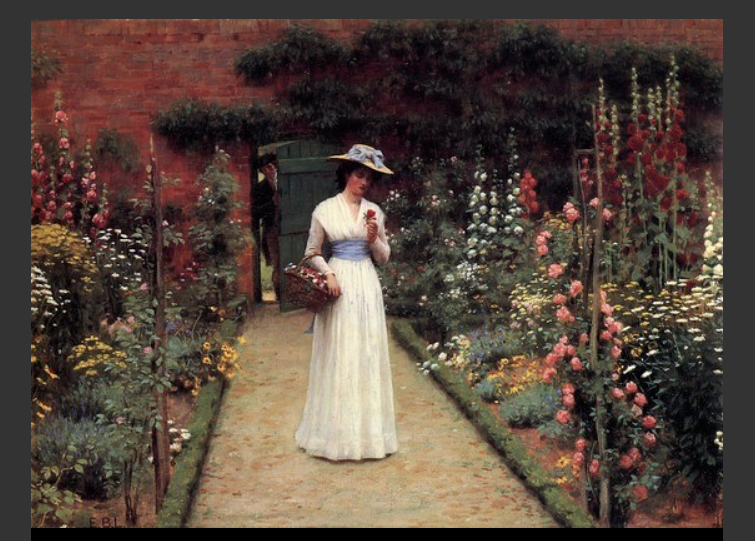
https://www.artrenewal.org/Artwork/Index/50459 -
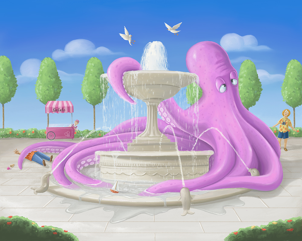
@inkandspatter This is looking good! - i had a couple ideas about composition - it feels like the main story is the octopus beating the heat with his discovery of the fountain and the reaction of the fellow with binoculars towards the scene - it feels like the composition may be too squished on the right hand side of the canvas - there is a lot of visual weight there and it is hard to come back to the left to enjoy the humorous details there (love the guy reaching out for his ruined ice-cream cone!) My thought is to flip the canvas and then flip the direction that the octopus is leaning so you have a left to right read in the composition - other random things i thought might be showing more pinkish skin on the octopus tops of forms to show that the sun is bothering him? also the elipses of the fountain seem to flatten too soon - lastly possibly adding a bit of texture to the octopus to reinforce it as a focal point? here is a quick cut and paste/paint-over of some of what i was thinking - (i know he should not have a mouth
-
@Kevin-Longueil Thanks, I didn’t think about flipping it, I will try that! I have cut out the trees so I have more space, and added some overflowing water to the fountain. I still have more spots and colour to add to the octopus, but I wanted to leave it until last so I know how much I have to pump him up. I think I’m going to avoid adding anymore people at this point because it doesn’t seem to be working. My fountain is definitely off, thanks for the example you provided!
-
This is where I have ended up with my "Big" composition. I am just sitting with it now and looking for any final edits before I submit. Any thoughts?
-
@inkandspatter Contradicting myself.... I prefer the version with the trees in front....
-
@ThisKateCreates Unfortunately I no longer have room for them. But I did move the bushes up and crop the final, hopefully it's more balance.
-
@inkandspatter It's really cute. Feel bad for the poor ice cream guy. XD