Society of Visual Storytelling

    SVSLearn Forums

    • Register
    • Login
    • Search
    • Recent
    • Tags
    • Popular
    • Users
    • Groups
    • Search

    environment design - thumbnail phase crit

    Artwork
    6
    14
    693
    Loading More Posts
    • Oldest to Newest
    • Newest to Oldest
    • Most Votes
    Reply
    • Reply as topic
    Log in to reply
    This topic has been deleted. Only users with topic management privileges can see it.
    • JerrySketchyArt
      JerrySketchyArt last edited by

      Second vote for C. It flows well.

      1 Reply Last reply Reply Quote 1
      • ThisKateCreates
        ThisKateCreates last edited by

        C popped out

        https://www.instagram.com/thiskatecreates

        1 Reply Last reply Reply Quote 1
        • Jonas Zavacky
          Jonas Zavacky last edited by

          Thanks for the feedback! So far it is set then 😃

          1 Reply Last reply Reply Quote 0
          • SCBenedict
            SCBenedict last edited by

            C, A, D, B

            Good luck!

            "Tell your own story, and you will be interesting." Louise Bourgeois

            scbenedict.com

            1 Reply Last reply Reply Quote 1
            • ?
              A Former User last edited by

              C really makes you feel like you are in the dining hall, and gives a great sense of dimension to the aliens. My second favourite is D, which I think invites more of a "I'm spying on these creatures" sort of feel.

              I really like the swirl in the rock up in the left corner of A, do you think that could be incorporated into C somehow?

              Jonas Zavacky 1 Reply Last reply Reply Quote 1
              • Jonas Zavacky
                Jonas Zavacky @Guest last edited by

                @mia-clarke Thank you for the input! I really like hearing what sort of feel you have from those thumbnails:)

                Yes, It could... C is basically seen from the opposite direction as A so I will play with that 🙂

                1 Reply Last reply Reply Quote 0
                • Jonas Zavacky
                  Jonas Zavacky last edited by

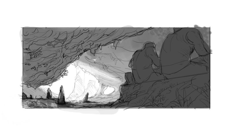
                  okay made some basic drawing and value sketch. any thought appreciated!

                  design.jpg

                  1 Reply Last reply Reply Quote 0
                  • ?
                    A Former User last edited by

                    Wow! It's so great to see this come to life! I really love the direction, and the swirl looks so good at the center bottom. I would not what these fellas to turn around!

                    I wonder, with all that light coming in from the top right, would it make sense for the overhang on the right to be quite a lot darker at the top? I feel like some added value differences in that section would make for a more interesting picture. What do you think?

                    Will the walls and overhangs be moist, or dripping?

                    Jonas Zavacky 1 Reply Last reply Reply Quote 1
                    • Jonas Zavacky
                      Jonas Zavacky @Guest last edited by

                      @mia-clarke glad you like it!

                      hmmm yes that sounds right.. for now it kinda blends together. Thanks !

                      yes the will, they won't be dripping everywhere, but some moist is definitely in my mind! also there will be higher amount of plants and roots all over the place.. 🙂

                      1 Reply Last reply Reply Quote 0
                      • Jonas Zavacky
                        Jonas Zavacky last edited by

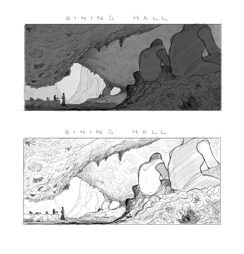
                        I guess I will call it done for now. Mainly because I have a tight deadline and I need to get everything done - and for the purpose of what it is for I think it is enough. If I will some time to revisit this I surely will.

                        But last questions. For presentation purposes. With tone or without?

                        design.jpg

                        ? 1 Reply Last reply Reply Quote 2
                        • ?
                          A Former User @Jonas Zavacky last edited by

                          @Jonas-Zavacky Love both, but the one with tone, I feel, matches the mood better. Great work!

                          Jonas Zavacky 1 Reply Last reply Reply Quote 1
                          • Jonas Zavacky
                            Jonas Zavacky @Guest last edited by

                            @mia-clarke Thank you !! 🙂 appreciate all the input you gave me throughout this!

                            1 Reply Last reply Reply Quote 0
                            • First post
                              Last post