Society of Visual Storytelling

    SVSLearn Forums

    • Register
    • Login
    • Search
    • Recent
    • Tags
    • Popular
    • Users
    • Groups
    • Search

    Up For A Colour Challenge?

    Artwork
    6
    35
    1944
    Loading More Posts
    • Oldest to Newest
    • Newest to Oldest
    • Most Votes
    Reply
    • Reply as topic
    Log in to reply
    This topic has been deleted. Only users with topic management privileges can see it.
    • Erin.Cortese
      Erin.Cortese Moderator last edited by Erin.Cortese

      Colour is something that I find challenging and frustrating, so I have created a simple exercise for myself to explore colour harmonies and help me to better understand colour. After taking a couple of cracks at it, I have decided to call in reinforcements 🙂

      I’m hoping to learn a thing or two by watching how other artists approach colour. Any joiners? I am very appreciative of anyone who wants to give it a try and share their results! (Instructions below)

      Colour Study

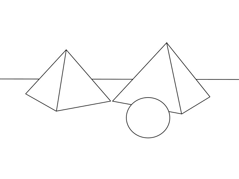
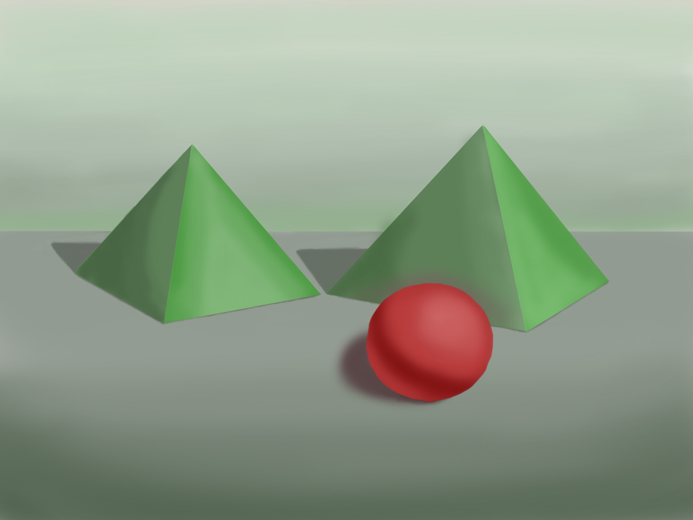
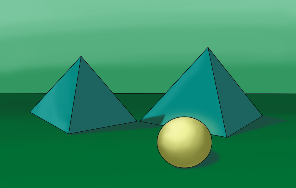
      I have created a basic composition using geometric shapes, you can use mine or create your own. I chose geometric shapes for their simplicity, I really want the colour to be the main focus.

      1. Paint the composition using one of the following colour harmonies: monochromatic, analogous, or complementary (originally I was planning to do all three and compare the results). Include basic highlights and shadows.

      2. Make the sphere the focal point of the composition.

      That’s it!

      Colour_Study.jpg

      Heather Boyd 1 Reply Last reply Reply Quote 3
      • Heather Boyd
        Heather Boyd @Erin.Cortese last edited by Heather Boyd

        @inkandspatter I may do this one with you because I am also experimenting with brushes on Photoshop that I like. So I can combine the two to help me with my February LOVE prompt colour and style. I may not get as many completed as you hope to but it will help me fore sure.

        I will step on this tomorrow and post as soon as possible.

        Instagram: www.instagram.com/heatherboyd.illustration/
        Website: https://heatherboydillustration.ca
        Shop: https://www.inprnt.com/search/products?q=HeatherBoydIllustration
        Ko-Fi: https://ko-fi.com/heatherboydillustration

        Be blessed,

        Erin.Cortese 1 Reply Last reply Reply Quote 1
        • Erin.Cortese
          Erin.Cortese Moderator @Heather Boyd last edited by

          @Heather-Boyd Thanks, I’m looking forward to seeing it!

          1 Reply Last reply Reply Quote 0
          • kaitlinmakes
            kaitlinmakes last edited by

            I'm so in!

            https://www.instagram.com/kaitlin.kahn.art
            Https://www.kaitlinkahn.com

            1 Reply Last reply Reply Quote 1
            • K
              Kat SVS OG last edited by

              I'm in, too! Color is something I'm learning more about right now, so this is good. Plus, it helps with staying accountable during these dreary winter days!

              1 Reply Last reply Reply Quote 1
              • Erin.Cortese
                Erin.Cortese Moderator last edited by Erin.Cortese

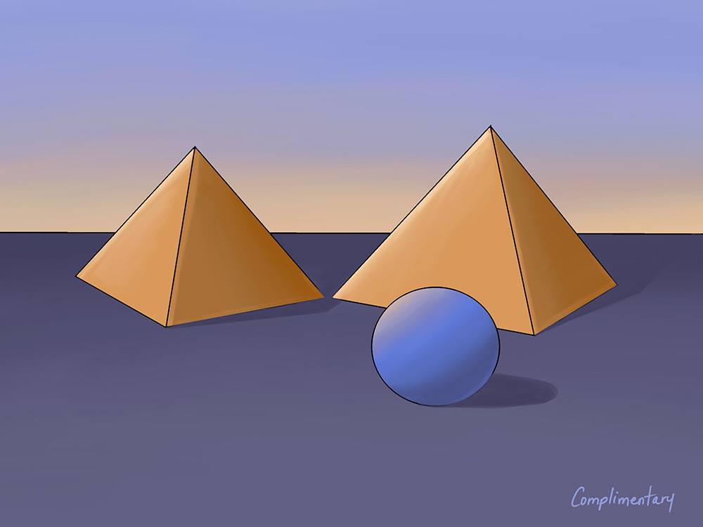
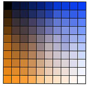
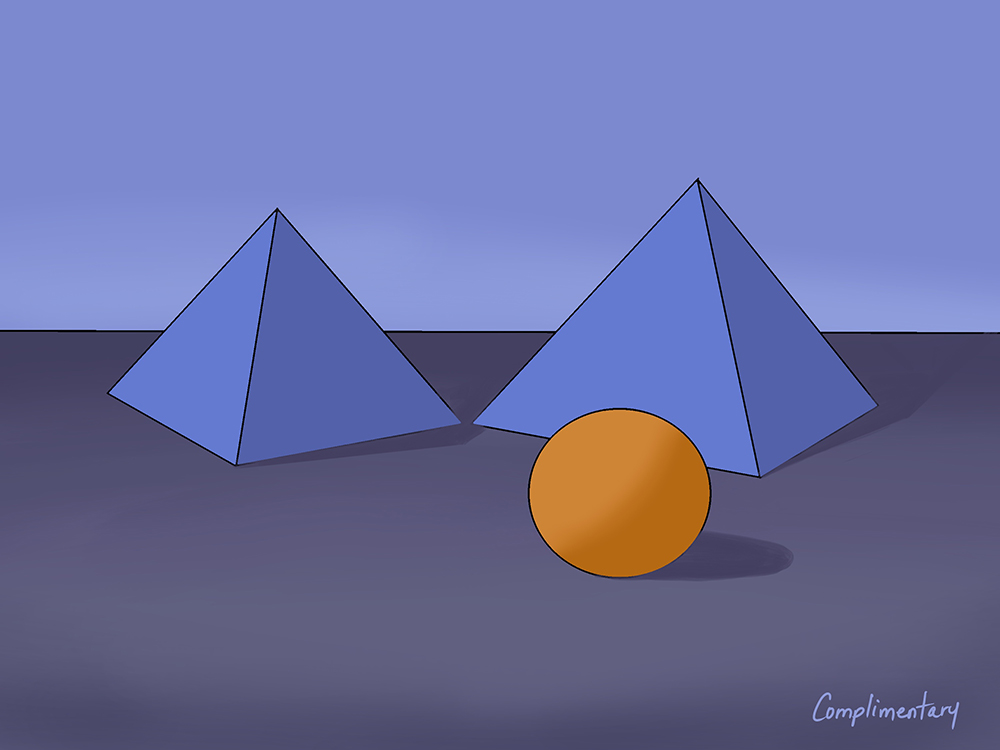
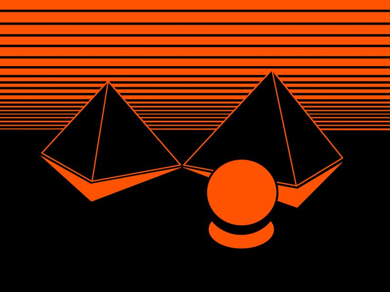
                So the 5th time was a charm. It may have taken me five attempts to get a result I am happy with, but it’s a start! I also realized that the colour pallete I started with might have something to do with my struggle. I used the colour grid exercise from Will Terry’s “The Magic Of Colour” course for this, and the hues I chose were not the most attractive, but looking at the palette, I think maybe I didn’t explore enough. Also, I’m not sure that I succeeded in making the sphere the focal point.

                So here is my attempt at a complementary scheme:

                CB7DCB8F-3BB5-4BEC-84BB-F1D1E306683E.jpeg D61B39B4-D185-43C4-AB70-6383EF4D1FEC.jpeg

                K 1 Reply Last reply Reply Quote 2
                • Erin.Cortese
                  Erin.Cortese Moderator last edited by

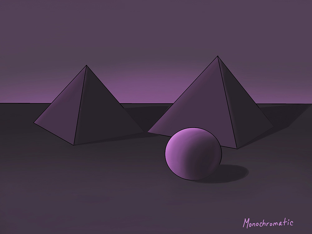
                  It took multiple attempts again, but here is my monochromatic colour scheme.

                  monochromatic.jpg

                  1 Reply Last reply Reply Quote 3
                  • K
                    Kat SVS OG @Erin.Cortese last edited by

                    @inkandspatter Nice work! I'm not sure the sphere stands out as the focal point, since it's color is so close to the "floor". Maybe it work better if the sphere were golden and the pyramids were purple. I love the sky, though!

                    1 Reply Last reply Reply Quote 1
                    • K
                      Kat SVS OG last edited by

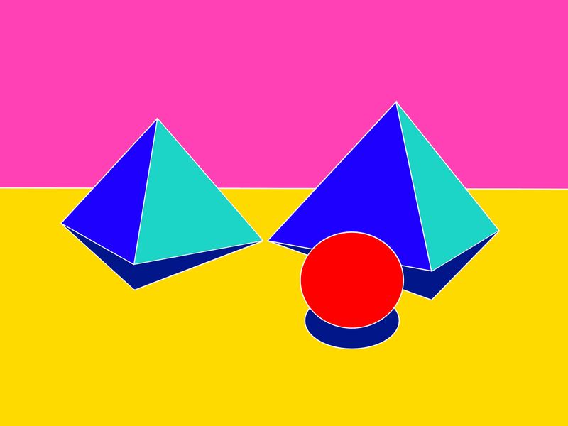
                      Ok, here's my attempt!
                      complimentary.jpg

                      1 Reply Last reply Reply Quote 3
                      • Erin.Cortese
                        Erin.Cortese Moderator last edited by Erin.Cortese

                        Nice! Very smart that you reserved the red strictly for the focal point. That did not even cross my mind, which is exactly why I way hoping to see someone else attempt it. Thank you! I am going to try my complementary scheme again with this approach.

                        K 1 Reply Last reply Reply Quote 0
                        • K
                          Kat SVS OG @Erin.Cortese last edited by

                          @inkandspatter Thanks! I remember Will Terry talking about how red totally grabs the attention, so I didn't try using it anywhere else. I think I'll try an analog color scheme next and see if I can work with more than two colors at a time!

                          1 Reply Last reply Reply Quote 1
                          • Erin.Cortese
                            Erin.Cortese Moderator last edited by

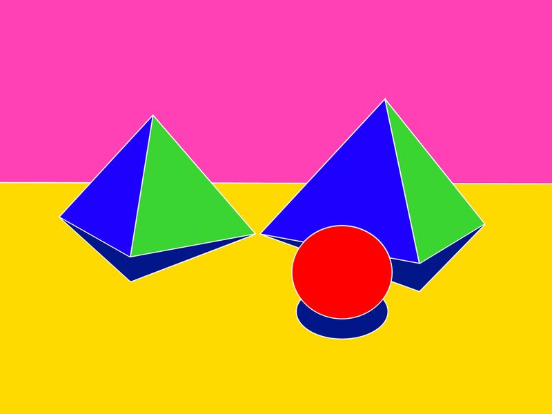
                            Here is another quick attempt at the complementary scheme, I think it is much more effective.

                            Colour_Study2.jpg

                            1 Reply Last reply Reply Quote 3
                            • K
                              Kat SVS OG last edited by

                              Oh yes, that works much better!

                              1 Reply Last reply Reply Quote 0
                              • sigross
                                sigross last edited by

                                I like this challenge. It's fun to play around with colour. I've been told this is the year for going bold. So here's a couple of bold red floating orbs at dusk in the desert.

                                orbpyramid2.jpg

                                orbpyramid.jpg

                                www.grossiebazaar.com
                                www.sigross.com
                                www.instagram.com/sigross/

                                Erin.Cortese 1 Reply Last reply Reply Quote 2
                                • sigross
                                  sigross last edited by

                                  Monochrome

                                  orbpyramid5MONOLINES.jpg

                                  www.grossiebazaar.com
                                  www.sigross.com
                                  www.instagram.com/sigross/

                                  1 Reply Last reply Reply Quote 2
                                  • K
                                    Kat SVS OG last edited by

                                    Analogous. I also tried to light it so the shadow would move up the side of the pyramid, but now I'm thinking it looks like a different light direction than the ball.
                                    analogous.jpg

                                    Erin.Cortese sigross 2 Replies Last reply Reply Quote 2
                                    • Erin.Cortese
                                      Erin.Cortese Moderator @sigross last edited by

                                      @sigross Very cool, I am going to try and force myself to go bold with my analogous scheme. I’m such a wimp with colour, I need to break out of that.Thanks for sharing!

                                      sigross 1 Reply Last reply Reply Quote 1
                                      • Erin.Cortese
                                        Erin.Cortese Moderator @Kat last edited by

                                        @Kat I really struggle with cast shadows, so I can’t be of much help there, but it looks like the right direction to me. This might be a good exercise for shadows too 🙂 Like the colours, I’m going to try analogous next!

                                        1 Reply Last reply Reply Quote 0
                                        • sigross
                                          sigross @Erin.Cortese last edited by

                                          @inkandspatter do you ever get paint or ink and mix it together in cups with a spatula? It's so satisfying doing that - just whisking it at high speeds!

                                          www.grossiebazaar.com
                                          www.sigross.com
                                          www.instagram.com/sigross/

                                          Erin.Cortese 1 Reply Last reply Reply Quote 0
                                          • Erin.Cortese
                                            Erin.Cortese Moderator @sigross last edited by

                                            @sigross I have never done that, but I can see how it would be very satisfying. I need to get more playful with colour, that’s a good thing to try.

                                            1 Reply Last reply Reply Quote 0
                                            • First post
                                              Last post