My new logo? Maybe
-
Trying to get this website up. I’m making progress, but I feel like I need a logo. It’s probably about time anyway. I would love a “stamp” on my work. That would help with brand identification. I’m think about pinning my work on Pinterest. I like it when I see my favorite artists mark on their work. It helps me find them. And the more you stamp it, the more people associate your work with you.
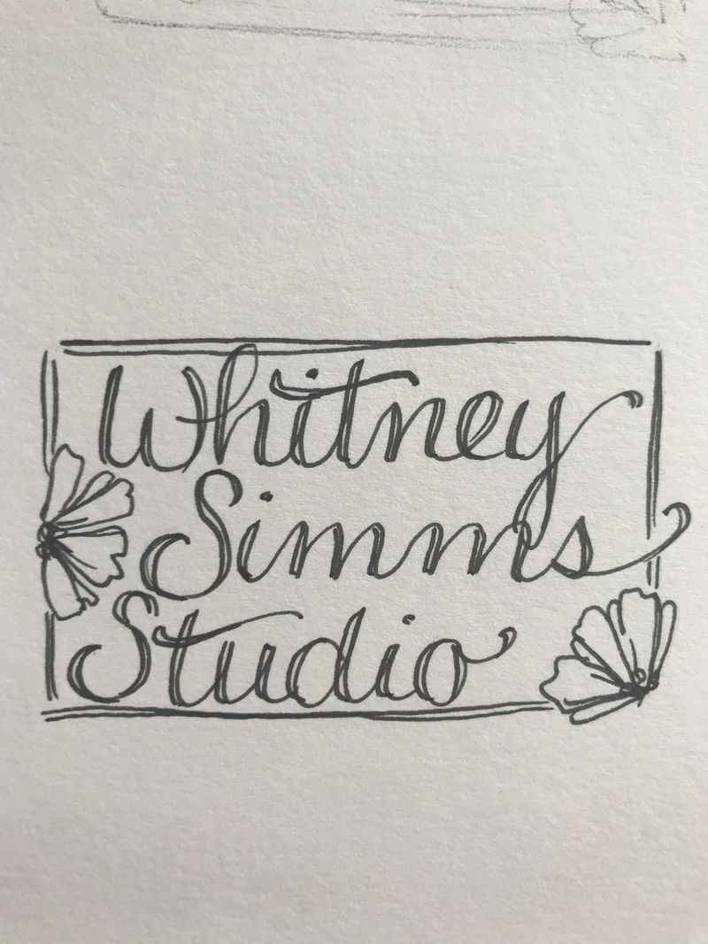
So here’s what I’ve come up with. I like the placement of the words, it’s the linework and everything else.
Any and all suggestions are welcome. Not offended at anything you say. I do like it, but not married to it.
-
I like it, though I like everything you do
") The one critique I would make is that the Whitney is just a little cramped so it takes a second for my eye to separate the i from the t. If you had a little more space at the top, you could raise the cross bar on the t a little to get it above the i.
The one critique I would make is that the Whitney is just a little cramped so it takes a second for my eye to separate the i from the t. If you had a little more space at the top, you could raise the cross bar on the t a little to get it above the i. -
Hi! It looks really nice
nice warm feeling from it,The problem I see is that it is too much complicated. I mean when you see it this big there is no problem with it. But when you will sized it down, there might me readability issue. Proportions are important in logos and smaller details are often hurting the readability. But it depends where you will put it as well I guess.
Just a quick idea of how the proportions can be more balanced - taking the flower as one object and the name as second.
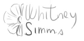
But I kinda cheated and left out the word studio haha ... but I think you have the idea of what I mean.
Hope I am making sense and good luck with designing the lettering is beautiful
-
@demotlj thanks for the heads up. It is kinda crowded. I’ll watch for that with the next few mock ups I do!
@Jonas-Zavacky youre right, it won’t shrink down very well. I’ll try to simplify it a little more. Not sure I want to drop studio. I’ll like to keep it if possible. I like the square of Jeannie Dickson has this rectangle design. But she does only have two words, not three.
Thanks for your input guys!
-
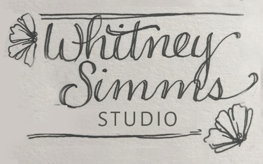
I agree with @Jonas-Zavacky , the more complicated the logo, the less effective it generally is. I think simplifying would be a good idea. The script has a really nice flow and feel, but it seems really cramped on the left. You mentioned that you like the stamp effect, so if you are really keen on keeping the borders, you might try eliminating the sides and just keeping the top and bottom. It should keep the same effect, but give it a cleaner more readable look. Script should also be used sparingly, again for readability, so you may want to consider using more than 1 font. Here is a very rough sample of what I mean:
-
@inkandspatter wow! Looks so much better. I don’t have much graphic design experience. I didn’t even think about using two fonts. That helps so much. Thanks for all the ideas. That really helps!
-
@Whitney-Simms lovely joined up handwriting. It flows. But I'd recommend giving it a bit more room by maybe making the studio word smaller than your name. As your Y and M are slapping each other on that tangent.
-
I think Inkandspatter's suggestion works best. I also visited your website and your logo is very consistent with your art. Good job!