"Love" WIP
-
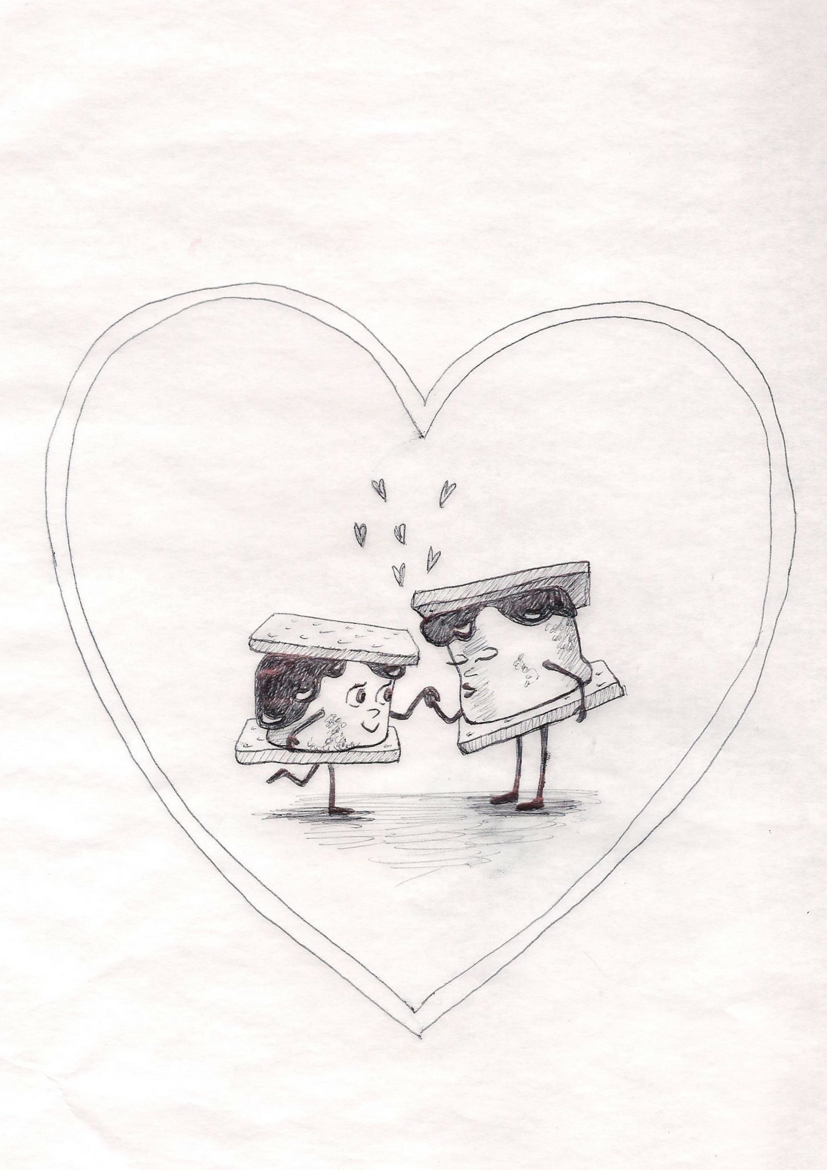
Happy Valentine's Day everyone! I am new to the forums and I thought I would start by showing my WIP for this month's art challenge. I call it S'more Amore. Let me know what I could do to improve this drawing. I am going for cute and simple.
-
@cbrocke Very cute! I do think it would be more effective without the heart around it. I don’t think you need it, the characters communicate the idea on their own. If you feel like something is missing without it, it may just be a balance issue in the composition.
-
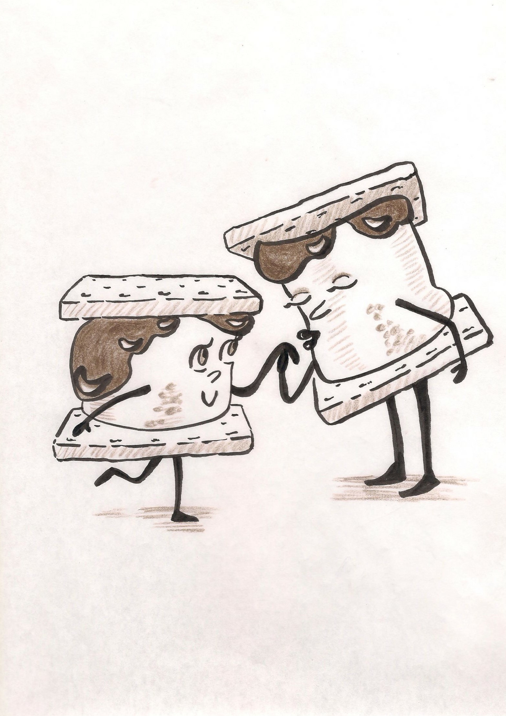
Thank you inkandsplatter for your critique! I took your advice and removed the heart. Here is the second try. I worked on emphasizing the pose more and getting rid of some of the tangents. I am worried that the characters do not look like they are standing on the same plane. Let me know what you think!

 )
) -
Adorable! Love these characters :-).
-
@cbrocke definitely improving with the removal of the big heart. Love the characters and the interaction. But I kind of miss the small floating hearts. They added some whimsy to the piece.
I don't feel like you have a problem with the characters not feeling on the same plane. I am reading the right character as a mother and the left as a son (not sure if that is what you wanted). But the Mother character seems to be be further back and if that is not what you intended then you may want to adjust.
It might be interesting to add a tear or something to the son. Like she is fixing an 'owie' for the boy. Just a thought and this doesn't make sense if that is not what you were going for.
-
Thank you @theprairiefox for your critique! The smaller character is actually supposed to be a girl and the taller one a boy. it is supposed to be a romantic gesture of him kissing her hand. Your critique helped me realize that I am not communicating that very well. I will make changes to hopefully make it more obvious.
-
Very cute characters. I actually enjoyed the little stylized hearts hearts between them from your original. I agree they do not look like they are standing on the same plane. The male's feet do not line up with the females. Maybe you could move him down?