Halloween illustration WIP
-
@Kevin-Longueil
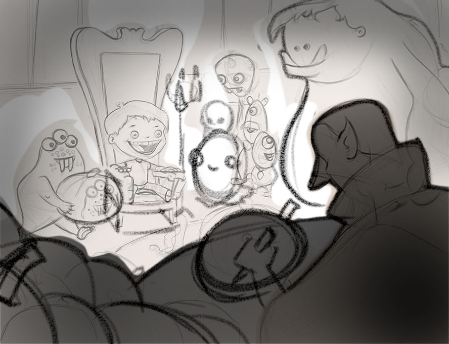
 I didn't spend a lot of time but in general you need to crop in towards your focal point. Also try to overlap and fit shapes together which will simplify your illustration and make it easier for your view to identify the important stuff from the non important things. Also on pumpkins in foreground - vary shapes from large to small for interest - to get away from pattern...pattern is good when you want a pattern for flavor but not by accident. Darken foreground objects will allow for contrast to lighted focal points.
 -
@Will-Terry Hey Will - great draw over! - just wanted to make sure you knew this awesome drawing belongs to @NoWayMe - the last composition in the thread was just me trying to show a few ideas i had -
-
@Will-Terry
Hi Will!
Wow! Thank you so much! I really like it a lot more this way! I'll rework the sketch in this direction and repost it later. You're making me realize that I have a tendency to really spread out my compositions and not overlap things enough. I will have to work on that!The only thing I am not sure of is the little guy with the pumpkin... I just can't figure out how to make him fit properly in the painting! Does anyone have another idea ?
Thanks again for doing this!
-
I think the problem with the little guy with the pumpkin is that he is a great little character and very nicely drawn - I think he is most likely most people favorite - but I think he does not fit the composition in the pose that he is in - I think you want to show clearly that Dracula is carving a pumpkin in the likeness of the sitter in the chair - the little character does that so well but his position does not make sense - he is walking and not looking at the pumpkin....I think this means he already admired it and is on his way - chronologically he should be walking off camera with his back slightly to Dracula - you could redraw him this way - we could see a 3/4 view with him(or her) looking down in amazement at his pumpkin headed to the left - this might become too focal though unless you put him more in shadow..worth a quick sketch maybe ...... another way to show what Dracula is doing without the little guy could be to have him squinting and holding a thumb up to judge proportions( possibly the universal sign of "I am doing a portrait") - the other way to show that he is carving a portrait would be to have the boy's likeness be more complete and obvious....but you want to keep the little guy with the pumpkin right?... maybe if the little guy were not walking but just looking down at his pumpkins face with delight but closer to the table as though he had just taken possession of it and was admiring it... so he may have to be a darker value - closer to Dracula's so he does not steal the show - not sure of any of this - just trying to brainstorm with you - cheers

-
@NoWayMe said:
@Will-Terry
Hi Will!
Wow! Thank you so much! I really like it a lot more this way! I'll rework the sketch in this direction and repost it later. You're making me realize that I have a tendency to really spread out my compositions and not overlap things enough. I will have to work on that!The only thing I am not sure of is the little guy with the pumpkin... I just can't figure out how to make him fit properly in the painting! Does anyone have another idea ?
Thanks again for doing this!
You could just move dracula over (which would get rid of the pile of pumpkins), bring that creature forward with dracula and have him walking off like he is now. It would make more sense that way. You'd have to zoom the group out a bit to fit it all. I may have time tonight to do a mock-up if what I am saying doesn't make sense.
-
Thanks!! I love the idea of him looking with delight at his pumpkin! I'll try that!
I read a lot of your posts recently and you always have excellent comments on people's work, thank you so much! -
Good idea as well! I'll try both that and @Kevin-Longueil's suggestions and see what fits better!
Thanks! -
@NoWayMe Thank you for the compliment Noemie! Looking forward to your next version!
-
Hello again!!
So Halloween is over, but I am still working on my illustration! (I would like to put it in my portfolio when it's done)
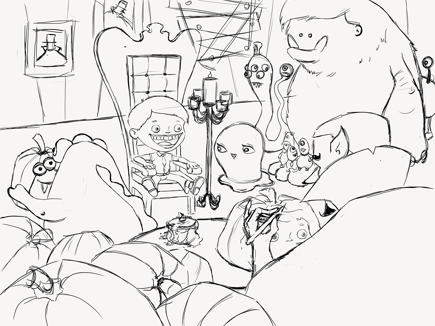
With all your help, I came up with this (almost) final version for the sketch! Anything I should modify before starting colors ? The background is still very rough, I will probably change it a little.Hope everyone had a great Halloween!

-
I really like it! this is very cute XD because he is carving his the boy face out of the pumpkin. I think the new composition is great. It's going to be awesome!
-
@NoWayMe it looks awesome! One little thing though, I like the old mouth on the boy much better than the new one. The new one just doesn't look right to me. Just my opinion wait and see what others think. Can't wait for you to paint it!!
-
Its a really nice piece! Cant wait to see the colors appearing! I agree With @Thrace-Shirley-Mears about the mouth.
-
Thank you all for the comments! I'll re-modify the mouth, I think it's the tongue... anyway it's true it looked better before!
-
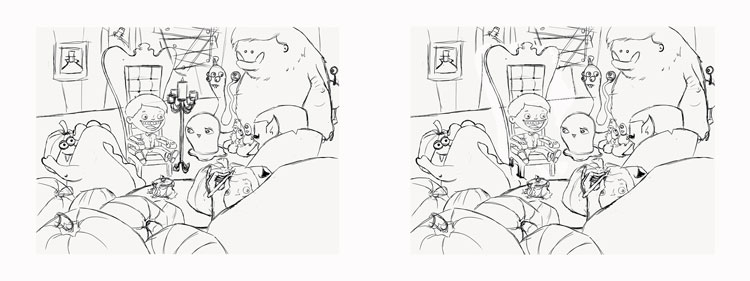
one thing I have to point out, it's the candle that shit right in mid of the illustration. I would move it back a bit so it sits behind and between the boy and the monster to the right. Now It divides the page and stops the flow of the composition. Again lovely piece!
-
@Naroth-Kean Uh...what exactly is that candle doing?? Not sure it's "stopping the flow", if you know what I mean. Hahahahaha, sorry. I'm still 12 years old.
-
@shinjifujioka Shinji I'm only 5 :D. I think Will did that by moving it to the back a bit but I think it's better without the candles since you already have one light source from the table. I'm worried that the candles will looks very hot on the boy hair. Here I removed it, just a thought

-
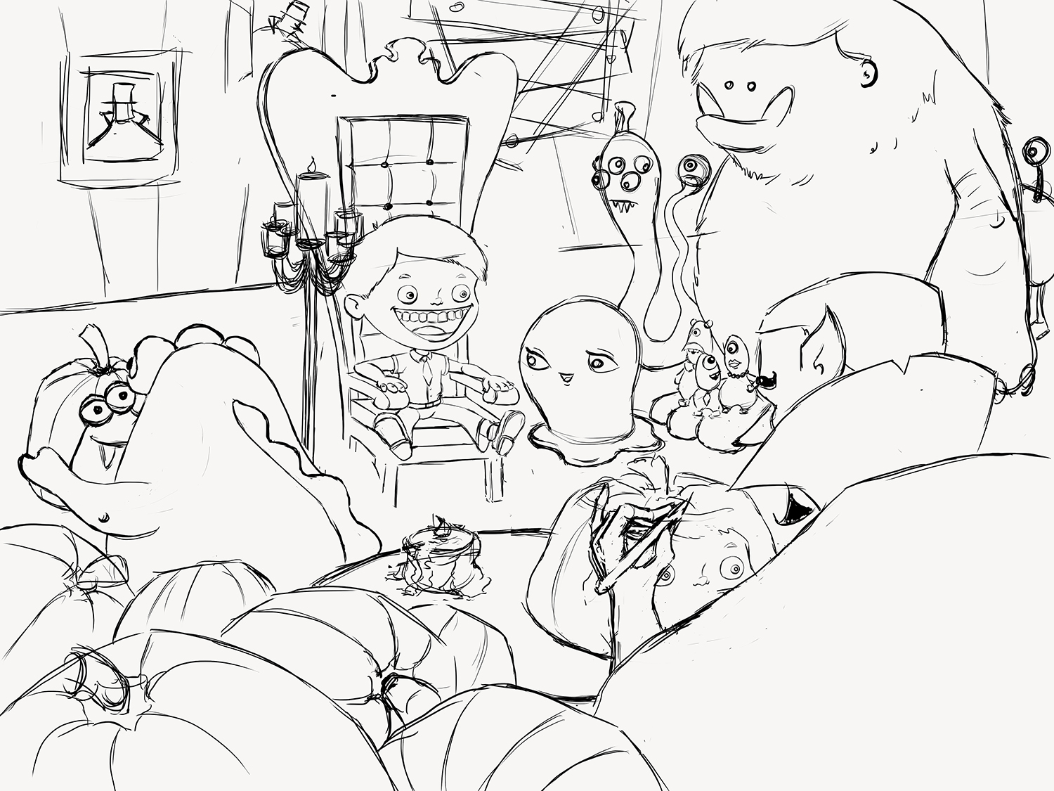
You could move candle to the other side of the chair and then it wouldn't interfere.
-
@shinjifujioka yeah i flipped to my own mistake LOLOLOLOLOLOLOLOLOL "shit" i'm sorry I mean "sit"
-
@Thrace-Shirley-Mears Yes! I will definitely do that! Now that @Naroth Kean pointed that out, it's the only thing I am seeing when looking at my drawing!! It couldn't be more "in the middle"! However, I really want to keep it in the illustration because I want it to be my primary light source (since the boy is my focal point).
-
I think this is better!
