Society of Visual Storytelling

    SVSLearn Forums

    • Register
    • Login
    • Search
    • Recent
    • Tags
    • Popular
    • Users
    • Groups
    • Search

    Which banner do you prefer?

    Artwork
    27
    36
    2021
    Loading More Posts
    • Oldest to Newest
    • Newest to Oldest
    • Most Votes
    Reply
    • Reply as topic
    Log in to reply
    This topic has been deleted. Only users with topic management privileges can see it.
    • braden H
      braden H @CatOnPaper last edited by

      @CatOnPaper said in Which banner do you prefer?:

      What I am curious of though is: Will you have your website mentioned there?

      Not on the banner, no. I'll have a ton of business cards at the table, though.

      1 Reply Last reply Reply Quote 0
      • braden H
        braden H @CukiArtist last edited by

        @CukiArtist said in Which banner do you prefer?:

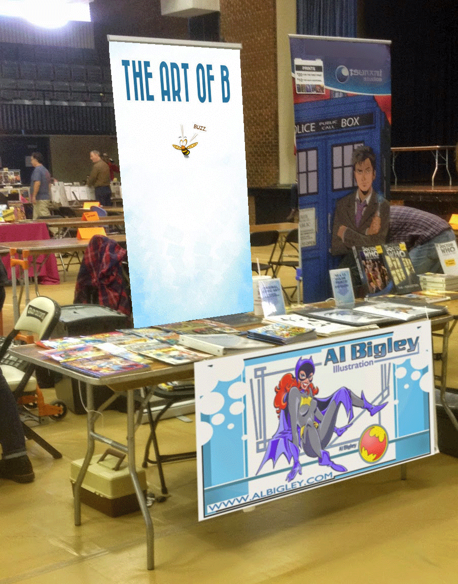
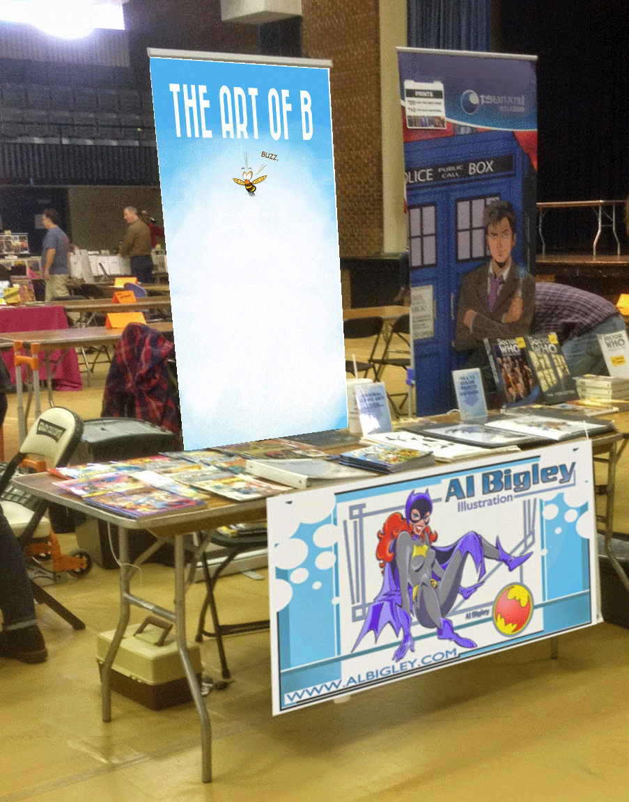
        speaking in my experience with cons most people never see the bottom of vertical banners

        That's been my experience, too. My last banner was a very full illustration that took up the whole banner. A good 2/3 of it was hidden at all times behind the wall of people, or just me and my table ๐Ÿ™‚

        1 Reply Last reply Reply Quote 1
        • braden H
          braden H @ArtofAleksey last edited by

          @Aleksey said in Which banner do you prefer?:

          I would clear that top left corner of 1

          Nice catch. I'll clean that up ๐Ÿ™‚ I tried the text the same colour as the gradient, but it was just a wee bit too light. I may try it again. I do like the idea ๐Ÿ™‚

          1 Reply Last reply Reply Quote 1
          • Jonas Zavacky
            Jonas Zavacky @braden H last edited by

            @Braden-Hallett I like the 1st one, but the 4th one is nice as well and probably the most striking?

            1 Reply Last reply Reply Quote 1
            • krisblack
              krisblack last edited by

              I think I like the first one best as the white will probably stand out more on the floor. I mocked up a couple of options in Photoshop using the Vanishing Point filter in the Filter menu.

              which-banner-1.gif

              which-banner-4.gif

              I found the original image to test with from this site:
              http://blog.playillustration.com/new-convention-banners/

              Kris Black ... designer, author, illustrator
              krisblack.com ... studio@krisblack.com

              instagram.com/krisblackstudio ... twitter.com/krisblack ... facebook.com/krisblackstudio

              braden H 1 Reply Last reply Reply Quote 4
              • braden H
                braden H @krisblack last edited by

                @krisblack Oh wow! Thanks for doing that :smiling_face_with_open_mouth: Looking at it as it would be on the floor certainly puts it in perspective!

                1 Reply Last reply Reply Quote 0
                • krisblack
                  krisblack last edited by

                  No problem. Any time you can put a design in a mockup to show how it'll look in the real world is always a great way to help make design decisions.

                  Kris Black ... designer, author, illustrator
                  krisblack.com ... studio@krisblack.com

                  instagram.com/krisblackstudio ... twitter.com/krisblack ... facebook.com/krisblackstudio

                  1 Reply Last reply Reply Quote 2
                  • RJWoodworth
                    RJWoodworth last edited by

                    I would agree that one of the final three are the best. The blue on white clouds for the first two were difficult to focus on. The third has some really nice simplicity. I personally think the logo near the bottom also helps balance the image, as simple as it is, but if this is going to be on a floor the logo might not even be visible.

                    Riley J Woodworth
                    AKA "Baldy" "Little Man" & "Jamal"

                    braden H 1 Reply Last reply Reply Quote 1
                    • djly
                      djly last edited by

                      The mock-up by @krisblack really helped me to also solidify my vote for #4.

                      1 Reply Last reply Reply Quote 2
                      • Judy Elizabeth Wilson
                        Judy Elizabeth Wilson SVS OG last edited by

                        1 and 3 look good. Well done for getting out and selling your art.

                        Website http://www.judyelizabethwilson.com/

                        Instagram https://www.instagram.com/judyelizabethart/

                        Sharing positivity through art.

                        1 Reply Last reply Reply Quote 1
                        • ThisKateCreates
                          ThisKateCreates @braden H last edited by

                          @Braden-Hallett I like one or two best. Love the color.

                          https://www.instagram.com/thiskatecreates

                          1 Reply Last reply Reply Quote 1
                          • ArtofAleksey
                            ArtofAleksey last edited by

                            Ooo thatโ€™s what youโ€™re gonna be using it for. The second one will provide a little arch around you. Btw where are you ordering this from?

                            instagram and twitter: @artofaleksey
                            alekseyillustration.com

                            braden H 1 Reply Last reply Reply Quote 0
                            • braden H
                              braden H @RJWoodworth last edited by

                              @RJWoodworth

                              Yup, that' logo's gotta be up high. Me (and the comicon crowd) will be standing in front of it.

                              1 Reply Last reply Reply Quote 0
                              • Coley
                                Coley last edited by

                                I like the last three the best but they're all quite appealing!

                                https://www.instagram.com/nicoleledrewmay/

                                1 Reply Last reply Reply Quote 0
                                • braden H
                                  braden H @ArtofAleksey last edited by

                                  @Aleksey I'm ordering from Vistaprint. I've had good results from them with business cards and banners.

                                  1 Reply Last reply Reply Quote 1
                                  • First post
                                    Last post