Up For A Colour Challenge?
-
@sigross I have never done that, but I can see how it would be very satisfying. I need to get more playful with colour, that’s a good thing to try.
-
@Kat I think if you're softening the edges of the ball, then soften the other objects shadows too. Softer shadows can result from diffused light. Try it with a bit of tracing paper held slightly in front of your phone camera torch and shine it on an orange or something round, then on a box.
I got a book that Jake recommended Perspective Made Easy by Ernest R. Norling. Every time I get on the tube now, I read it and then look down the carriage to see how the shadows shift and move in perspective.
-
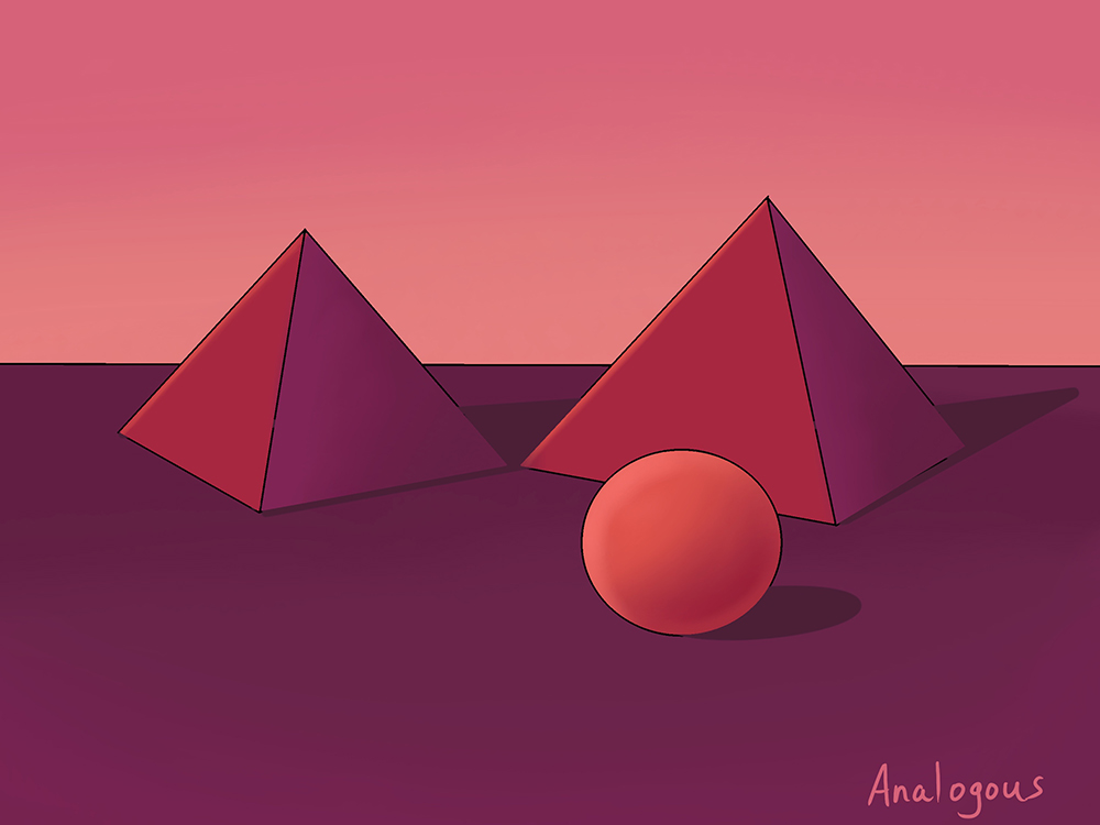
Here is my next attempt. I feel like the process is becoming quicker and easier which is a relief. To challenge myself, I am going to do all of the colour schemes a second time but reverse my approach - dark if I went light the first time, using colours on different objects.
-
So I used a Square Charcoal brush and a Square Pastel brush. I also like to further challenge myself and needed to cast my pyramid shadow over the sphere. I have not worked with the cast shadow of pyramids so I looked over some references. I watched part of the Creative Composition 1 class and listen to the warm colours draw you forward and cool colours push you back and so I made my sphere a more salmon orange (yes I did find the colour in the orange section, lols) . I hope you like it!
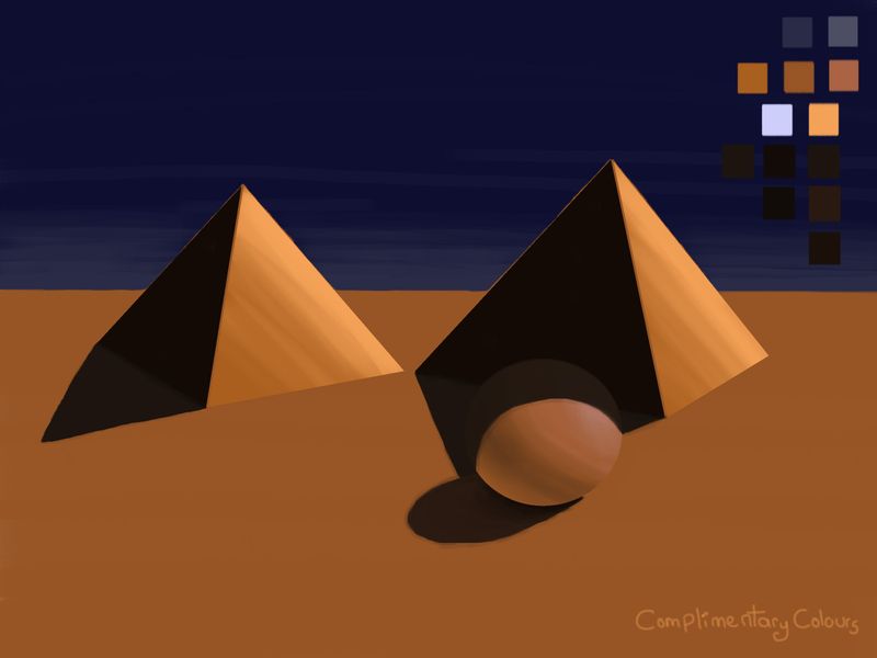
My first time including colour swatches to the side.

-
@Heather-Boyd Nice colours! Smart to look at reference first, I ended up going back and revising all of my pyramid shadows this afternoon.
-
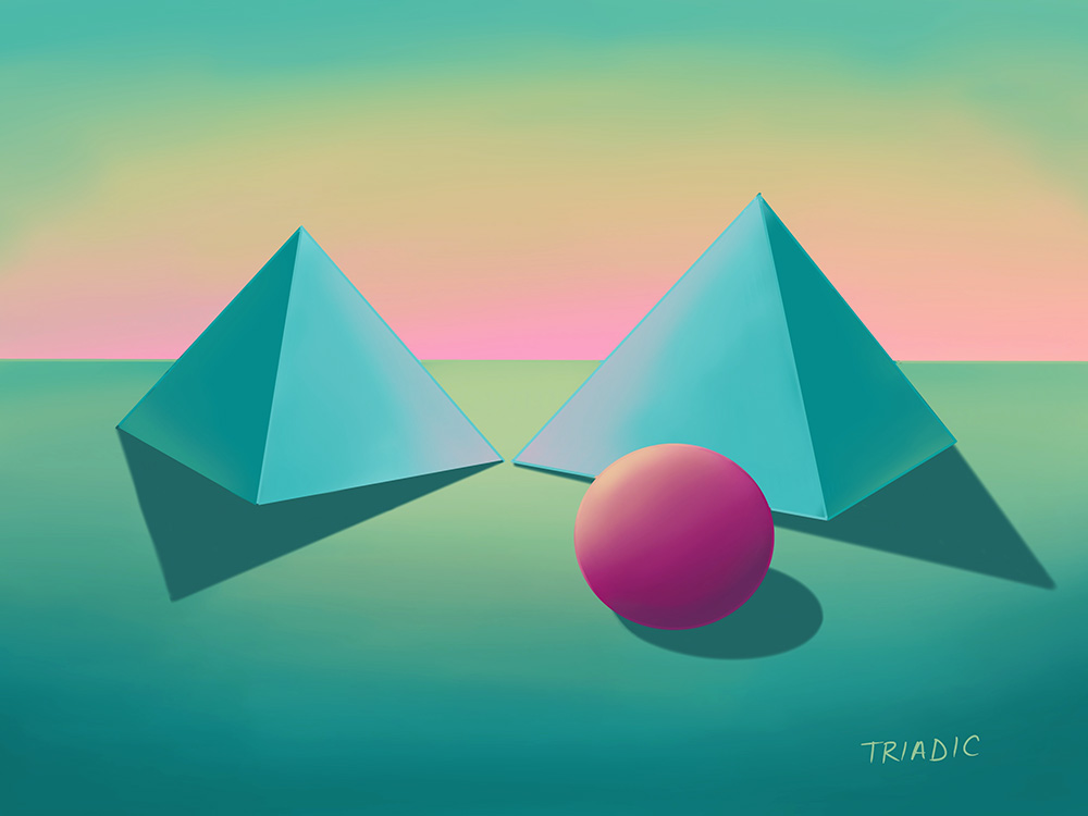
Here is my final attempt. I did a triadic colour scheme this time. I tried to be a little more adventurous and explore a variety of different options.
-
@inkandspatter What does Triadic mean colour wise?
-
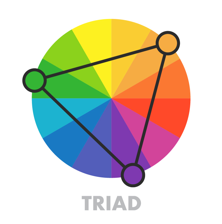
@Heather-Boyd Triadic uses three colours that are equal distance from each other on the colour wheel. If you drew lines connecting the colours you would draw a perfect triangle on the colour wheel.
-
@inkandspatter Oh that's nice, thanks it's really helpful!
-
So I was watching a Marco Bucci YouTube on Grey scale to Colour video and tried out the first suggested practise. Cut your page in half and paint directly in colour with different brushes an abstract piece -mine started that way but alas I was listening to Celtic music and the dance showed up on the image. Then add a grey scale redraw and then add he calls them glazes (colour and overlay) to compare. I really liked doing the grey scale but not adding the glaze. I know you can probably put in a lot more hours to make it look good. But I like his reasoning why he doesn't: 1 Lack of Expression and 2) No fun.
Anyways since you @inkandspatter started a colour challenge thread - I thought I would just insert mine here -it is a monochromatic work either way.

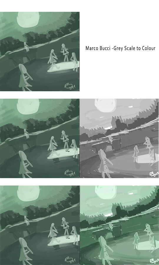
To note in the last "glaze work" I used the same colour greens -came out different on the glaze one.

-
I wondered if this little tool would be interesting, someone put me onto it last week
https://color.adobe.com
I guess it’s a bit like a colour wheel come palette picker. -
@peteolczyk Wow super helpful thanks so much!
-
@Heather-Boyd Thanks for sharing, I would love to try this. Could you post the link to the video?
I actually learned a lot from my last colour studies/experiments, but I don’t think it began to show until my last one. After looking at all of them, I started to see a pattern in the way I was working with colour, and it was very rigid! This looks like a great way to loosen things up.
-
@inkandspatter
That’s the link. There are 4 excerises I hope to get to the next one tomorrow. I am still thumbnailing through ‘balance’ composition class which is very challenging. A lot on the go! Lols
-
So to continue the next exercise still has to do with colour so please forgive me I am going to post this one here and the other two. I would like to see yours too @inkandspatter when you complete them. So the Exercise #2 starts in Grey scale roughly, then moves to a quick colour glaze and then finishes up merging those two layers and going straight on top with colour brushes.
I am still working out how I want to share. This mountain is one of the Rock Faces at Medeora Hewn in Greece (when I went with my church in 2007). Looked like a rock giant face
 . So the mountains were in part grey already. Thanks.
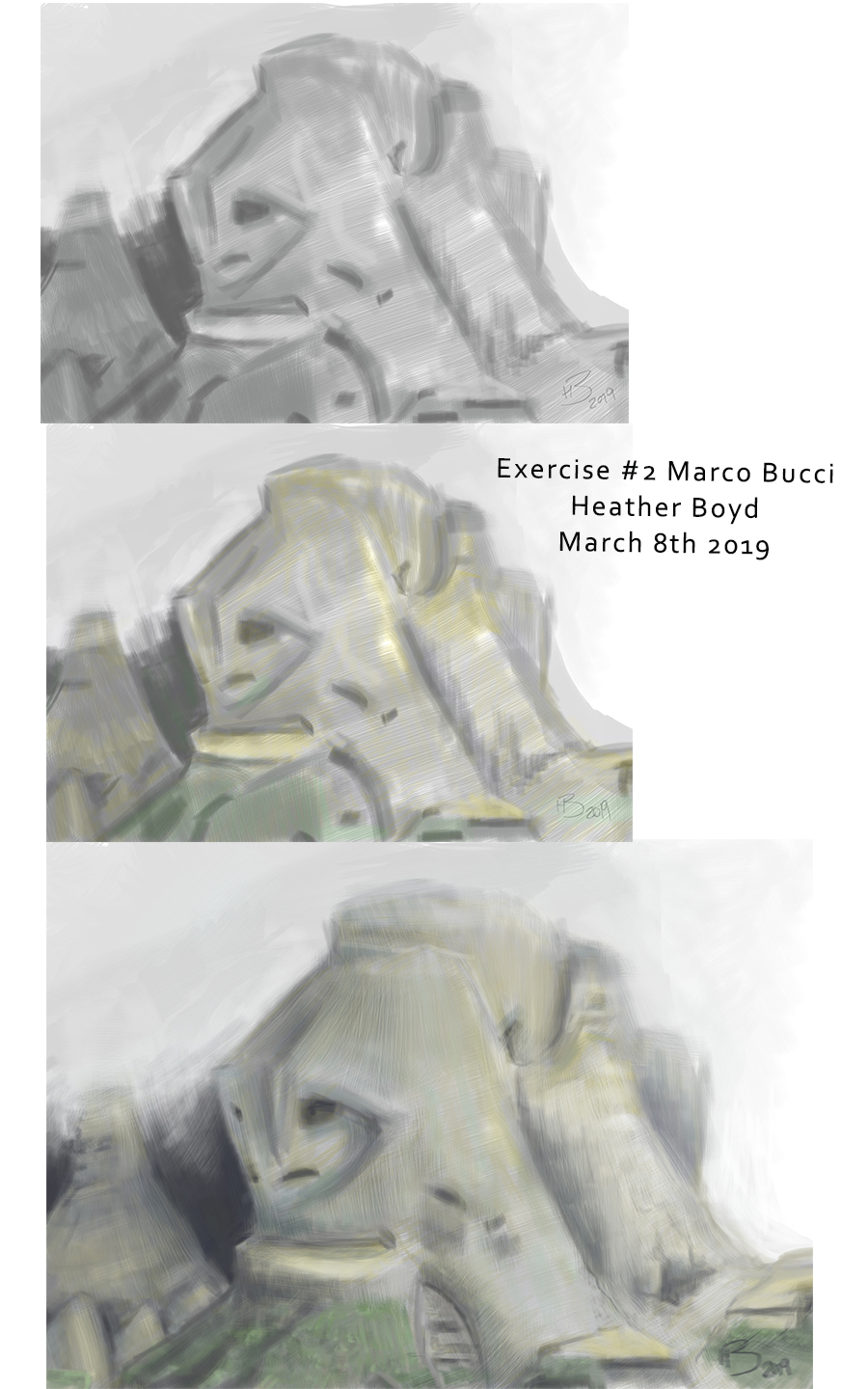
Note still working out why my text is slanted when it is balanced with free transform.
-
@Heather-Boyd Hopefully I can get to these exercises soon. My kiddos are on March Break this week, so I may have to work on them next week.