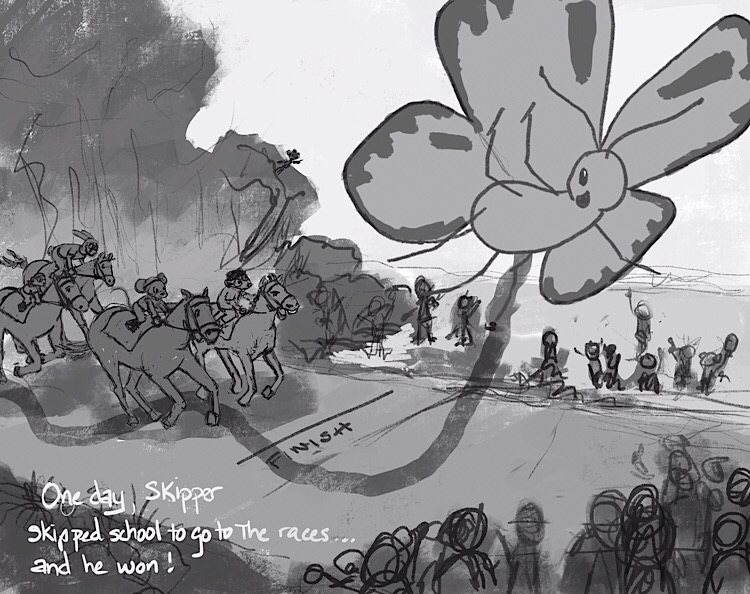
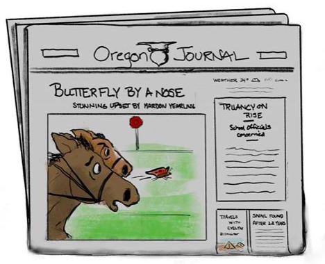
Butterfly race WIP
-
Hi Laurie,
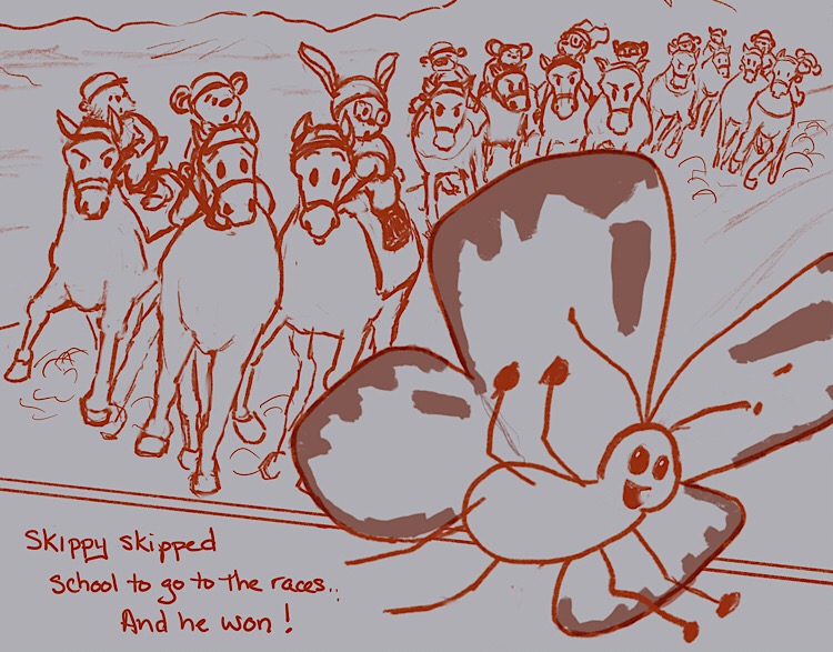
The first and third are the same in relative terms and are the stronger images. The second one makes me afraid Skipper, the butterfly, is on the verge of getting trampled. -
I agree with the previous comment. Not seeing much difference between 1 and 3 (I think 1 is the stronger of the two) but image 2 seems flat.
-
My favourite is also number one
") What I think you could add / change is to show more the speed of the butterlfy because he looks pretty chilled now, like he is maybe just accidentally by a horse race. His feelers and legs could be bended backwards and you could give him a more eager expression.
What I think you could add / change is to show more the speed of the butterlfy because he looks pretty chilled now, like he is maybe just accidentally by a horse race. His feelers and legs could be bended backwards and you could give him a more eager expression. -
I am going to work some more on these and do some more thumbnails. The advantage of 2 is that I can show facial expressions on the horses and riders as well as the butterfly but I agree that it is flat and 1 and 3 show the butterfly’s movement more. I also have the problem of the size differential between horse and a butterfly. Back to the drawing board.
Laurie DeMott
instagram.com/demotlj -
@demotlj I think 1 and 3 read the best - 3 is my pick but with the horse poses from 1 - i am not seeing the size difference problem you mention? I am seeing the butterfly as being much closer to the picture plane than the horses. I think it looks good and reads well.
-
@Kevin-Longueil By size difference, I just meant that butterflies and horses are so different in size that it restricts my options for POV if I want the butterfly to show up at all. These were the only thumbnails I've been able to come up with so far that work with that size differential but there may be more if I do some more exploring. Everyone's comments have been helpful and I think I have a better sense of what I'm trying to do with this picture.
-
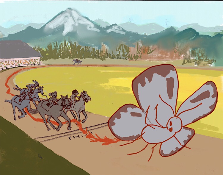
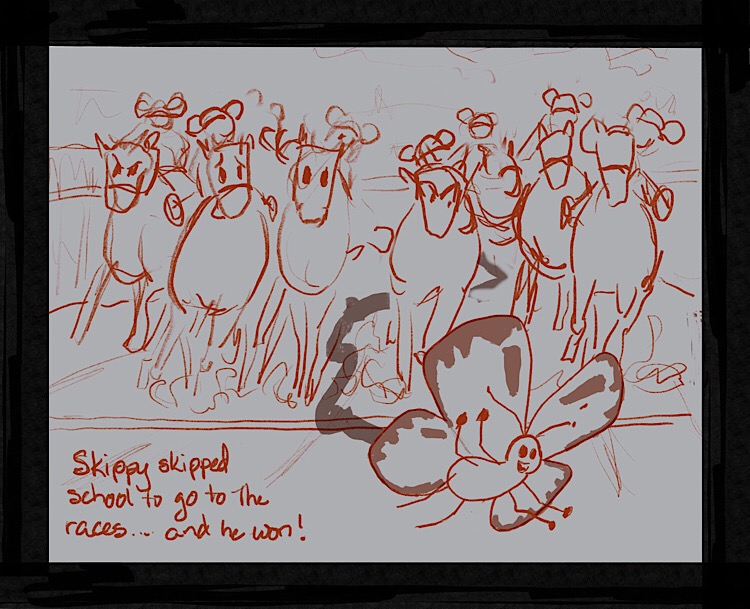
I did a couple of other thumbnails none of which I loved so I’m going with the first. Here is the next permutation. The colors and values are just “placeholders” — I’m still just working on composition.
Laurie DeMott
instagram.com/demotlj -
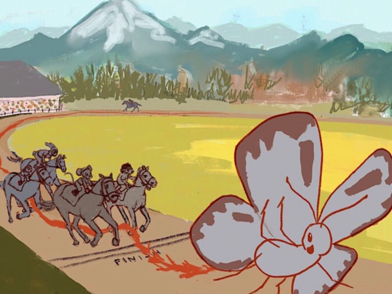
@demotlj I think your picture could maybe benefit from cropping it. I allowed myself to make a screenshot to show you what I mean. I also deformed it just a tiny bit because there happend some strange gaps while cropping. It’s just a quick try!
Instagram: saciia_
-
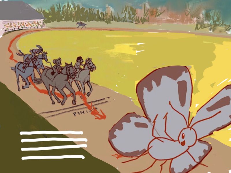
@saciia_ I see what you mean. I was saving that left bottom corner for text but there is a lot of empty space in the middle right now. Maybe the text should go somewhere else.
Laurie DeMott
instagram.com/demotlj -
@demotlj Ah, I see! I think your composition is great! It’s just tiny bits that need to be moved. On the bottom there is the empty space, like a line and if you have text to the left I feel there would sit a lot of weight together with the horses and it could feel squeezed. I made a quick change to show you how I maybe would do it. I gave more space on the bottom and moved the butterfly more down and closer. I hope it helps you!
Instagram: saciia_
-
@saciia_ This is really helpful because I think you are right about the text making it
left bottom heavy even with your adjustments. In fact, I'm re-thinking whether my third thumbnail is more balanced. I'm going to have to mull this over some more. -
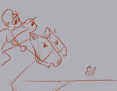
My problem overall is the scale. I can't tell how big the butterfly is. Is it a huge butterfly? or is it a small butterfly right up next to the camera? If it is the second, then the butterfly isn't even close to the race. this is why I would lean towards the second composition as I feel this is your best bet at creating a composition that sells the scale of the butterfly next to the horses. Also, I love your gesture drawings of the horses best in option 2 as well.
I love this idea. It is funny and clever. I look forward to seeing how you finish this!
-
Here’s another in which I just cut and paste the butterfly and horses into a whole new background to try to get a feel of the composition. It deals with space issues better but not necessarily with the scale issues that @andersoncarman notes and that also bug me still.
Just for comparison, here is the quick modification I had done to #2 to try to see if I could make it look like the butterfly wasn’t being trampled.
Laurie DeMott
instagram.com/demotlj -
@demotlj have you considered a side view of the race from a lower angle? so kind of like a combo of those two sketches? Instead of the butterfly having won by a long shot and already flying off maybe he's barely pulled ahead of the horses and is just crossing the finish line, kind of flying at the horses knee height. That would give you a better sense of scale.
Taylor Woolley
(Formerly Taylor Ackerman / StudioLooong)
Website: www.woolleystories.com
Instagram: https://www.instagram.com/woolleystories/ -
I did consider that but the problem is that the size differential is so great that if I put them on any plane that gives a true comparison, either you can’t see the butterfly or you can’t see the horses. Here is one of the quick thumbnails I did which shows the problem and I even fudged the butterfly’s size. In real life it would be half that size. If I zoom in more on the butterfly so that you can see his face, the only thing in the scene will be the butterfly and the horse’s legs.
This is a good puzzle for me, trying to figure out how to cope with vastly different sized characters. It makes me appreciate illustrators of Gulliver’s Travels.
-
@demotlj - could one of the spectators be holding binoculars and you can then see the butterfly? Just a thought :-).
-
I did some more research on characters of vastly different size and for those who are interested, here are the strategies often used:
- Both characters in the frame but the larger one is detailed and the smaller one is too small for detail (Gulliver's Travels)
Here, the emphasis of the illustration is either on the action of the larger figure or to show the size differential
- The smaller character is detailed and the larger character is seen only in part (Gulliver's Travels)
In these, the emphasis in on the smaller creature's actions and the larger creature is implied through the partial view
- The smaller creature is the focal point while the larger creature is seen at a distance (Beatrix Potter)
This allows the smaller creature to be the primary focus of the piece while the larger creatures act as back drop to the scene.
Since the focus in my story is on the smaller creature not the larger one, and the story isn't about the size differential directly but about the race, I think #3 is the best strategy which my thumbnails have done more or less. I don't know if this changes anything for me but it was interesting research!
-
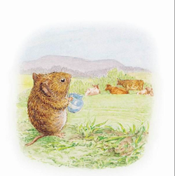
@demotlj I really like the thumbnail in red, I think it is getting there. I think you need to keep pushing this composition. I love the reference you brought up of the mouse because we get a sense of scale from the fact that the mouse overlaps the horizon that the cows are on. I think you can use this same principle in your drawing by having the butterfly directly covering up some of the horses. right now it's covering some of their feet and I think that is because you dont want to cover the horses, but remember, Skippy is your focal point (That's my assumption) and if he covers horses thats ok!
Cheers,
Anderson Carmanhttps://www.andersoncarman.com/
https://www.instagram.com/andersoncarman/ -
@andersoncarman Good point about Skippy covering the horses. I tried developing the other scene but am not liking the way it is going and keep coming back to the thumbnail in red (the horses thundering down the track). I think I'll switch to playing with that one some more now and see where it goes.
This morning before work, I was so tired of trying to figure this out that I drew this:
I'll get serious again about it tonight though. Thanks for your encouragement.
-
After lots of failed sketches, here is the design I am going with. On to clean up and inking.