Need help with portfolio piece
-
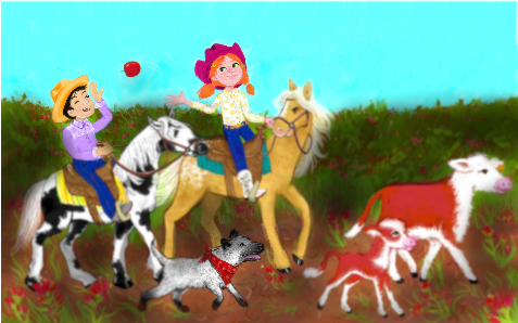
The challenge theme for the New England scbwi conference is "an act of kindness along the way". This is what I'm working on for it and I'm getting frustrated. I would appreciate any help or thoughts!

-
Hi @Heather-Bouteneff looks like the values of the hedge, ground and animals are pretty close. I've turned your image black and white to demonstrate what I mean.
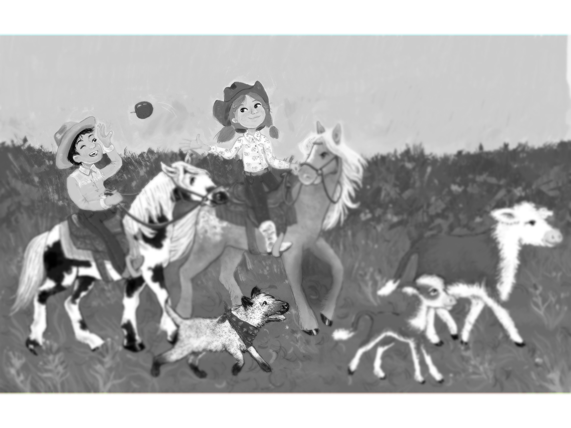
I took your drawing and quickly darkened the bushes and floor (with my finger on my phone so it's a bit messy). The characters aren't quite as lost within the hedge.
The focal point is the exchange of the apple between the two human characters. I'd suggest upping the contrast even more around them by lightening the sky around their heads maybe. Maybe even drop that top of the hedge down a bit so the figures are silhouetted against the sky. The line of the top of the hedge is touching the girls hand which slightly obscures the action of her throwing the apple.
Hope that helps

-
@skillydan it heps a lot, thank you!
-
Your characters are really lovely and the colours are nice and vibrant! Like it has already been said, the values need a little work as the piece is lacking a bit of depth at the moment, I would also add some shadows under all the animals so they look grounded
You could maybe also have a look at changing the bush or removing it altogether and adding more of a background like hills, or a stable building in the distance, just so it tells more to the story of where the characters are, plus it will open up your whole scene and make your characters really stand out! Something to think about anyway -
@hannahmccaffery great ideas! I wanted it to look like a plain of wildflowers and if it's reading like a bush that's a good reason to cut it down. That might also let me change the boy you a green shirt like i wanted anyway lol
-
@Heather-Bouteneff Ah I see, well if you wanted to keep it as a plain then I think all you'd need to do is look at the perspective of it and I'd still add something behind the plain (like a windmill on a hill or something) just to give us an idea of the background, middle and foreground! I personally like his purple shirt as it is, you could try a dark orange colour perhaps? Might help him stand out more from the greens/blue sky etc!
-
I gotta stop since the toddler isn't agreeing with the nap but I tried changing it a bit and I like it better so far, spot on suggestions

-
This looks so much better, it really makes you focus more on the characters now
great stuff! -
@HeatherBouteneff You made some good changes from the first one. I'm glad that you changed the sky, the clouds really soften up the vibrant cyan. I think that you can go a bit farther with the value of the ground. Watch the saturation though, the red brown of the ground is competing with the red brown of the cows. Go duller with the dirt and the cows and flowers should start to pop.