Middle ground/ foreground darkness/lightness?
-
Hi guys!
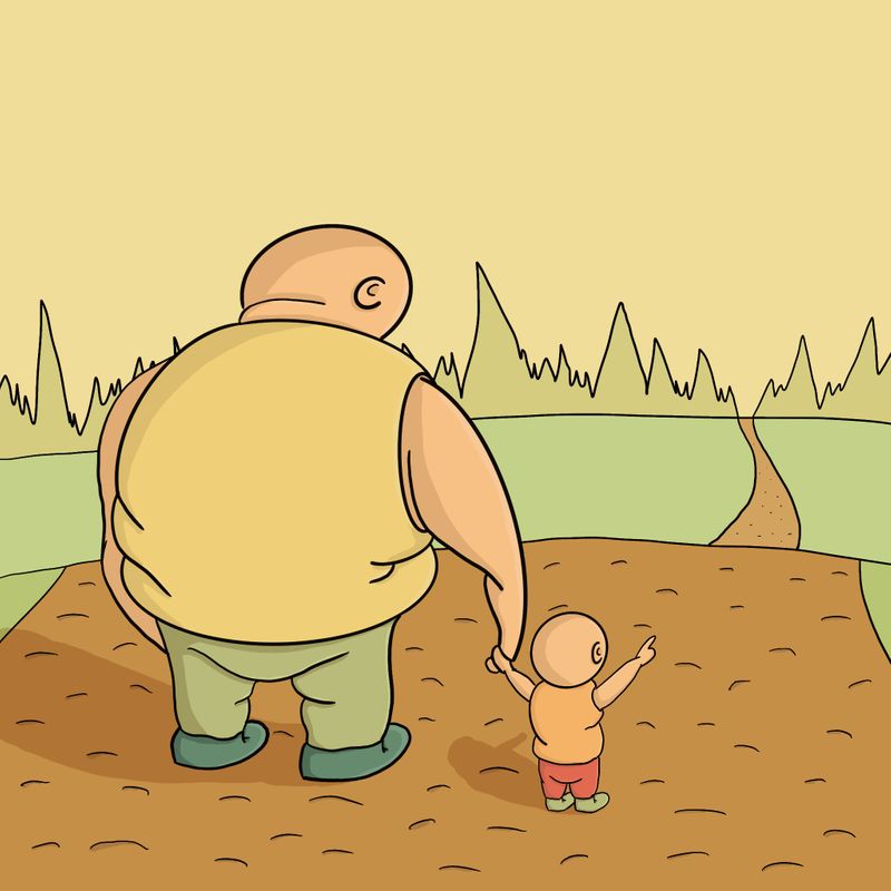
I have a question about the darkness/lightness of what the middle ground and background of an image should be? I just made this quick drawing to see how Procreate works (please excuse the crudeness of it, I only started learning to draw a month ago so as you can tell I’ve got a long way to go!
 ) I have conflicting thoughts about the middle ground and foreground. Am I meant to darken the parts of the drawing furthest away to ‘push them back’ in the painting, or do things get lighter the further away they are due to atmospheric haze? Any advice would be much appreciate and is there anything else that jumps out to you straight away from the image that looks like I’m going in the wrong direction?
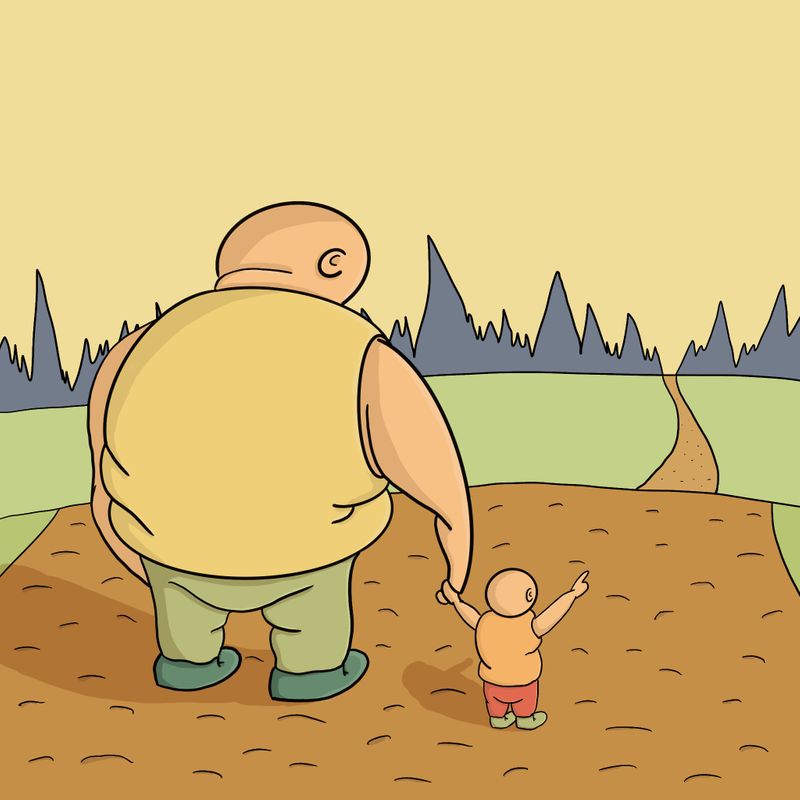
-
@hoppershaun Your second guess was the right one
") A good rule of thumb to remember that helps me is that the closest something is to the sky background, the closer they will be in color to that sky! Here, your furthest away background element is the darkest which make the values a bit odd! Try lightening and yellowing your tree line. The middle ground and foreground will be progressively more detailed, more saturated and darker. Sometimes there are exceptions depending on where the light source is, but for most outdoor scenes this works like a charm!
A good rule of thumb to remember that helps me is that the closest something is to the sky background, the closer they will be in color to that sky! Here, your furthest away background element is the darkest which make the values a bit odd! Try lightening and yellowing your tree line. The middle ground and foreground will be progressively more detailed, more saturated and darker. Sometimes there are exceptions depending on where the light source is, but for most outdoor scenes this works like a charm! -
@hoppershaun I agree with @NessIllustration as well.
One thing that jumps out with me that a lot of people do, is the head of the child. Children have big heads. Right now your child looks like a small adult. Don’t feel bad, though, even the masters did it once upon a time.
I like your line work and composition. For a self proclaimed newbie you have good potential.
-
@NessIllustration & @burvantill thanks very much for the comments, yeah totally agree with you both. I’ve tried to quickly change the image to incorporate what you advise, hopefully going more in the right direction