Society of Visual Storytelling

    SVSLearn Forums

    • Register
    • Login
    • Search
    • Recent
    • Tags
    • Popular
    • Users
    • Groups
    • Search

    WIP Book Cover: The Picture of Dorian Gray

    Artwork
    13
    14
    844
    Loading More Posts
    • Oldest to Newest
    • Newest to Oldest
    • Most Votes
    Reply
    • Reply as topic
    Log in to reply
    This topic has been deleted. Only users with topic management privileges can see it.
    • NessIllustration
      NessIllustration Pro last edited by

      Love the second one best! But I also really the 3rd one with the text across the face, I think that's really cool! I wonder how it would look if you mixed the 2, maybe make the paint swipe a bit bigger to put the text on there?

      vanessastoilova.com
      instagram.com/vanessa.stoilova/

      Check out my Youtube channel for tips on how to start your career in illustration! www.youtube.com/c/ArtBusinesswithNess

      1 Reply Last reply Reply Quote 1
      • eddysage
        eddysage last edited by

        I think a combo between 2 and 4. Definitely prefer the solid stripe across the eyes, shows a sense of drama and hate by whoever did the cross out. And the eyes I think are something so personal, to look someone in the eyes can be a deep connection. To cut that out entirely I think simbolizes it’s personal.

        I like the contrast with that of other portraits that are normal, untouched. You could add a lot of fun details with the teams and other portraits and then make the lighting and colors more bold on that center painting to really draw the eyes to that.

        1 Reply Last reply Reply Quote 1
        • Pamela Fraley
          Pamela Fraley SVS OG last edited by

          These are great. The 4th one is my favorite, but as you said, its not accurate to the story to have it hanging on the wall. I think you could make it work if you set the framed photo on the floor in an attic-type space with some other portraits laying or stacked close by. Maybe a few cobwebs and mothballs? That way you'd still have the contrast with the other pictures whose faces are not messed with. I really like the 2nd and 3d versions too, though. They are all very eye catching.

          instagram.com/fraleycreates

          1 Reply Last reply Reply Quote 1
          • Heather Boyd
            Heather Boyd @andersoncarman last edited by

            @andersoncarman
            Again never read the book however visually speaking I like the background of number 4 with all the other portraits in the background but the paint swip of number 2 instead of the scribble, unless you made the scribble more like engrave scarring of his face.

            πŸ™‚

            Instagram: www.instagram.com/heatherboyd.illustration/
            Website: https://heatherboydillustration.ca
            Shop: https://www.inprnt.com/search/products?q=HeatherBoydIllustration
            Ko-Fi: https://ko-fi.com/heatherboydillustration

            Be blessed,

            1 Reply Last reply Reply Quote 1
            • JerrySketchyArt
              JerrySketchyArt last edited by

              I like 2 and 3 the best. 3 would be my favorite.

              1 Reply Last reply Reply Quote 1
              • Jonas Zavacky
                Jonas Zavacky last edited by Jonas Zavacky

                Nice work! My fave is the last one. It has really good vibe. I love the idea that the picture is actually on the wall - I think that it can be explored in a ways that it doesnt interfiere with the story

                1 Reply Last reply Reply Quote 1
                • Kris
                  Kris last edited by

                  This looks really great, I like the one with the pink swatch over the face.
                  I believe the portrait in the book is a full standing portrait which could open up some more compositional options if you choose.
                  Cool stuff. πŸ˜„
                  ✌

                  1 Reply Last reply Reply Quote 1
                  • Heather Bouteneff
                    Heather Bouteneff last edited by

                    love the full gallery one, but the second or third paint swatch like others have said. Almost like spray paint which modernizes the story for me in a really good cool way. You can have some fun with the other paintings 'reacting'. So creepy, love it!

                    https://heatherbouteneff.com

                    1 Reply Last reply Reply Quote 1
                    • andersoncarman
                      andersoncarman last edited by

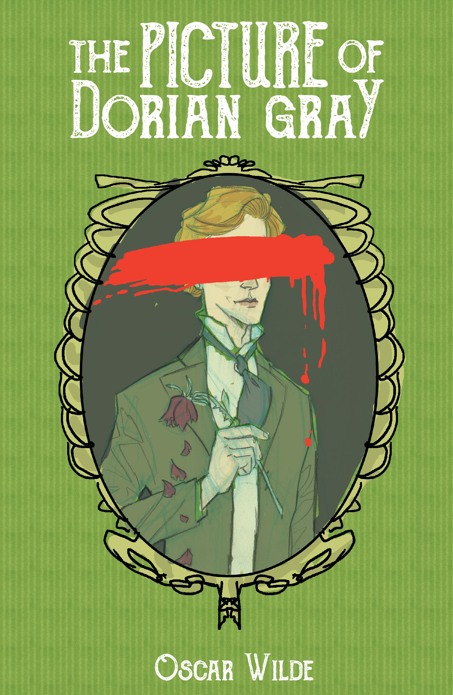
                      Thank you all for the wonderful feedback! I have continued to work on this and here is my current stage. I have a digital color mock-up.

                      I wanted to go with a really sickly green and red color scheme and the text is white because white is really important to the story. What do you think? I am concerned that it feels messy. The final will be watercolor and will give it a more painterly look on the portrait.

                      Dorian-Gray-color-mockup.jpg

                      Cheers,
                      Anderson Carman

                      https://www.andersoncarman.com/
                      https://www.instagram.com/andersoncarman/

                      1 Reply Last reply Reply Quote 6
                      • MichaelaH
                        MichaelaH last edited by

                        I like the color combination, so go for it. It looks good all together

                        https://www.instagram.com/michaelaheimlich/
                        https://www.heimlich-illustration.de/

                        1 Reply Last reply Reply Quote 0
                        • Coley
                          Coley last edited by

                          I like the colors, looks good πŸ™‚

                          https://www.instagram.com/nicoleledrewmay/

                          1 Reply Last reply Reply Quote 0
                          • First post
                            Last post