Society of Visual Storytelling

    SVSLearn Forums

    • Register
    • Login
    • Search
    • Recent
    • Tags
    • Popular
    • Users
    • Groups
    • Search

    The Moment Before WIP

    General Discussion
    6
    15
    639
    Loading More Posts
    • Oldest to Newest
    • Newest to Oldest
    • Most Votes
    Reply
    • Reply as topic
    Log in to reply
    This topic has been deleted. Only users with topic management privileges can see it.
    • Chip Valecek
      Chip Valecek SVS Team SVS OG last edited by

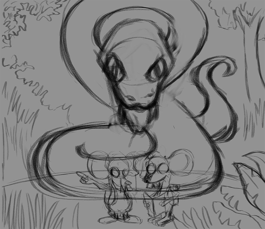
      Jack and Jill went up the hill but of course Jack thinks he knows where he is going....

      Here is my rough and started on my first pass on clean up. I will do at least two more passes on cleaning up the sketch before I ink. Do you see anything that needs fixing?

      wip01.jpg

      wip02.jpg


      https://www.instagram.com/chipvalecek/
      https://www.facebook.com/cvalecek
      http://www.cshellmedia.com/

      1 Reply Last reply Reply Quote 4
      • burvantill
        burvantill Moderator last edited by

        Cute. 👍
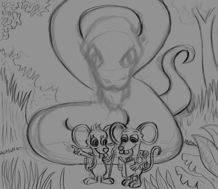
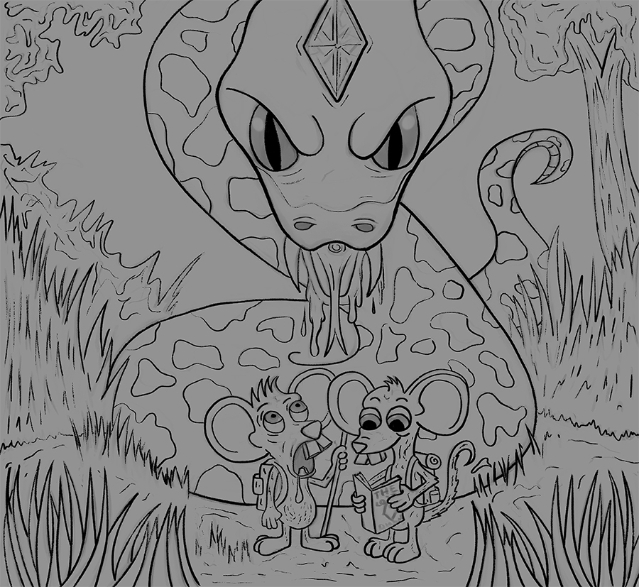
        I think the mice need to be moved up, off the bottom of the page. I think if you adjust your crop to include space below them, that should fix that.

        Lisa Burvant
        www.lisaburvant.com
        Instagram & Twitter & SVS: @burvantill

        1 Reply Last reply Reply Quote 0
        • Chip Valecek
          Chip Valecek SVS Team SVS OG last edited by

          Here is the last sketch before I ink it. Anything that needs changing?

          wip03.jpg


          https://www.instagram.com/chipvalecek/
          https://www.facebook.com/cvalecek
          http://www.cshellmedia.com/

          Johanna Kim 1 Reply Last reply Reply Quote 5
          • braden H
            braden H last edited by

            Those poor, poor mice... Nice work so far!

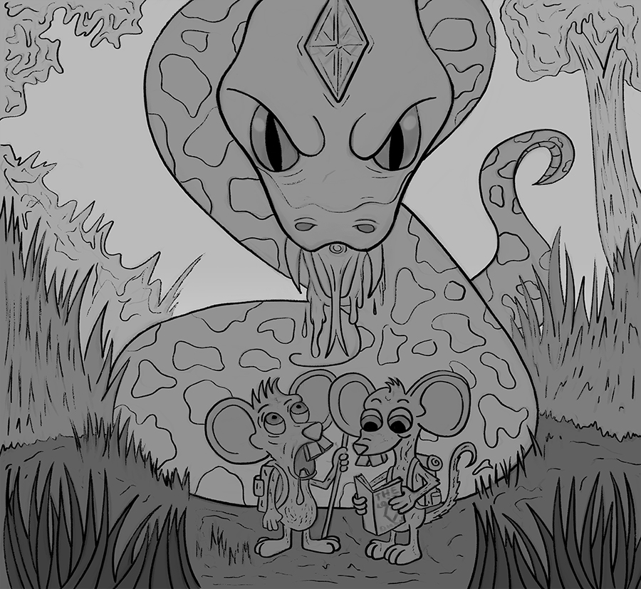
            Since the piece is already mostly symmetrical, I kinda wanna see the grass in the lower left repeated in the lower right. Seems unbalanced to me for some reason 🙂

            1 Reply Last reply Reply Quote 1
            • Coreyartus
              Coreyartus Moderator last edited by

              Oh, Chip--this has got just the right balance of humor and terror! Depending on where you focus, it is both lighthearted and very scary! In my opinion, the snake is just scary enough without being too scary--which is a hard balance. Well done! This image can go so many directions depending on what you do with the color palette and the values... Wow--it could be innocent or really dark humor. Can't wait to see what you choose! 🙂

              Children's Illustration Portfolio: https://www.coreyartusillustration.com
              Art Portfolio: https://www.coreyartusimagery.com
              Mastodon: https://mindly.social/@Coreyartus
              Pixelfed: https://pixelfed.social/Coreyartus

              1 Reply Last reply Reply Quote 1
              • burvantill
                burvantill Moderator last edited by

                Those mice are done for 👍👍👍😃

                Lisa Burvant
                www.lisaburvant.com
                Instagram & Twitter & SVS: @burvantill

                1 Reply Last reply Reply Quote 1
                • ?
                  A Former User last edited by

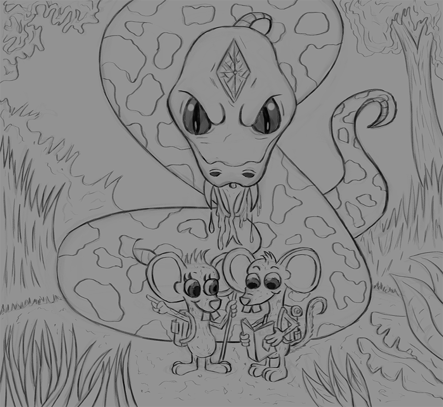
                  Haha this made me chuckle, love those teeth on the mice! Apart from what others have said, the only other thing that sticks out for me is on the left of the snake, is it long grass? and then behind that, is it a bush? The line seems to join the pattern on the snake, so maybe that's something to look at 🙂
                  Cool stuff!!

                  1 Reply Last reply Reply Quote 1
                  • Johanna Kim
                    Johanna Kim SVS OG @Chip Valecek last edited by

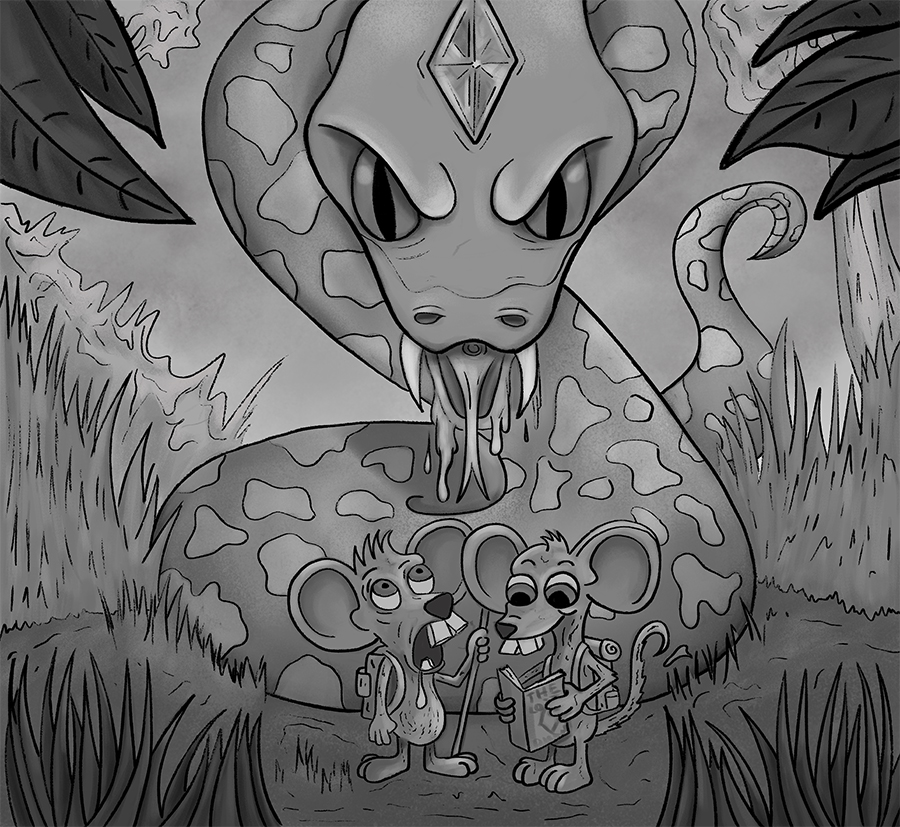
                    @Chip-Valecek Looking good, Chip! That snake is looking pretty frightening (poor mice!). I wonder if you might increase the suspense and tension by perhaps having the snake concealed a bit by the foliage and shadows, maybe repeating the pattern of its scales in the foliage in the form of dappled light. This way, it's lurking just beyond the light of the clearing where the mice are. And what if you added eyelids to the snake, so that we only see the smallest slits of its eyes gazing hungrily down at the mice. Lastly, you might lift the snake's head up so that it's partially cropped by the top edge, and also towering higher and larger above the mice in comparison.

                    http://www.johannakim.com
                    http://instagram.com/johannahkim/

                    1 Reply Last reply Reply Quote 2
                    • Chip Valecek
                      Chip Valecek SVS Team SVS OG last edited by

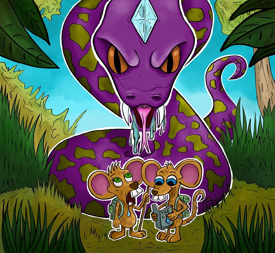
                      Here is the updated version. I changed the one mouse to notice the snake. I wanted to keep the diamond in the snakes head visible because its part of the story. You see the two mice are on the search for The Lost Diamond of Snake Isle. Little did they know it was part of the king snakes head.

                      Moving to ink now.

                      wip04.jpg


                      https://www.instagram.com/chipvalecek/
                      https://www.facebook.com/cvalecek
                      http://www.cshellmedia.com/

                      1 Reply Last reply Reply Quote 3
                      • Chip Valecek
                        Chip Valecek SVS Team SVS OG last edited by

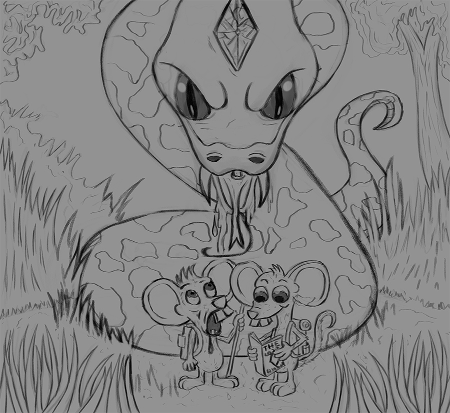
                        Here are my next two steps. Line work and base values. I am thinking about adding a couple leaves at the top in the foreground to frame it in a little, what do you guys think?

                        wip05.jpg

                        wip06.jpg


                        https://www.instagram.com/chipvalecek/
                        https://www.facebook.com/cvalecek
                        http://www.cshellmedia.com/

                        1 Reply Last reply Reply Quote 3
                        • Chip Valecek
                          Chip Valecek SVS Team SVS OG last edited by

                          Here is the next pass with some values to get the forms developed. Next will be to slap some color on top and play around with it. Question is should I do more cartoony colors or stick with the normal colors of the mice and snake?

                          wip07.jpg


                          https://www.instagram.com/chipvalecek/
                          https://www.facebook.com/cvalecek
                          http://www.cshellmedia.com/

                          1 Reply Last reply Reply Quote 2
                          • ?
                            A Former User last edited by

                            For some reason I'm picturing the snake to be purple with gold eyes, so maybe try the cartoony colours for the characters but keep the background quite realistic? Looking cool though 🙂 the mouse's face is fab!

                            1 Reply Last reply Reply Quote 1
                            • Chip Valecek
                              Chip Valecek SVS Team SVS OG last edited by

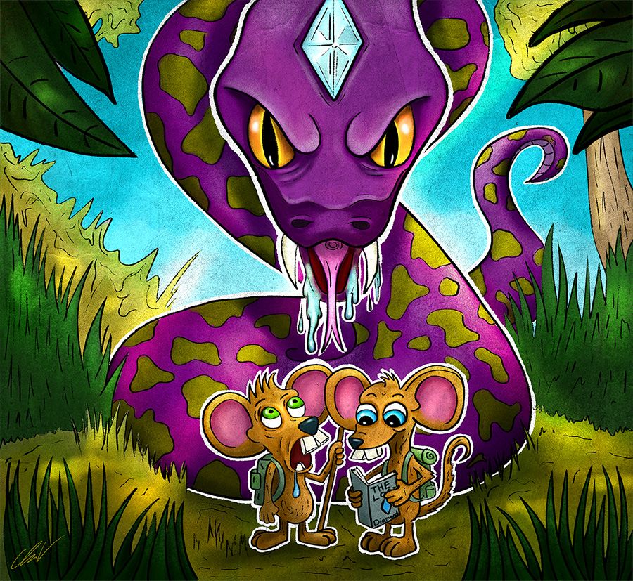
                              Here are my colors slapped over the values using overlay and multiple. I will start to clean up and push the shadows and highlights more as we;; as add some more lighting.

                              wip08.jpg

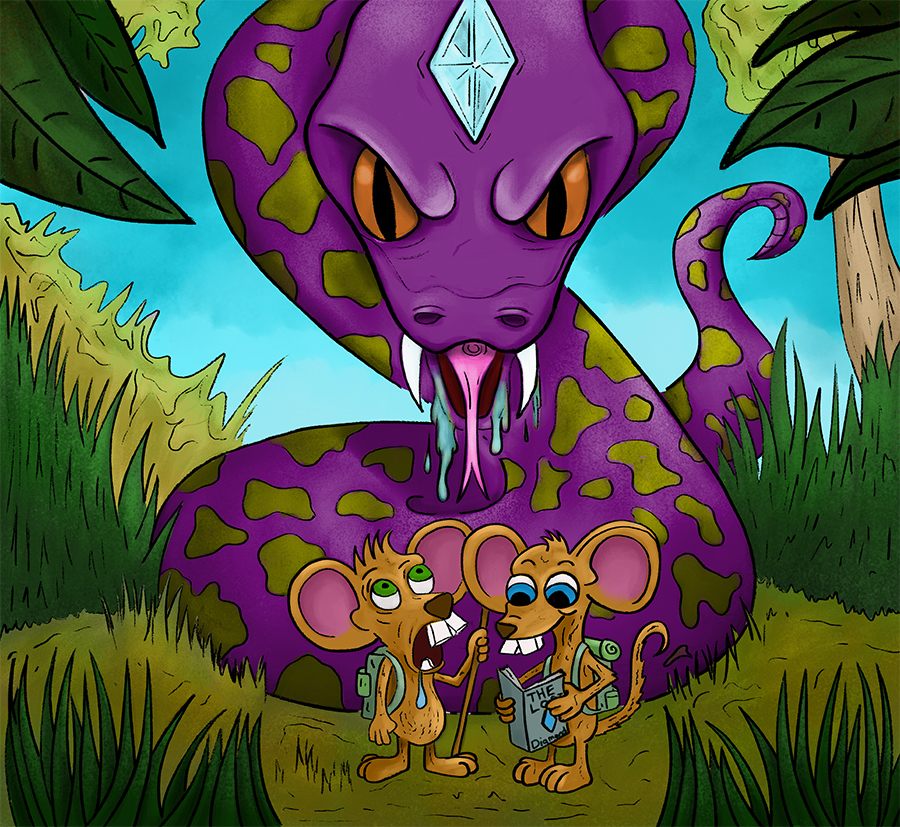
                              Add the white ink lines to pop my characters.

                              wip09.jpg


                              https://www.instagram.com/chipvalecek/
                              https://www.facebook.com/cvalecek
                              http://www.cshellmedia.com/

                              1 Reply Last reply Reply Quote 2
                              • Chip Valecek
                                Chip Valecek SVS Team SVS OG last edited by

                                Here is the final, I will sit on it for the rest of the week. Any tweaks?

                                moment_before_sm.jpg


                                https://www.instagram.com/chipvalecek/
                                https://www.facebook.com/cvalecek
                                http://www.cshellmedia.com/

                                braden H 1 Reply Last reply Reply Quote 4
                                • braden H
                                  braden H @Chip Valecek last edited by

                                  @Chip-Valecek I always find sitting on it for a week to be a good idea 🙂

                                  I'm really likin' the texture that you're working into your work. It suits it.

                                  I'll try and think of any tweaks n such.

                                  Those poor mice...

                                  1 Reply Last reply Reply Quote 1
                                  • First post
                                    Last post