Society of Visual Storytelling

    SVSLearn Forums

    • Register
    • Login
    • Search
    • Recent
    • Tags
    • Popular
    • Users
    • Groups
    • Search

    The moment before WIP

    Artwork
    29
    77
    5483
    Loading More Posts
    • Oldest to Newest
    • Newest to Oldest
    • Most Votes
    Reply
    • Reply as topic
    Log in to reply
    This topic has been deleted. Only users with topic management privileges can see it.
    • braden H
      braden H last edited by

      Allrighty. From here I fiddle and paint!

      alt text

      Heather Boyd lenwen 2 Replies Last reply Reply Quote 9
      • Dima Eichhorn
        Dima Eichhorn @braden H last edited by

        @Braden-Hallett 3, or 1 if the man behind is going to kick the person.😋 gread idea.

        https://www.instagram.com/dima_eichhorn/

        1 Reply Last reply Reply Quote 1
        • Heather Boyd
          Heather Boyd @braden H last edited by

          @Braden-Hallett I just noticed your character's elbows- cinnamon rolls -lols.

          Instagram: www.instagram.com/heatherboyd.illustration/
          Website: https://heatherboydillustration.ca
          Shop: https://www.inprnt.com/search/products?q=HeatherBoydIllustration
          Ko-Fi: https://ko-fi.com/heatherboydillustration

          Be blessed,

          ArtofAleksey braden H 2 Replies Last reply Reply Quote 2
          • ArtofAleksey
            ArtofAleksey @Heather Boyd last edited by

            @Heather-Boyd I was just thinking that!

            instagram and twitter: @artofaleksey
            alekseyillustration.com

            1 Reply Last reply Reply Quote 1
            • steph_artist
              steph_artist last edited by

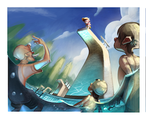
              So cool to see your progressions with this piece. My eye is really drawn to the character on the diving board. Not an easy viewpoint to create.

              1 Reply Last reply Reply Quote 1
              • ?
                A Former User last edited by

                @Braden-Hallett Fantastic work so far. I'd probably add a touch of light/halo around the kid on the diving board. I feel like he's getting a tiny bit lost in that deep blue sky?

                braden H 1 Reply Last reply Reply Quote 1
                • braden H
                  braden H @Heather Boyd last edited by

                  @Heather-Boyd @Aleksey There's just somethin' about elbows that scream swirly cinnamon rolls to me 🙂

                  1 Reply Last reply Reply Quote 0
                  • braden H
                    braden H @Guest last edited by

                    @lovetherobot Interesting! I may try that. To me at the moment he looks like he contrasts a bit too (almost vibrating)

                    Thanks for the feedback 🙂

                    1 Reply Last reply Reply Quote 0
                    • ?
                      A Former User last edited by

                      This looks amazing 😮 😮 😮 that water reflection and the colours are just brilliant and the boys face on the diving board is SO good and he really stands out! 😃 You're so good at drawing sides of faces, that's something i struggle with, but your swimming teacher's moustache is fab haha!

                      braden H 1 Reply Last reply Reply Quote 1
                      • lenwen
                        lenwen @braden H last edited by

                        @Braden-Hallett wow this is amazing! I can feel the depth and the fear of the character. Looking forward for more

                        www.lennywen.com
                        https://www.instagram.com/lunartcy/

                        1 Reply Last reply Reply Quote 1
                        • braden H
                          braden H @Guest last edited by

                          @hannahmccaffery I was struggling to think of props that would make a character the 'coach' and for some reason a bushy moustache just seemed appropriate 🙂

                          1 Reply Last reply Reply Quote 3
                          • braden H
                            braden H last edited by

                            Work continues! I'm sure I'll think of things to fiddle and fix as the month goes along 🙂

                            alt text

                            1 Reply Last reply Reply Quote 4
                            • bnewman
                              bnewman @braden H last edited by

                              @Braden-Hallett This is way cool. I love seeing your process. Very helpful of you to share!

                              1 Reply Last reply Reply Quote 1
                              • KathrynAdebayo
                                KathrynAdebayo last edited by

                                This is looking so good! Have you fiddled with showing the warm light from the sun hitting your bottom characters? I imagine that you're trying to really highlight the kid on the diving board, which is working very well, I think! You'd know what's best, but I'm imagining that more warm light on the other characters might give the piece a more cohesive feel. The reflected light looks amazing. 🙂 Thanks for sharing your process again!

                                braden H 1 Reply Last reply Reply Quote 1
                                • braden H
                                  braden H @KathrynAdebayo last edited by

                                  @KathrynAdebayo I'll try splashing some warmer light on the swimmers 🙂 I think you're right. Right now the contrast between the swimmers and the diver is a bit stark

                                  1 Reply Last reply Reply Quote 1
                                  • braden H
                                    braden H last edited by

                                    Work continues! I knew that this one was lacking something that all the rest of the stuff in my portfolio has which is definite use of tool marks. I really like having some strokes and hatching in my work, so I worked it in. Dunno if this is something that everyone else likes, but it resonates with me for some reason. It was feeling too smooth 🙂

                                    alt text

                                    MichaelaH Kevin Longueil evilrobot shinjifujioka 4 Replies Last reply Reply Quote 5
                                    • MichaelaH
                                      MichaelaH @braden H last edited by

                                      @Braden-Hallett I like the new texture you put there Braden, only on the skin I don't like it so much, on the skin it looks like the grandpa had some hair on the head and the boy right looks dirty. Also I liked the water little bit brighter, like the pictures before. altogether it is really such great piece of work You did . 😍

                                      https://www.instagram.com/michaelaheimlich/
                                      https://www.heimlich-illustration.de/

                                      1 Reply Last reply Reply Quote 1
                                      • Kevin Longueil
                                        Kevin Longueil SVS OG @braden H last edited by

                                        @Braden-Hallett This is looking so good! not sure if you are looking for feedback or not? I was thinking that the right side of the diving tower should be really lit up by the sun in the same way that the boy is? I think i went a little crazy with my scribble over but i feel like a bit of sun on the side might look right - feel free to ignore of course - as @bnewman said above, it is so helpful to see your process here - thank you for sharing it with us!

                                        Untitled_Artwork 2.png

                                        Portfolio: kevinlongueil.com
                                        https://www.instagram.com/kevinlongueil/

                                        Erin.Cortese braden H 2 Replies Last reply Reply Quote 7
                                        • Erin.Cortese
                                          Erin.Cortese Moderator @Kevin Longueil last edited by

                                          @Kevin-Longueil Oooh I like the lighting from the sun.

                                          1 Reply Last reply Reply Quote 2
                                          • evilrobot
                                            evilrobot SVS OG @braden H last edited by

                                            @Braden-Hallett Love the texture that's something I was always trying to get in my color work and don't think I ever quite got there. Are you using Painter? I was always having color management problems with it when going back and forth to Photoshop and then I hated that I couldn't have another window open on my second monitor. But I did love how the brushes worked. Are you using the newest version of the software? Wondering if they've gotten any better?

                                            http://www.palacioillustration.com/

                                            https://www.scbwi.org/illustrator-gallery/illustrator-detail/?illustrator_id=84142

                                            https://www.pinterest.com/evilrobot2/pins/

                                            https://twitter.com/MyEvilRobot

                                            braden H 1 Reply Last reply Reply Quote 1
                                            • First post
                                              Last post