Society of Visual Storytelling

    SVSLearn Forums

    • Register
    • Login
    • Search
    • Recent
    • Tags
    • Popular
    • Users
    • Groups
    • Search

    Critique needed- Night Cat

    Artwork
    8
    15
    752
    Loading More Posts
    • Oldest to Newest
    • Newest to Oldest
    • Most Votes
    Reply
    • Reply as topic
    Log in to reply
    This topic has been deleted. Only users with topic management privileges can see it.
    • BetelJio
      BetelJio @CukiArtist last edited by

      @CukiArtist I never thought about this. That's a good suggestion, I will try it out very soon, thankyou!

      www.jiobutlerart.com
      www.instagram.com/jiobutlerart

      1 Reply Last reply Reply Quote 0
      • Chip Valecek
        Chip Valecek SVS Team SVS OG last edited by

        I agree with @MichaelaH with the white background and just the black stroke. Maybe beef the black stroke up a little.


        https://www.instagram.com/chipvalecek/
        https://www.facebook.com/cvalecek
        http://www.cshellmedia.com/

        1 Reply Last reply Reply Quote 0
        • BetelJio
          BetelJio @MichaelaH last edited by

          @MichaelaH Thanks! I definitely need to get rid of that stroke. I thought it would make it pop but it just looks too tryhard... White bg just seemed too stark for me.

          www.jiobutlerart.com
          www.instagram.com/jiobutlerart

          1 Reply Last reply Reply Quote 0
          • BetelJio
            BetelJio last edited by

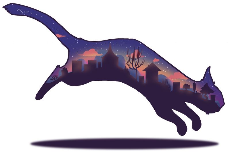
            Here is a new version with some suggestions- I will redraw the black stroke by hand but wanted to show you what it looked like anyway. I am still worried that the canvas is constraining the movement of the picture. Maybe it's just something I am going to have to sacrifice in order for people to see the details!
            Kitty Print_test.jpg

            www.jiobutlerart.com
            www.instagram.com/jiobutlerart

            1 Reply Last reply Reply Quote 4
            • MichaelaH
              MichaelaH last edited by

              I have to say, it looks much better, I don't need the shadow, only the cat and than I am concentraiting on the inside landscape.

              https://www.instagram.com/michaelaheimlich/
              https://www.heimlich-illustration.de/

              1 Reply Last reply Reply Quote 0
              • Erin.Cortese
                Erin.Cortese Moderator @BetelJio last edited by Erin.Cortese

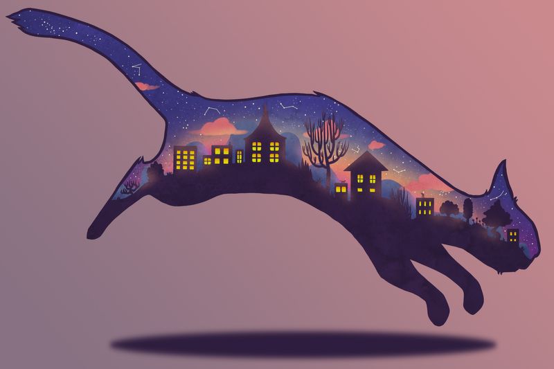
                @BetelJio I really love the colours in the piece and the scenery inside the cat! The white is a little harsh, I think the contrast is too high. Have you tried other colours? I don’t think the gradient was working either, because of too little contrast. Maybe something in between?

                1 Reply Last reply Reply Quote 0
                • BetelJio
                  BetelJio last edited by

                  Thanks again wonderful people, for helping me out. I've added a few more details and put in a more subtle background. I think it looks it's best yet, but I would be interested to hear your viewpoints. πŸ™‚
                  Kitty Print_2.jpg

                  www.jiobutlerart.com
                  www.instagram.com/jiobutlerart

                  Johanna Kim Elizabeth Rose 2 Replies Last reply Reply Quote 5
                  • CukiArtist
                    CukiArtist last edited by

                    I think that is looking much better.

                    1 Reply Last reply Reply Quote 0
                    • BetelJio
                      BetelJio last edited by

                      Thanks, I appreciate everyone's help! πŸ˜ƒ

                      www.jiobutlerart.com
                      www.instagram.com/jiobutlerart

                      1 Reply Last reply Reply Quote 0
                      • Johanna Kim
                        Johanna Kim SVS OG @BetelJio last edited by

                        @BetelJio Like how this turned out with the shadow. But when I first saw this piece (the earlier version), I thought it was meant to be a painting on a canvas or board that was in the shape of a cat. On a white wall, that would look really cool. The overall effect of this piece is really dreamy.

                        http://www.johannakim.com
                        http://instagram.com/johannahkim/

                        1 Reply Last reply Reply Quote 0
                        • Elizabeth Rose
                          Elizabeth Rose @BetelJio last edited by

                          @BetelJio Love the colors and the simple shapes! The only thing that i'm trying to figure out is the shape of the cats face. I'm not sure if its just in a specific style or a special breed of cat, but I feel like the chin is not dainty enough.

                          Anyhow, great job!

                          Screen Shot 2019-04-08 at 1.55.14 PM.png

                          https://elizabethrosehoffman.com/
                          https://www.instagram.com/elizabethrosehoffmanart/
                          https://linktr.ee/elizabethrosehoffman

                          1 Reply Last reply Reply Quote 0
                          • djly
                            djly last edited by

                            @BetelJio -

                            I really love this image and the progress is really wonderful to see between your first post to the most recent!

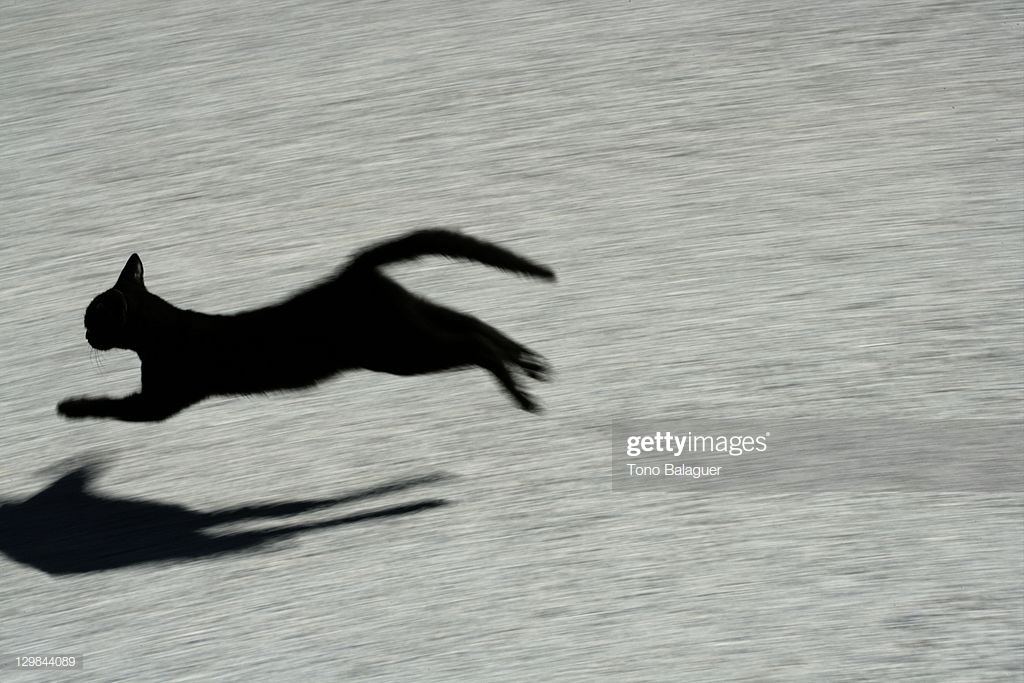
                            For the shadow, I wonder if it might be nice to add a bit more movement or shape corresponding to the cat. I did a quick google search and found this image for reference:

                            2412fbcb-74bf-4809-be66-24535dfb61ae-image.png

                            1 Reply Last reply Reply Quote 2
                            • First post
                              Last post