Group run through creative environment design week 1 art and feedback
-
@Braden-Hallett Let me have it. As a game developer, I'm not sensitive. You can't possibly say meaner things about my work than users on Google Play.
 (And anyone else feel free to join. I'm looking to improve.)
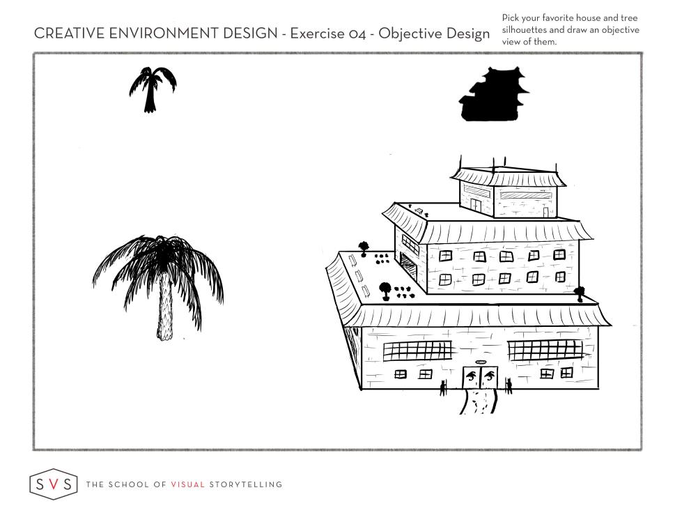
-
@Braden-Hallett I just saw this post after I posted mine. Would love a critique! Wanting to improve so I'm totally open and not the least bit sensitive about it!

-
@JerrySketchyArt My feedback: I like the palm the best, really detailed with great stroke. I like the palm better than the house.
I think the house is missing little details, the facade in the first and second floor has strokes like for smaller house, to strong in my opinion. I don't like the black trees on the first roof, I think bright sketchy and some better design would be better. The windows are bit to much rough with the big lines. More details would make it better. The best part of the house is the second roof. It is fine detailed on the facade -this facade I would make on the whole house.
Hope it helped. -
I agree I like the palm tree -texture reminds me of a pineapple
")
House wise I am distracted by the two types of lines you have. The outer lines are accurately straight but then your inside detail lines are free hand (I concluded), I like it to be consistent. Drawing straight lines digitally is hard for me too but I rather draw freehand all for final works. *Now I could be terribly off and you have hand drawn them but point remains (windows are wiggly and walls are straight).
Time is wiggly wobbly -Doctor Who memory lols
-
Okeedokee!
Something I like: Those doors and windows certainly do give us a sense of scale. Lots of neat little details.
Something I'd change: The silhouette feels unbalanced (feels to me like it really wants to fall over to the right). I would either shift that top floor further centre, or extend the base floor to the right.
Another thing I'd change: I also think this would benefit from being done in something closer to isometric perspective (because you want this to be really objective, yes?) This'll also make it easier to avoid tangents like the one formed with the left awning edge and the bottom of the building. I'm gonna do a drawover at some point today to show you what I mean
-
Critique

Something I like: That tree is awesome. You've got that form shading with the edge of the leaves down pat!
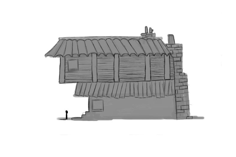
Something I'd change: Your silhouette had elements which made it feel balanced which are missing in your objective view! The silhouette has thin supports at an angle from the left and right which certainly made it feel more stable. I would add in supports to hold that second floor balcony up. It seems in your objective view that it's extending a bit too far for comfort
-
Here's what I mean. It's a good way to figure out 3d shapes without having to worry as much about converging lines. Then once everything's figured out you can play around with placing the building in more realistic perspective

-
Thanks to everyone who has responded so far.
@Braden-Hallett I will definitely do it in an isometric style next time. I think you mentioned that after I posted it before. Certainly makes things easier to read at this design stage!
Question on the alignment: Wasn't our goal on these to make things more interesting and less symmetrical? I imagined this being built like an ocean or riverfront property, where one side is more interesting and would only need balconies looking one direction. (And tried to stick to the thumbnail)
@Heather-Boyd Good call on the lines. I was practicing with a new drawing monitor and really wanted to practice.
 Definitely not consistent though. I'll keep that in mind.
@MichaelaH I think this raises a good question of what type of details we should put into this phase. I was trying to keep time spent to a minimum since this wouldn't actually be shown publicly (normally).
How detailed is too detailed in this phase? How accurate would something like a window need to be? My thought process was basically "could I build a 3d model out of this?" I'm interested to see how far others take this phase with the details.
-
@JerrySketchyArt said in Group run through creative environment design week 1 art and feedback:
Question on the alignment: Wasn't our goal on these to make things more interesting and less symmetrical? I imagined this being built like an ocean or riverfront property, where one side is more interesting and would only need balconies looking one direction. (And tried to stick to the thumbnail)
Absolutely! And thinking asymmetrically and focussing on the thirds and fifths I think is great
-
@Braden-Hallett great point. I'll go about adding a log pole support type thing.
-
My stab at the house part of exercise #4. Trees are a lot easier for me -I will take a stab at the iso diagram version for this. That was last on row 1.
-
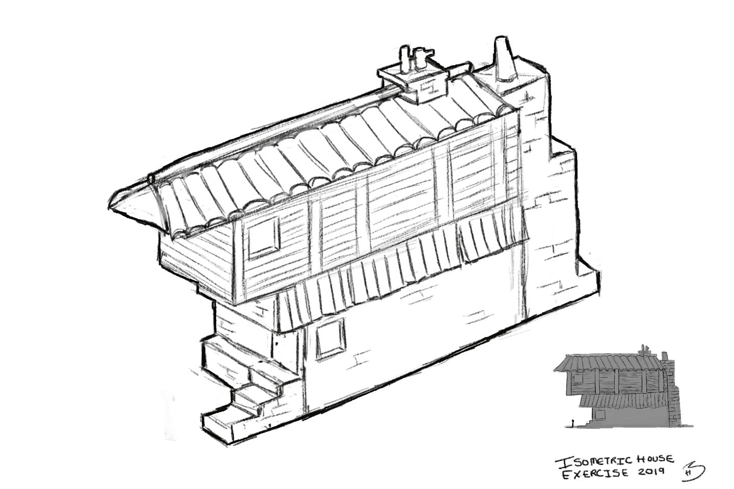
Not perfect but finished. Now I haven't been on week 2 -spoilers -now I can!
@Braden-Hallett Now I know some of my issues but feedback is good too. Had some issues with roof tiles specifically and it was far more challenging doing the isometric version - but was able to put How To Draw Everything course more into practise.Thanks and anybody else is always welcomed to comment.
Instagram: www.instagram.com/heatherboyd.illustration/
Website: https://heatherboydillustration.ca
Shop: https://www.inprnt.com/search/products?q=HeatherBoydIllustration
Ko-Fi: https://ko-fi.com/heatherboydillustrationBe blessed,
-
@Heather-Boyd Hey, I'm still going to give a little feedback.
On the side view, it looks like the roof is passing the wall, while on the top view it looks like the roof stops where the wall starts. From this angle I was expecting the roof to cover a little of the window.Love your work by the way. I wished mine could look so clean.
-
@murielle That's a good catch thanks, that's an easy fix.
-
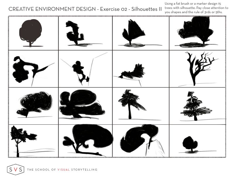
I worked on Worksheets 1 and 2 again after I watched past 50 minutes on the Reference Video to create them from my head mostly with a bit of help from the shapes I found in my house. I started and finished these today.
This time please let me know which ones don't really meet the 3rds and/or 5ths Rule - some are more natural and others I had to stop and see if they were working with the rule. @Braden-Hallett and everyone else
always appreciative.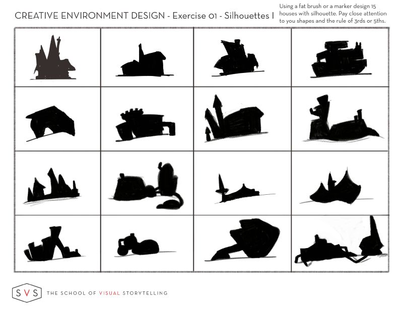
Instagram: www.instagram.com/heatherboyd.illustration/
Website: https://heatherboydillustration.ca
Shop: https://www.inprnt.com/search/products?q=HeatherBoydIllustration
Ko-Fi: https://ko-fi.com/heatherboydillustrationBe blessed,
-
@Heather-Boyd I can't see a single one that looks boring or too symmetrical
Some of those tree shapes are super neat. I particularly like the three in the second row that are growing near/on cliff faces.
I think with the trees I may keep in mind balance. Throwing some small objects on the other end of the teeter totter to help balance out some of the big swooping flowing shapes.
Awesome work!
-
@Braden-Hallett My mother agrees, we call that particular one the woman with swooping hair. I like my trees with personality and attitude. Now when you say small objects -do you mean as part of the tree -branches or other elements - which I tried to do with the cliff?
Thanks -my free choice are birds far more challenging for me.
Instagram: www.instagram.com/heatherboyd.illustration/
Website: https://heatherboydillustration.ca
Shop: https://www.inprnt.com/search/products?q=HeatherBoydIllustration
Ko-Fi: https://ko-fi.com/heatherboydillustrationBe blessed,
-
I mean tree elements
-
@Heather-Boyd said in Group run through creative environment design week 1 art and feedback:
Not perfect but finished. Now I haven't been on week 2 -spoilers -now I can!
@Braden-Hallett Now I know some of my issues but feedback is good too. Had some issues with roof tiles specifically and it was far more challenging doing the isometric version - but was able to put How To Draw Everything course more into practise.Thanks and anybody else is always welcomed to comment.
@Heather-Boyd I feel your pain. Roof tile drive me nuts :smiling_face_with_open_mouth_cold_sweat:
Nice work with the isometric perspective!
I think out of all your silhouettes, this is the one that I find just ever so slightly off balance. That's my one issue
-
@Braden-Hallett Yes I tried to balance it better with chimney weight. Thanks for your thoughts.