Group run through creative environment design week 5 art and feedback
-
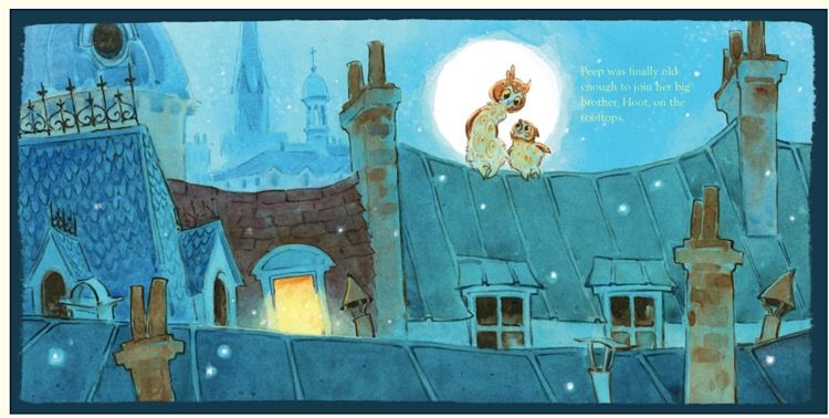
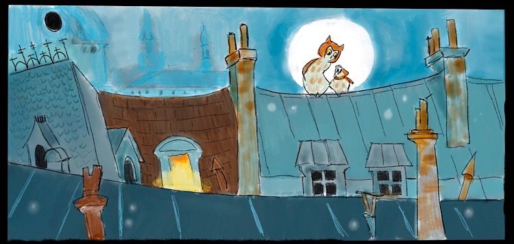
Mine is not nearly as detailed as all of yours but I chose it because I have tried to figure out how to do night scenes without having them become too drab and murky, and I liked the colors and atmosphere in this scene from a book by Lita Judge so I decided to give it a try.
Here’s the original
Here’s my copy:
Laurie DeMott
instagram.com/demotlj -
@demotlj Nice! I think you did a really good job capturing the atmosphere and overall feeling

Did you learn anything in particular about rendering night scenes?
-
Since I will being doing this next week, is subjective drawing looking at colour, brush stroke, lightening what else and how should I approach it?
Thanks
Instagram: www.instagram.com/heatherboyd.illustration/
Website: https://heatherboydillustration.ca
Shop: https://www.inprnt.com/search/products?q=HeatherBoydIllustration
Ko-Fi: https://ko-fi.com/heatherboydillustrationBe blessed,
-
@Braden-Hallett That's a really good question. Before I did this, I would have done night scenes using purples or grays, but was surprised that she really stuck to pretty saturated blues that were mostly of the same hue but in different values. Her whole piece used an extremely limited palette -- although I did it digitally, if I had been doing it in watercolor, I could have done it all with just a cool blue and a warm rust (and the yellow at the window). Even the owls were a very light value blue and rust. Colors are more muted at night so that would make sense.
Design-wise, she didn't use any perfectly straight lines which is something I struggle with all of the time. I tend to want to over-control my lines which leaves things stiff.
-
I'm playin' catch up!

-
A subjective background has more to do with feeling right rather than technical accuracy, so the study (I think) focuses more on the values and composition and what makes the environment feel the way it does (happy, safe, sinister, dangerous, etc)
-
@Braden-Hallett
So colour choice is important here then? I have trouble choosing colour but I can’t take the colour class -I have too many classes inline lols.
Instagram: www.instagram.com/heatherboyd.illustration/
Website: https://heatherboydillustration.ca
Shop: https://www.inprnt.com/search/products?q=HeatherBoydIllustration
Ko-Fi: https://ko-fi.com/heatherboydillustrationBe blessed,
-
@Heather-Boyd The workbook says 'composition and values, paying close attention to core shapes and proportions'.
-
@Braden-Hallett
Alright a t bit sad but that’s what it says I will practise that.
-
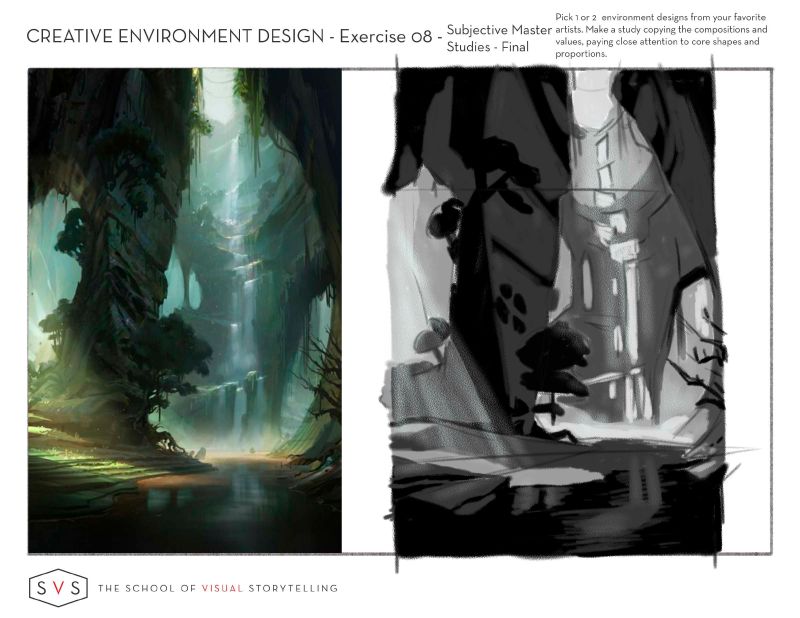
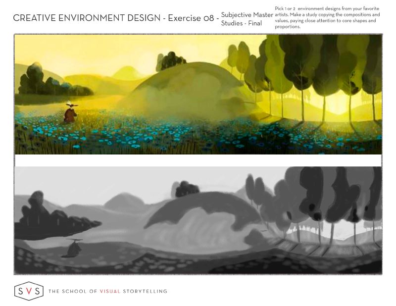
So my first Subjective Master Copy - I really loved this work -artist I don't know. But love the lighting and atmosphere - colour too but I did it in b/w. To understand the right values I selected the colours and dragged them to the b/w side to learn what value they used where as well as squinting. The other study will be a bit more kid friendly.
")
-
Only doing 2 Subjective Drawings - still trying to figure out if I am even doing it right.
Instagram: www.instagram.com/heatherboyd.illustration/
Website: https://heatherboydillustration.ca
Shop: https://www.inprnt.com/search/products?q=HeatherBoydIllustration
Ko-Fi: https://ko-fi.com/heatherboydillustrationBe blessed,
-
If you revisit the videos, the point where Jake explains all the homework is at about the 50 minute mark in the 'reference' video.
But I'm pretty sure you're doing fine
-
I started a different one than this but realized after (after I had a ton of work into it!) that it was more objective than subjective, I was being all picky with details. And I wasn't finished and it was taking forever! So I just threw this one together for the subjective study, focusing on color and atmosphere and shapes and not too mmuch on anything else! I really like the purply orangish combo
also, purply is a fun word to say over and over ha ha -
@Coley Anticipating seeing more
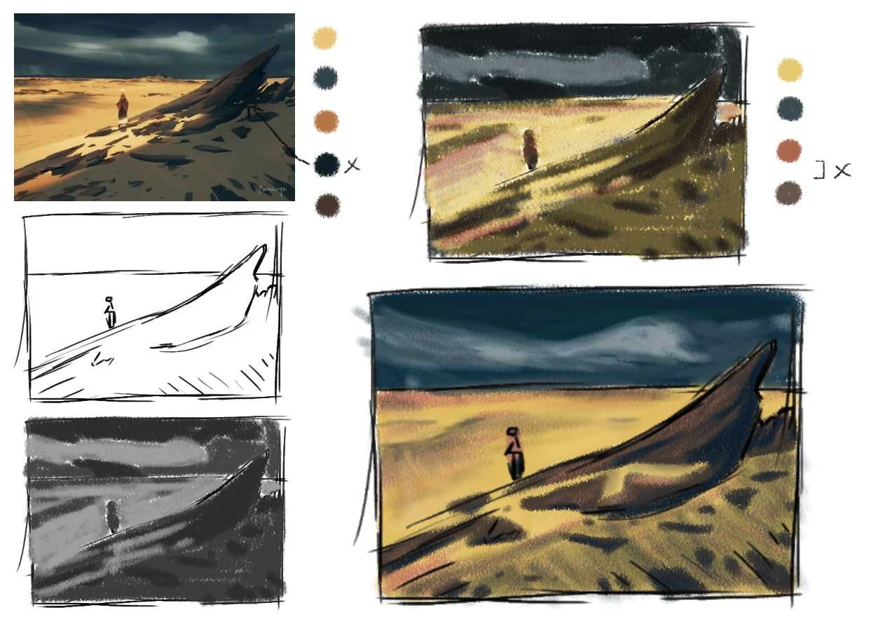
I know you are working on the Mermay though.So I needed to practise step by steps. I colour swatch dotes by eye and added them to the overlay top right and then colour swatch the original and noticed I missed the dark shadow which was a deep teal and not brown (nice surprise) . So I moved over to the largest and eye balled it again with what I picked up from everything I had done. Would the original have been done in a oil brush?
Original
Original top left.
Instagram: www.instagram.com/heatherboyd.illustration/
Website: https://heatherboydillustration.ca
Shop: https://www.inprnt.com/search/products?q=HeatherBoydIllustration
Ko-Fi: https://ko-fi.com/heatherboydillustrationBe blessed,
-
@Heather-Boyd nice work
It is really cool how one is surprised and learns so much from that color picking/trying to match etc.....I sure am learning a bit lately from doing that. Always surprised!
Mermay is nearly killing me lol! -
@Heather-Boyd Colour matching that way really does help a LOT. I'm always surprised at wrong I am when it comes to picking colours
it's almost never blue, just grey!) -
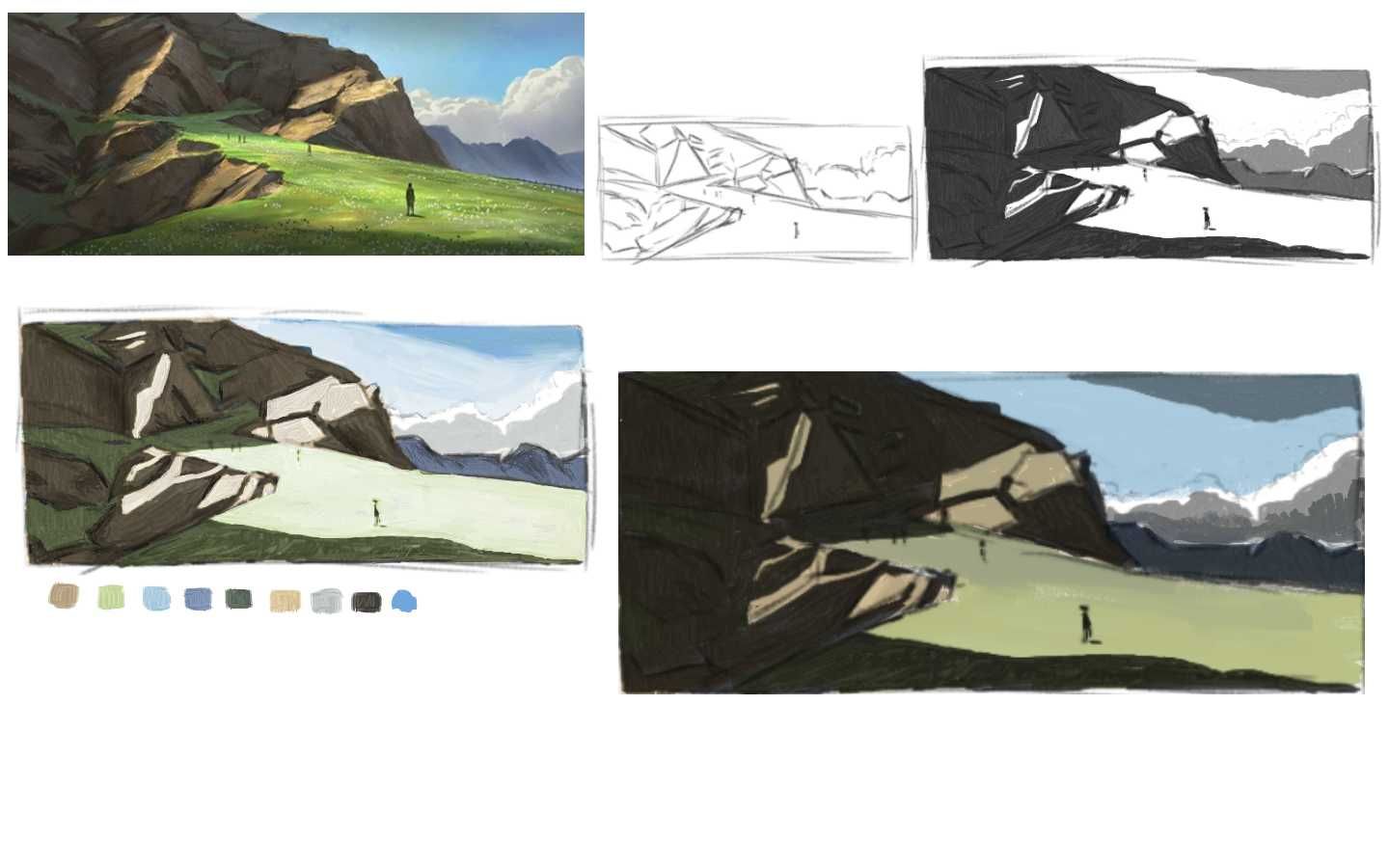
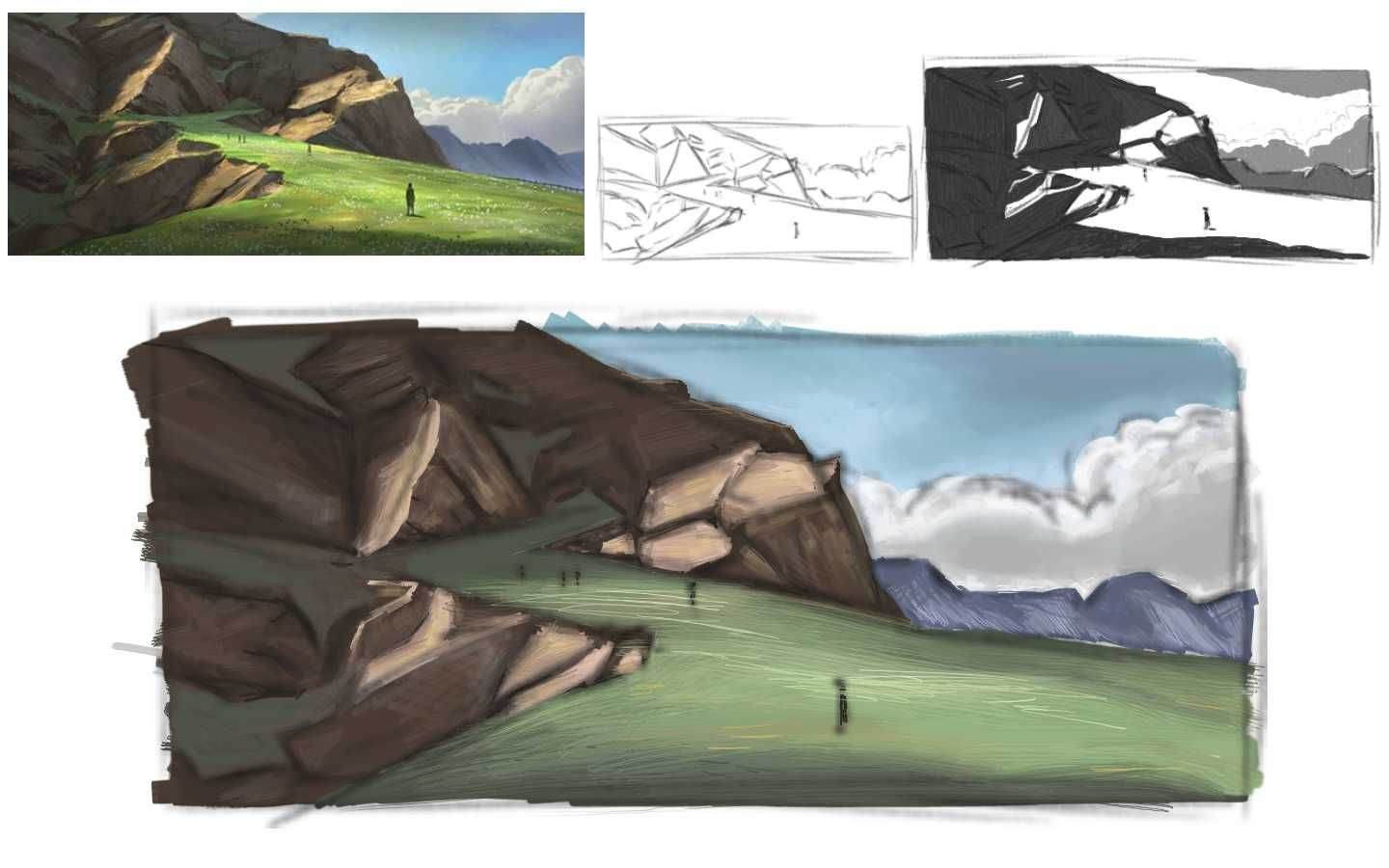
My last for subjective colour composition -trying to conquer a lot in this one:
understand grey scale, eye balling colour, and trying out oil brushes.So I tried a stab at using an overlay and multiple layer different ways. Then I enlarged my thumbnail sketch and eyeballed colours -the first I left the sketch lines in and the second I hid them.
I am very pleased, and I like the oil brushes -it's fun if not a bit frustrating pushing and pulling paint around the page. I also discovered some beautiful colours in the greys
.And so happy my clouds look like fluffy clouds in the no sketch lines one.
Thanks everyone

Edit note: I am prone to finding my mistakes now. lolsInstagram: www.instagram.com/heatherboyd.illustration/
Website: https://heatherboydillustration.ca
Shop: https://www.inprnt.com/search/products?q=HeatherBoydIllustration
Ko-Fi: https://ko-fi.com/heatherboydillustrationBe blessed,
-
@Heather-Boyd Wow it looks cool
-
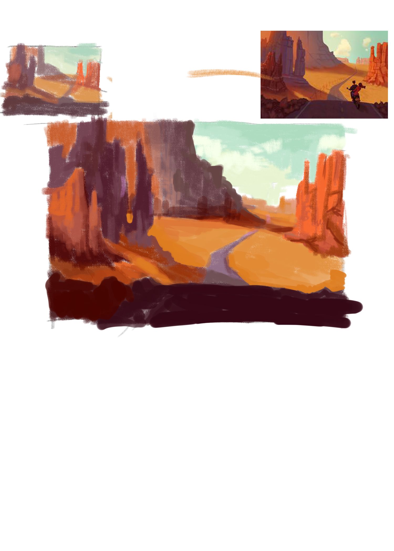
So finally week 5..started with some braking in parts and rough sketch, will work on it next day
-
Looks like a good study and thanks for posting on here -I see back that I did week 5 but I might do a more children book friendly one when I get back. And I will be excited to see yours!