Trying to step up my game
-
I could use some advice. Like everyone else, I'm trying to develop my skills with any eye toward portfolio imagery. At this point I'm looking toward Middle Grade or Young Adult.
Based on the information in a couple 3-Point Perspective podcasts--including this last one-- I'm aware of the different elements one should include in one's portfolio. I'm working toward that. I also know it's a smart thing to sometimes use familiar stories--Three Pigs, Riding Hood, etc.
But I've also read that there are some stories that are just over-used. I'd like to think about using some well known stories but twist or bend them in some ways... Perhaps use the characters but put them in different situational contexts that allow for a unique visual narratives.
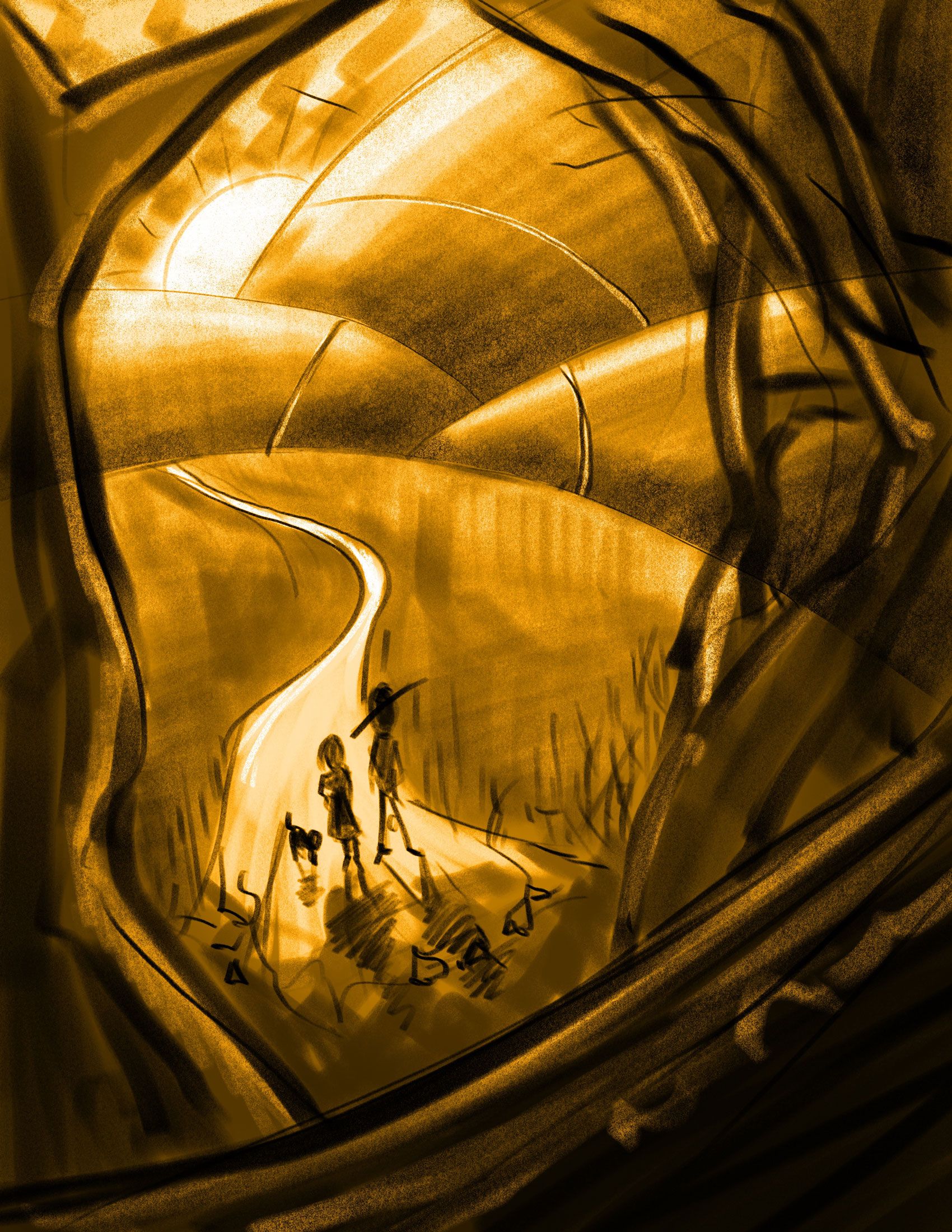
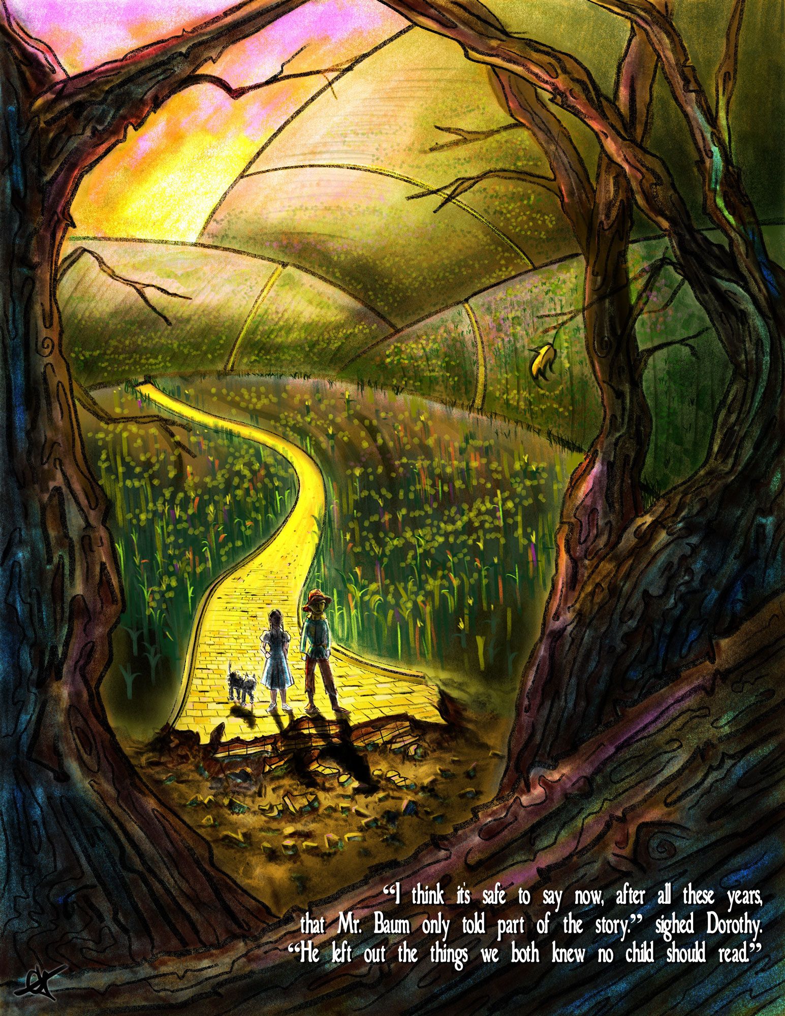
So with that in mind, I made something up inspired by the Wizard of Oz. Is that a good idea at all?
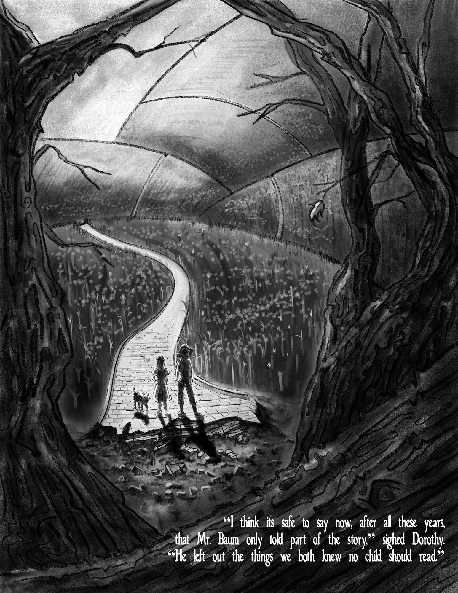
To the drawing--Did I lose my focal point, maybe? I did a grey scale value study, and the highest point of contrast is with Dorothy, but I'm pretty sure they're lost in all the goo gah. Is it too dark?
Any constructive criticism is welcomed!! Thank-you!
Children's Illustration Portfolio: https://www.coreyartusillustration.com
Art Portfolio: https://www.coreyartusimagery.com
Mastodon: https://mindly.social/@Coreyartus
Pixelfed: https://pixelfed.social/Coreyartus -
@Coreyartus I think the problem is that while your Dorothy does have high contrast, there are several other areas in the image that offer the same or similar contrast. The brick road contrast against the dark plants equally along its entire length, the tree trunk on the left against the sun is very high contrast, even that leaf on the branch on the right. I think you need to use the light source to create more of a focal point on the characters.
-
I think the tree in the foreground is distracting for me. What if you just left to two trees on the side and removed the branch in front. With your lighting scheme you have, I think the values on your characters are good since they wouldn't be lite up from the front unless you have another source of light.