Halloween illustration WIP
-
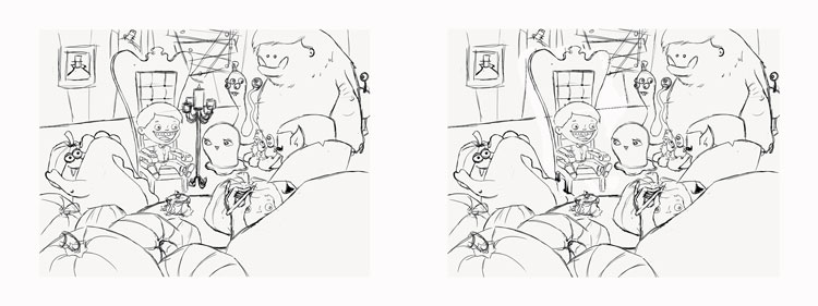
one thing I have to point out, it's the candle that shit right in mid of the illustration. I would move it back a bit so it sits behind and between the boy and the monster to the right. Now It divides the page and stops the flow of the composition. Again lovely piece!
-
@Naroth-Kean Uh...what exactly is that candle doing?? Not sure it's "stopping the flow", if you know what I mean. Hahahahaha, sorry. I'm still 12 years old.
shinjifujioka.com
https://www.facebook.com/shinjifujiokaart
IG: @shinjifujiokastudio -
@shinjifujioka Shinji I'm only 5 :D. I think Will did that by moving it to the back a bit but I think it's better without the candles since you already have one light source from the table. I'm worried that the candles will looks very hot on the boy hair. Here I removed it, just a thought
-
You could move candle to the other side of the chair and then it wouldn't interfere.
-
@shinjifujioka yeah i flipped to my own mistake LOLOLOLOLOLOLOLOLOL "shit" i'm sorry I mean "sit"
-
@Thrace-Shirley-Mears Yes! I will definitely do that! Now that @Naroth Kean pointed that out, it's the only thing I am seeing when looking at my drawing!! It couldn't be more "in the middle"! However, I really want to keep it in the illustration because I want it to be my primary light source (since the boy is my focal point).
-
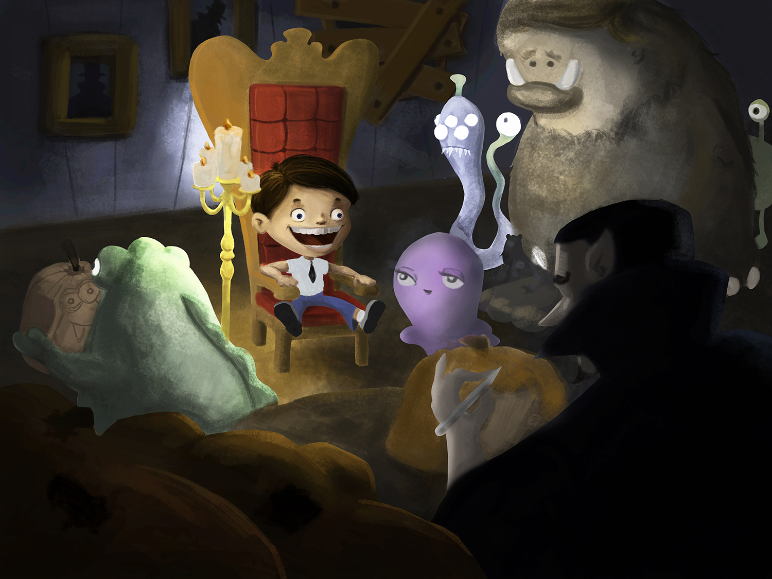
I think this is better!
noemiegionetlandry.squarespace.com
noemie_illustration on Instagram -
@NoWayMe Yup - tons better! I'm looking forward to seeing this finished... even if it is too late for Halloween haha.
Ace
-
@Ace-Connell Hahaha! It will probably be done it time for Christmas...
noemiegionetlandry.squarespace.com
noemie_illustration on Instagram -
@NoWayMe There's always next Halloween
")
-
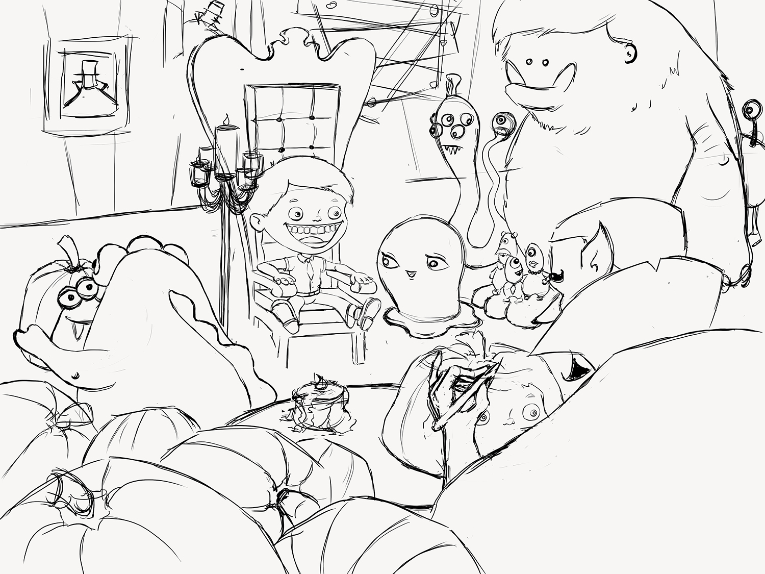
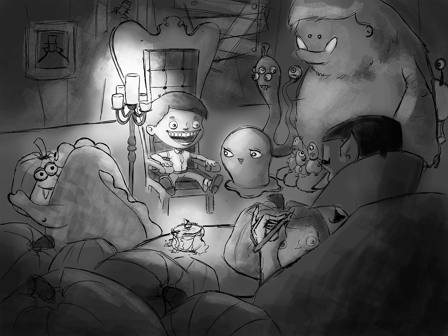
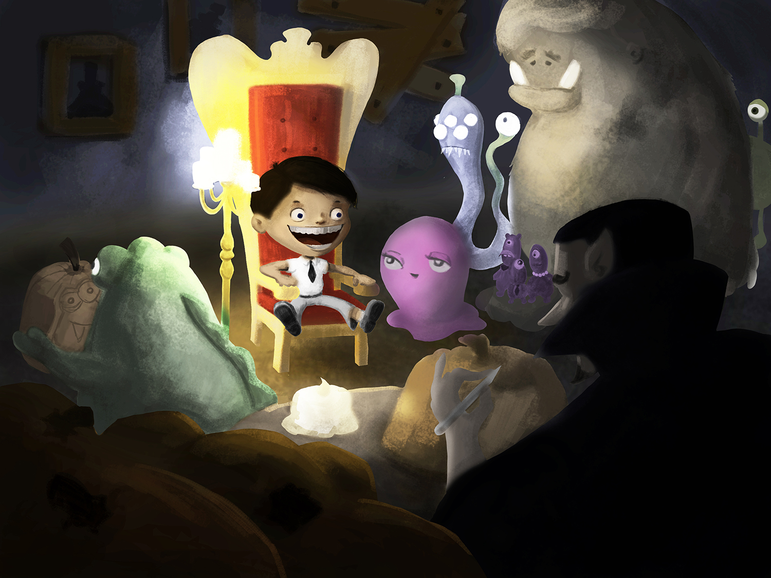
I started the painting phase of my illustration with a value study. I tried to clearly have the boy in focus, and then the carving vampire as a secondary focal point.
I have to disclose that I have never done a fully rendered illustration on photoshop before! I usually work traditionally (mostly in soft pastels) so I'm walking in the dark a little bit here! Hope it is going to turn out good! Critiques are of course more than welcome!
-
Personally, I'd try and work in more contrast between the foreground of the dude with the awesome beard carving the pumpkin and the rest of the scene so you get that real sense of dimension.
Hope that helps a little
Ace -
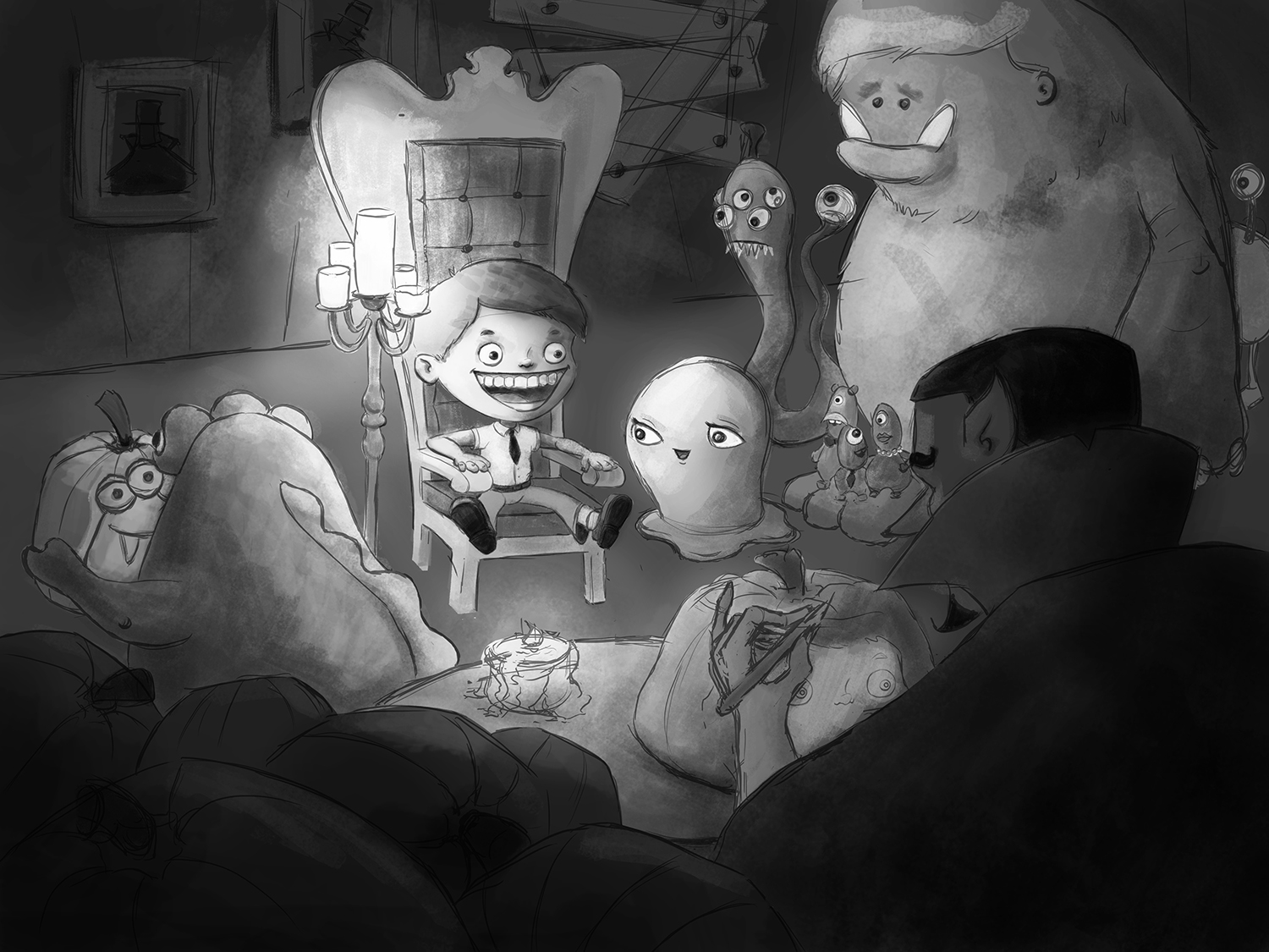
Still working values, and slowly adding details!
-
Hello again!
I am starting to add colors to this illustration and I would really appreciate any feedback you guys can give me! Of course it is still very rough, but I would rather have feedback at this early stage, when it is still relatively easy to modify things!
Thanks in advance!
noemiegionetlandry.squarespace.com
noemie_illustration on Instagram -
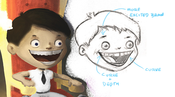
This is such an excellent piece! Love it!....there is something about the original drawing of the boy's face that i like so i thought i would try to figure out what it is - i think it is the eyebrow mostly and then the curve of the mouth in two places .....possibly the larger tongue and smaller pupils in the first one too but I'm not sure about those - lastly the teeth recede i size on the original but not yet in the painting (on our left) it is such a subtle difference but i think the boys expression in the original drawing has a bit more magic to it - what do you think?
-
@Kevin-Longueil Thanks again for such an helping comment! You're absolutely right that I am losing the boy's expression, I will definitely work on that! I am going to take advantage of your always extremely helpful comments... do you have any thoughts on colors for me ?? I know everything is fairly messy right now, I have changed the colors so many times I stopped counting! I am trying to limit my palette, but at the same time, the monsters need a little color! I feel like the pink monsters is stealing the focus a little to much... what do you think ?
noemiegionetlandry.squarespace.com
noemie_illustration on Instagram -
@NoWayMe I wish i could help with color but that is my greatest struggle - the limitless possibilities of the color picker - yikes! - i am reading James Gurney Color and Light at the moment - i am going to try to stick to a split complimentary palette on my next attempt at painting - i found an awesome resource at sacra.net - it is a spit complimentary palette - he does a great video on mixing colors using the tool - the tool is here http://www.sycra.net/splitcomppalette.png - the video is here https://www.youtube.com/watch?v=_iWiZikXSsc - Sycra has some great videos - so for me i'm going to try this to limit my pallet and force me to make better color choices - But to answer your question - i do agree that the pink monster is dominating ....maybe see what the split complimentary wheel says her color should be (what shade of purple) to harmonize with the rest - you could reduce her saturation though i think in the short term to knock her back a bit - anyways no real answers here..Sorry
...really looking forward to seeing this as is it progresses! ....here is a jpeg of the split compliment tool from Sycra.net (just to show what it is - but i would download the png file for use in Photoshop) 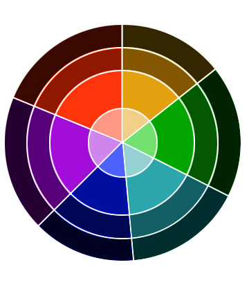
-
I have enjoyed watching the progress of this piece. It started so strong---and just keeps getting better! A few suggestions:
The pink character demands the most attention. In part because of the color and in part because of it's placement. The color is too strong. It distracts from the warm yellow's and reds surrounding the boy. Try a green, purple or blue...similar in saturation to the other monsters. Also, I feel the candle would be casting the boy's shadow onto that pink character which would make the face darker. As for placement...right now it is almost completely framed by negative space. If you nudge it down so it is slightly behind the pumpkin, it will blend more with the other characters.
I also find the candle on the table distracting. I suggest creating a less bright "off screen" light source over Dracula's right shoulder shining onto his carving. That way the boy will be the first place you look and the carving the second. I attempted a draw over to help explain. The color of the pink character is still not right...maybe a blue? But the placement and shading is what I was meaning. Hope it helps/makes sense. It really is an amazing illustration!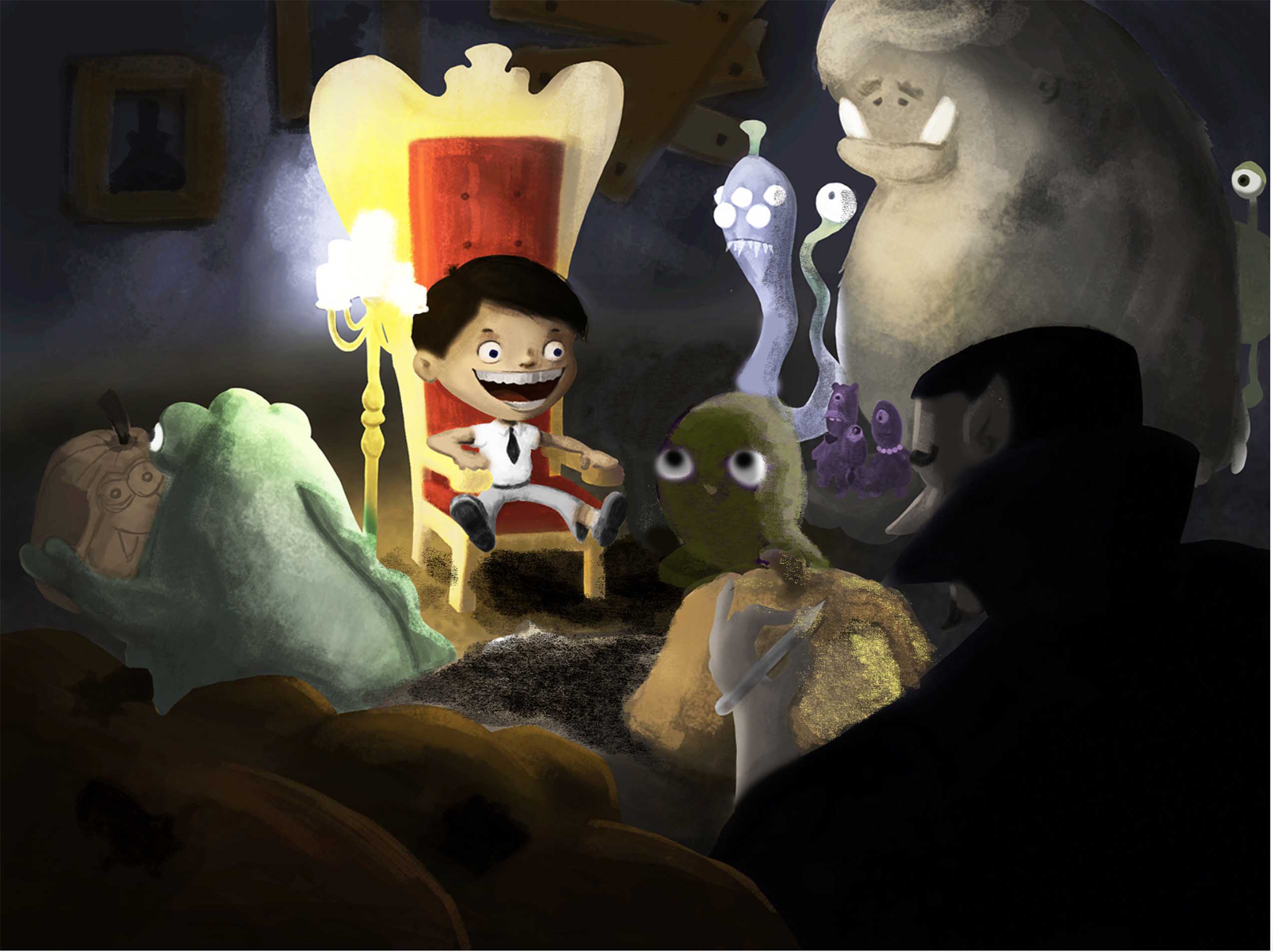
-
@NoWayMe Just want to say again that I love this image.
I did a paint over because I feel like, as a children's illustration, it might be getting too dark and muddy. In my opinion it should be brighter and more colorful. Especially since you have all those cool monsters--there is a great opportunity to get a lot of great colors in there.
Here is a really quick paint over. I didn't spend a whole lot of time deciding on the colors so a different scheme may be better.
One other really important thing to think about: Although that candle stand is AWESOME and adds a lot of character to the piece, it almost FORCES you to go with a very specific lighting scenario (one in which those candles are the main light source--and because candles do not give off a lot of light--the areas beyond that little spot need to be dark). One idea would be to just ditch them and free yourself to light it however you want. I'm not at all saying you should--just be aware that with the candles you are pretty much locked into one particular lighting scheme. @will-terry 's latest Santa piece would actually be an excellent reference for you.
Here they are, first with the lines, then without:
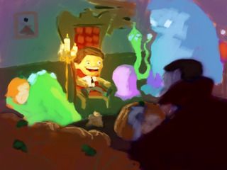
By the way: My kids saw me working on this and they were like: "Wow did YOU draw that?" Then I had to pause my paint over to let them color it first. One of my daughters didn't get the chance yet so she's excited that tomorrow she gets a turn at it.
-
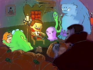
Here's where I am at now!
@mattramsey I just saw your comment! You are right that it is getting too dark for a children's illustration; I am in the process of making it lighter! I want it to have a hunted house feeling though, so I think I will keep the candle, but maybe by adding another "off camera" light source like @Joy Heyer suggested I will be able to lighten it up and keep the candles?! Also, one thing that adds to the problem is that I think I need to recalibrate my Cintiq, because colors appears WAY lighter on my Cintiq vs my computer!
@Joy Heyer Thanks so much for the great tips! I love the idea of adding a light source behind Dracula instead of the candle! I still have to shade the now purple monster, but you're right that having her behind the pumpkin is better! I am still not sure about the color though...
I will keep working on this tomorrow and post an update!
Thank you all so much again for helping!