Composition Final Project
-
Starting a new personal project with several goals in mind.
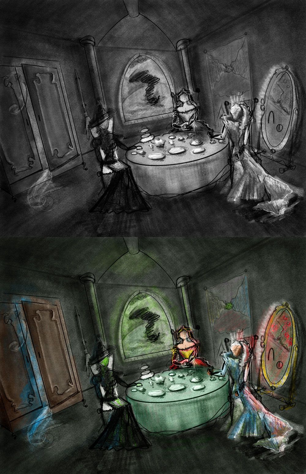
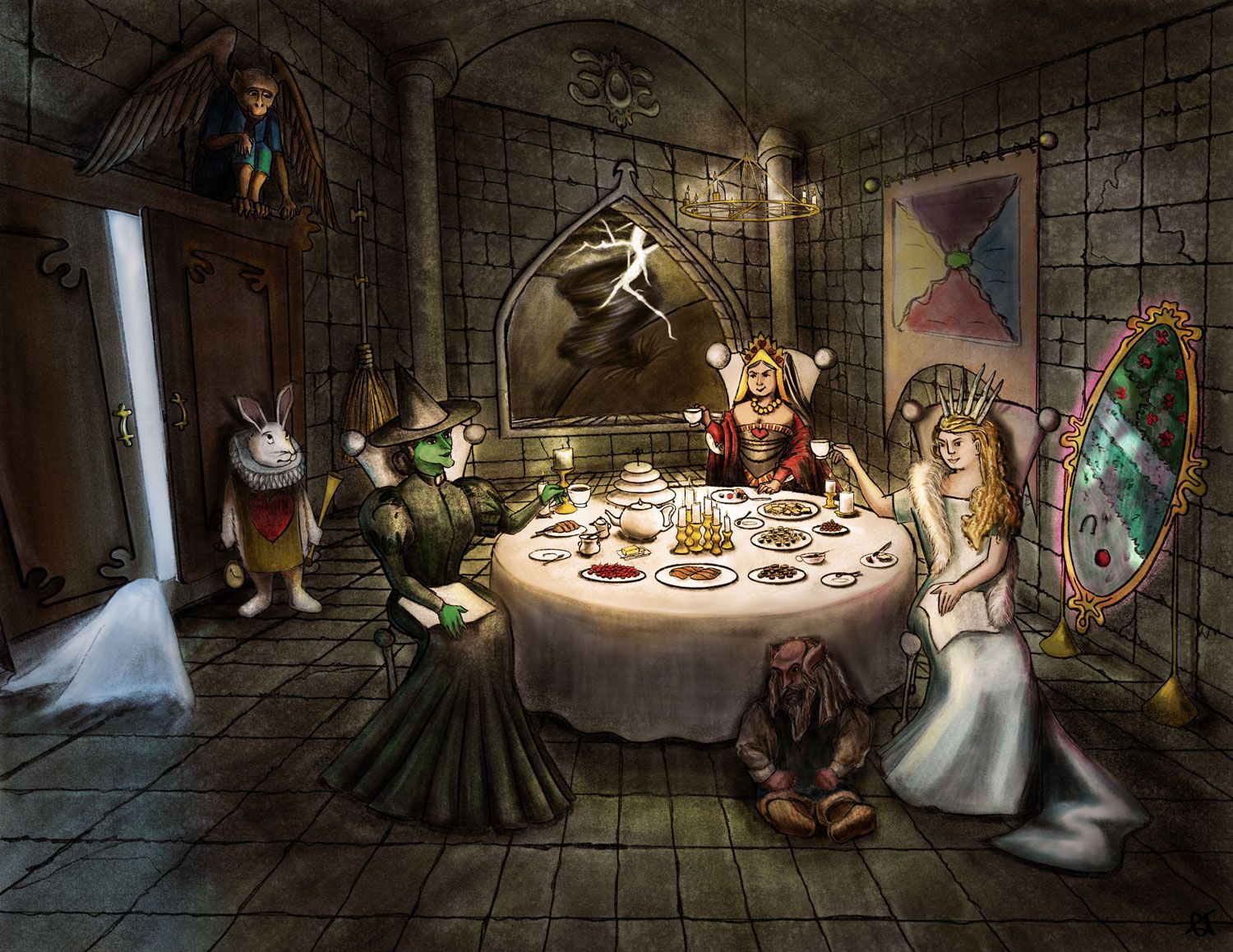
#1: Trying to make an interesting composition. There's a LOT going on in this image (maybe not 50 items, but a lot never the less). I haven't taken the self-guided "Draw 50 Things" course yet, but I have taken "Creative Composition", and this is sort of my own self-assigned final project. As such I am including:
a wardrobe w/glow and snow coming out
a mirror w/glow and image of flower hedges and croquet ball
a window w/landscape including hills and tornado
a table with tea set for three including napkins, food, and dishes
Wicked Witch of the West (from Oz)
Jadis, the White Witch (from Narnia)
The Red Queen (from Wonderland)
Stone walls and floor (lots of texture here...)
Simplified tapestry map wall hanging of Land of Oz
a broom hanging vertically in a wall bracket#2: Trying to create subject matter that is intriguing.
#3: Practicing drawing. As ever. With a particular eye toward texture.
#4: Developing awareness of different levels of lighting from multiple sources as well as commensurate shadows.
--------------------------------------------
I could use some advice/response regarding my rough. I am particularly interested in:#1: Where does your eye go?
#2: Does the image make sense? (i.e. Does is actually look like a tea party with the Wicked Witch of the West, The Red Queen, and The White Witch?)
#3: Is the composition too evenly horizontally laid out (my other imagery in this series is all vertical, and I need to try another format)? It doesn't follow the Rule of Thirds exactly... Is that a bad thing for this composition?
#4: Are my values okay?
#5: I know I am warping perspective a bit for the table. Is that distracting?I have not gone too far on this that I can't back up and start over. I could use some good constructive criticism. As a practice project, this is a first go after becoming aware of a lot of the things to think about. Oy. I'm not sure I'm checking off all the items on the CCchecklist... hehe...
-
@Coreyartus Hi Corey! This is a great composition with many interesting elements.
#1: My eye goes to the tornado outside the window, the reason being it is a dark mass on a fairly empty light space.
#2: The image makes complete sense; the table layout gives plenty of clues that it is a tea party involving the three characters.
#3: I don't think the composition is too evenly laid out, but I am wondering if the portion with the three characters at the table is too close to the bottom of the page, with too much headspace above them, if that makes sense. I am thinking that just including a little more space below this portion to let them breathe could help.
#4: Your values look good to me, but I would say the mirror on the right of the picture is fighting for some attention with the other elements. Since it is meant to be luminescent, maybe it could be one of the main light sources? If that is the case, I'm thinking there would be a strong rim light on the character right in front of it.
#5: The perspective on the table looks great to me. The perspective on the arch-like structure right at the top of the picture looks warped to me.
Do feel free to write back with updates on the piece so we could help you along!

-
@animatosoor Thank-you thank-you thank-you!! I needed more eyes. I really appreciate your thoughts! So many excellent points!
-
Wow Corey, you're setting yourself quite a challenge.
#1: My eye goes to the tornado on the first image, to the table on the second.
#2: The tea-party is obvious, the three queens not yet, but I guess that will become clearer once you render the persons a bit more.
#3: I'm no expert on this at all, but the table seems to sit on the lower third. And since that's where my eyes are drawn that seems to work. I actually like that you have more space above the queens, it gives the impression of the high ceilings in castles.
#4: I think the overall painting is a bit dark. You could try to get a bit more light coming from the wardrobe with the snow (looking at the first image). In the second image the blue of the snow seems a bit too blue, I would make that a lot lighter. But like I said, I'm no where near an expert on this.
#5: I don't mind the perspective so much, but the image feels tilted... What I mean is that I get the impression the plates on the table can slide of at any moment.These are just my impressions. I'm only in the very beginning stages of learning digital art and illustration myself, so my remarks may be completely off the mark.
I will say that I really like the idea and the story you are trying to tell. I can't wait to see your progress. -
Thanks so much for the observations! I've been contemplating everything and re-drawing everything and contemplating things some more... I added perspective lines to guide me when I'm drawing the stone blocks, and that made me step back and look at things.
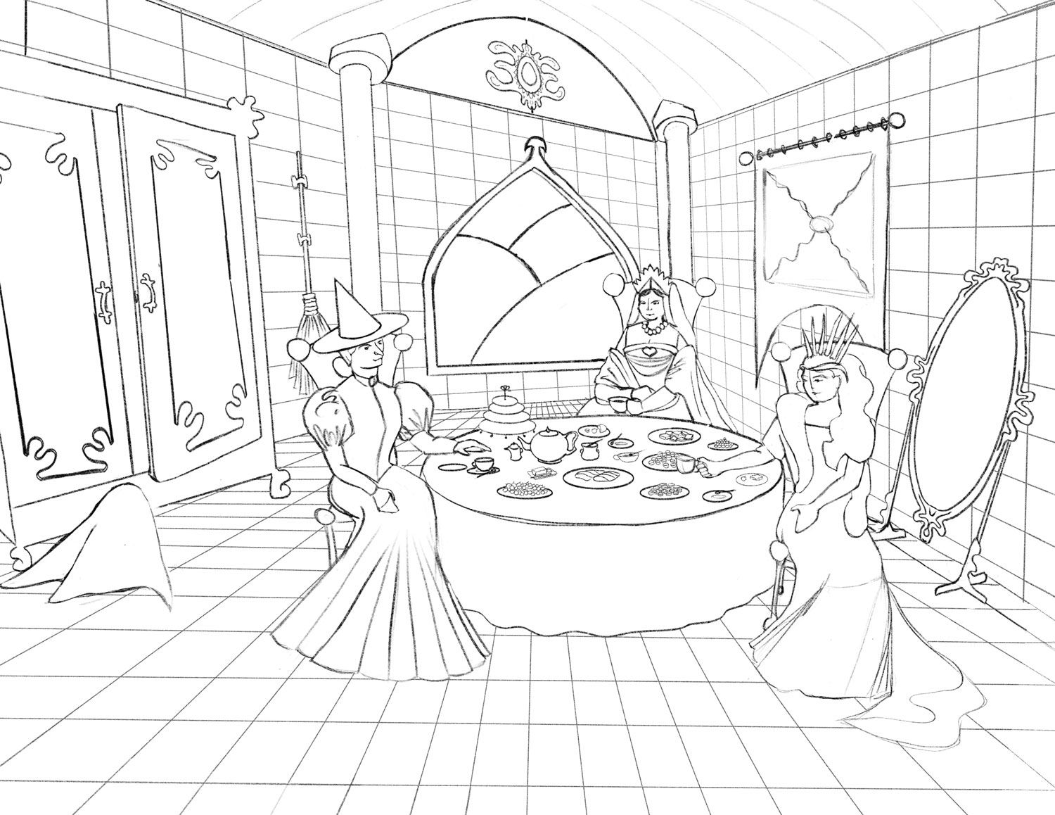
@Annemieke Having a slanted table seemed even more evident with the strong perspective lines of the tiles. So I straightened it up. And now I'm puzzled.
There's something really dramatic and contemporary about skewing the angles of an image to see things from an unusual vantage, and I fear it's now very Neoclassical looking ala David or even the Victorian Classicism of Godward, which to my mind is very rigid and unforgiving of mistakes... hehe... I could totally see the image going that way--stylistically it could be very interesting--but that is WAY beyond my capacity and would have to be done by someone who is a master at oils. That would not be me. LOL!
I had skewed some of the perspective on purpose before, and now I'm not quite sure the back window wall works or the floor's stone... It begs to be simplified visually with basic two-point perspective, and that makes it even more flat and stagey to me. I think I lost some drama somehow, and I wonder if maybe I should have made my viewpoint even more severe instead just to be clear it was a choice and not an accident.
Hm.
-
I agree that your first image was a lot more dramatic with the skewed perspective. The new one looks a bit boring...
My gut says that if you just slant the table a bit more to the right in the first image (and keep the skewed perspective otherwise) it will be a bit more balanced. But this is just me guessing, because I don't know that much about the theoretical side of perspective (especially skewed perspective....) -
Very creative concept! I like the idea of these three villains getting together. And the hints to their stories in the wardrobe, mirror, broom, map and tornado are great. I feel it is a little stagnant, however. Explore illustrating a different moment in time--like the queen arriving through the mirror. Same with the White Witch through the wardrobe. They each could be bringing something for the tea party--like heart sugar cookies or Turkish Delight. At the very least, make them more animated around the table. Right now it is three similar shapes just sitting there in similar poses. And the poses don't match their personalities. Skewing the perspective helps make it less stagnant, but it falls short of the potential a different moment in time would have.
Before working any more perspective I suggest doing a bunch of thumbnails with the witches and objects in different positions and different moments in time. If you are set on this composition, the back wall is off--especially where it connects to the left wall, the table is too low making it look like it is further back than it should be (the characters legs should be able to go underneath the table...), and the legs of the mirror should be straight up and down, not leaning back.
This is definitely an idea worth exploring and finishing! Can't wait to see more!
-
I have to agree with @Joy-Heyer there is so much more potential here. The idea of the three witches meeting is awesome.
But the them just sitting there is kind of bland. I was thinking you could try having them all looking at something and laughing in an evil way. Or one of them showing off one of their evil deeds and the other two laughing or cheering her on.
You might want to think about 'why' they are together and add that storytelling to it. Even if it is to get together and relax think about what do women do when they get together and relax? Add some of that.
Great kernel of an idea. Can't wait to see where it goes!
-
Brilliant idea. I look forward to see you progress. @Coreyartus What do you think about adding in a black cat, a frog or a crow, the witches' animal guides?
-
I really like this concept. Two things are jumping out at me.
First, the room has an unexpected shape to it. The corner behind the characters seems to suggest a triangular room (maybe a room in the turret of a castle?). Unless the shape of the room is critical to the story maybe giving the viewer a more expected environment would help.
Second, I can’t help but think there could be more drama here.You have this awesome and dynamic characters, but they are placed in the situation without much drama. Could a character be standing up, could one be glowering arms crossed, could another be summoning an underling? Imagine this scene playing out. They have all come together for a reason, what is the most dramatic moment of this meeting. What moment will most move the story forward and draw that?
I love the concept and can’t wait to see where you go with it. Cool work!
-
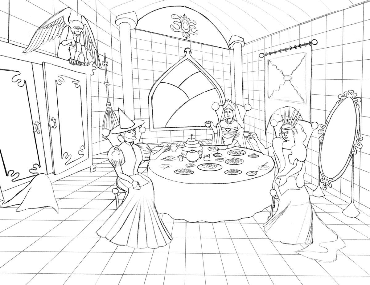
Alrighty, I've spent some time processing the comments thus far and made some adjustments.
1-- I skewed the left wall more so it looks like it's an odd-shaped room on purpose instead of an accident of perspective.
2-- I added a flying monkey. I feel like this sort of balances the table being in the lower third of the image and draws attention to the cavernous height. I'm not sure I'm ready to put in the White Rabbit or a the henchman Dwarf--I'm already biting off a HUGE endeavor for me. Unless it feels like they really need to be there. And you'll have to tell me if you think they should. These compatriot baddies seemed more in keeping than individual familiars that I'd have to invent.
3-- I gave them some small bit of action at the table--a toast. That felt like they were actually doing a little something instead of just sitting and posing for a group portrait.
4-- I lowered the Wicked Witch of the West and the Queen of Hearts so they look like they could feasibly get their legs under the table.
5-- I adjusted the mirror, facial expressions, some stuff on the table, & generally cleaned things up a smidge.Thoughts?
-
@Coreyartus good changes! I am really digging the toast and wicked smiles. It adds a lot. Nice progress.
One thing you might play with is zooming in... It is one of the techniques @Lee-White uses all the time. Try framing it in closer. I think you might get a better picture by zooming in on those lovely ladies!
-
@Coreyartus said in Composition Final Project:
@animatosoor Thank-you thank-you thank-you!! I needed more eyes. I really appreciate your thoughts! So many excellent points!
You're welcome, Corey! You've gotten some great feedback here. Your latest sketch looks very good, and I really like the changes you've made.
As far as the perspective goes - since you intended it to be an odd-shaped room, I guess that explains why the lines won't converge as they would normally - what would normally be parallels aren't parallels in your room design (which would be a box), and now I get that was done on purpose.

If you do decide to put in the other two characters, where would they be? It would be interesting to see what their roles in the scene would be, if you decide to go that route. Right now the three characters already have a common action/motive to bind them, and that's working very well.
-
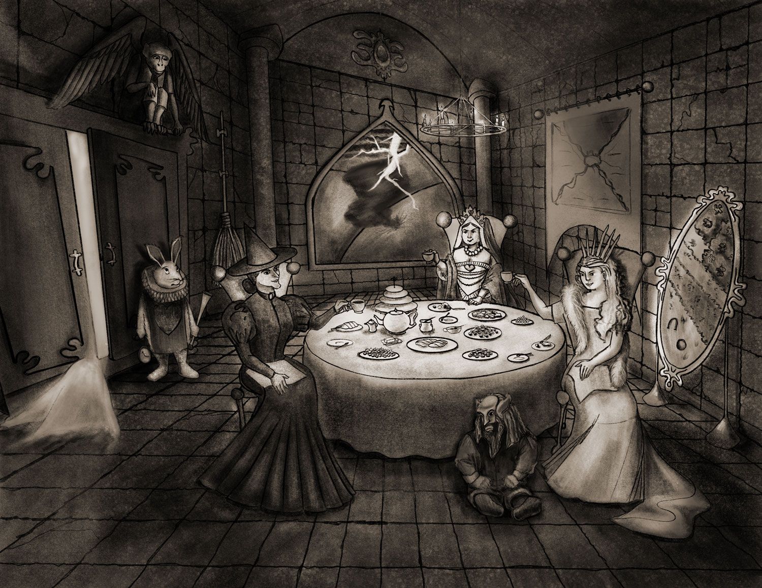
Well, I did another lurch forward and made some significant steps forward. Made some major changes:
- I went ahead and took the leap and added two characters--the White Rabbit and the White Witch's dwarf henchman. In for a penny, in for a pound, eh?
- A LOT of rendering and texture.
- A different, stronger source of light above the table than the window (which I decided wasn't a good idea since I wanted to make it stormy out there with the tornado).
-
Oh wow, you’ve made a lot of progress. Very good job on adding the henchmen, the scene looks a lot more complete now. The only thing that is bothering me a bit is where is the light coming from...? I really like the strong light on the table, maybe you could emphasize is a bit more by adding shadow at the backs of the queens, but the tiny chandelier hanging over the table is not enough to give such strong light. Can you make it bigger? And hang it a bit lower maybe?
I really like where this is going, and love that you’re setting yourself this huge, challenging task. Keep it up! -
Ok, I need to call this done and walk away.
Onward to the next project, eh? I think I'm going to so something much simpler now. Much much simpler. Haha!!
-
@Coreyartus I just joined into this party-so I got to watch it evolve-and it turned out just wonderfully. Your lighting is just right for this image. You did a great job of distinguishing the 3 characters visually.