Society of Visual Storytelling

    SVSLearn Forums

    • Register
    • Login
    • Search
    • Recent
    • Tags
    • Popular
    • Users
    • Groups
    • Search

    Group run through creative environment design week 6 art and feedback

    SVS Class Work
    9
    69
    5363
    Loading More Posts
    • Oldest to Newest
    • Newest to Oldest
    • Most Votes
    Reply
    • Reply as topic
    Log in to reply
    This topic has been deleted. Only users with topic management privileges can see it.
    • Erin.Cortese
      Erin.Cortese Moderator last edited by

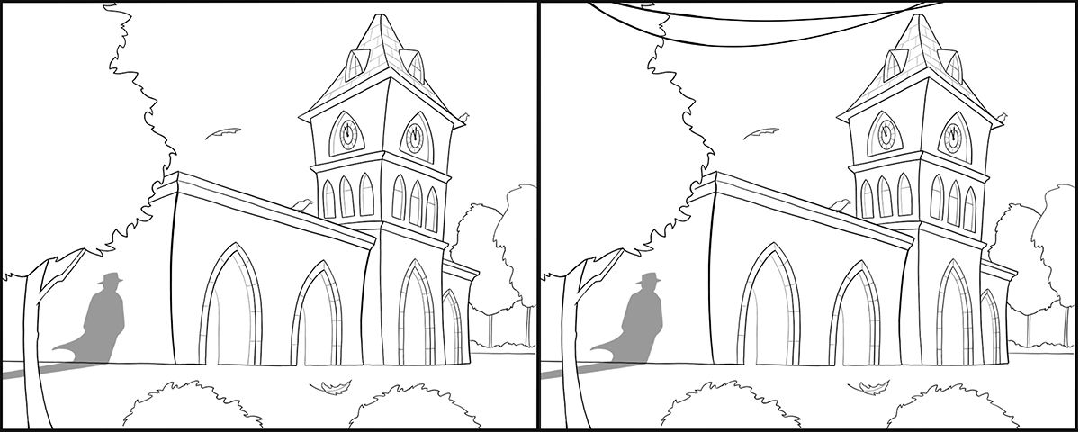
      @Braden-Hallett @Coley Thanks guys, I really appreciate the feedback! When I looked at it again this morning I saw the problem really clearly. I redrew the power lines, hopefully I made an improvement? I have plans for them so I am really hoping to keep them, but if you guys feel like they look terrible and it would be a bad call to keep them, let me know. Here is the piece with and without the lines, which works better?
      clocktowers.jpg

      Heather Boyd braden H 2 Replies Last reply Reply Quote 1
      • Heather Boyd
        Heather Boyd @Erin.Cortese last edited by Heather Boyd

        @Erin-Cortese I find with lines is distracting and even takes my eye strangely away or off of the shadow man.

        Instagram: www.instagram.com/heatherboyd.illustration/
        Website: https://heatherboydillustration.ca
        Shop: https://www.inprnt.com/search/products?q=HeatherBoydIllustration
        Ko-Fi: https://ko-fi.com/heatherboydillustration

        Be blessed,

        Erin.Cortese 1 Reply Last reply Reply Quote 3
        • Erin.Cortese
          Erin.Cortese Moderator @Heather Boyd last edited by Erin.Cortese

          @Heather-Boyd Thanks for letting me know. I’m wondering if it will have that effect once coloured. That’s the other reason I am struggling with this - it’s going to be a night scene, and the wires will be black on a dark sky, so I’m hoping the will read in a much more subtle way. But, they could cause the exact same problem once coloured. Hmm. They may have to go.

          Coley 1 Reply Last reply Reply Quote 0
          • Coley
            Coley @Erin.Cortese last edited by

            @Erin-Cortese I think they look better than they did before. they do stand out a little, but they are also currently the thickest looking line on the page. So you may be right that with the the dark sky they may not stand out. If they were a thinner line or I think if their value is not in huge contrast they might work (right now with black on white they are bound to stand out more) if they are a part of the story of the piece.

            https://www.instagram.com/nicoleledrewmay/

            1 Reply Last reply Reply Quote 1
            • Nyrryl  Cadiz
              Nyrryl Cadiz SVS OG @Erin.Cortese last edited by

              @Erin-Cortese i actually thought those lines were the movement of he wind. Yeah, they’re not really that clear that they were telephone lines. Great composition though.

              Portfolio: nyrrylcadiz.com
              Instagram: https://www.instagram.com/nyrryl_cadiz/
              YouTube: https://www.youtube.com/channel/UCbJCF1Im8ZO7hpGWTKOJMuA

              1 Reply Last reply Reply Quote 1
              • braden H
                braden H @Erin.Cortese last edited by

                @Erin-Cortese If you need to keep those power lines for story purposes that's totally cool. It's not that they look bad, it's that without context they just look like lines. I think you need a way to show people that they ARE power lines.

                My solution would be to have them running to a power pole situated behind the building and stretching off into the distance.

                Or a bird sitting on the line may give it just enough context to work.

                Neat stuff so far 😃

                Erin.Cortese 1 Reply Last reply Reply Quote 2
                • Erin.Cortese
                  Erin.Cortese Moderator @braden H last edited by

                  @Braden-Hallett Thanks! I tried to put a pole in the foreground and it looked like a hot mess, but I did not think of moving it toward the back. I will give that a try!

                  1 Reply Last reply Reply Quote 1
                  • Coley
                    Coley last edited by

                    bedroomwip2.jpg

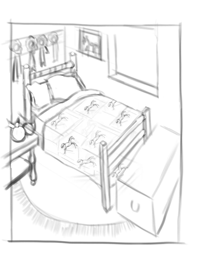
                    I developed it a little further tho it is still quite rough. just roughing out ideas. tho I started to get a little detailed on the blanket on the bed. So I didn't know if that's too much for the subjective take?

                    https://www.instagram.com/nicoleledrewmay/

                    Erin.Cortese braden H 2 Replies Last reply Reply Quote 2
                    • Erin.Cortese
                      Erin.Cortese Moderator @Coley last edited by

                      @Coley I love the horses on the blanket, really nice detail!

                      Coley 1 Reply Last reply Reply Quote 0
                      • Erin.Cortese
                        Erin.Cortese Moderator last edited by

                        @Braden-Hallett @nyrrylcadiz @Coley @Heather-Boyd

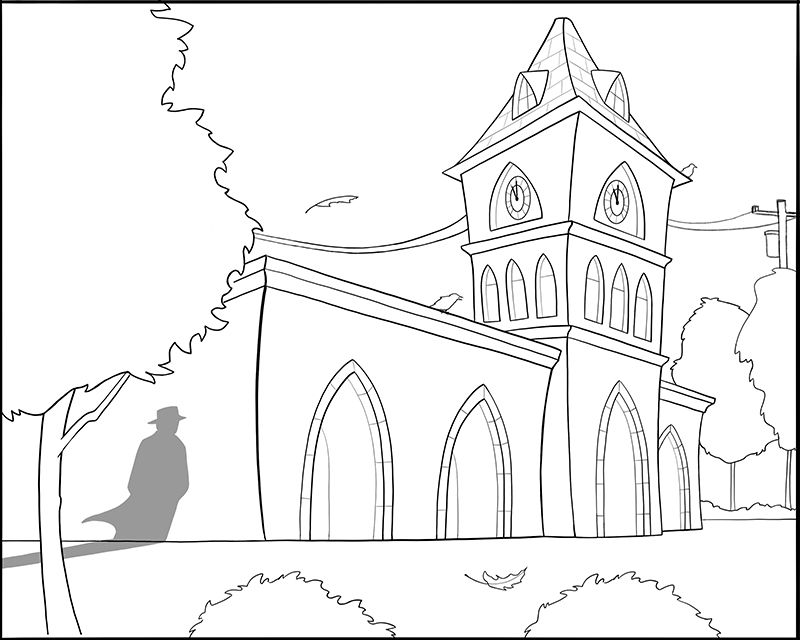
                        I have moved the power lines to the back all together and added more detail so they are recognizable (line work is still rough). Does this work? Thanks in advance everyone, I really seem to be caught up on this detail.

                        Clocktower.jpg

                        Coley Heather Boyd demotlj braden H 4 Replies Last reply Reply Quote 2
                        • Coley
                          Coley @Erin.Cortese last edited by

                          @Erin-Cortese I am no expert being reasonably new to illustration but I think it is a lot better. the lines are not floating like your husband has said (my husband does this to me too lol - it's good and bad lol). They also vary in length , shape, etc from one side of the structure to the other which is good!!! 🙂 Sometimes it's good to get hung up on details if we figure it out in the end 🙂

                          https://www.instagram.com/nicoleledrewmay/

                          1 Reply Last reply Reply Quote 1
                          • Heather Boyd
                            Heather Boyd @Erin.Cortese last edited by Erin.Cortese

                            @Erin-Cortese

                            I think that's better - just watch where the pole comes down -seems to disappear and merge with the tree trunk at the bottom.
                            Small thing -your foreground leaf is relatively the same size as the one above the lines. But the placement is not great, I will move it inward.

                            Instagram: www.instagram.com/heatherboyd.illustration/
                            Website: https://heatherboydillustration.ca
                            Shop: https://www.inprnt.com/search/products?q=HeatherBoydIllustration
                            Ko-Fi: https://ko-fi.com/heatherboydillustration

                            Be blessed,

                            Erin.Cortese 1 Reply Last reply Reply Quote 2
                            • Coley
                              Coley @Erin.Cortese last edited by

                              @Erin-Cortese thanks 😀

                              https://www.instagram.com/nicoleledrewmay/

                              1 Reply Last reply Reply Quote 0
                              • Erin.Cortese
                                Erin.Cortese Moderator @Heather Boyd last edited by Erin.Cortese

                                @Heather-Boyd I’m hoping to do a bit of a cheat here - no matter where I draw the bottom of the pole it will be too busy with the trees at the bottom, so I’m no going to draw the bottom of the pole 😬. It will be dark and the pole is in the distance, so I’m hoping it will look natural not to see it. The placement of it is not great though, so I will definitely move it inward.

                                1 Reply Last reply Reply Quote 2
                                • demotlj
                                  demotlj SVS OG @Erin.Cortese last edited by

                                  @Erin-Cortese I think having that pole in the back makes the wires look a lot better. I can't wait to see the next step.

                                  Laurie DeMott
                                  instagram.com/demotlj

                                  1 Reply Last reply Reply Quote 1
                                  • braden H
                                    braden H @Coley last edited by

                                    @Coley if this is a study I'd focus on how the values and composition make the piece feel. If this is going to be a finished piece, then detail away 🙂

                                    1 Reply Last reply Reply Quote 1
                                    • braden H
                                      braden H @Erin.Cortese last edited by

                                      @Erin-Cortese I think that works nicely, now! Having that power pole fade away behind the tree's will look pretty awesome.

                                      1 Reply Last reply Reply Quote 1
                                      • Heather Boyd
                                        Heather Boyd @ArtofAleksey last edited by

                                        @Aleksey Are you still working on this penguin farm? How is your progress?

                                        Instagram: www.instagram.com/heatherboyd.illustration/
                                        Website: https://heatherboydillustration.ca
                                        Shop: https://www.inprnt.com/search/products?q=HeatherBoydIllustration
                                        Ko-Fi: https://ko-fi.com/heatherboydillustration

                                        Be blessed,

                                        ArtofAleksey 1 Reply Last reply Reply Quote 1
                                        • Heather Boyd
                                          Heather Boyd last edited by

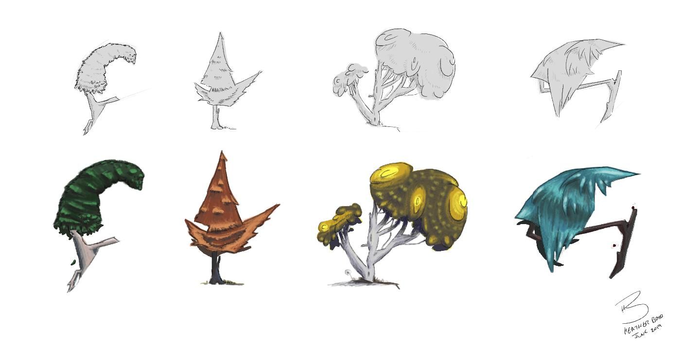
                                          Not sure what week to add this one too so week 6 it is!
                                          A step by step to final. Improved on colour and thought I would put my pinterest to better use and tried some of the techniques out for applying colour.
                                          If you have a favourite -let me know 🙂

                                          6 Tree Type Sketches from 02.1 .jpg

                                          6 Tree Type Colour Style 01 .jpg

                                          Instagram: www.instagram.com/heatherboyd.illustration/
                                          Website: https://heatherboydillustration.ca
                                          Shop: https://www.inprnt.com/search/products?q=HeatherBoydIllustration
                                          Ko-Fi: https://ko-fi.com/heatherboydillustration

                                          Be blessed,

                                          Erin.Cortese Coley demotlj 3 Replies Last reply Reply Quote 3
                                          • ArtofAleksey
                                            ArtofAleksey @Heather Boyd last edited by

                                            @Heather-Boyd im taking a break from that because of my residency. I got to the rough sketch phase and stopped.

                                            instagram and twitter: @artofaleksey
                                            alekseyillustration.com

                                            1 Reply Last reply Reply Quote 1
                                            • First post
                                              Last post